Data Visualization Using R
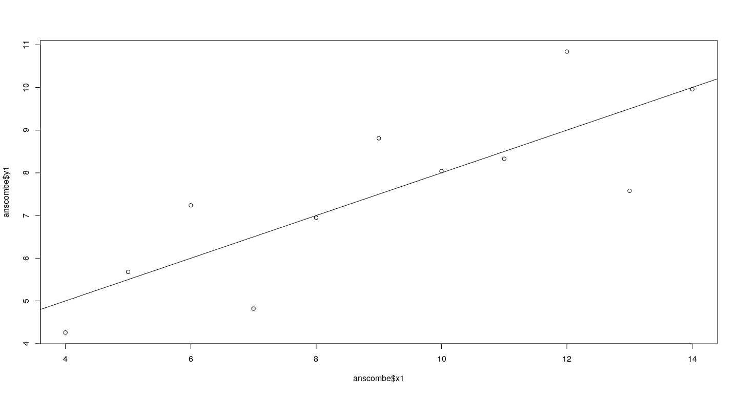
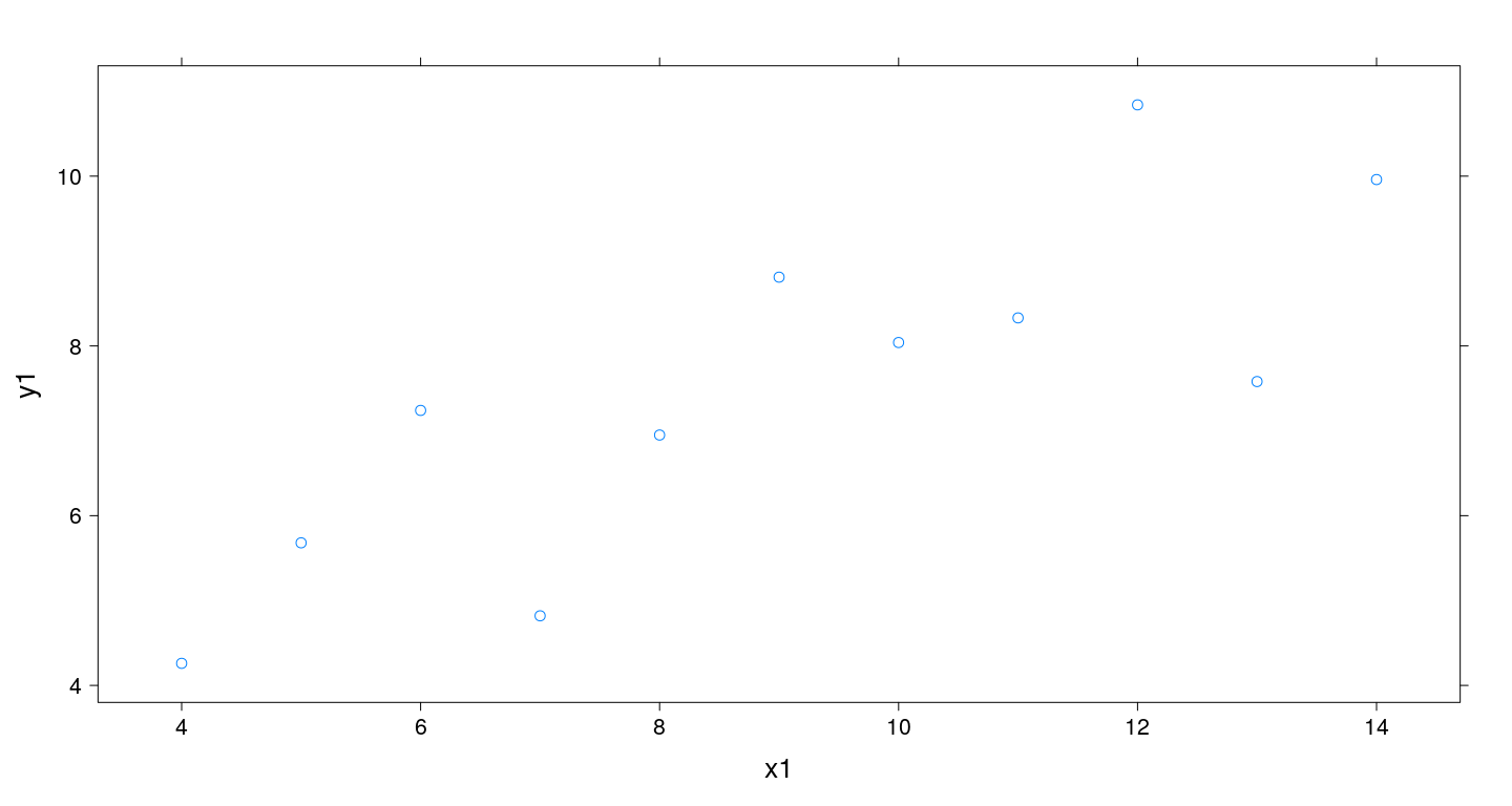
An example: Anscombe’s dataset 1
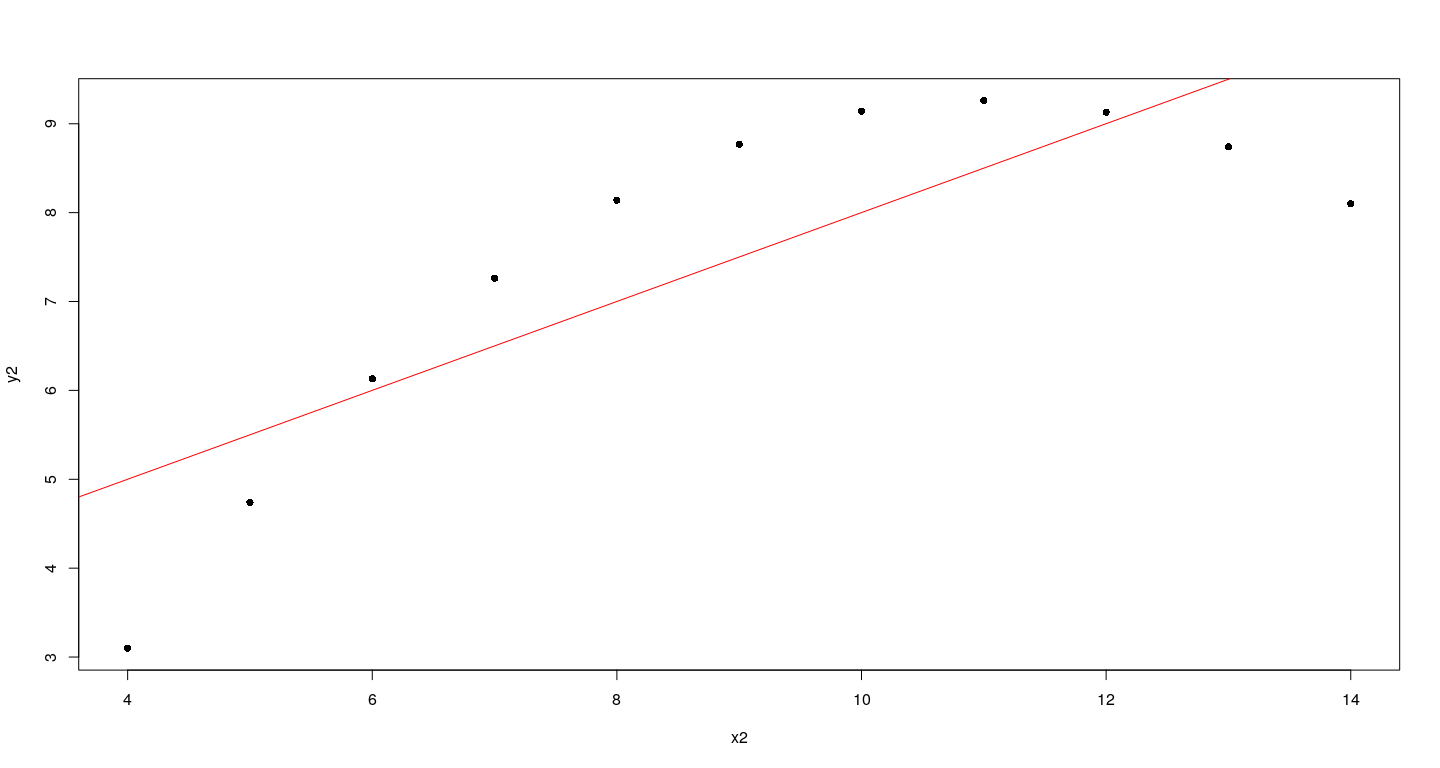
An example: Anscombe’s dataset 2
How could this plot have been created using low-level functions?
Try running this code one line at a time:
plot(anscombe$x1, anscombe$y1, type = "n", axes = FALSE, xlab = "", ylab = "")
box()
points(anscombe$x1, anscombe$y1, pch = 16)
axis(side = 1)
axis(side = 2)
title(main = "Anscombe's first dataset", xlab = "x1", ylab = "y1")
abline(lm(y1 ~ x1, anscombe), col = "red")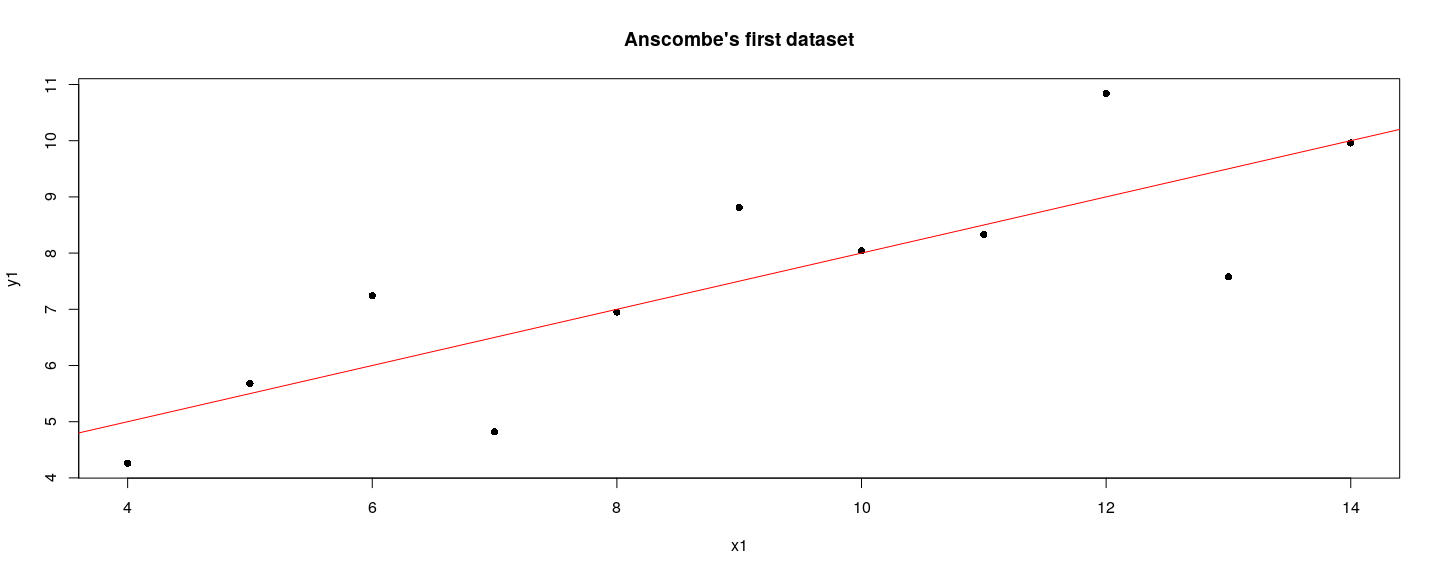
A more polished version
plot(anscombe$x2, anscombe$y2, type = "n", axes = FALSE, xlab = "", ylab = "")
lims <- par("usr")
rect(lims[1], lims[3], lims[2], lims[4], col = "grey80", border = NA)
abline(v = pretty(lims[1:2]), h = pretty(lims[3:4]), col = "white", lwd = 2)
axis(side = 1, col = "grey80", col.axis = "grey20")
axis(side = 2, col = "grey80", col.axis = "grey20", las = 1)
points(anscombe$x2, anscombe$y2, pch = 16)
title(main = "Anscombe's second dataset", xlab = "x2", ylab = "y2", col = "grey20")
abline(lm(y2 ~ x2, anscombe), col = "grey20")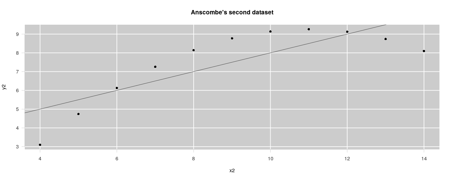
Other high-level plots - examples
Other high-level plots - examples
Other high-level plots - examples
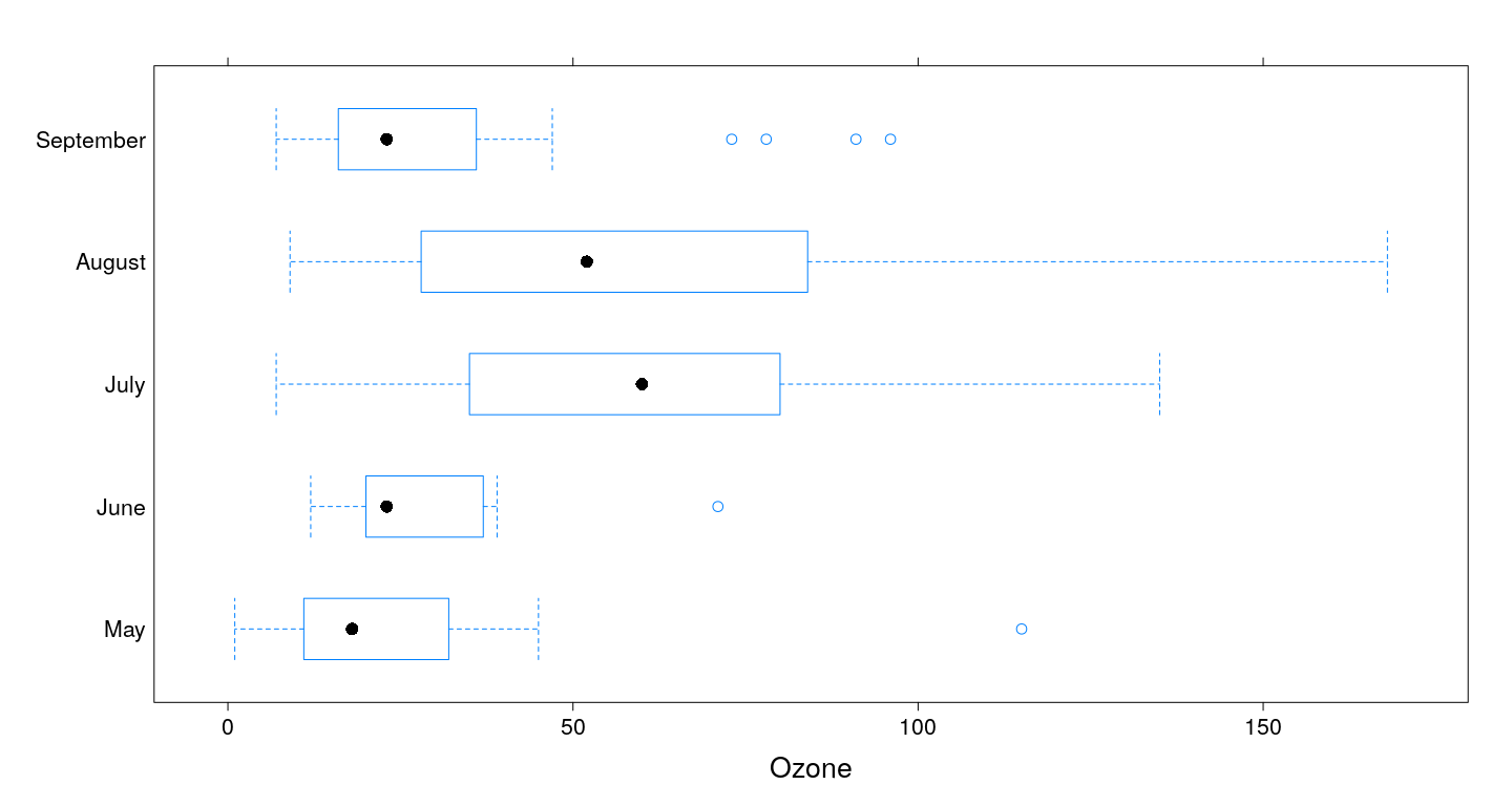
airquality$fmonth <- with(airquality, factor(Month, levels = 1:12, labels = month.name))
boxplot(Ozone ~ droplevels(fmonth), data = airquality)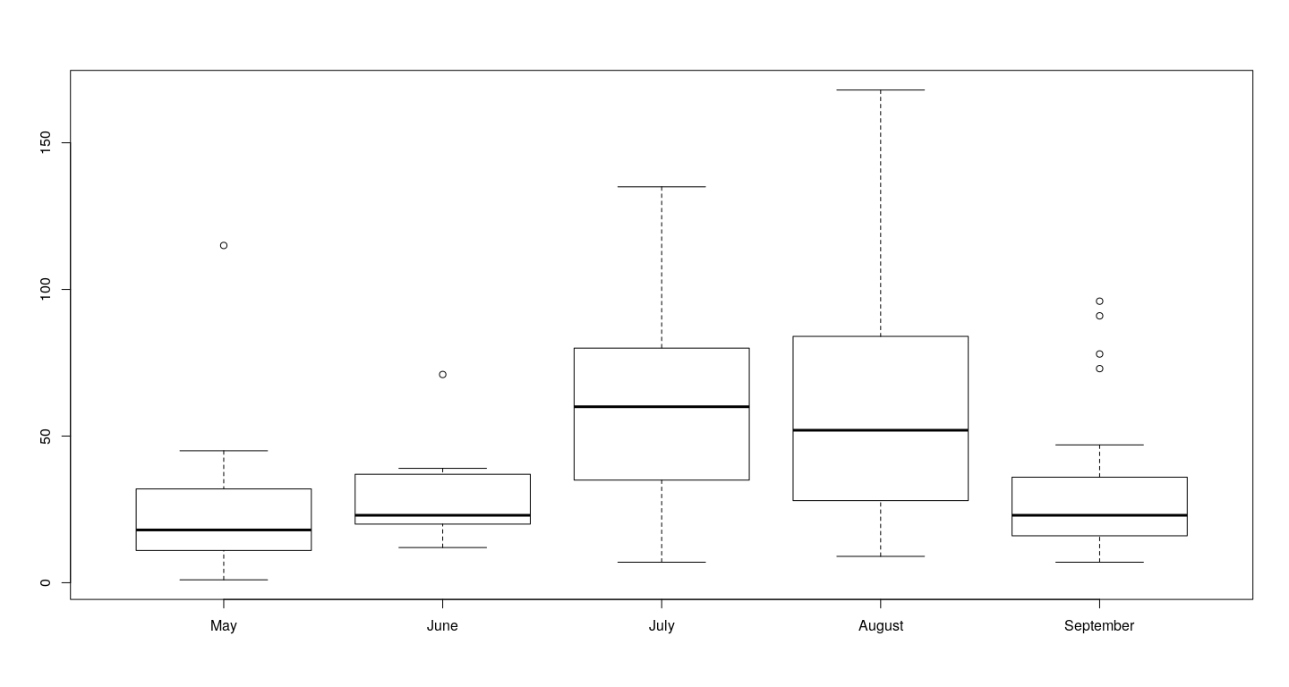
Juxtaposing by splitting figure region
par(mfrow = c(2, 2))
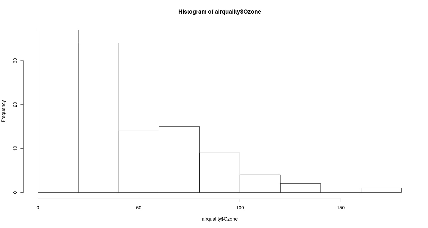
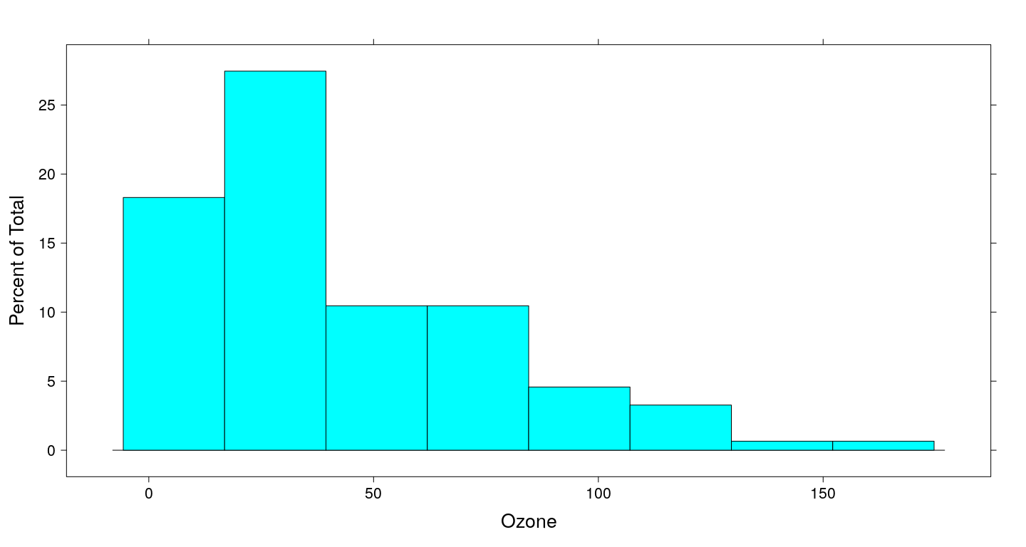
hist(airquality$Ozone)
hist(airquality$Solar.R)
hist(airquality$Wind)
hist(airquality$Temp)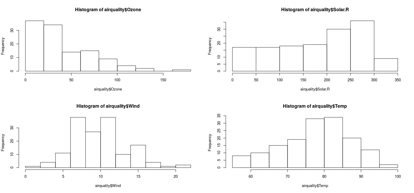
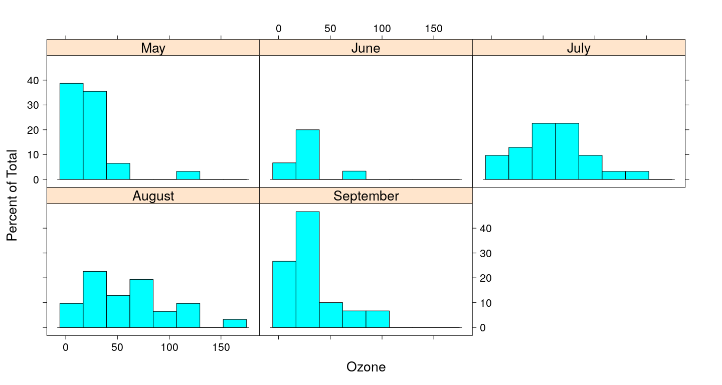
Juxtaposing by splitting figure region
par(mfrow = c(2, 3))
qqnorm(s$May, main = "May")
qqnorm(s$June, main = "June")
qqnorm(s$July, main = "July")
qqnorm(s$August, main = "August")
qqnorm(s$September, main = "September")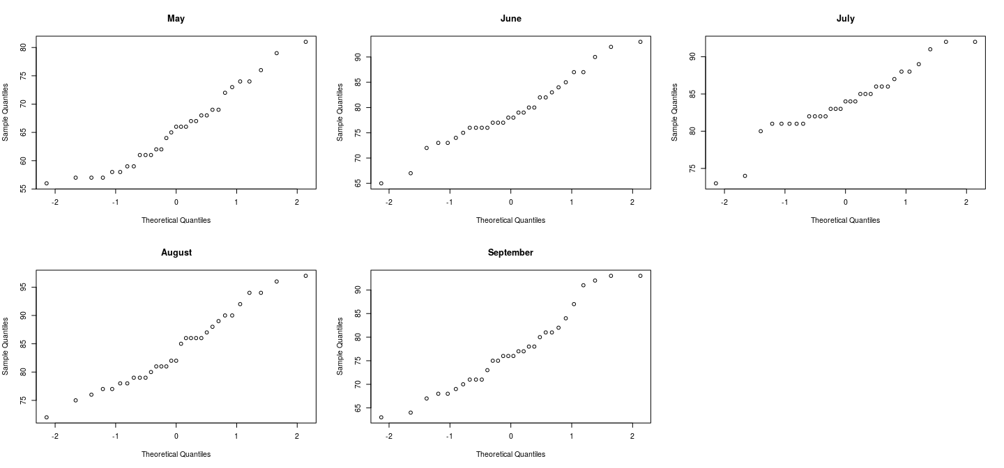
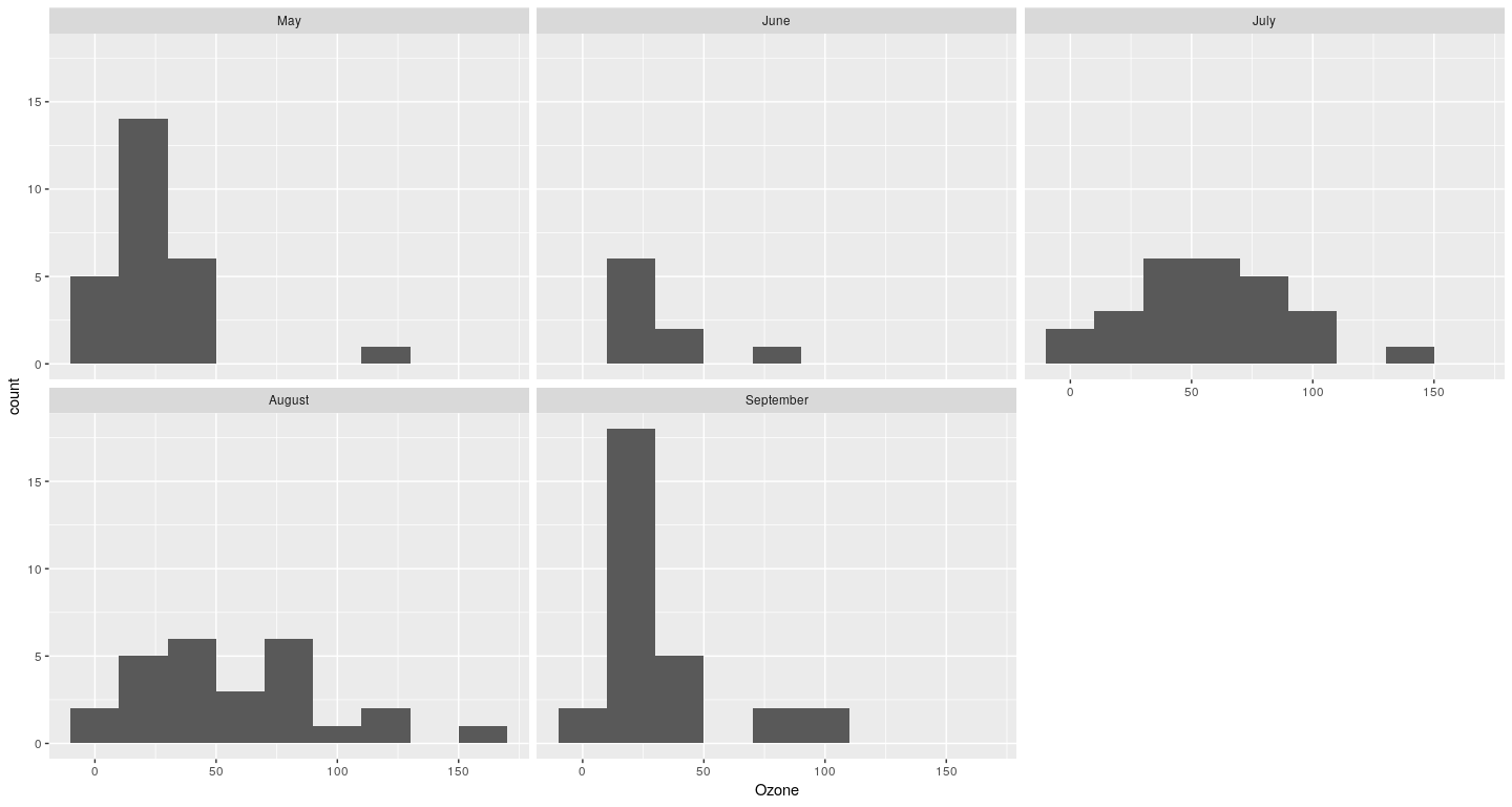
Juxtaposing by splitting figure region
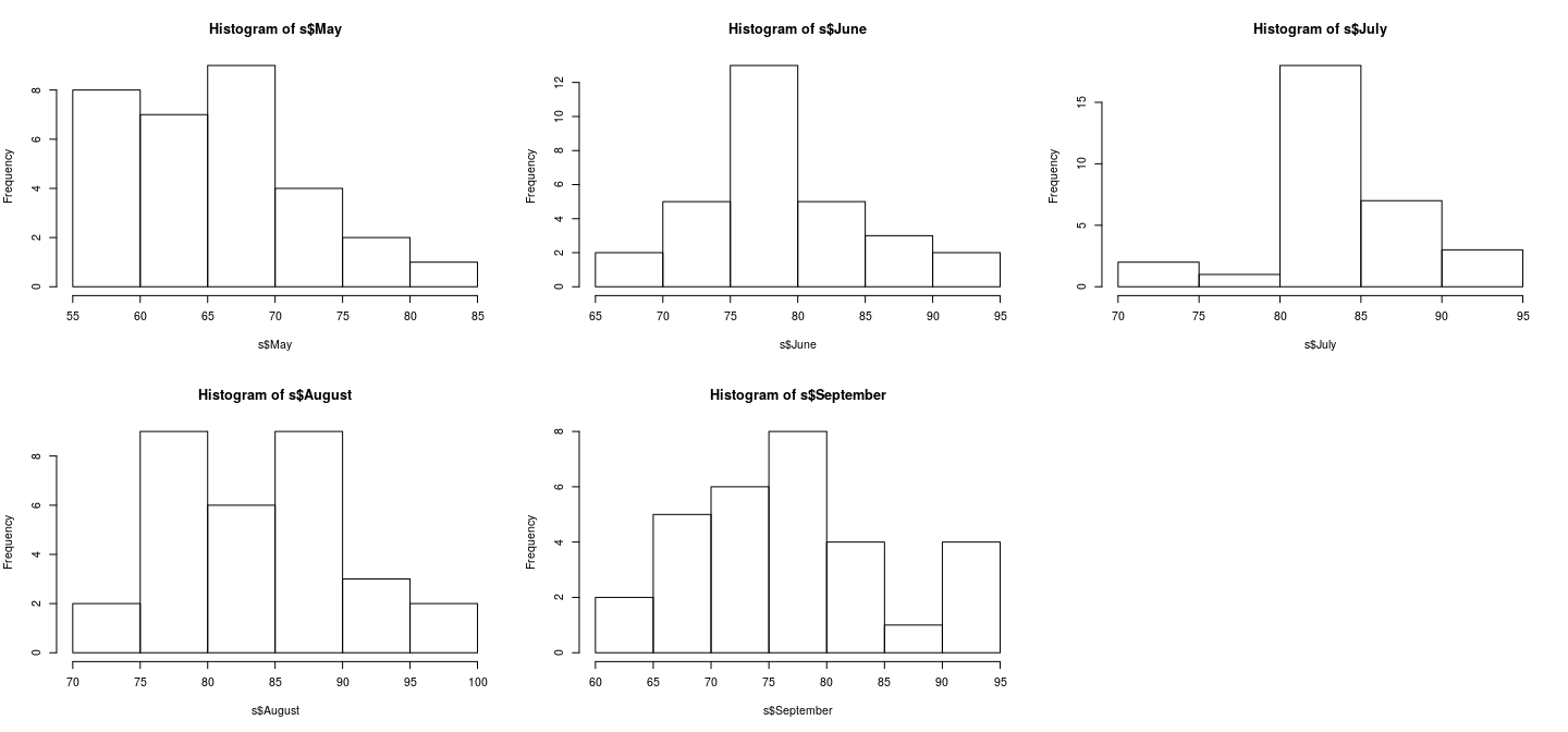
Juxtaposing: better comparison with common scales
par(mfrow = c(2, 3)); r <- range(airquality$Temp)
hist(s$May, xlim = r)
hist(s$June, xlim = r)
hist(s$July, xlim = r)
hist(s$August, xlim = r)
hist(s$September, xlim = r)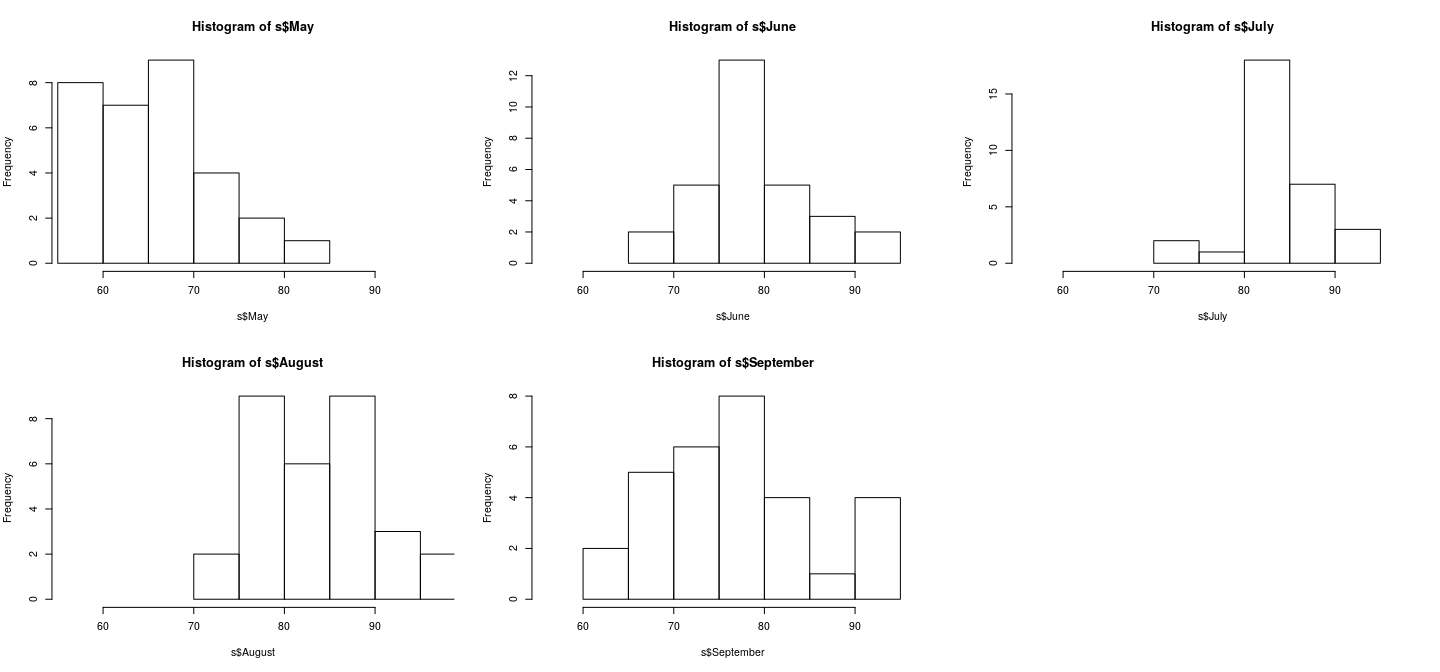
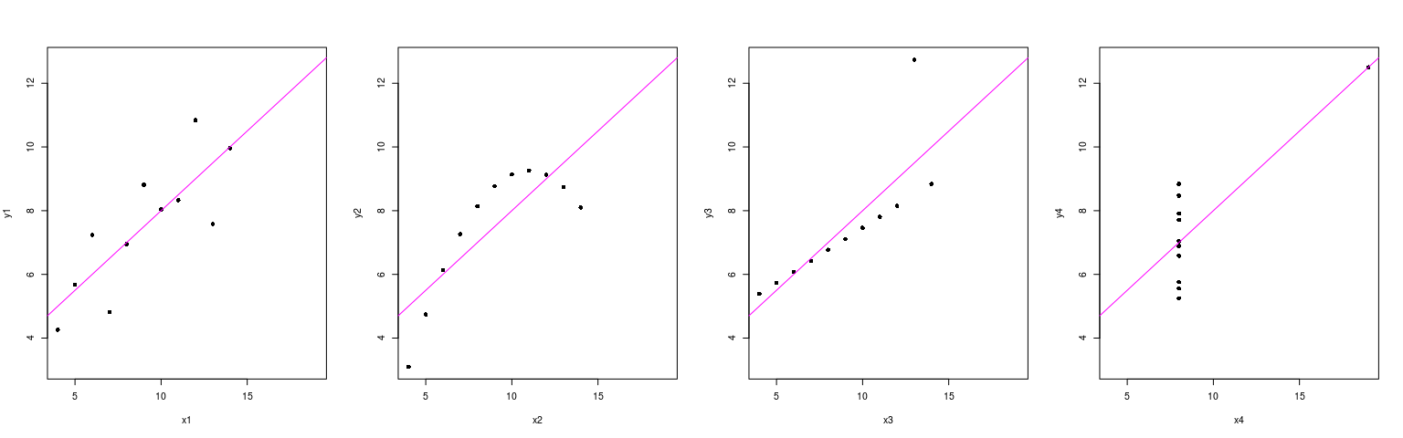
Juxtaposing: better comparison with common scales
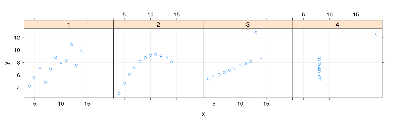
par(mfrow = c(1, 4))
with(anscombe,
{
    rx <- range(x1, x2, x3, x4)
    ry <- range(y1, y2, y3, y4)
    plot(y1 ~ x1, pch = 16, xlim = rx, ylim = ry); abline(lm(y1 ~ x1), col = "magenta")
    plot(y2 ~ x2, pch = 16, xlim = rx, ylim = ry); abline(lm(y2 ~ x2), col = "magenta")
    plot(y3 ~ x3, pch = 16, xlim = rx, ylim = ry); abline(lm(y3 ~ x3), col = "magenta")
    plot(y4 ~ x4, pch = 16, xlim = rx, ylim = ry); abline(lm(y4 ~ x4), col = "magenta")
})
Superposition is better when feasible
dlist <- lapply(s, density, na.rm = TRUE)
dxrng <- range(unlist(lapply(dlist, function(d) d$x)))
dyrng <- range(unlist(lapply(dlist, function(d) d$y)))
plot(dxrng, dyrng, xlab = "Temperature", ylab = "Density")
for (i in seq_along(dlist)) lines(dlist[[i]], col = i)
legend("topright", legend = names(dlist),
       lty = 1, col = seq_along(dlist))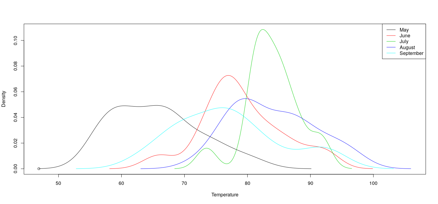
Example of a lattice plot
Example of a lattice plot
Example of a ggplot2 plot
Example of a ggplot2 plot
Example: Scatter plots with xyplot()
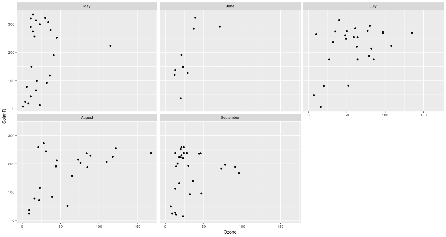
Example: conditioning
Here x and y are “primary variables”, which is a “conditioning variable”.
Customization
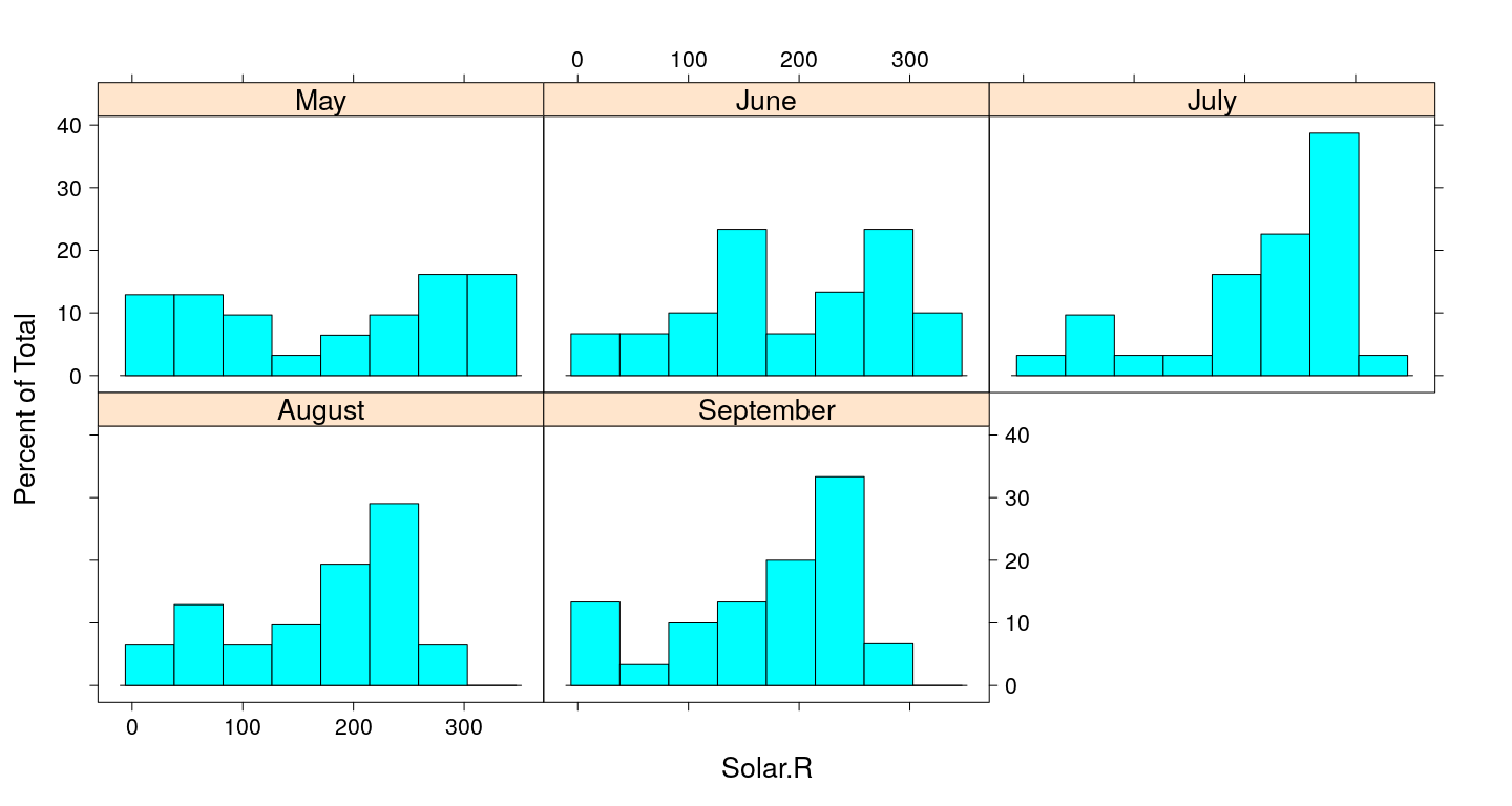
Histogram
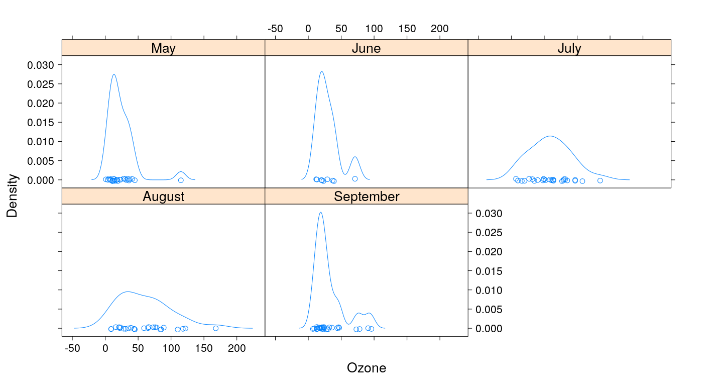
Kernel density plots
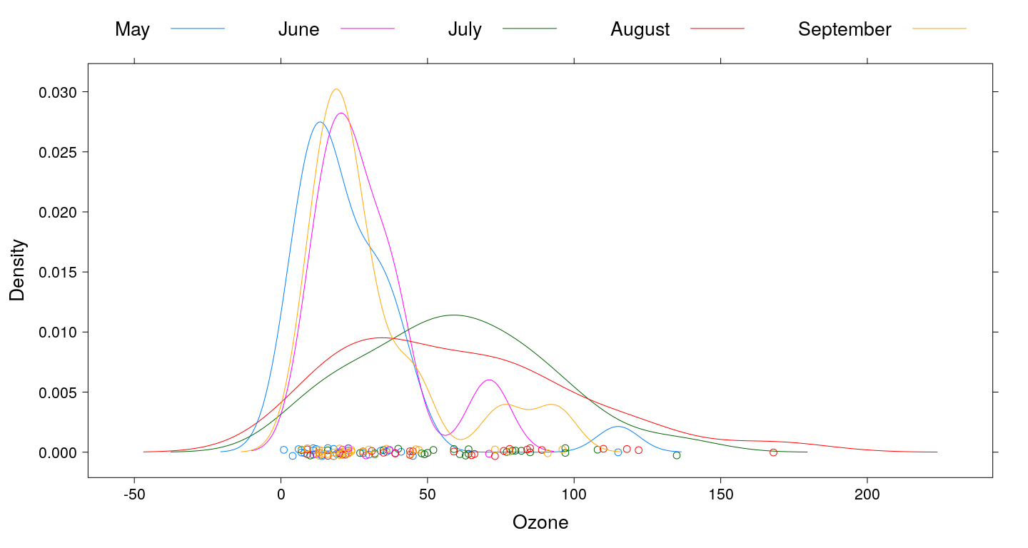
Kernel density plots (with grouping)
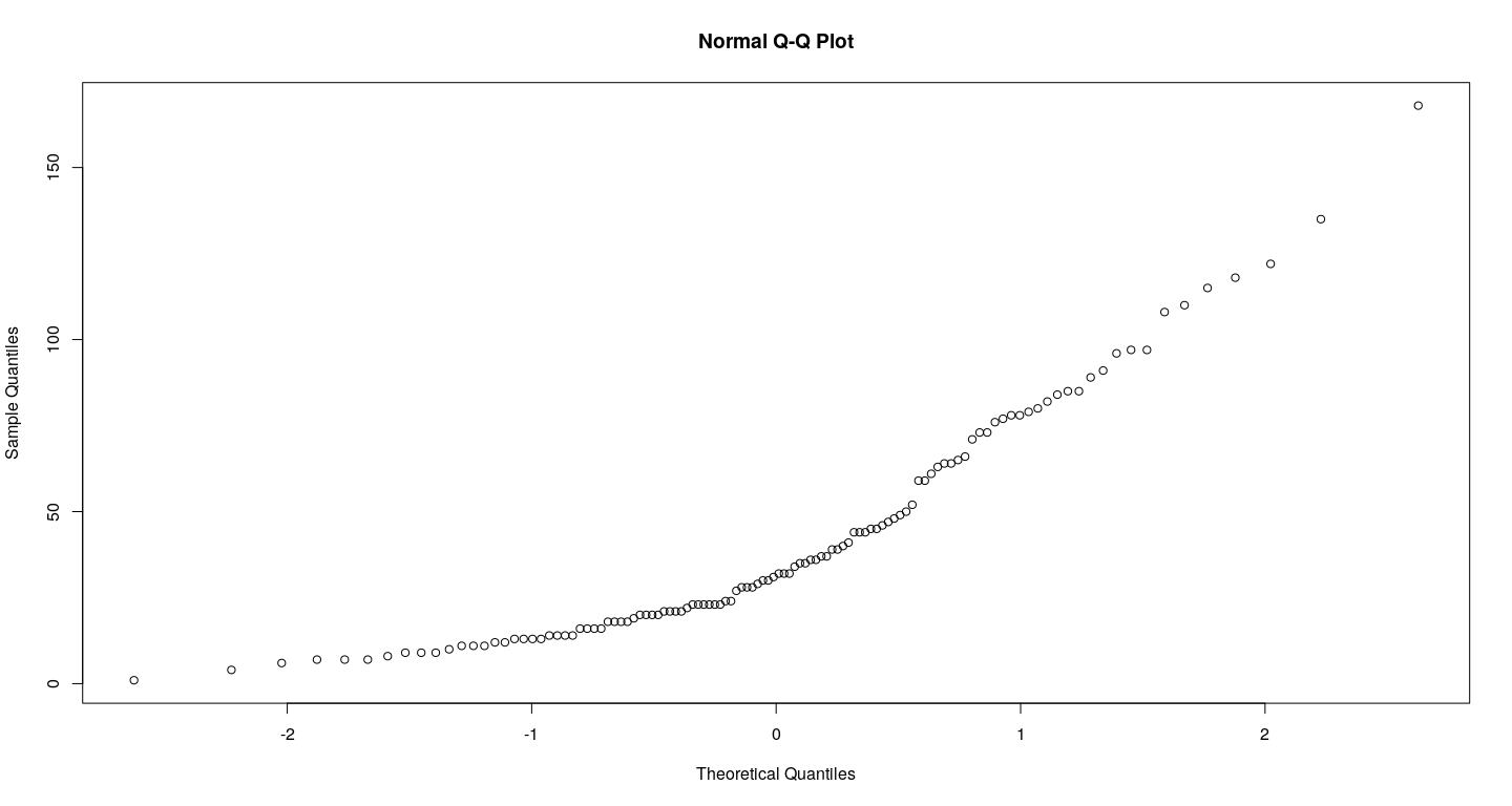
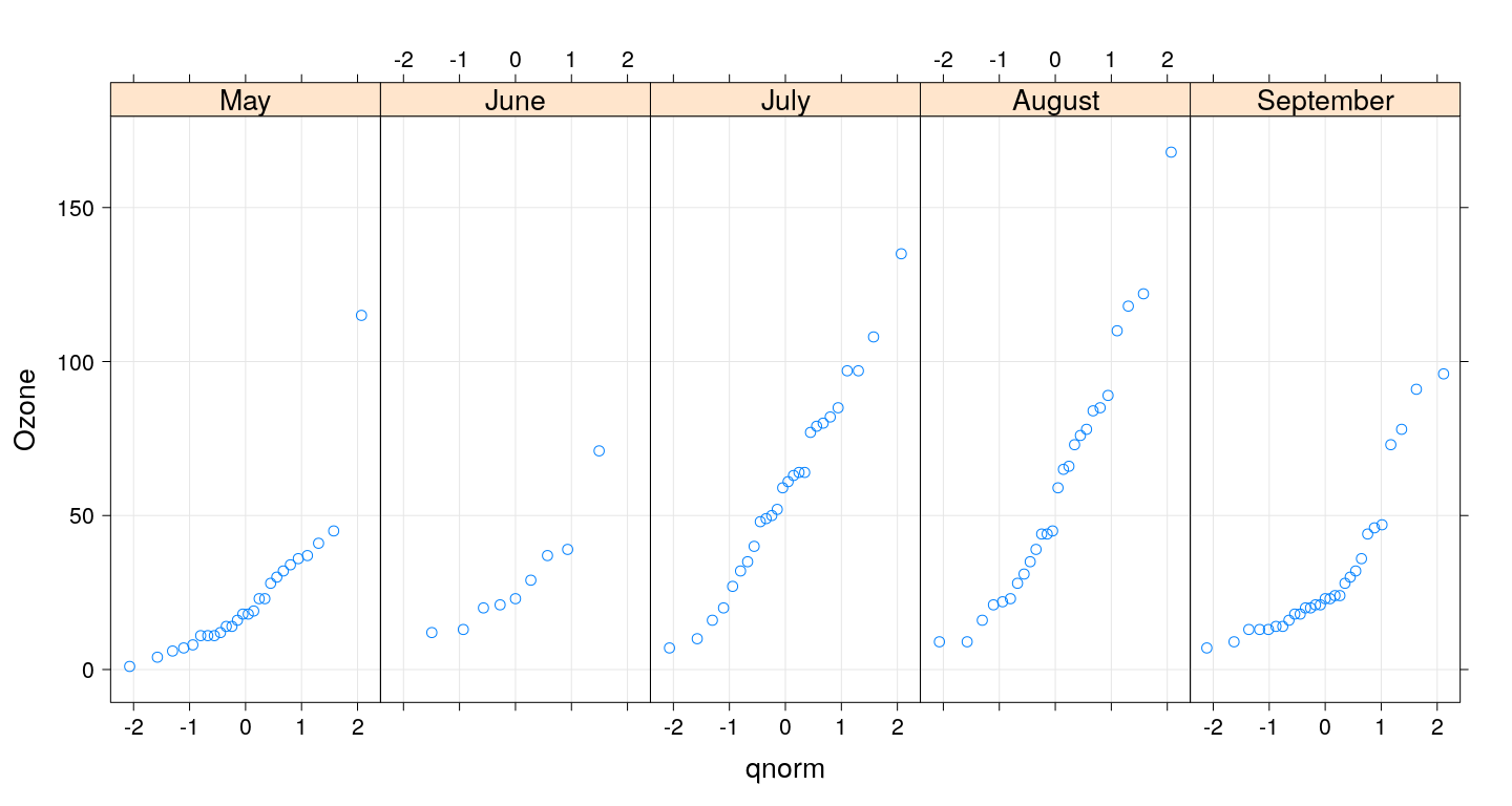
Q-Q plots
Box and whisker plots
Multiple primary variables / different scales
bwplot(fmonth ~ Ozone + Solar.R, airquality, outer = TRUE,
       between = list(x = 1),
       scales = list(x = "free"), xlab = NULL)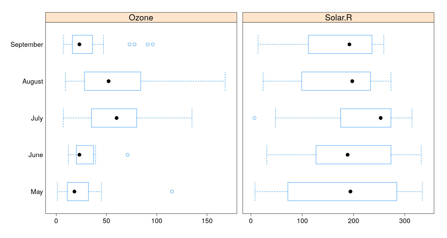
Violin plots - alternative display function
bwplot(fmonth ~ Ozone + Solar.R, airquality, outer = TRUE,
       between = list(x = 1), panel = panel.violin,
       scales = list(x = "free"), xlab = NULL)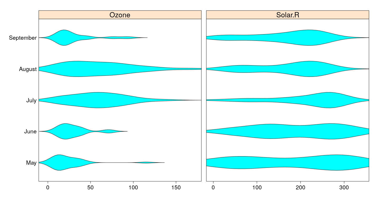
Bar chart - traditional graphics
par(mfrow = c(1, 2))
barplot(t(VADeaths))
barplot(VADeaths, beside=TRUE, horiz=TRUE,
        legend.text=TRUE, xlim = c(0, 100))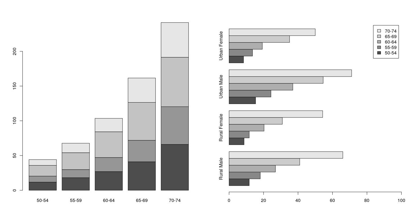
Bar chart - lattice
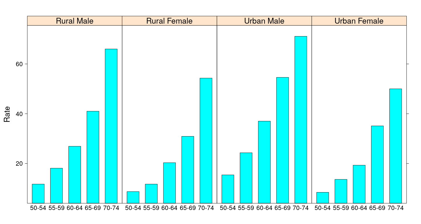
Bar chart - without misleading heights
barchart(Rate ~ Var1 | Var2, VADeathsDF, layout = c(4, 1), origin = 0,
         scales = list(x = list(rot = 45)))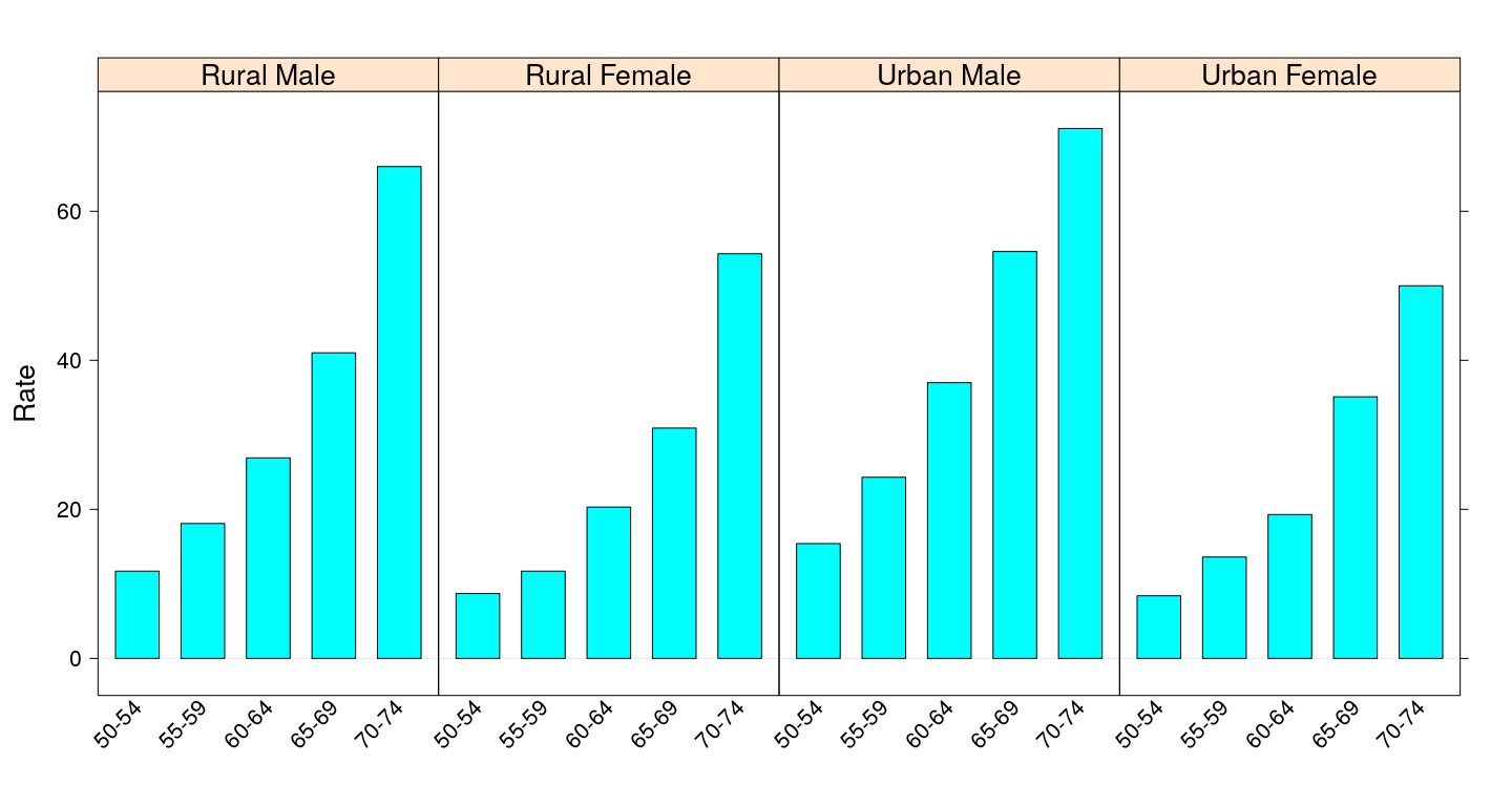
Dot plot
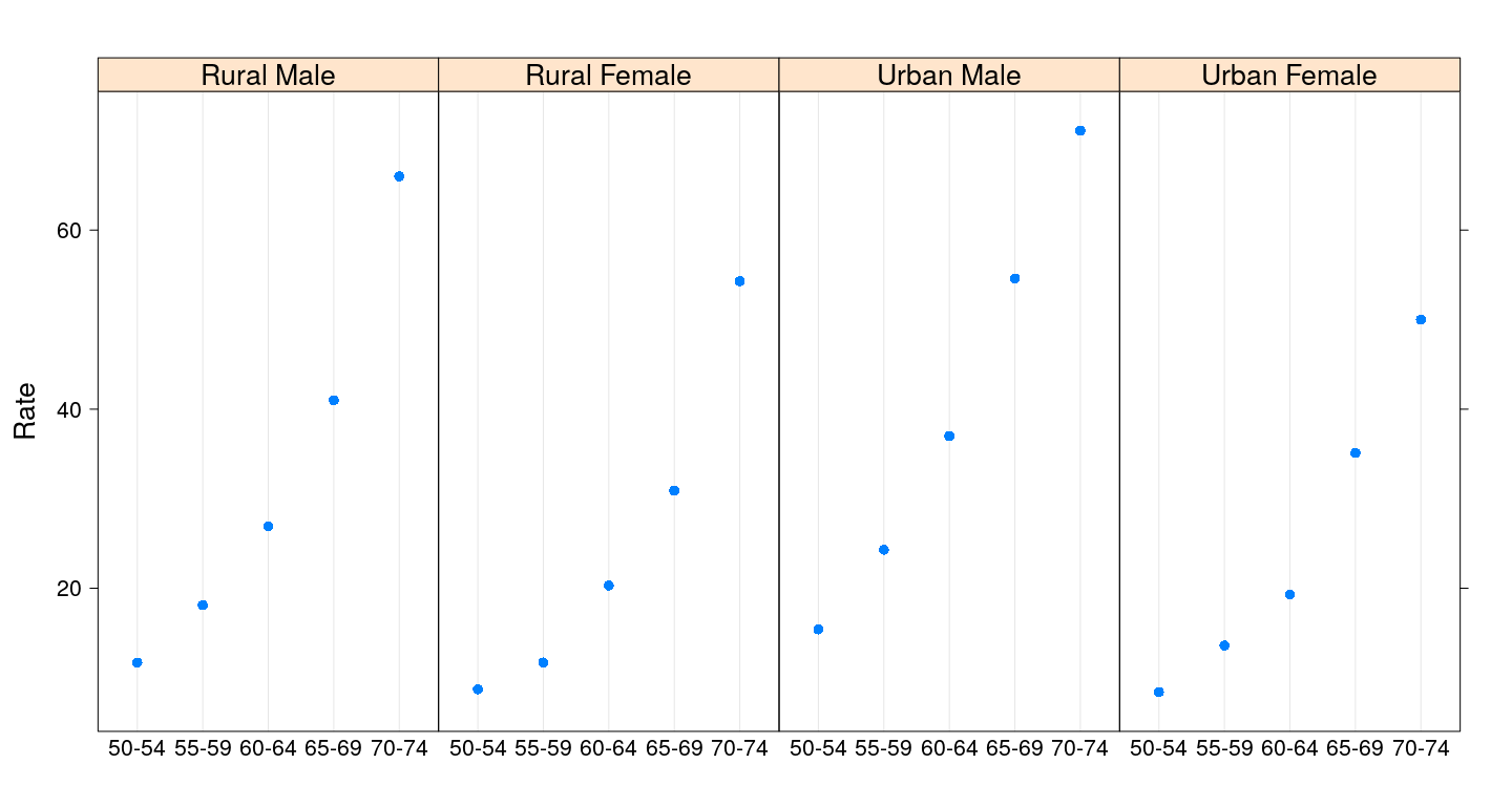
Dot plot with grouping
dotplot(Rate ~ Var1, VADeathsDF, groups = Var2, type = "o",
        auto.key = list(columns = 2, points = TRUE, lines = TRUE))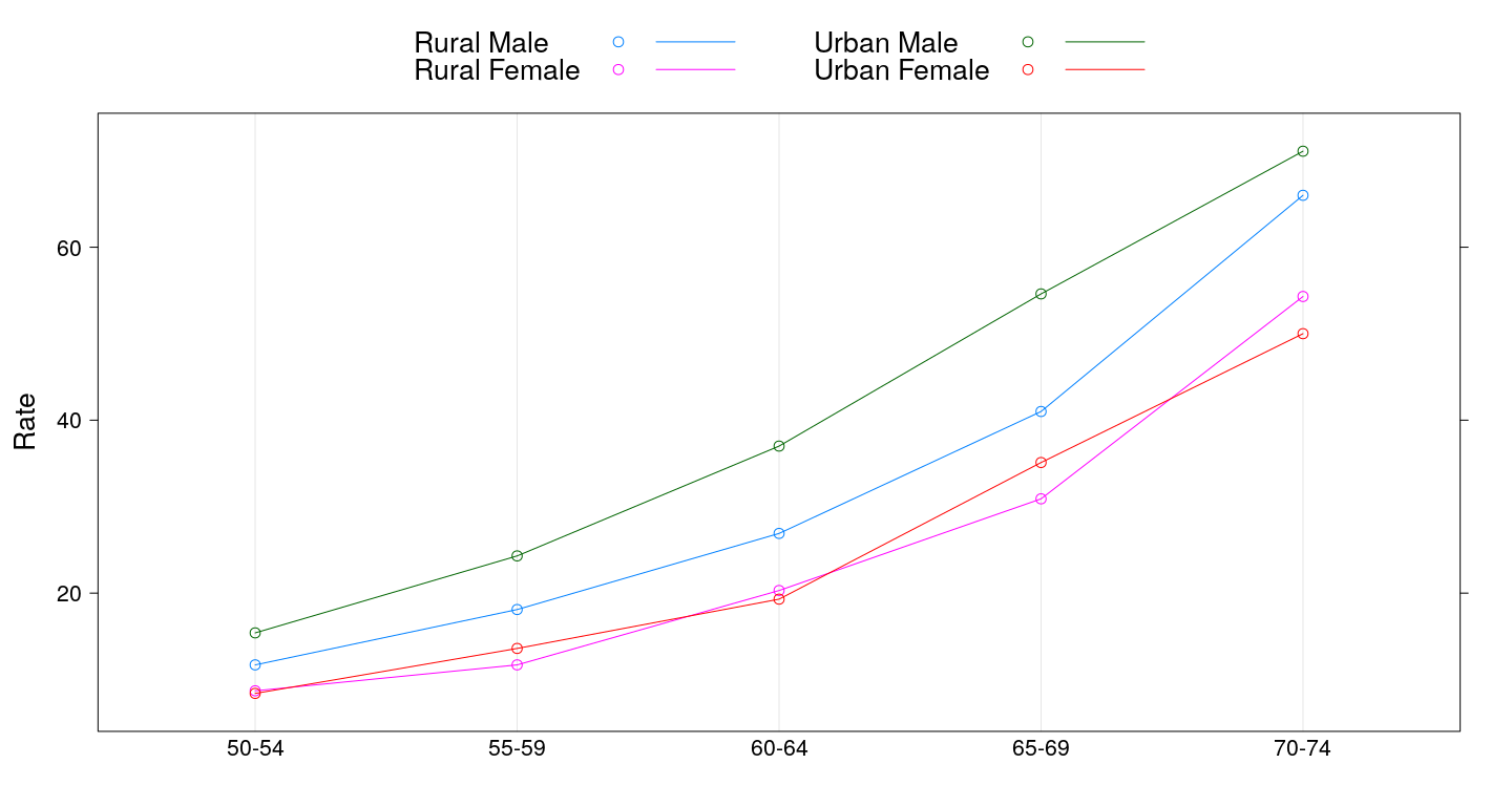
3-D scatter plots
cloud(depth ~ lat * long, data = quakes,
      zlim = rev(range(quakes$depth)),
      screen = list(z = 105, x = -70), panel.aspect = 0.75,
      xlab = "Longitude", ylab = "Latitude", zlab = "Depth")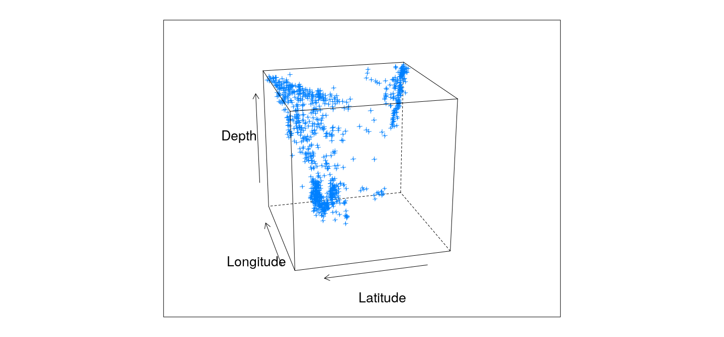
3-D surface plots
wireframe(Freq ~ Var1 + Var2, data = as.data.frame.table(volcano),
          shade = TRUE, aspect = c(61/87, 0.5))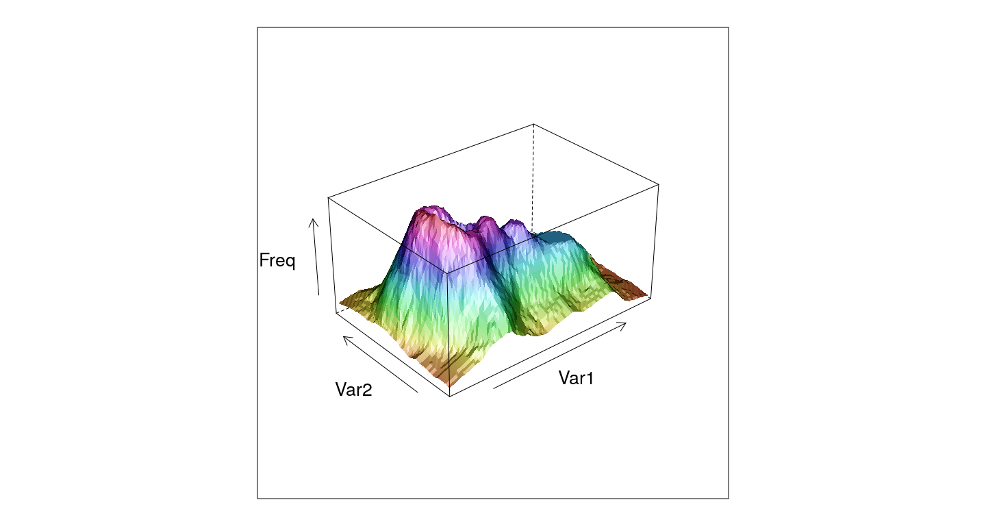
Example: scatter plot
- A scatter plot needs a dataset, an x-variable, and a y-variable

Example: scatter plot
- Equivalent call
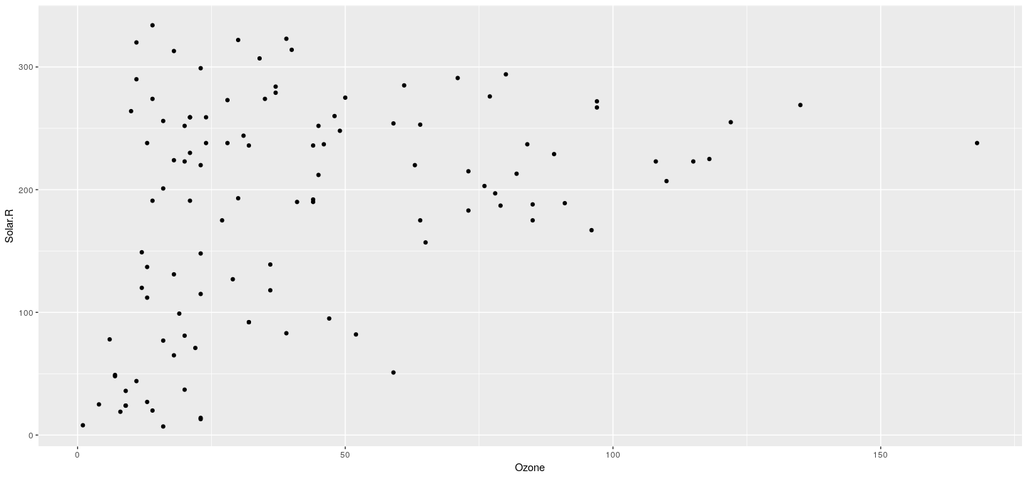
Example: scatter plot
- Something different (and meaningless)
p <- ggplot(airquality, aes(x = Ozone, y = Solar.R))
p + geom_bar(stat = "identity", position = "identity")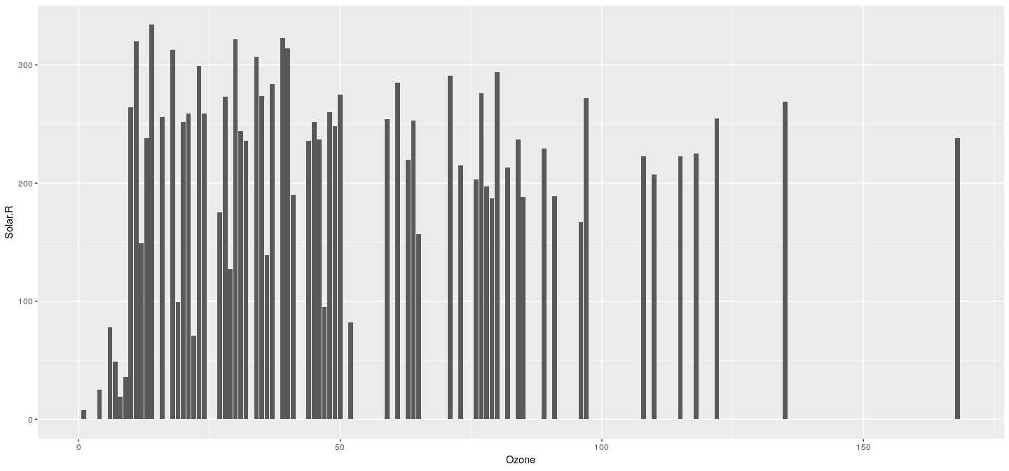
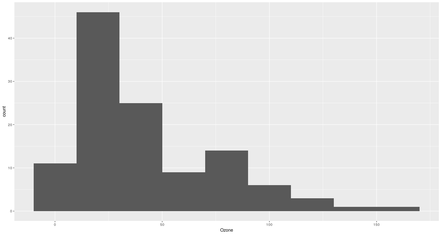
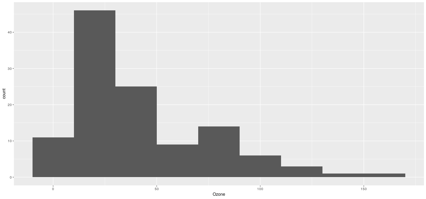
Example: histogram
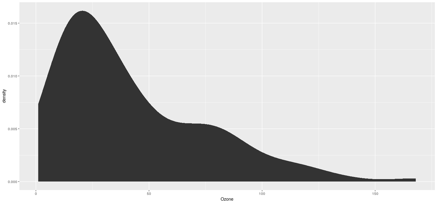
Example: density plot
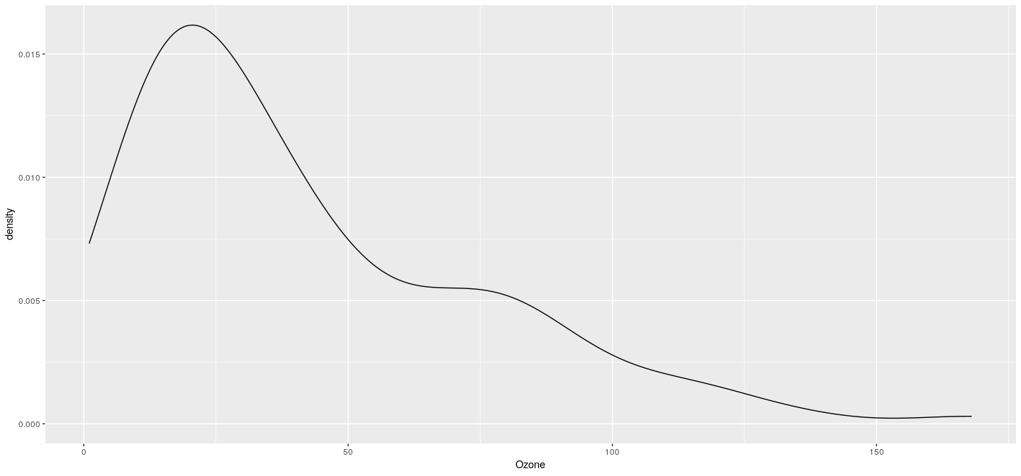
Example: density plot without shading
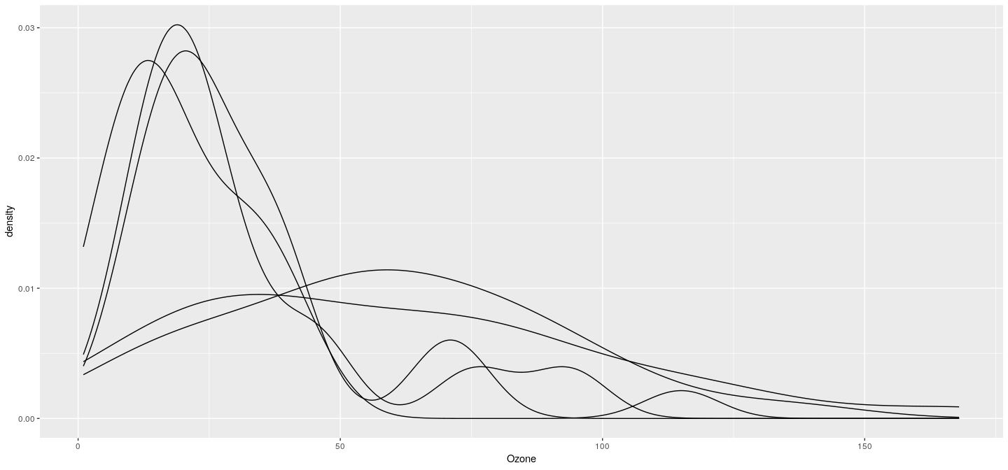
Example: density plot with groups
Example: density plot with colored groups
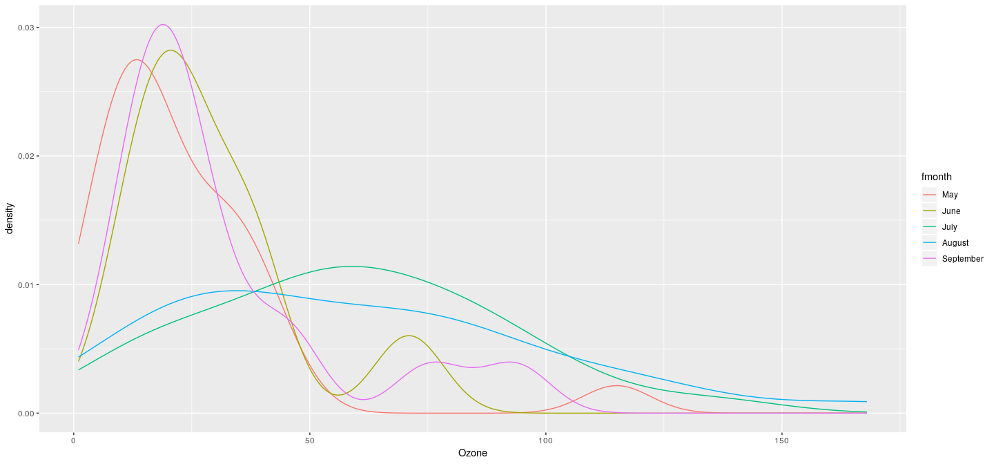
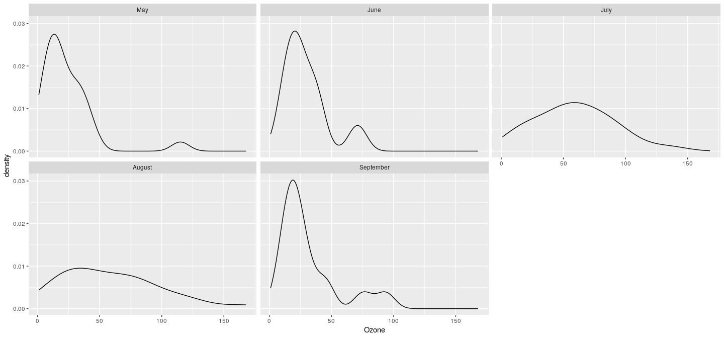
Example: density plot with faceting (conditioning)
Example: scatter plot
Example: density plot
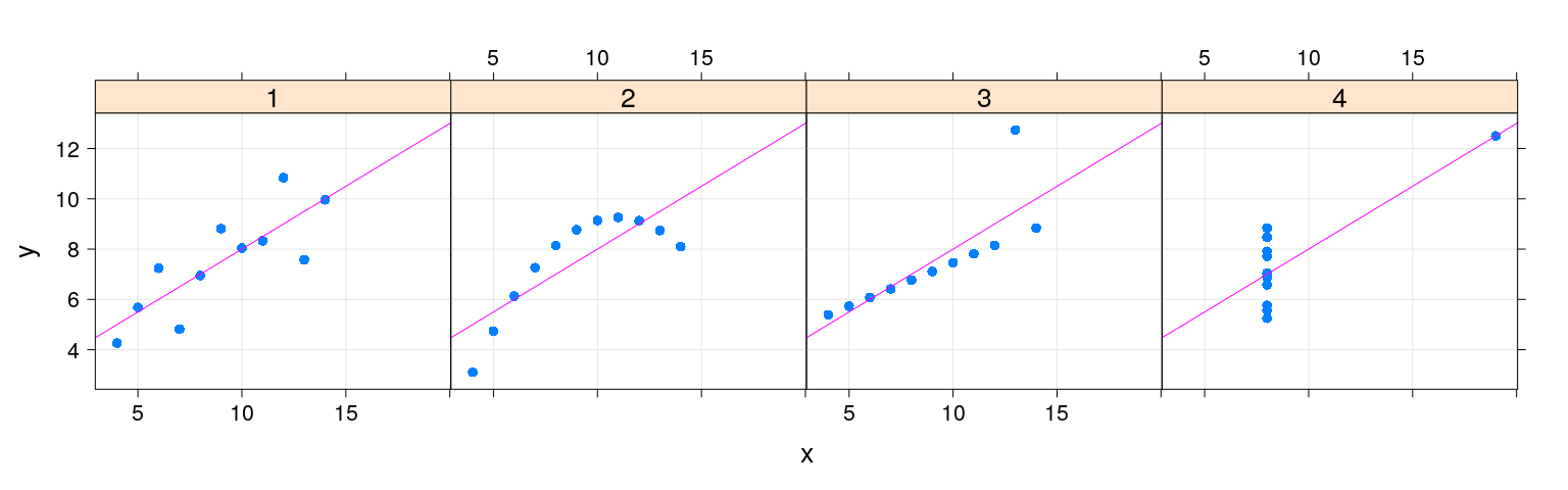
Layering to customize displays
qplot(x = x, y = y, data = anscombe.long, facets = ~ which) +
    stat_smooth(method = "lm", se = FALSE)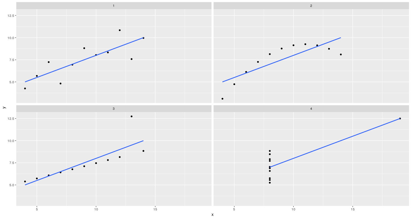
Layering to customize displays
qplot(x = x, y = y, data = anscombe.long, facets = ~ which) +
    stat_smooth(method = "lm", se = FALSE) +
    stat_smooth(method = "lm", formula = y ~ poly(x, 2), se = FALSE)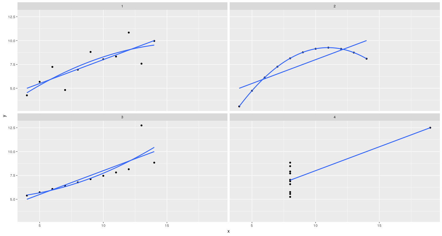
Dot plot
