Visualizing Large Data: Broad Themes
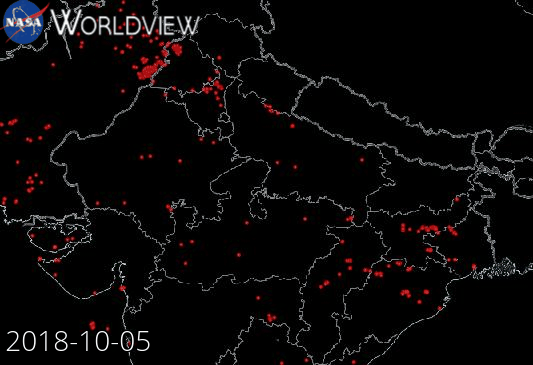
Example: NASA Wordview (Satellite data visualization)
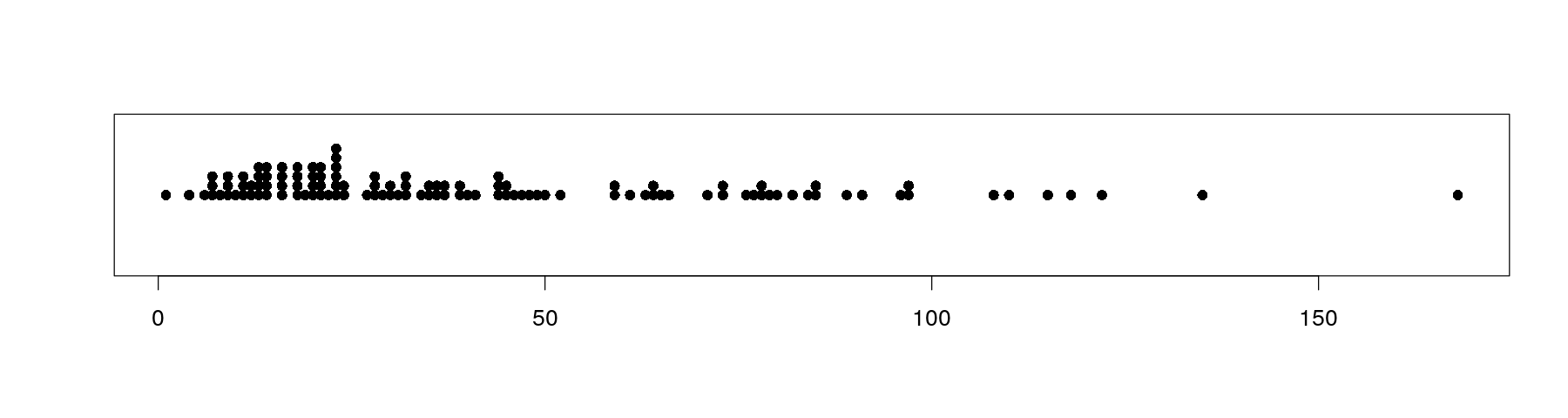
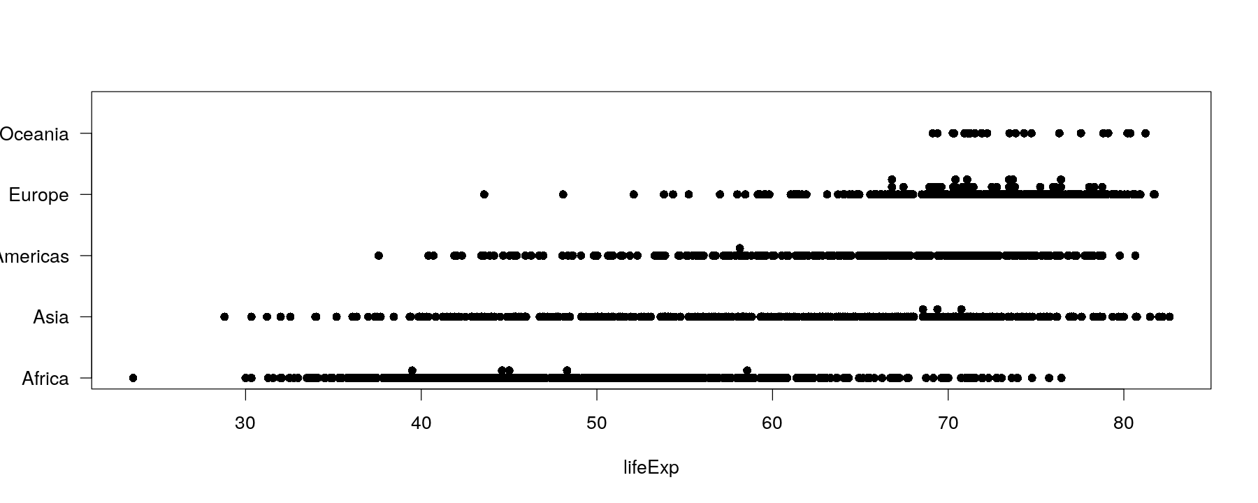
Univariate distributions: strip charts or dot plots
The simplest possible plot of univariate data is to represent each observation by a point
Value of observation is converted into position on x-axis

Univariate distributions: strip charts or dot plots
This overplots multiple data points with same values
A common textbook suggestion is to stack repeated values
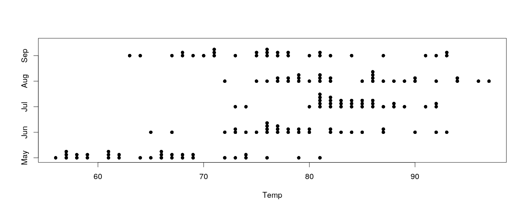
Univariate distributions: comparative strip charts
- Easy to add comparison across categorical variable by encoding as y-coordinate

Univariate distributions: comparative strip charts
- More variation in temperature
Univariate distributions: comparative strip charts
- This no longer works for moderately sized data (and not many ties)
Univariate distributions: comparative strip charts
- Can be improved somewhat by jittering (add random noise) and semi-transparent colors

Univariate distributions: comparative strip charts
- Still not enough when there are too many data points

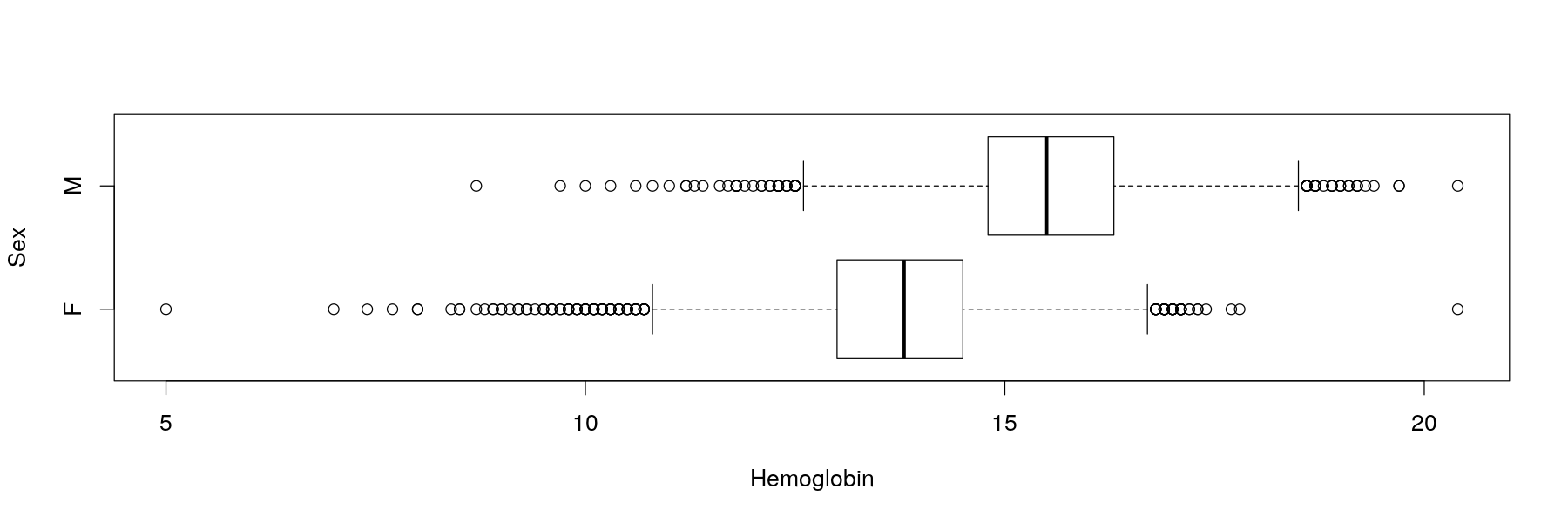
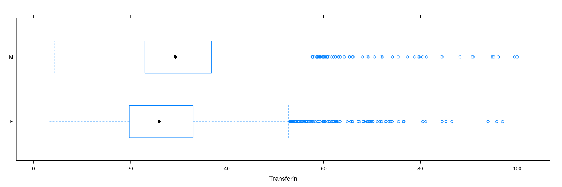
Univariate distributions: comparative box and whisker plots
Solution: summarize data instead of showing all data points
A common tool is to show quartiles and extremes (and “outliers”)
Univariate distributions: comparative box and whisker plots
- A Similar plot using the
latticepackage (more details tomorrow)
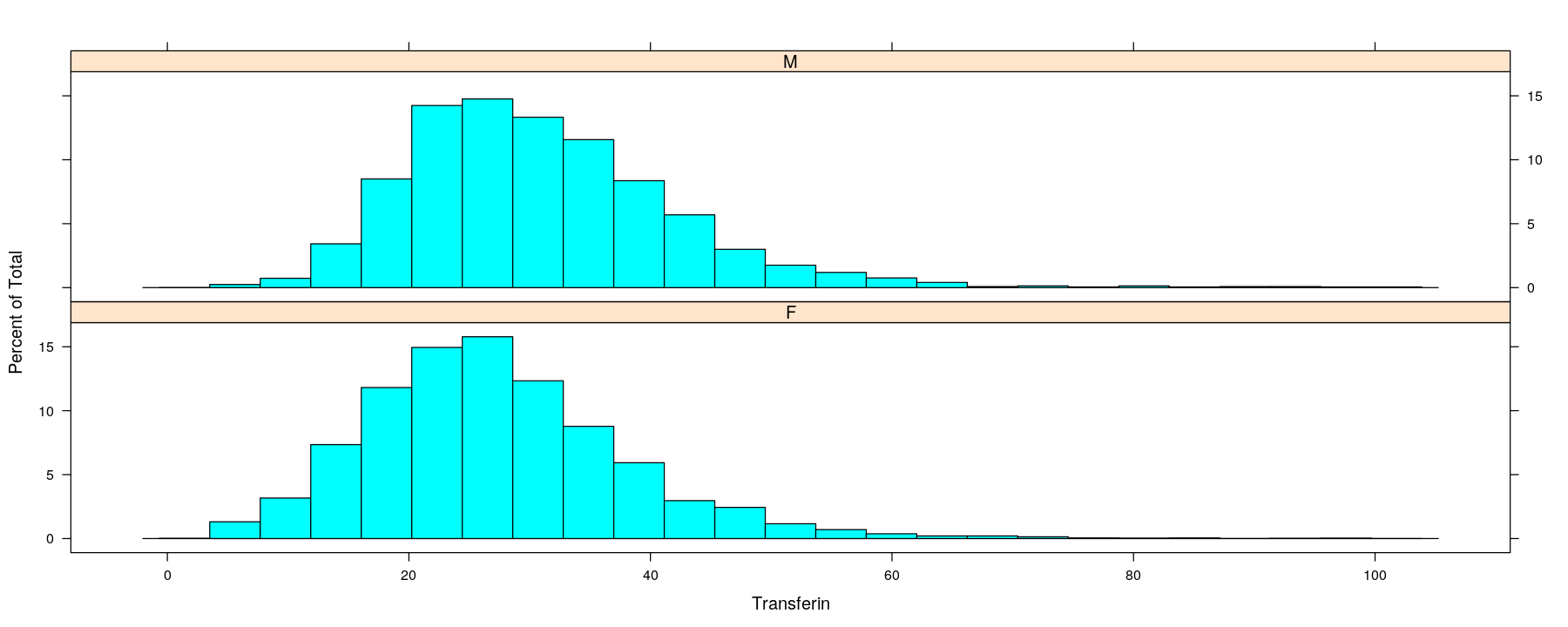
Univariate distributions: comparative histograms
- Another common summary: put data into bins and plot bin counts
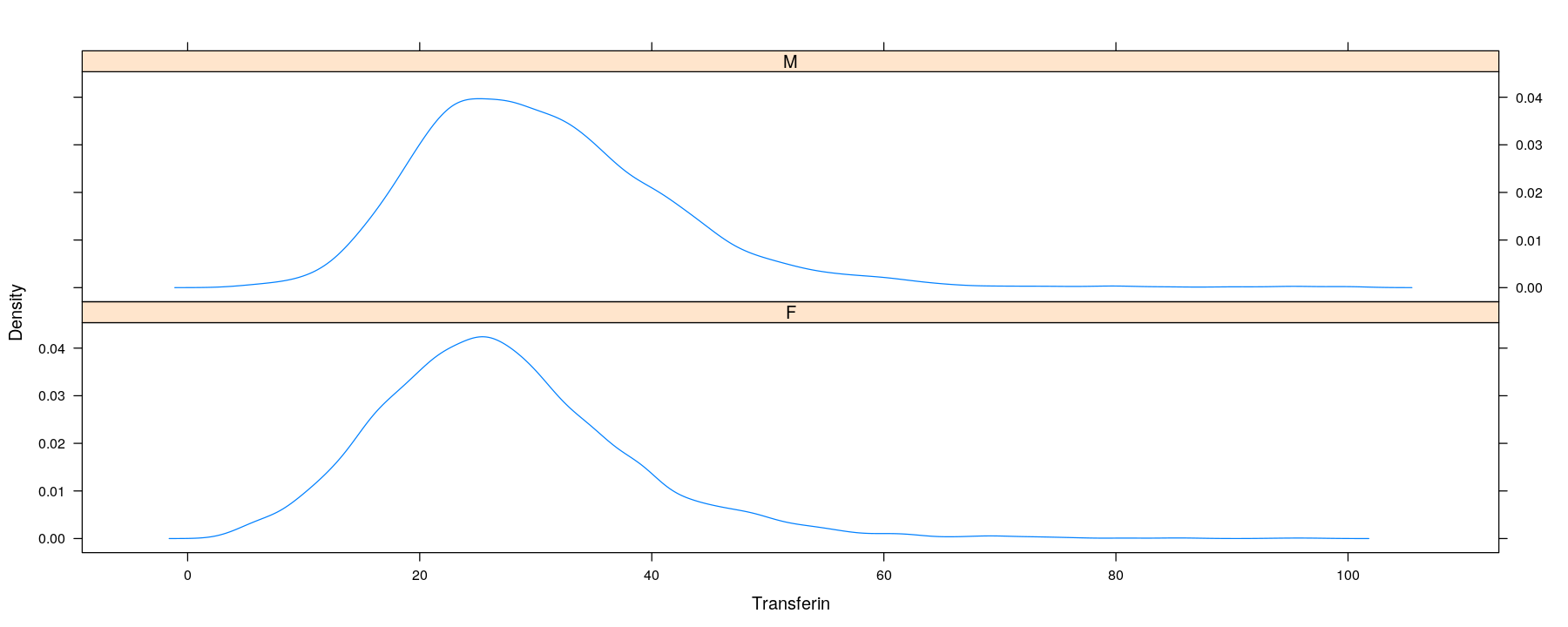
Univariate distributions: kernel density estimates
- A more sophisticated summary: smooth histogram
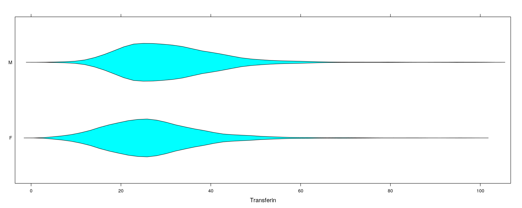
Univariate distributions: comparative violin plots
- Can be incorporated into the box-and-whisker plot design
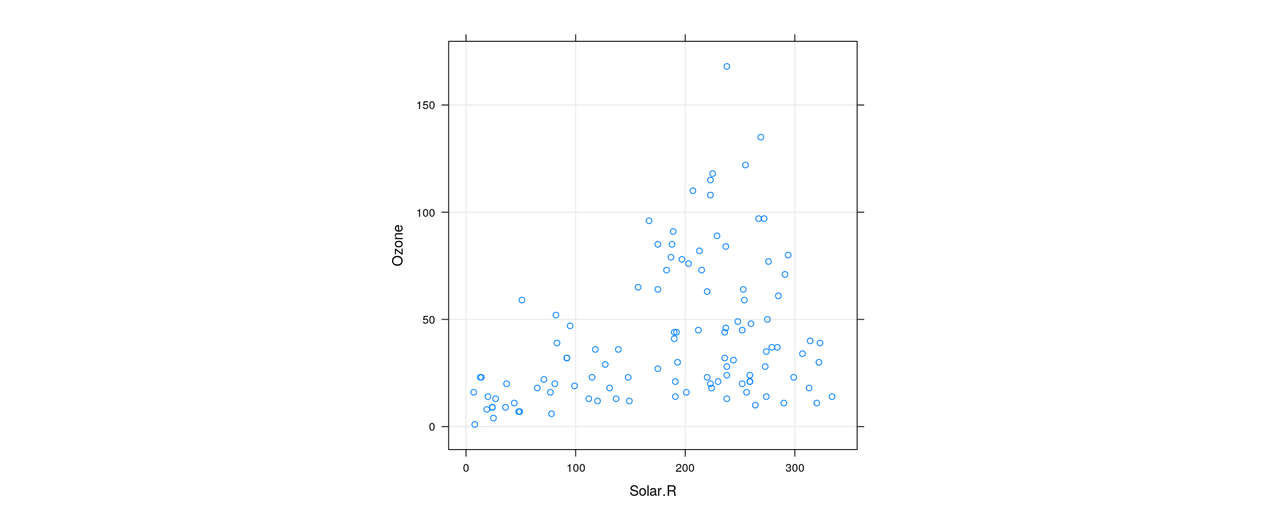
Bivariate distributions: scatter plot
- The basic scatter plot encodes two variables as x- and y-coordinates
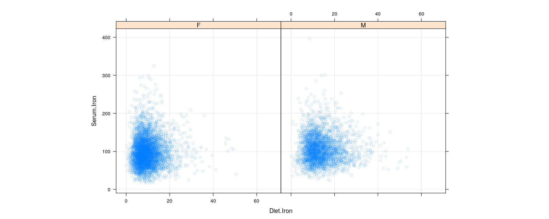
Bivariate distributions: comparative scatter plots

Bivariate distributions: scatter plots using semi-transparent colors
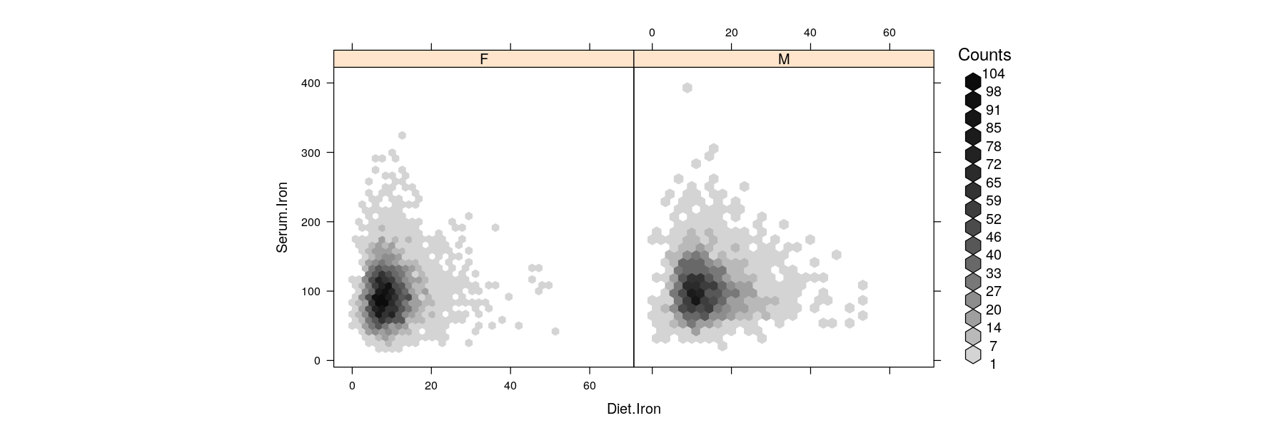
Bivariate distributions: hexagonal binning
Hexagons are preferable over squares for two-dimensional binning (more dense packing)
Bin counts are usually indicated by color (somewhat similar to overplotted semi-transparent points)
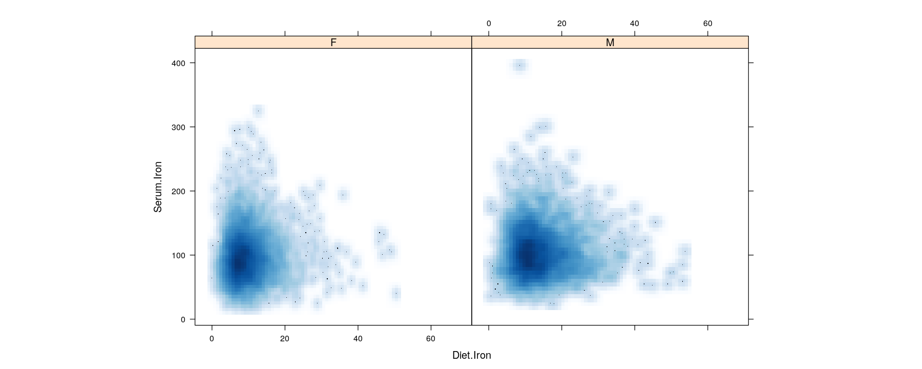
Bivariate distributions: kernel density estimates
- Two-dimensional kernel density estimates can be similarly encoded by color
Tables: Summary measures on categorical attributes
- Small tables are often visualized using bar charts or Cleveland dot plots (summary encoded by position)
dotplot(reorder(country, lifeExp) ~ lifeExp, data = subset(gapminder, continent == "Asia" & year %in% c(1962, 1982, 2002)),
        groups = year, auto.key = list(space = "top", columns = 3), par.settings = simpleTheme(pch = 16))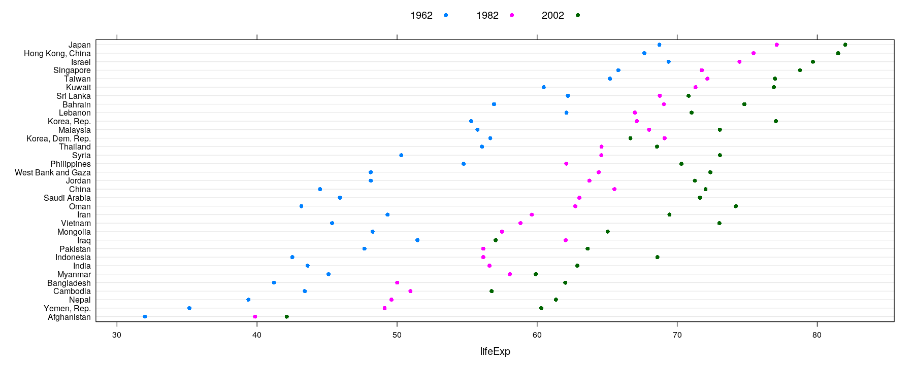
Tables: Summary measures on categorical attributes
- Color can be used to encode value for 2-D tables: e.g., number of measles cases per 100,000 population
levelplot(xtabs(count ~ year + state, data = vaccines), scales = list(x = list(rot = 90)),
          col.regions = rev(hcl.colors(16, palette = "Purple-Orange")), aspect = "fill")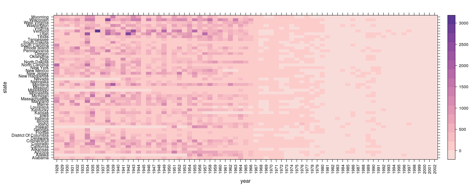
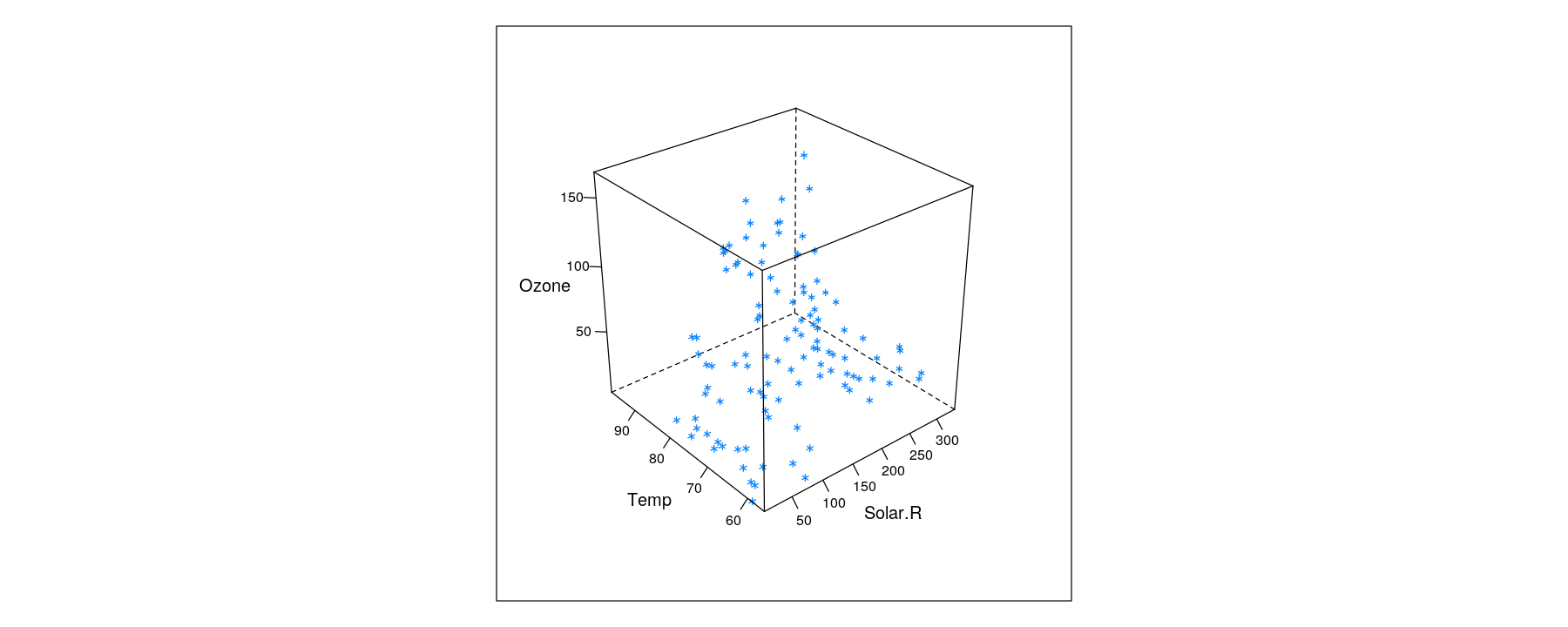
Trivariate data: projection into two-dimensional space
- In principle, three variables can be mapped to x, y, z-coordinates
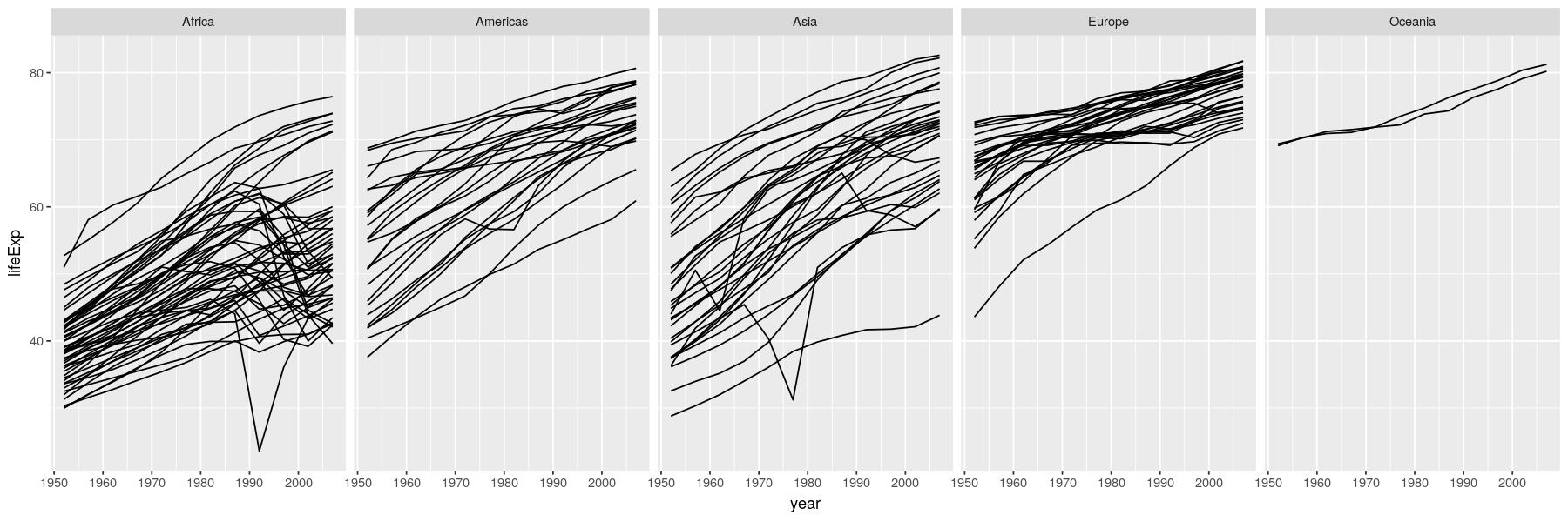
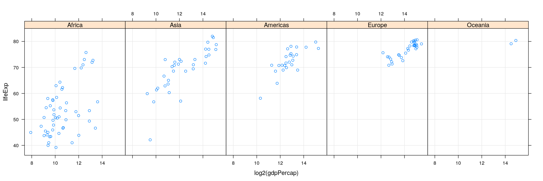
More variables to compare against: conditioning / faceting
- As seen earlier, further categorical variables can be used to compare by superposition
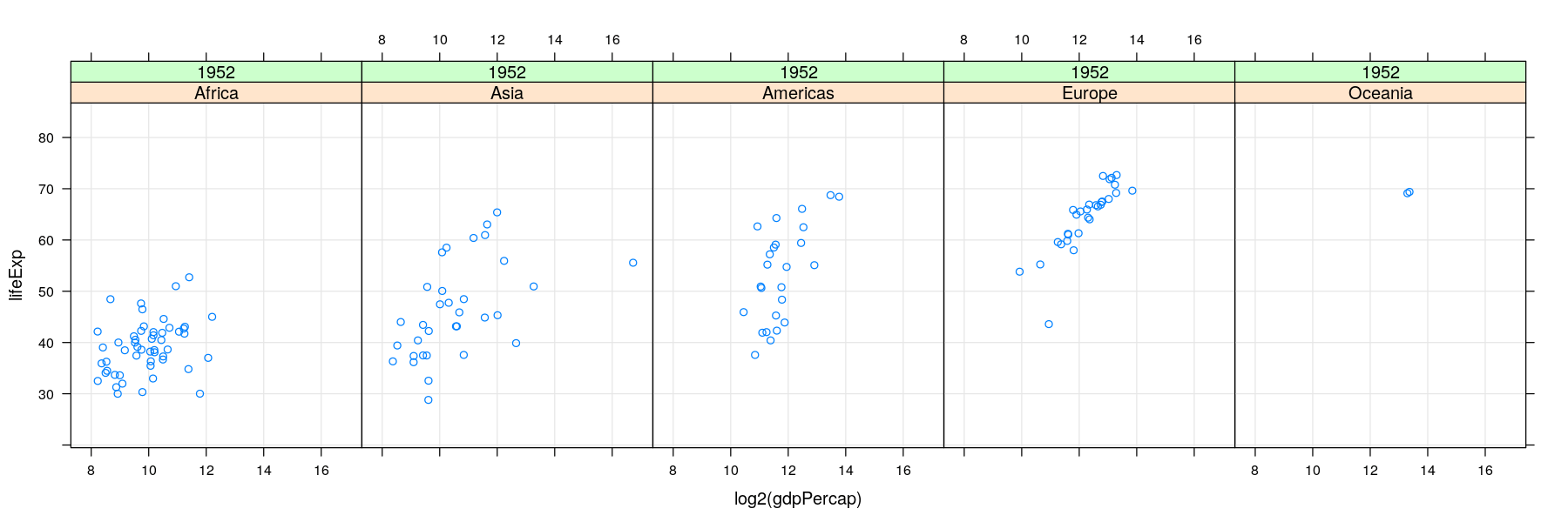
More variables to compare against: conditioning / faceting
- For too many comparisons, a single display page may not be enough
Time-series
- Essentially scatter plots with time on x-axis, conventionally with positions joined by lines
library(ggplot2)
vaccines <- transform(vaccines, count0 = ifelse(is.na(count), 0, count))
ggplot(data = vaccines, aes(x = year, y = sqrt(count0))) + geom_line(aes(group = state), alpha = 0.3)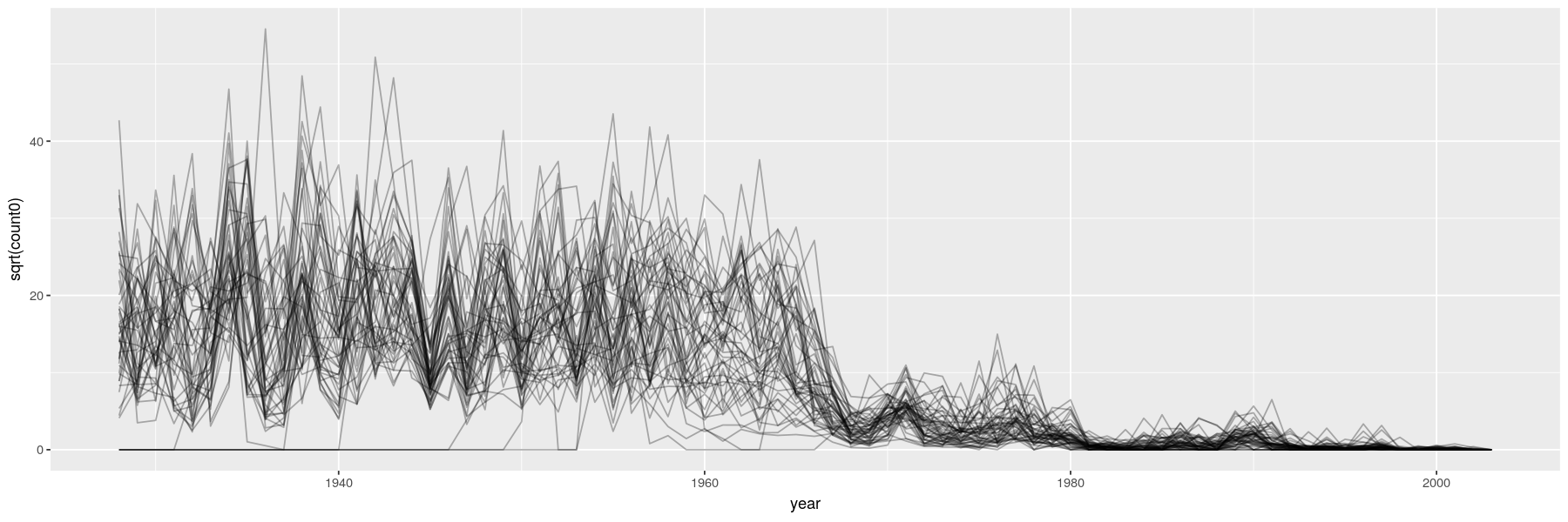
Time-series
- Essentially scatter plots with time on x-axis, conventionally with positions joined by lines