Introduction to R Graphics
R graphics
R has a reputation for being a good system for graphics
This is mainly based on its ability to produce good publication-quality statistical plots
R actually has two largely independent graphics subsystems
Traditional graphics
- Available in R from the beginning
- Rich collection of tools
- Not very flexible
Grid graphics
- Relatively recent (2000)
- Low-level tool, highly flexible
Grid graphics, lattice and ggplot2
Grid graphics is not usually used directly by the user
But it forms the basis of two high-level graphics systems:
lattice: based on Trellis graphics (Cleveland)
ggplot2: inspired by “Grammar of Graphics” (Wilkinson)
These represent two very different philosophical approaches to graphics
lattice is in many ways a natural successor to traditional graphics
ggplot2 represents a completely different declarative approach
All of these are worth learning (but requires some effort)
I will briefly introduce all three, but mainly focus on lattice
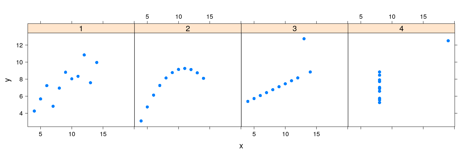
An example: Anscombe’s quartet
Francis Anscombe introduced four artificial bivariate datasets to emphasize the importance of graphics
These datasets are available in R as the built-in dataset
anscombe(see?anscombe)
'data.frame':   11 obs. of  8 variables:
 $ x1: num  10 8 13 9 11 14 6 4 12 7 ...
 $ x2: num  10 8 13 9 11 14 6 4 12 7 ...
 $ x3: num  10 8 13 9 11 14 6 4 12 7 ...
 $ x4: num  8 8 8 8 8 8 8 19 8 8 ...
 $ y1: num  8.04 6.95 7.58 8.81 8.33 ...
 $ y2: num  9.14 8.14 8.74 8.77 9.26 8.1 6.13 3.1 9.13 7.26 ...
 $ y3: num  7.46 6.77 12.74 7.11 7.81 ...
$ y4: num 6.58 5.76 7.71 8.84 8.47 7.04 5.25 12.5 5.56 7.91 ...- The datasets all had the same means, standard deviations, and correlation
      x1       x2       x3       x4       y1       y2       y3       y4
9.000000 9.000000 9.000000 9.000000 7.500909 7.500909 7.500000 7.500909 x1 x2 x3 x4 y1 y2 y3 y4
3.316625 3.316625 3.316625 3.316625 2.031568 2.031657 2.030424 2.030579 [1] 0.8164205 0.8162365 0.8162867 0.8165214
- How can we plot all four datasets together?
Anscombe’s quartet using traditional graphics
Traditional graphics thinks of this as four different data sets
The function to create scatter plots is
plot()Multiple plots can be put in the same figure using
par(mfrow = ...)Several ways of specifying variable names inside dataset:
plot(anscombe$x1, anscombe$y1)     # ugly and error-prone

with(anscombe, plot(x1, y1))       # temporarily attach dataset

plot(y1 ~ x1, data = anscombe) # formula-data interface (also used in modeling)par(mfrow = c(1, 4))
plot(y1 ~ x1, data = anscombe, pch = 1)
plot(y2 ~ x2, data = anscombe, pch = 16)
plot(y3 ~ x3, data = anscombe, pch = 16)
plot(y4 ~ x4, data = anscombe, pch = 16)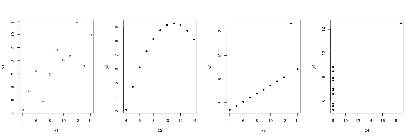
xrng <- with(anscombe, range(x1, x2, x3, x4))
yrng <- with(anscombe, range(y1, y2, y3, y4))   ## common axis limits
par(mfrow = c(1, 4))
plot(y1 ~ x1, data = anscombe, pch = 16, xlim = xrng, ylim = yrng)
plot(y2 ~ x2, data = anscombe, pch = 16, xlim = xrng, ylim = yrng)
plot(y3 ~ x3, data = anscombe, pch = 16, xlim = xrng, ylim = yrng)
plot(y4 ~ x4, data = anscombe, pch = 16, xlim = xrng, ylim = yrng)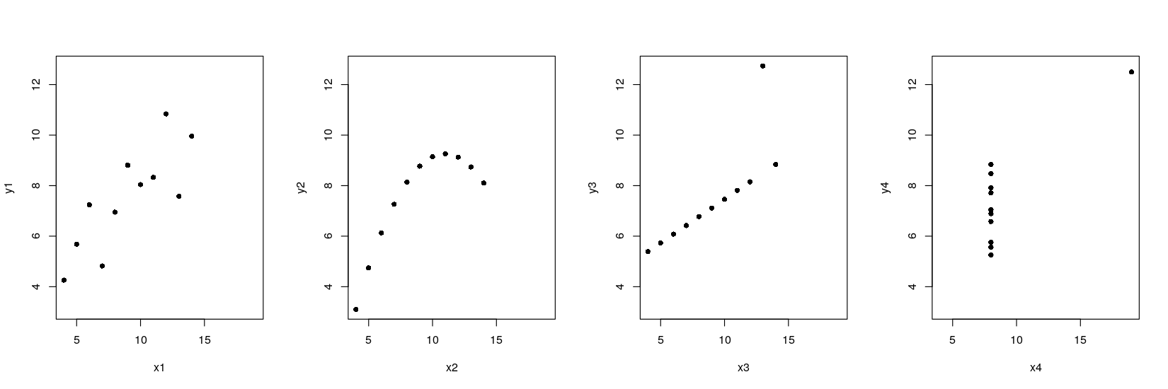
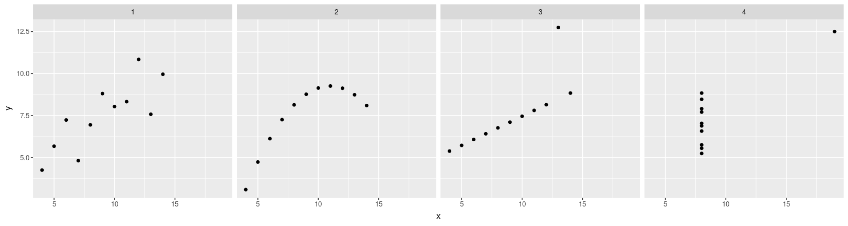
Anscombe’s quartet using lattice and ggplot2
Both lattice and ggplot2 are capable of producing a single plot with all four datasets
But this requires the dataset to be in the “long format” (or “transposed”), with one row per data point
anscombe.long <-
    with(anscombe, data.frame(x = c(x1, x2, x3, x4),
                              y = c(y1, y2, y3, y4),
                              which = rep(c("1", "2", "3", "4"), each = 11)))
str(anscombe.long)
'data.frame': 44 obs. of 3 variables:
$ x : num 10 8 13 9 11 14 6 4 12 7 ...
$ y : num 8.04 6.95 7.58 8.81 8.33 ...
$ which: Factor w/ 4 levels "1","2","3","4": 1 1 1 1 1 1 1 1 1 1 ...Anscombe’s quartet using lattice
library(package = "lattice")
xyplot(y ~ x | which, data = anscombe.long, subset = (which %in% c("1", "2")))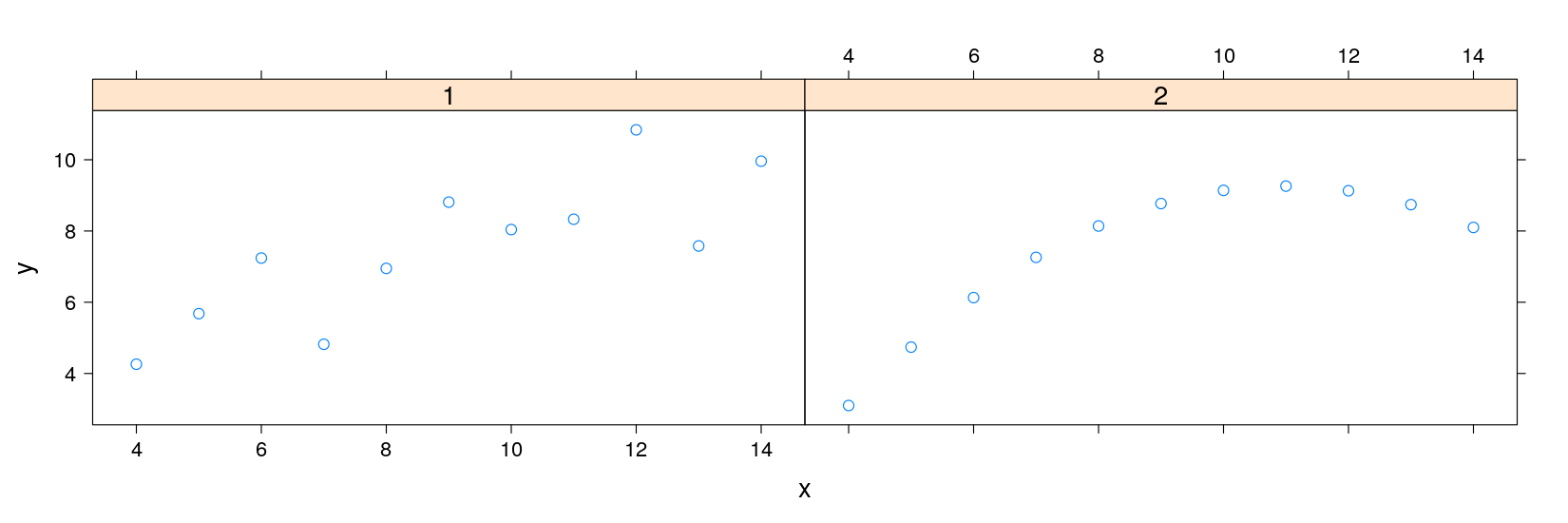
p1 <- xyplot(y ~ x, data = anscombe.long, subset = which == "1", pch = 16)
p2 <- xyplot(y ~ x, data = anscombe.long, subset = which == "2", pch = 16)

p1
print(p2, newpage = FALSE, position = c(0.5, 0.1, 0.9, 0.5))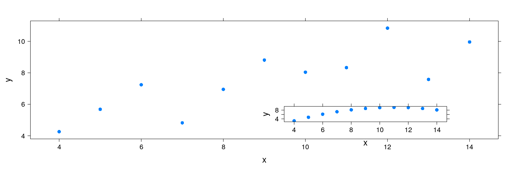
Anscombe’s quartet using ggplot2
library(package = "ggplot2")
ggplot(data = anscombe.long) + geom_point(aes(x = x, y = y)) + facet_wrap( ~ which)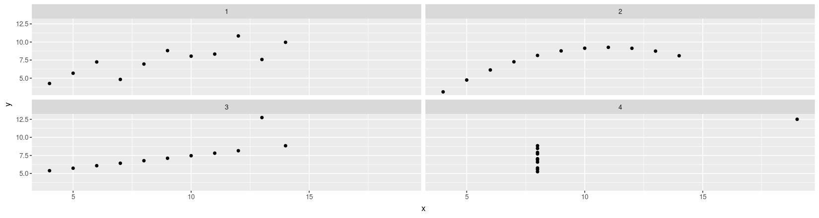
Anscombe’s quartet using lattice and ggplot2
The approaches share many common features
Both Capable of plotting subsets of data (indexed by categorical variables)
- This idea is known by several names: small multiples, conditioning, facetting
Both makes efficient use of available space (common scales, common axes)
Different visual appearance, but that is superficial (different default themes)
However, the way in which we specify the display is very different
lattice uses an extension of the formula-data interface (with function
xyplot()instead ofplot())ggplot2 specifies type of rendering (geom) and mapping of variables to coordinates (aesthetics)
The differences become clearer if we try to customize the display further
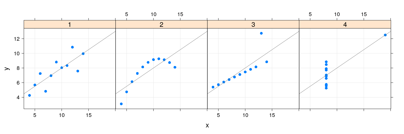
A natural extension in this example is to add a linear regression line to each scatter plot
Anscombe’s quartet with regression lines
xrng <- with(anscombe, range(x1, x2, x3, x4))
yrng <- with(anscombe, range(y1, y2, y3, y4))
par(mfrow = c(1, 4))
plot(y1 ~ x1, anscombe, pch = 16, xlim = xrng, ylim = yrng)
abline(lm(y1 ~ x1, anscombe))  ## lm() fits regression line, abline() adds the line to current plot
plot(y2 ~ x2, anscombe, pch = 16, xlim = xrng, ylim = yrng)
abline(lm(y2 ~ x2, anscombe))
plot(y3 ~ x3, anscombe, pch = 16, xlim = xrng, ylim = yrng)
abline(lm(y3 ~ x3, anscombe))
plot(y4 ~ x4, anscombe, pch = 16, xlim = xrng, ylim = yrng)
abline(lm(y4 ~ x4, anscombe))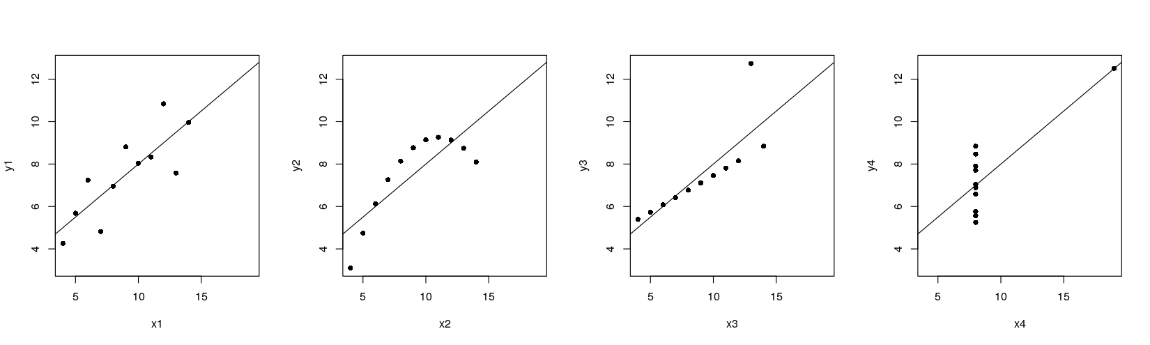
The traditional graphics approach is to add the line after the plot is drawn
In general, a plot is never finished, you can always add more points, lines, text, …
This is possible because there is only one plot !
lattice and ggplot2 need alternative solutions
The ggplot2 solution is to allow plots to have multiple layers
The lattice solution is to allow user to fully specify the procedure used to display data
Regression lines: the ggplot2 solution
- Plot with points only
- Plot with regression line only
ggplot(data = anscombe.long) + facet_grid( ~ which) +
                          geom_smooth(aes(x = x, y = y), method = "lm", se = FALSE)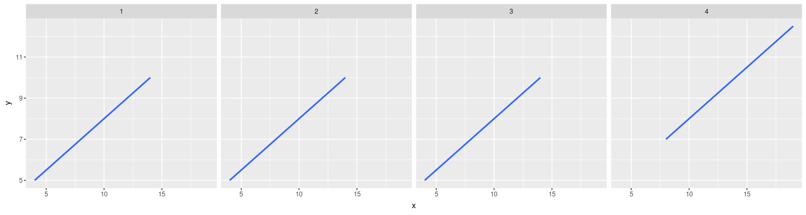
- Plot with both points and regression lines
ggplot(data = anscombe.long) + facet_grid( ~ which) + geom_point(aes(x = x, y = y)) +
                          geom_smooth(aes(x = x, y = y), method = "lm", se = FALSE)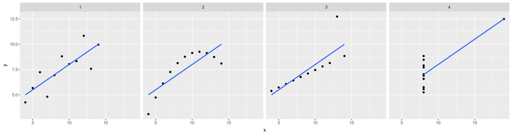
Regression lines: the lattice solution
The lattice solution is actually very similar to the traditional graphics solution
Basically, we want to do the following for each data subset
x, y:Draw points at
(x, y)Draw the linear regression line through
x, y
For lattice, we need to encapsulate this procedure into a function
displayFunction <- function(x, y) {
    panel.grid(h = -1, v = -1)               ## add a reference grid
    panel.points(x, y, pch = 16)             ## draw the points
    panel.abline(lm(y ~ x), col = "grey50")  ## draw linear regression line
}
This function is then supplied to the
xyplot()function as thepanelargumentPlot with points only
- Plot with grid, points, and regression line
- lattice also supports a layering mechanism similar to ggplot2
library(package = "latticeExtra")
xyplot(y ~ x | which, data = anscombe.long, layout = c(4, 1), pch = 16) +
                      layer_(panel.grid(h = -1, v = -1)) + layer(panel.abline(lm(y ~ x)))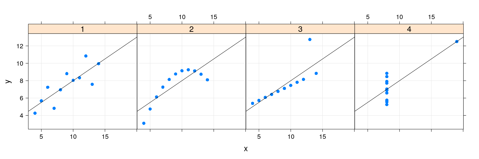
- Common customizations like these are also supported directly through optional arguments
library(package = "latticeExtra")
xyplot(y ~ x | which, data = anscombe.long, layout = c(4, 1), pch = 16,
       grid = TRUE, type = c("p", "r"))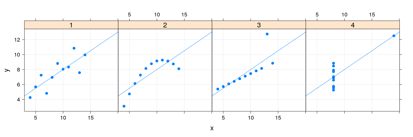
Philosophy of traditional graphics
The core of the traditional R graphics system is the graphics package
Various add-on packages provide further functionality
The full list of functions can be seen using
The listed functions can be roughly categorized into two groups:
High-level functions are intended to produce a complete plot by themselves
Low-level functions are intended to add elements to existing plots
Examples of high-level traditional graphics functions
| Function | Default Display |
|---|---|
plot() |
Scatter Plot, Time-series Plot (with type="l") |
boxplot() |
Comparative Box-and-Whisker Plots |
barplot() |
Bar Plot |
dotchart() |
Cleveland Dot Plot |
hist() |
Histogram |
plot(density()) |
Kernel Density Plot |
qqnorm() |
Normal Quantile-Quantile Plot |
qqplot() |
Two-sample Quantile-Quantile Plot |
stripchart() |
Stripchart (Comparative 1-D Scatter Plots) |
pairs() |
Scatter-Plot Matrix |
The plot() function
The
plot()function is actually a generic functionCan plot several types of R objects
The most common method is the default method
plot.default(), which can be used toplot paired numeric data
plot univariate numeric data against serial number
See
?plotand?plot.defaultfor details, includinglogarithmic scales using the
logargumentthe
typeargument for controlling display
Another useful alternative for bivariate data that we have already seen is
?plot.formula
Philosophy of lattice graphics
Very similar in spirit to traditional graphics
There are various designs or types of graphs for displaying data
Each design usually has a name (scatter plot, histogram, box plot, bar chart)
lattice provides a high-level function corresponding to each such design (to be directly invoked by user)
The display produced should have reasonable defaults
Some customization through optional arguments (esp. graphical parameters)
Further customization can be done by adding to or replacing the display procedurally
Examples of high-level traditional graphics functions
| Function | Default Display |
|---|---|
plot() |
Scatter Plot, Time-series Plot (with type="l") |
boxplot() |
Comparative Box-and-Whisker Plots |
barplot() |
Bar Plot |
dotchart() |
Cleveland Dot Plot |
hist() |
Histogram |
plot(density()) |
Kernel Density Plot |
qqnorm() |
Normal Quantile-Quantile Plot |
qqplot() |
Two-sample Quantile-Quantile Plot |
stripchart() |
Stripchart (Comparative 1-D Scatter Plots) |
pairs() |
Scatter-Plot Matrix |
lattice defines analogous functions with different names
| Function | Default Display |
|---|---|
xyplot() |
Scatter Plot, Time-series Plot (with type="l") |
bwplot() |
Comparative Box-and-Whisker Plots |
barchart() |
Bar Plot |
dotplot() |
Cleveland Dot Plot |
histogram() |
Histogram |
densityplot() |
Kernel Density Plot |
qqmath() |
Normal Quantile-Quantile Plot |
qq() |
Two-sample Quantile-Quantile Plot |
stripplot() |
Stripchart (Comparative 1-D Scatter Plots) |
splom() |
Scatter-Plot Matrix |
- Low-level graphics function also have similar lattice analogues
| graphics | lattice | Purpose |
|---|---|---|
text() |
panel.text() |
Add Text to a Plot |
lines() |
panel.lines() |
Add Connected Line Segments to a Plot |
points() |
panel.points() |
Add Points to a Plot |
polygon() |
panel.polygon() |
Polygon Drawing |
rect() |
panel.rect() |
Draw One or More Rectangles |
segments() |
panel.segments() |
Add Line Segments to a Plot |
abline() |
panel.abline() |
Add Straight Lines to a Plot |
arrows() |
panel.arrows() |
Add Arrows to a Plot |
grid() |
panel.grid() |
Add Grid to a Plot |
Learning lattice essentially means
Learning about these functions (and a few others)
Learning how to customize the default displays through optional arguments
Learning how to customize displays by writing alternative panel functions
Learning how to customize other parts (annotation, axis, themes)
We don’t have time to learn everything in detail
Instead, we will go through some examples relevant for clinical trial reporting
Please ask if you want to know some specific aspect in more detail
Case studies
Laboratory Data Scatter Plot
Clinical Response Line Plot
Clinical Response Bar Chart
Box Plot
Odds Ratio Plot
Kaplan-Meier Estimates Plot
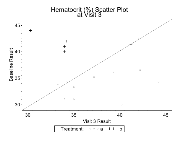
Example: Laboratory Data Scatter plot
- Read in data:
valuegives hematocrit percentage, wish to compare tobaseline
   subject_id lbtest value baseline trt
1         101    hct  35.0     31.0   a
2         102    hct  40.2     30.0   a
3         103    hct  42.0     42.4   b
4         104    hct  41.2     41.4   b
5         105    hct  35.0     33.3   a
6         106    hct  34.3     34.3   a
7         107    hct  30.3     44.0   b
8         108    hct  34.2     42.0   b
9         109    hct  40.0     41.1   b
10        110    hct  41.0     42.1   b
11        111    hct  33.3     33.8   a
12        112    hct  34.0     31.0   a
13        113    hct  34.0     41.0   b
14        114    hct  34.0     40.0   b
15        115    hct  37.2     35.2   a
16        116    hct  39.3     36.2   a
17        117    hct  36.3     38.3   b
18        118    hct  37.4     37.3   b
19        119    hct  44.2     34.3   a
20 120 hct 42.2 36.5 a- Sample SAS output:
xyplot(baseline ~ value, data = labs, groups = trt,
       auto.key = list(space = "top", columns = 2),
       abline = c(0, 1), aspect = 0.75)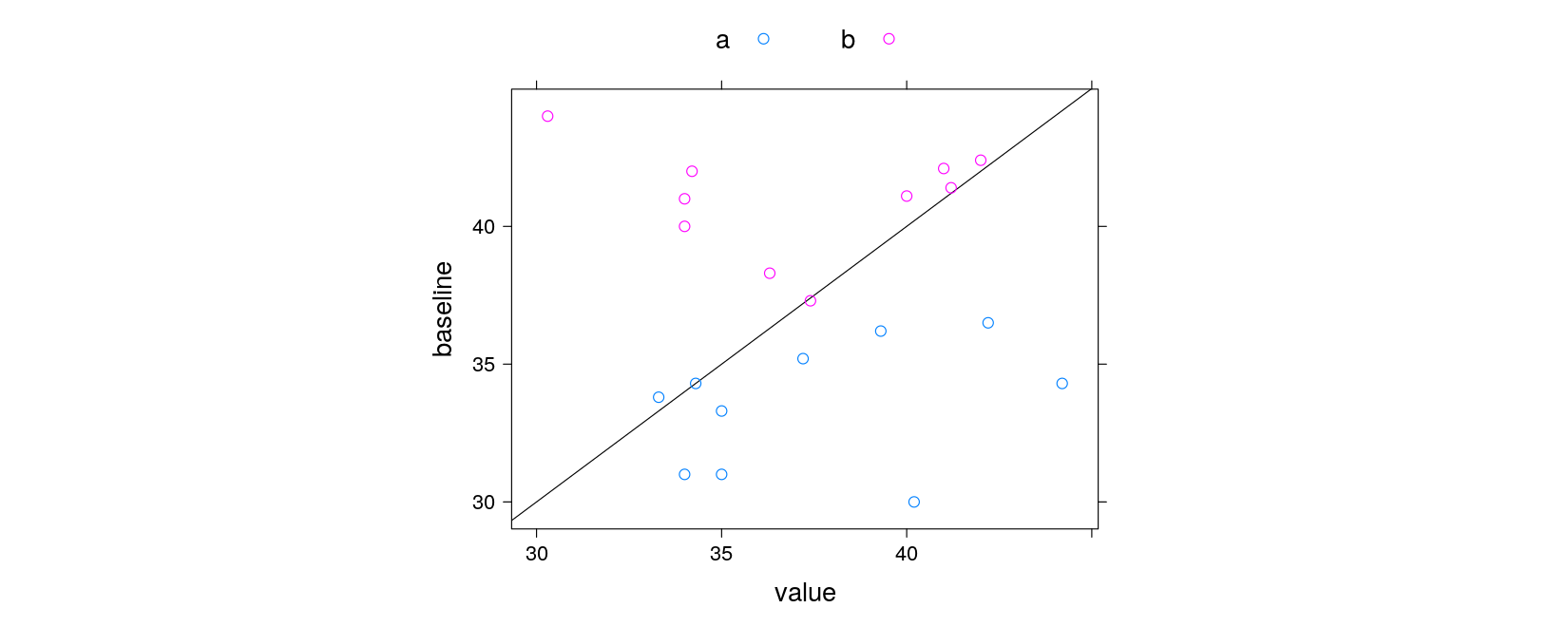
xyplot(baseline ~ value, data = labs, groups = trt, grid = TRUE,
       par.settings = simpleTheme(pch = c(1, 3)),
       auto.key = list(title = "Treatment", space = "bottom", columns = 2),
       abline = list(c(0, 1), col = "grey"), aspect = "iso",
       main = "Hematocrit (%) Scatter Plot \n at Visit 3",
       xlab = "Visit 3 Result", ylab = "Baseline Result")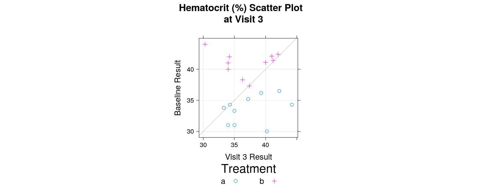
Example: Clinical Response Line plot
- Read in data:
trtis treatment,responseis recorded for on days 0–10 (0 is baseline)
response <- read.table("data/response.txt", header = TRUE, na.strings = ".", stringsAsFactors = FALSE)
response
trt visit response
1 1 0 9.40
2 2 0 9.35
3 1 1 9.35
4 2 1 9.40
5 1 2 8.22
6 2 2 8.78
7 1 3 6.33
8 2 3 8.23
9 1 4 4.00
10 2 4 7.77
11 1 5 2.22
12 2 5 4.46
13 1 6 1.44
14 2 6 2.00
15 1 7 1.13
16 2 7 1.86
17 1 8 0.55
18 2 8 1.44
19 1 9 0.67
20 2 9 1.33
21 1 10 0.45
22 2 10 1.01- Create categorical variables as appropriate
response <- transform(response,
                      trt = factor(trt, levels = c(1, 2), labels = c("Super Drug", "Old Drug")),
                      visit = factor(visit, levels = 0:10,
                                     labels = c("Baseline", paste("Day", 1:10))))
response
trt visit response
1 Super Drug Baseline 9.40
2 Old Drug Baseline 9.35
3 Super Drug Day 1 9.35
4 Old Drug Day 1 9.40
5 Super Drug Day 2 8.22
6 Old Drug Day 2 8.78
7 Super Drug Day 3 6.33
8 Old Drug Day 3 8.23
9 Super Drug Day 4 4.00
10 Old Drug Day 4 7.77
11 Super Drug Day 5 2.22
12 Old Drug Day 5 4.46
13 Super Drug Day 6 1.44
14 Old Drug Day 6 2.00
15 Super Drug Day 7 1.13
16 Old Drug Day 7 1.86
17 Super Drug Day 8 0.55
18 Old Drug Day 8 1.44
19 Super Drug Day 9 0.67
20 Old Drug Day 9 1.33
21 Super Drug Day 10 0.45
22 Old Drug Day 10 1.01- Sample SAS output:
xyplot(response ~ visit, data = response, groups = trt, grid = TRUE, type = "o",
       auto.key = list(title = "Treatment", space = "inside", corner = c(1, 1)),
       abline = list(v = 1.9, col = "grey"),
       main = "Mean Clinical Response by Visit",
       xlab = "Visit", ylab = "Mean Clinical Response")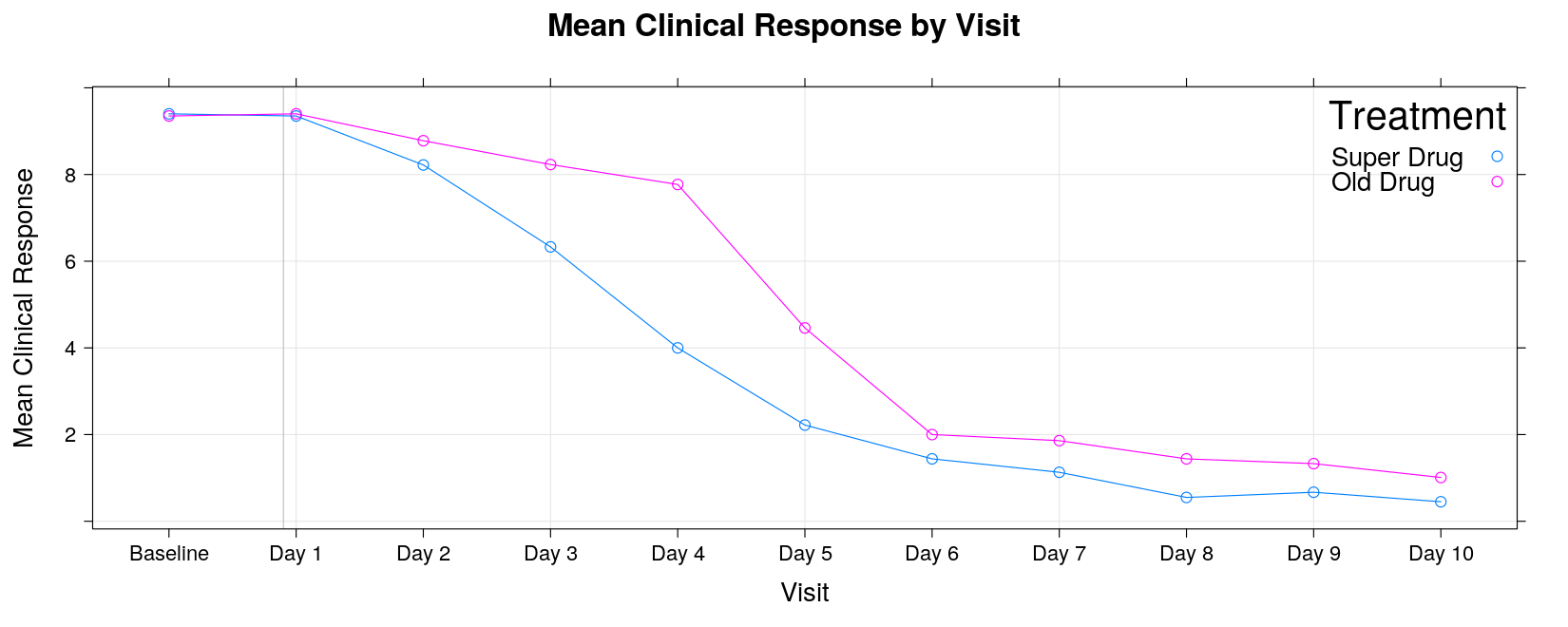
xyplot(response ~ visit, data = response, groups = trt, grid = TRUE, type = "o",
       auto.key = list(title = "Treatment", space = "inside", corner = c(1, 1)),
       abline = list(v = 1.9, col = "grey"),
       main = "Mean Clinical Response by Visit",
       xlab = "Visit", ylab = "Mean Clinical Response",
       scales = list(x = list(rot = 90)))
Example: Clinical response bar chart
- Read in data:
trtis treatment,painindicates pain level
pain <- read.table("data/pain-1.txt", header = TRUE, na.strings = ".", stringsAsFactors = FALSE)
str(pain)
'data.frame': 150 obs. of 3 variables:
$ subject: int 113 420 780 121 423 784 122 465 785 124 ...
$ pain : int 1 1 0 1 0 0 1 4 1 4 ...
$ trt : int 1 2 3 1 2 3 1 2 3 1 ...- Create suitable categorical variables
pain <-
    transform(pain,
              pain = factor(pain, levels = 0:4, labels = c("0", "1-2", "3-4", "5-6", "7-8")),
              trt = factor(trt, levels = 1:3, labels = c("Placebo", "Old Drug", "New Drug")))
head(pain, 20)
subject pain trt
1 113 1-2 Placebo
2 420 1-2 Old Drug
3 780 0 New Drug
4 121 1-2 Placebo
5 423 0 Old Drug
6 784 0 New Drug
7 122 1-2 Placebo
8 465 7-8 Old Drug
9 785 1-2 New Drug
10 124 7-8 Placebo
11 481 5-6 Old Drug
12 786 5-6 New Drug
13 164 7-8 Placebo
14 482 0 Old Drug
15 787 0 New Drug
16 177 7-8 Placebo
17 483 0 Old Drug
18 789 0 New Drug
19 178 0 Placebo
20 484 0 Old Drug- Sample SAS output:
A bar chart essentially summarizes a cross-tabulation of pain levels by treatment
First we need to create the appropriate table
trt
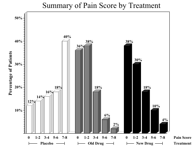
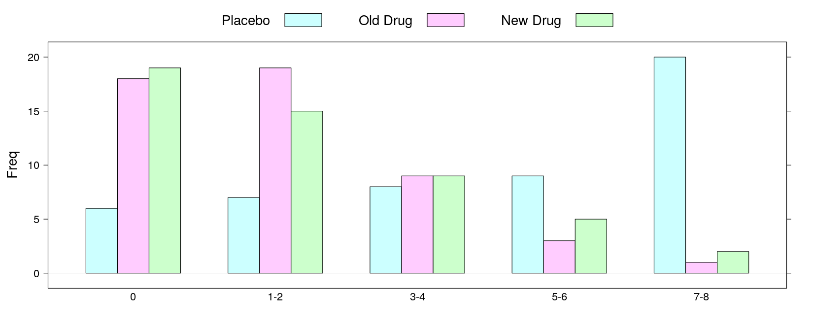
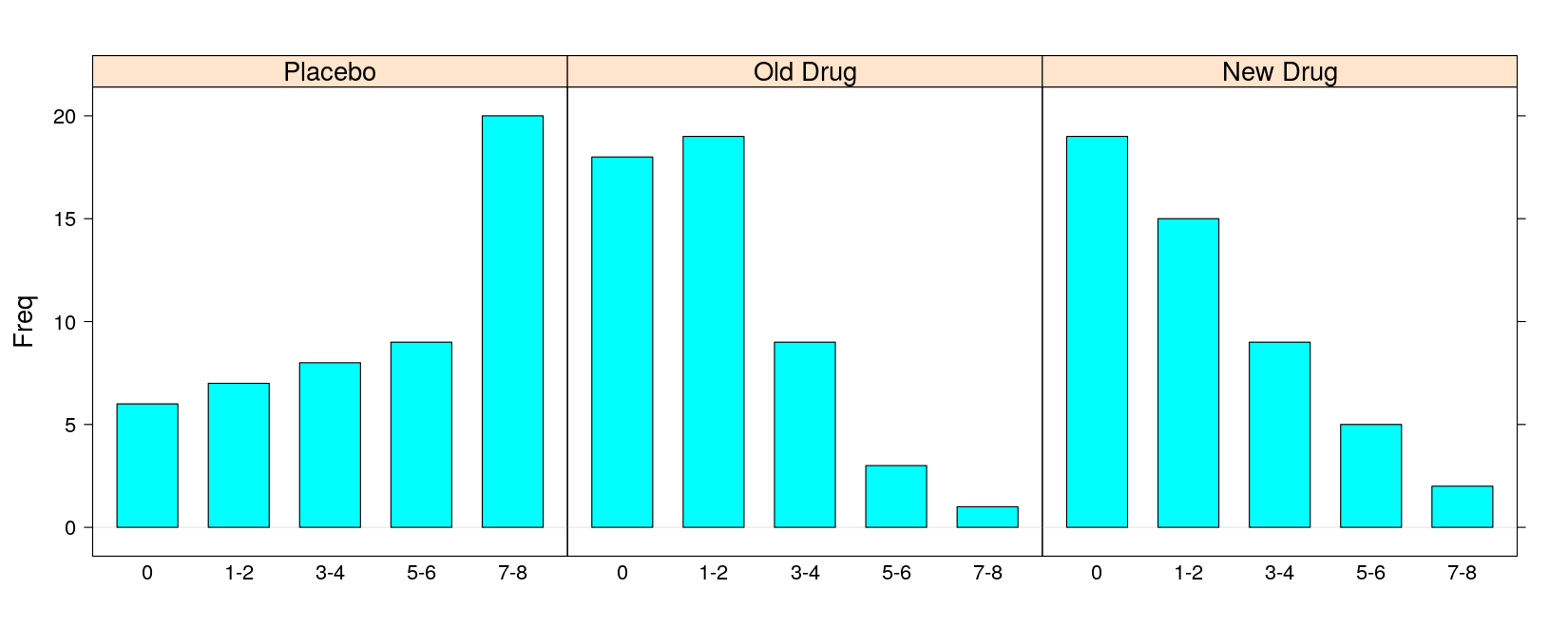
pain Placebo Old Drug New Drug
0 6 18 19
1-2 7 19 15
3-4 8 9 9
5-6 9 3 5
7-8 20 1 2- Grouped bar chart:
- Multi-panel bar chart:
- With percentage instead of count (as in SAS output)
pain.pct <- 100 * prop.table(pain.tab, margin = 2)
barchart(pain.pct, groups = FALSE, horizontal = FALSE, layout = c(3, 1),
         ylab = "Percentage of Patients", xlab = "Pain score",
         main = "Summary of Pain Score by Treatment")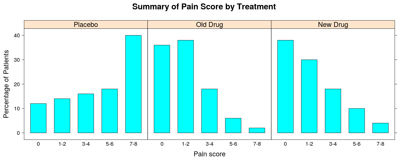
Alternative: Cleveland Dot Plot — direct superposition makes comparison easier
dotplot(pain.pct, groups = TRUE, horizontal = FALSE, type = "o",
        par.settings = simpleTheme(pch = 16), auto.key = list(space = "right", title = "Treatment"),
        ylab = "Percentage of Patients", xlab = "Pain score", main = "Summary of Pain Score by Treatment")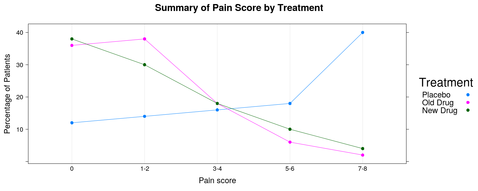
Example: Box plots
- Read in data: seizures per hour by treatment and visit
seizures <- read.table("data/seizures.txt", header = TRUE, na.strings = ".", stringsAsFactors = FALSE)
str(seizures)
'data.frame': 98 obs. of 3 variables:
$ trt : int 1 2 2 2 2 2 1 2 1 1 ...
$ visit : int 2 1 2 1 2 3 1 3 1 2 ...
$ seizures: num 1.5 3 1.8 2.6 2 2 2.8 2.6 3 2.2 ...- Make suitable categorical variables.
seizures <-
    transform(seizures,
              visit = factor(visit, levels = 1:3, labels = c("Baseline", "6 Months", "9 Months")),
              trt = factor(trt, levels = 1:2, labels = c("Active", "Placebo")))
head(seizures, 20)
trt visit seizures
1 Active 6 Months 1.5
2 Placebo Baseline 3.0
3 Placebo 6 Months 1.8
4 Placebo Baseline 2.6
5 Placebo 6 Months 2.0
6 Placebo 9 Months 2.0
7 Active Baseline 2.8
8 Placebo 9 Months 2.6
9 Active Baseline 3.0
10 Active 6 Months 2.2
11 Active Baseline 2.4
12 Placebo Baseline 3.2
13 Placebo Baseline 3.2
14 Active 6 Months 1.4
15 Active Baseline 2.6
16 Placebo 6 Months 2.1
17 Active 9 Months 1.8
18 Active 6 Months 1.2
19 Active Baseline 2.6
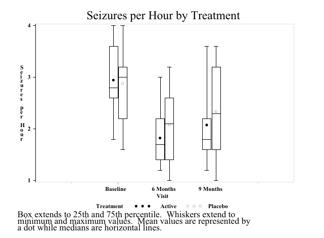
20 Placebo Baseline 3.0- Sample SAS output:
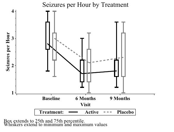
- Sample SAS output:
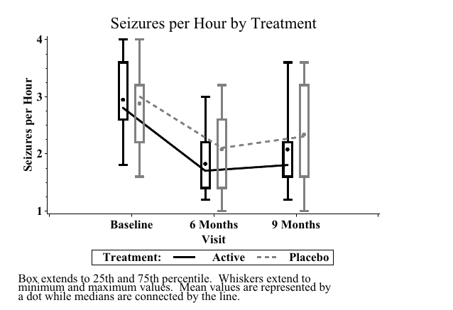
- Sample SAS output:
Obtaining a grouped box plot as in the book is somewhat complicated
It is also not necessarily the best thing to do
It is easy to obtain a multi-panel box plot as follows:
bwplot(seizures ~ trt | visit, data = seizures, layout = c(3, 1),
       coef = 0, # extend whiskers to extremes (minimum and maximum)
       ylab = "Seizures per Hour", xlab = "Visit", pch = "|",
       main = "Seizures per Hour by Treatment")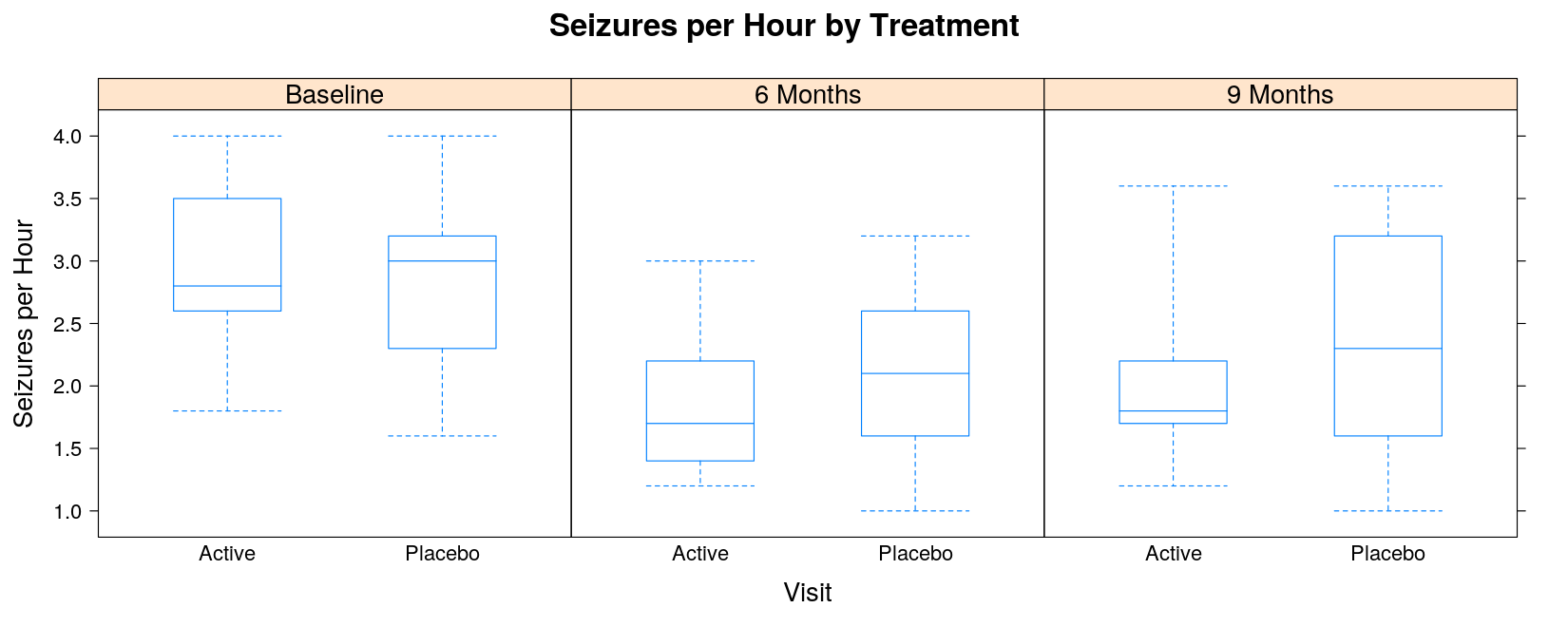
- Alternatively, define panels by treatment to visualize the time course for each treatment
bwplot(seizures ~ visit | trt, data = seizures, coef = 0,
       ylab = "Seizures per Hour", xlab = "Visit",
       main = "Seizures per Hour by Treatment")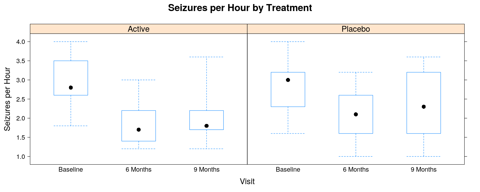
Recreating the grouped boxplot as produced by SAS will need more work
Non-standard customizations require an alternative display procedure through a “panel function”
The following panel function simply adds a line joining the medians
panel.bwjoin <- function(x, y, ...)
{
    panel.bwplot(x, y, ...) # the default box plot
    ux <- sort(unique(x))   # unique x values
    ymedian <- tapply(y, factor(x, levels = ux), median, na.rm = TRUE)
    panel.lines(ux, ymedian, ...)
}bwplot(seizures ~ visit | trt, data = seizures, coef = 0, panel = panel.bwjoin,
ylab = "Seizures per Hour", xlab = "Visit",
main = "Seizures per Hour by Treatment")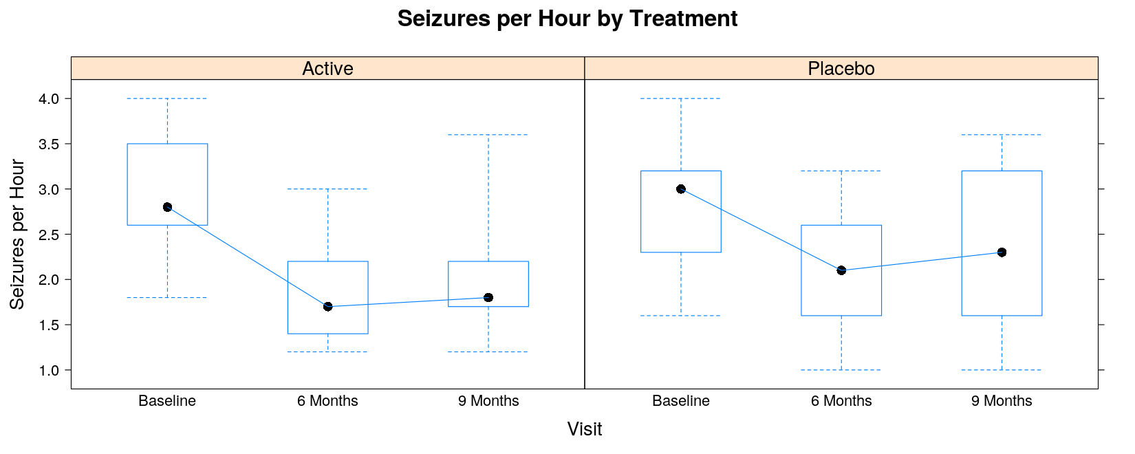
The following function is similar, but
Indicates the mean instead of the median as a point
Still joins the medians by lines
panel.bwmean <- function(x, y, pch, ..., col, col.line = "black")
{
    panel.bwplot(x, y, col = "transparent", ...) # the default box plot, but omit the median
    ux <- sort(unique(x))
    ymean <- tapply(y, factor(x, levels = ux), mean, na.rm = TRUE)
    ymedian <- tapply(y, factor(x, levels = ux), median, na.rm = TRUE)
    panel.points(ux, ymean, pch = 16, ...) # plot the means as points
    panel.lines(ux, ymedian, col.line = col.line) # join the medians by lines
}bwplot(seizures ~ visit | trt, data = seizures, coef = 0,
panel = panel.bwmean, col.line = "black",
ylab = "Seizures per Hour", xlab = "Visit",
main = "Seizures per Hour by Treatment")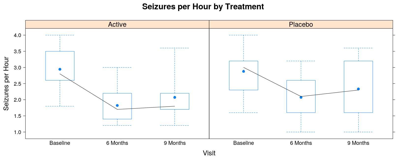
A proper grouped box plot will need a bit more work (esp. getting the colors right)
A reasonable approximation is given by the following
This is achieved using the
panel.superpose()panel functionConverts a regular panel display function into a grouped display function
One additional trick is needed to shift the boxplots horizontally according to group
panel.bwgroup <- function(x, y, group.number, ...)
{
    panel.bwmean(x + 0.25 * (group.number - 1.5), y, box.width = 0.2, ...)
}bwplot(seizures ~ visit, data = seizures, coef = 0, groups = trt,
panel = panel.superpose, panel.groups = panel.bwgroup,
ylab = "Seizures per Hour", xlab = "Visit", main = "Seizures per Hour by Treatment",
auto.key = list(space = "right", title = "Treatment", points = FALSE, lines = TRUE))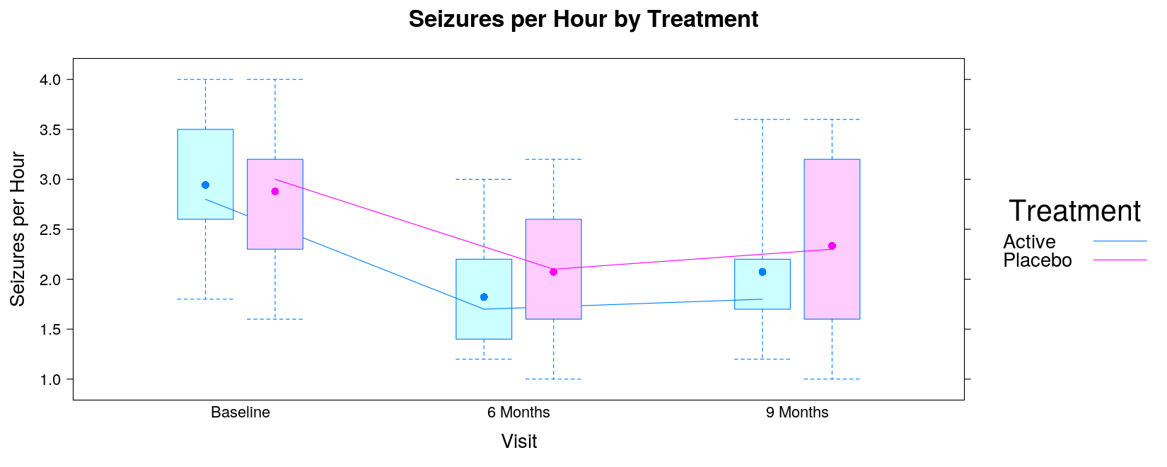
Example: Odds Ratio Plot
- Read in data: pain by treatment, gender, race
pain <- read.table("data/pain-2.txt", header = TRUE, na.strings = ".", stringsAsFactors = FALSE)
str(pain)
'data.frame': 65 obs. of 5 variables:
$ success : int 1 1 1 1 0 0 1 0 1 1 ...
$ trt : int 0 1 0 1 0 0 1 0 1 0 ...
$ male : int 1 2 2 1 1 2 1 2 1 1 ...
$ race : int 3 1 2 1 3 1 3 1 2 1 ...
$ basepain: int 20 22 20 10 24 20 22 20 25 11 ...- Sample SAS output:
This plot was new to me
Essentially, this summarizes the results of a logistic regression model
The coefficients of such a model influence the “success probability” non-linearly
With the standard logisitic regression model, the coefficients are the log of the odds ratios
Logistic regression models are fit using
glm()(for generalized linear models)Uses essentially the same formula interface as
lm(), along with a “family” defining modelAs before, we need to first make suitable categorical variables
This does not actually matter for categorical variables that have two levels
Such variables contribute only one independent dummy variable
However, it does matter for
race
Unfortunately, the SAS code neglects to treat race as categorical
Instead, it treats
raceas a continuous variable (with values 1, 2, 3)This is an error, but we will retain it to match SAS results
pain <-
    transform(pain,
              trt = factor(trt, levels = 0:1),
              male = factor(male, levels = 1:2))
##            race = factor(race, levels = 1:3)) # error to match SAS output
head(pain)
success trt male race basepain
1 1 0 1 3 20
2 1 1 2 1 22
3 1 0 2 2 20
4 1 1 1 1 10
5 0 0 1 3 24
6 0 0 2 1 20Example: Odds Ratio Plot
- Fit logistic regression model:
Call:
glm(formula = success ~ basepain + male + race + trt, family = binomial(),
    data = pain)

Deviance Residuals:
    Min       1Q   Median       3Q      Max
-2.0701  -1.0072   0.6187   0.8637   1.4417

Coefficients:
             Estimate Std. Error z value Pr(>|z|)
(Intercept)  1.217920   1.111842   1.095   0.2733
basepain     0.009032   0.027082   0.334   0.7388
male2       -0.768458   0.594465  -1.293   0.1961
race        -0.616383   0.423524  -1.455   0.1456
trt1         1.226517   0.588593   2.084   0.0372 *
---
Signif. codes:  0 '***' 0.001 '**' 0.01 '*' 0.05 '.' 0.1 ' ' 1

(Dispersion parameter for binomial family taken to be 1)

    Null deviance: 81.792  on 64  degrees of freedom
Residual deviance: 72.688  on 60  degrees of freedom
AIC: 82.688

Number of Fisher Scoring iterations: 3
We need the relevant coefficient estimates (log odds) and their confidence intervals
This computation is available in the MASS package
Waiting for profiling to be done... 2.5 % 97.5 %
(Intercept) -0.92576323 3.49865470
basepain -0.04126015 0.06790952
male2 -1.96474468 0.39138930
race -1.48310317 0.20591317
trt1 0.10652176 2.44258253- We use this to construct a data frame that will provide data for our plot
log.odds <- cbind(data.frame(covariate = names(coef(fm)),
                             estimate = coef(fm)),
                  confint(fm, level = 0.95))
Waiting for profiling to be done... covariate estimate 2.5 % 97.5 %
(Intercept) (Intercept) 1.217919975 -0.92576323 3.49865470
basepain basepain 0.009032014 -0.04126015 0.06790952
male2 male2 -0.768458365 -1.96474468 0.39138930
race race -0.616382916 -1.48310317 0.20591317
trt1 trt1 1.226516853 0.10652176 2.44258253- An easy way to plot these is to plot the coeffient estimates and then add the confidence intervals.
log.odds.keep <- log.odds[-1, ] # drop intercept
cov.labels <- c("Baseline pain (continuous)", "Male vs. Female",
                 "White vs. Black", "Active Therapy vs. Placebo")
log.odds.keep <-
    transform(log.odds.keep,
covariate = factor(covariate, levels = covariate, labels = cov.labels))with(log.odds.keep, ## this example uses the traditional graphics function dotchart()
{
dotchart(estimate, labels = covariate)
arrows(lower, 1:4, upper, 1:4, angle = 90, code = 3)
})
with(log.odds.keep,    ## extend x-axis limits to accommodate intervals
{
    dotchart(estimate, labels = covariate, xlim = range(lower, upper))
    arrows(lower, 1:4, upper, 1:4, angle = 90, code = 3)
})
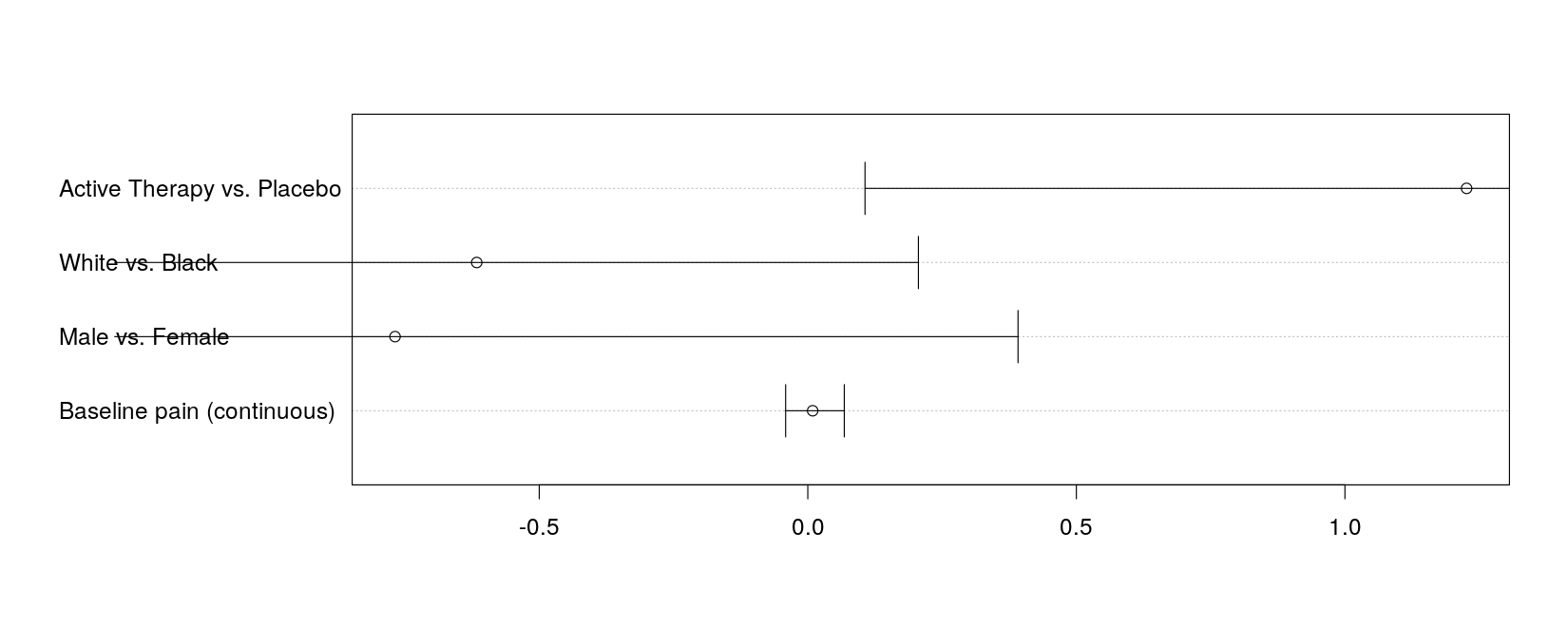
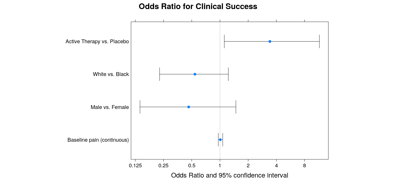
- lattice version: cheating a bit using
with()
lodds.plot <-
    with(log.odds.keep,
    {
        dotplot(covariate ~ estimate, xlim = extendrange(range(lower, upper)), aspect = 0.7,
                main = "Odds Ratio for Clinical Success", xlab = "Odds Ratio and 95% confidence interval",
                panel = function(x, y) {
                    panel.abline(v = 0, col = "grey")
                    panel.arrows(lower, 1:4, upper, 1:4, angle = 90, code = 3)
                    panel.points(x, y, pch = 16)
                },
                scales = list(x = list(at = log(2^(-3:4)), labels = as.character(2^(-3:4)))))
    })
Log-scales are faked by specifying explicit tick mark locations and labels
This example uses another feature of lattice: high-level plot functions return objects
The actual display is created by the
print()method (see next page)
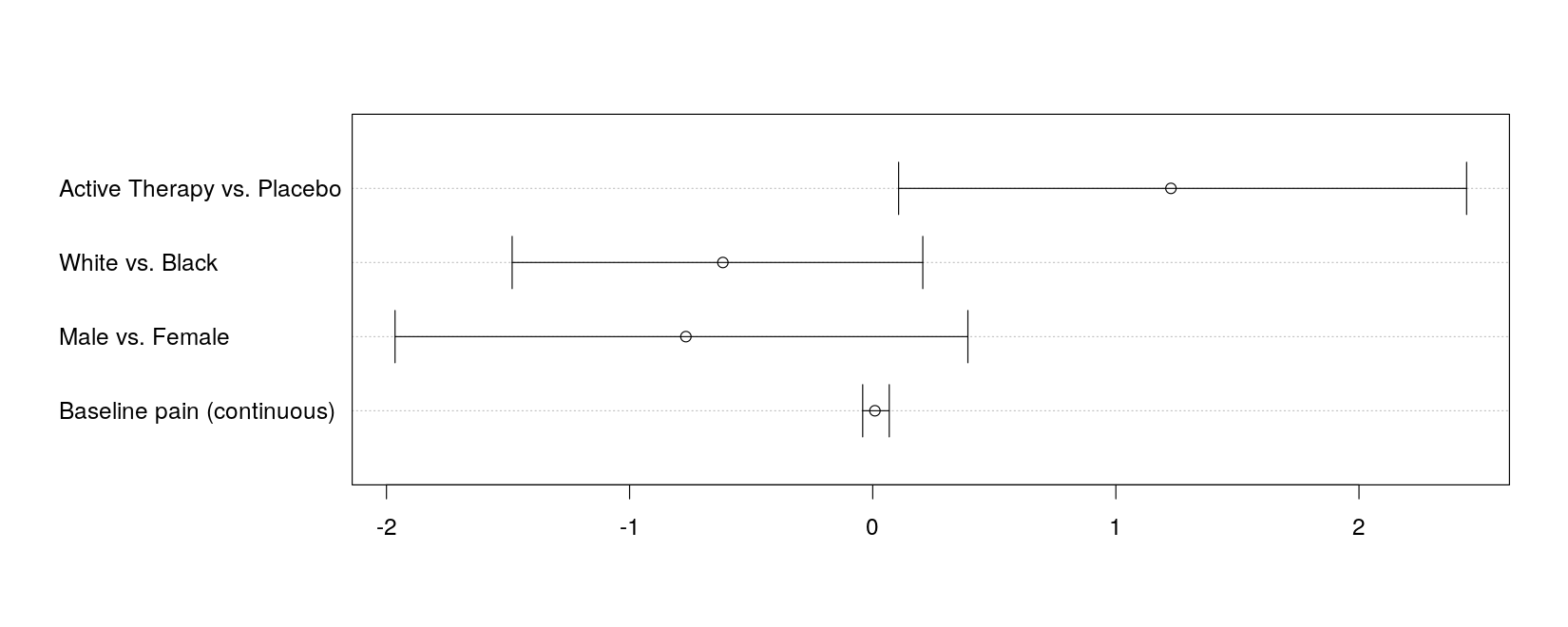
- A better alternative is the
segplot()function in latticeExtra
library(latticeExtra)
segplot(covariate ~ lower + upper, data = log.odds.keep, center = estimate, aspect = 0.7,
        draw.band = FALSE, lwd = 2, scales = list(x = list(at = log(2^(-3:4)), labels = 2^(-3:4))),
        main = "Log-odds Ratio for Clinical Success", xlab = "Log-odds Ratio and 95% confidence interval") +
    layer_(panel.grid(h = -1, v = -1))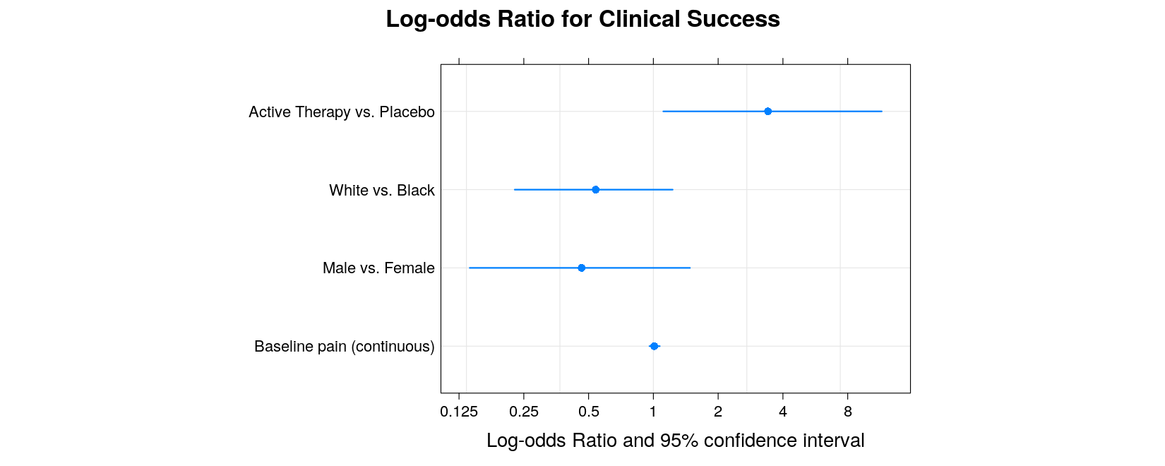
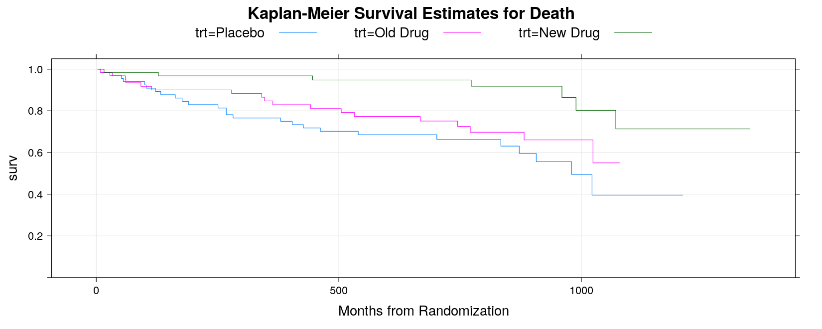
Example: Kaplan-Meier Estimates Plot
- Read in data:
death <- read.table("data/death.txt", header = TRUE, na.strings = ".", stringsAsFactors = FALSE)
death <-
    transform(death,
              trt = factor(trt, levels = c("A", "B", "C"),
                           labels = c("Placebo", "Old Drug", "New Drug")))
str(death)
'data.frame': 200 obs. of 3 variables:
$ trt : Factor w/ 3 levels "Placebo","Old Drug",..: 1 1 3 3 2 2 2 2 3 3 ...
$ daystodeath: int 52 825 693 981 279 826 531 15 1057 793 ...
$ deathcensor: int 1 0 0 0 1 0 0 0 0 0 ...- As seen earlier, we need to create a survival object and use it in the
survfit()function
Call: survfit(formula = Surv(daystodeath, deathcensor) ~ trt, data = death)

              n events median 0.95LCL 0.95UCL
trt=Placebo  68     26    980     872      NA
trt=Old Drug 64     18     NA    1024      NA
trt=New Drug 68 7 NA NA NA- The fitted survival model can be plotted using the corresponding
plot()method.
plot(sm, col = 1:3, mark.time = TRUE,
     xlab = "Months from Randomization",
     main = "Kaplan-Meier Survival Estimates for Death")
legend("bottomleft", names(sm$strata), inset = 0.01, lty = 1, col = 1:3)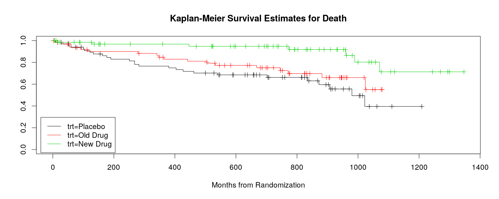
- Can also use
xyplot, but lacks event marking, and the curves do not start from time 0
xyplot(surv ~ time, data = summary(sm, censored = TRUE),
       groups = strata, type = "s", ylim = c(0, 1.05), grid = TRUE,
       xlab = "Months from Randomization", main = "Kaplan-Meier Survival Estimates for Death",
       auto.key = list(space = "top", columns = 3, lines = TRUE, points = FALSE))