Lattice: Introduction
Anscombe’s quartet using traditional graphics
par(mfrow = c(1, 4))
plot(y1 ~ x1, data = anscombe, pch = 16)
plot(y2 ~ x2, data = anscombe, pch = 16)
plot(y3 ~ x3, data = anscombe, pch = 16)
plot(y4 ~ x4, data = anscombe, pch = 16)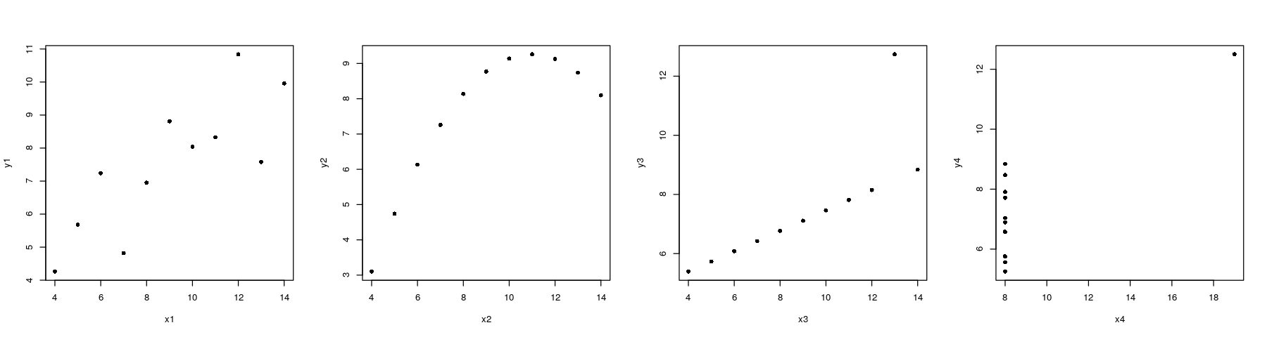
Anscombe’s quartet using traditional graphics
xrng <- with(anscombe, range(x1, x2, x3, x4))
yrng <- with(anscombe, range(y1, y2, y3, y4))   ## common axis limits
par(mfrow = c(1, 4))
plot(y1 ~ x1, data = anscombe, pch = 16, xlim = xrng, ylim = yrng)
plot(y2 ~ x2, data = anscombe, pch = 16, xlim = xrng, ylim = yrng)
plot(y3 ~ x3, data = anscombe, pch = 16, xlim = xrng, ylim = yrng)
plot(y4 ~ x4, data = anscombe, pch = 16, xlim = xrng, ylim = yrng)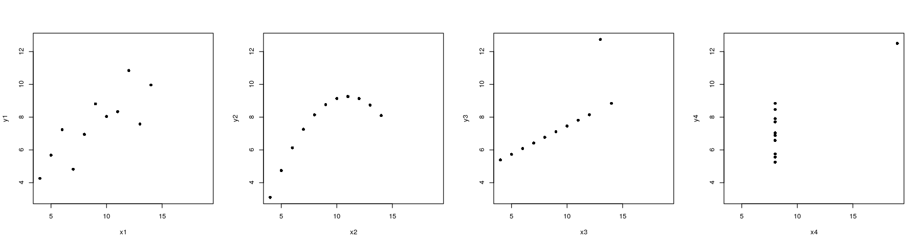
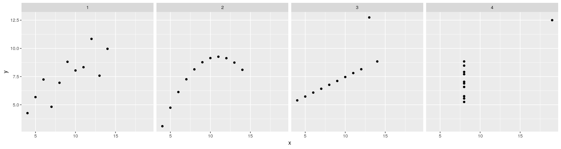
Anscombe’s quartet using lattice
library(package = "lattice")
xyplot(y ~ x | which, data = anscombe.long, layout = c(4, 1), pch = 16)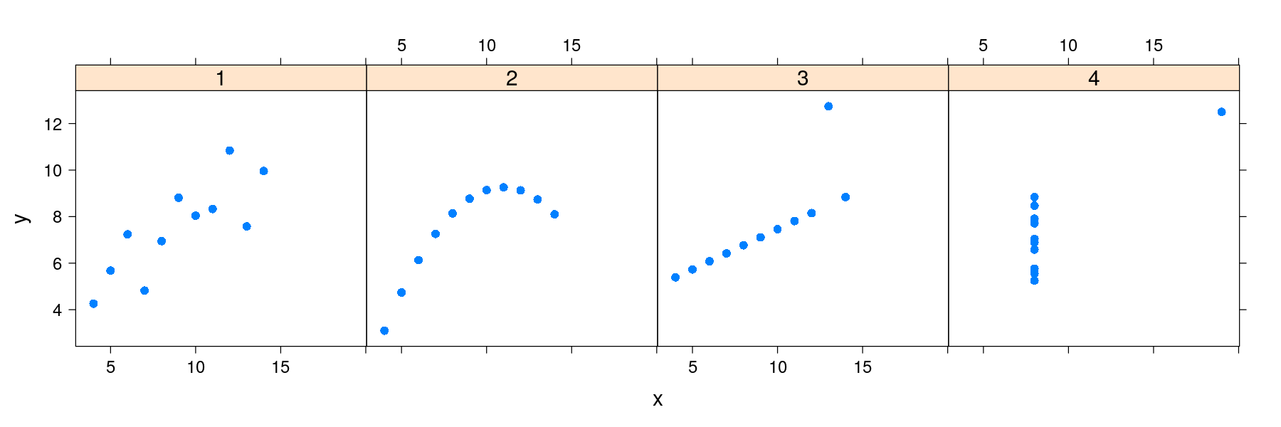
Anscombe’s quartet using ggplot2
library(package = "ggplot2")
ggplot(data = anscombe.long) + geom_point(aes(x = x, y = y)) + facet_grid( ~ which)
Anscombe’s quartet with regression lines
xrng <- with(anscombe, range(x1, x2, x3, x4))
yrng <- with(anscombe, range(y1, y2, y3, y4))
par(mfrow = c(1, 4))
plot(y1 ~ x1, anscombe, pch = 16, xlim = xrng, ylim = yrng)
abline(lm(y1 ~ x1, anscombe))  ## lm() fits regression line, abline() adds the line to current plot
plot(y2 ~ x2, anscombe, pch = 16, xlim = xrng, ylim = yrng)
abline(lm(y2 ~ x2, anscombe))
plot(y3 ~ x3, anscombe, pch = 16, xlim = xrng, ylim = yrng)
abline(lm(y3 ~ x3, anscombe))
plot(y4 ~ x4, anscombe, pch = 16, xlim = xrng, ylim = yrng)
abline(lm(y4 ~ x4, anscombe))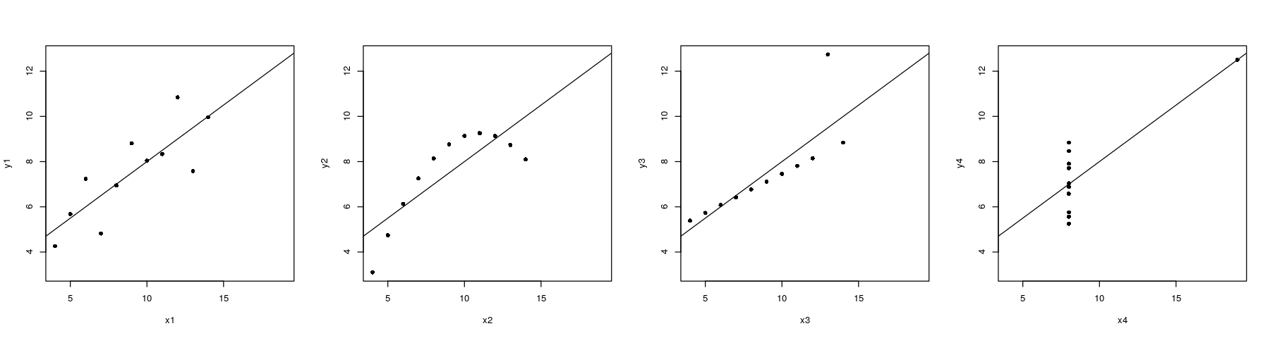
Regression lines: the ggplot2 solution
- Plot with points only
Regression lines: the ggplot2 solution
- Plot with regression line only
ggplot(data = anscombe.long) + facet_grid( ~ which) +
                          geom_smooth(aes(x = x, y = y), method = "lm", se = FALSE)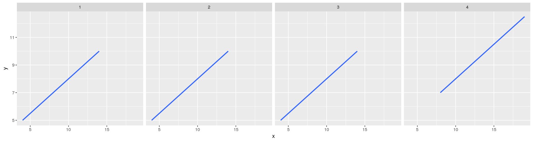
Regression lines: the ggplot2 solution
- Plot with both points and regression lines
ggplot(data = anscombe.long) + facet_grid( ~ which) + geom_point(aes(x = x, y = y)) +
                          geom_smooth(aes(x = x, y = y), method = "lm", se = FALSE)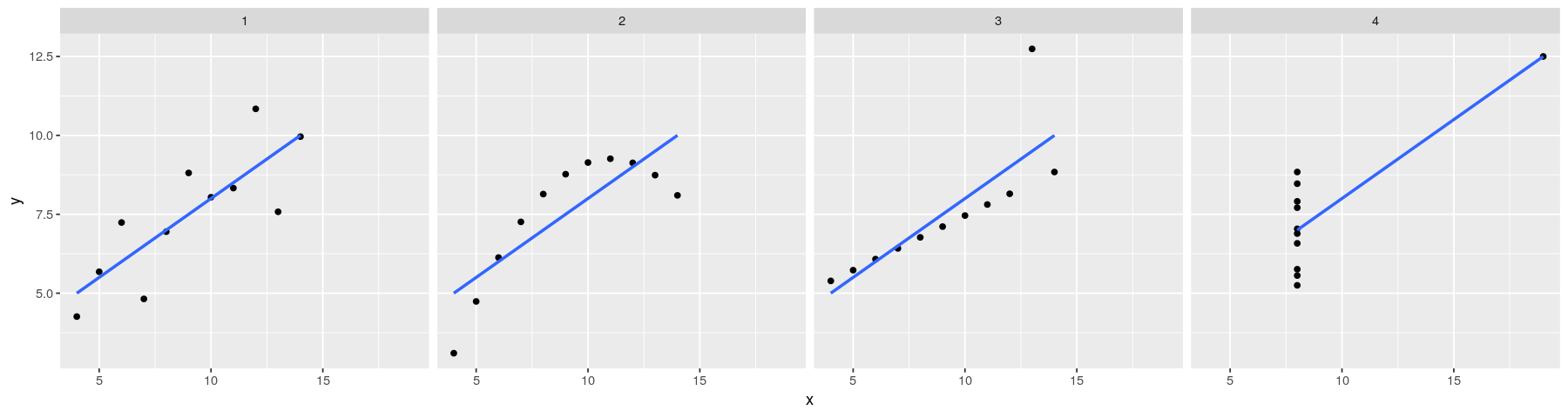
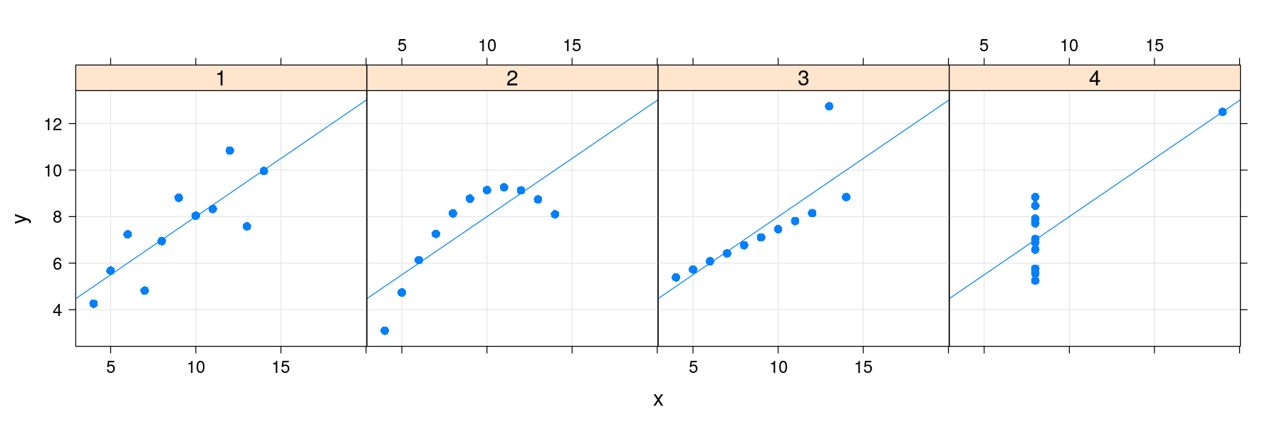
Regression lines: the lattice solution
- Plot with points only

Regression lines: the lattice solution
- Plot with grid, points, and regression line
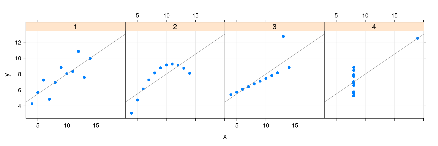
Regression lines: the lattice solution
- lattice also supports a layering mechanism inspired by ggplot2
library(package = "latticeExtra")
xyplot(y ~ x | which, data = anscombe.long, layout = c(4, 1), pch = 16) +
                      layer_(panel.grid(h = -1, v = -1)) + layer(panel.abline(lm(y ~ x)))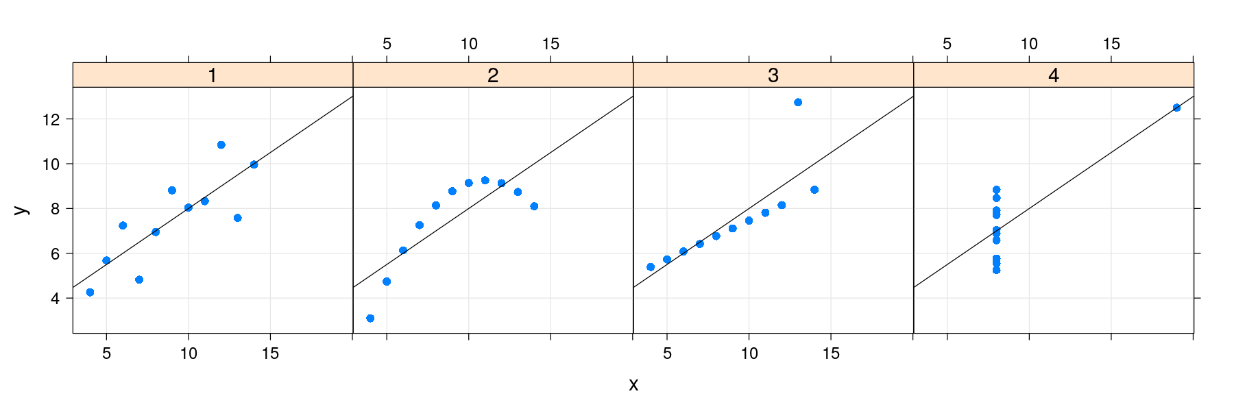
Regression lines: the lattice solution
- Common customizations like these are also supported directly through optional arguments
library(package = "latticeExtra")
xyplot(y ~ x | which, data = anscombe.long, layout = c(4, 1), pch = 16,
       grid = TRUE, type = c("p", "r"))