Lattice Graphics: Basic Usage
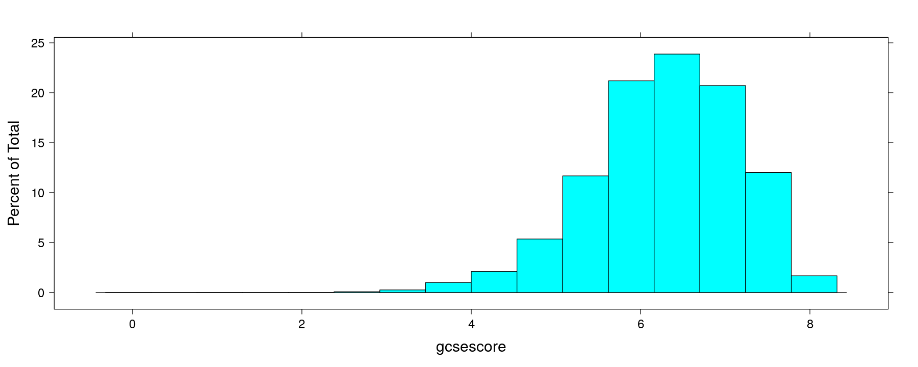
A basic histogram

A basic histogram using the formula interface
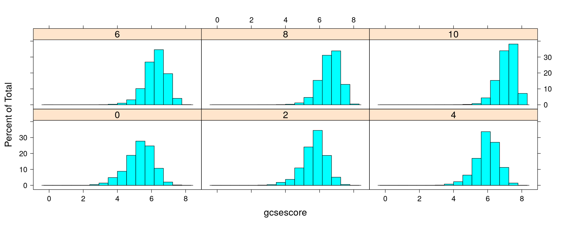
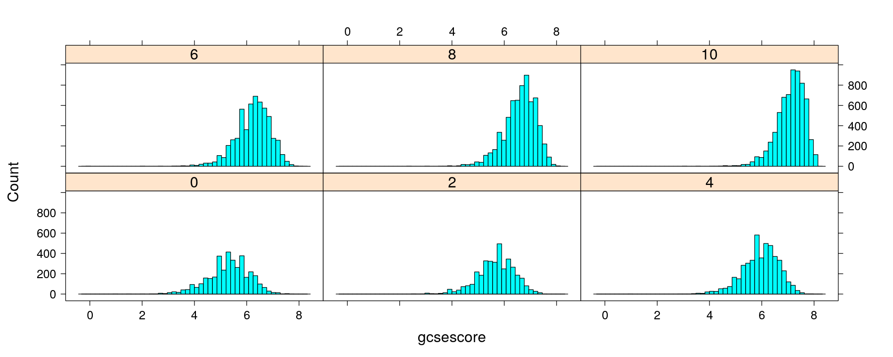
Histograms with multipanel conditioning
Density plots with multipanel conditioning
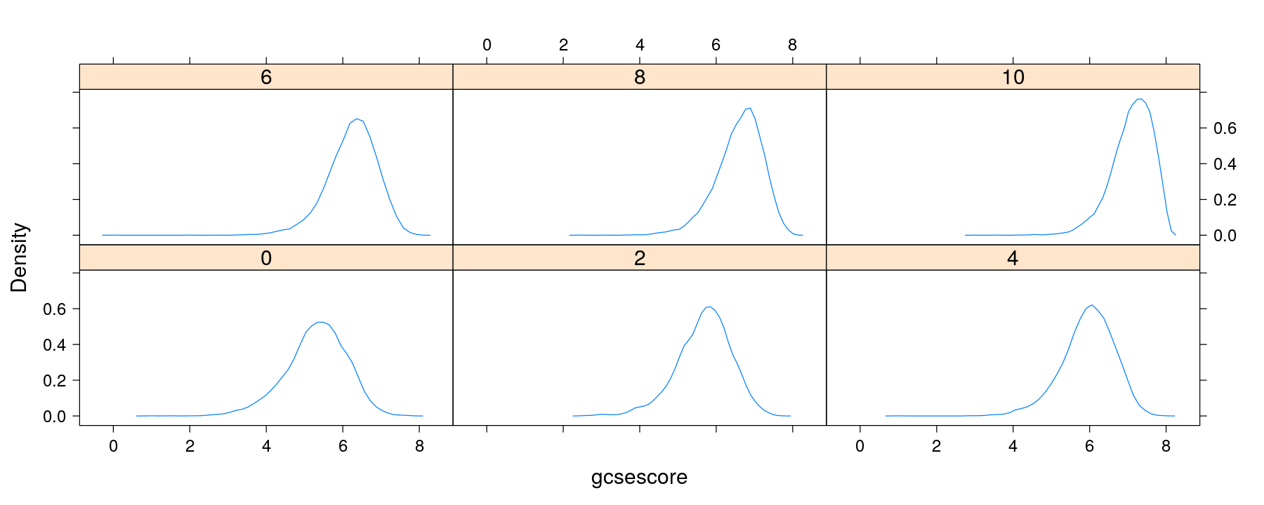
Density plots with multipanel conditioning
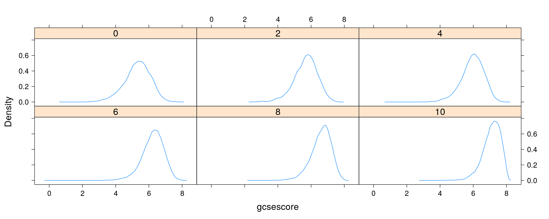
Density plots with multipanel conditioning
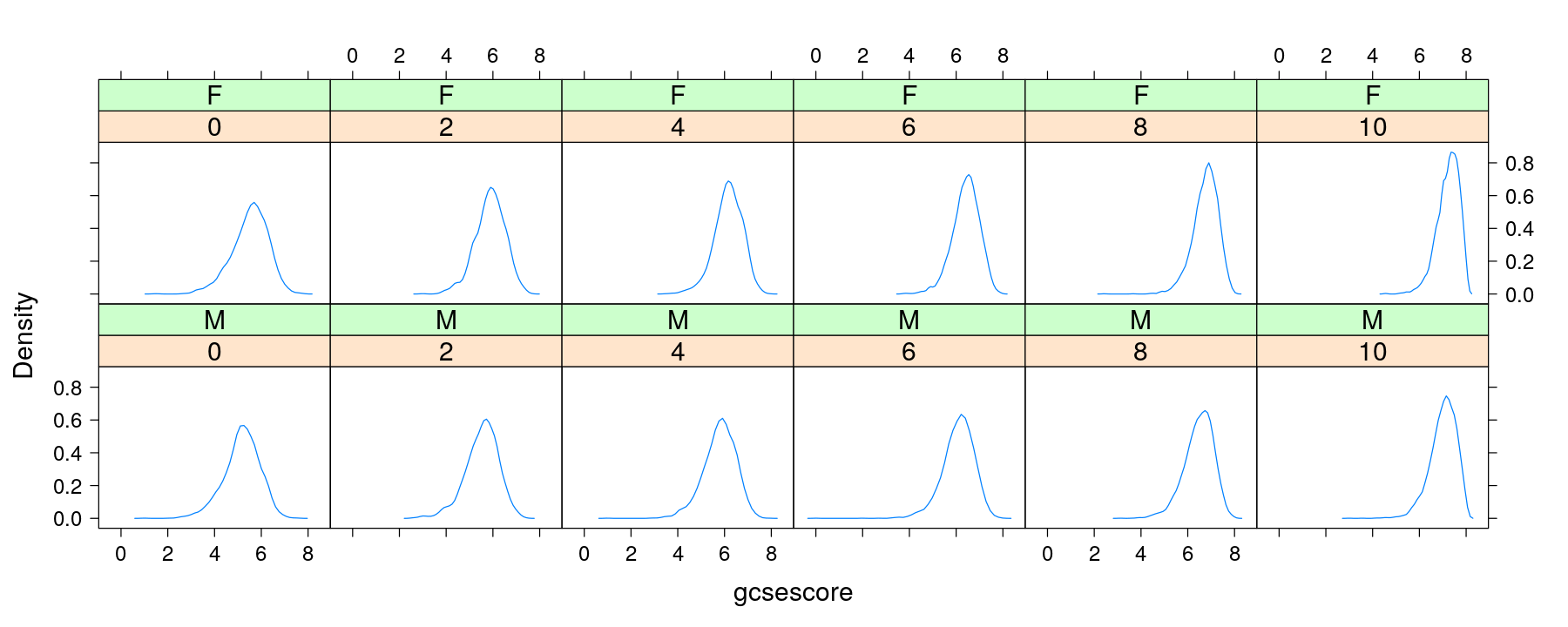
Density plots with conditioning and within-panel grouping
densityplot(~ gcsescore | factor(score), data = Chem97, plot.points = FALSE,
            groups = gender, auto.key = TRUE)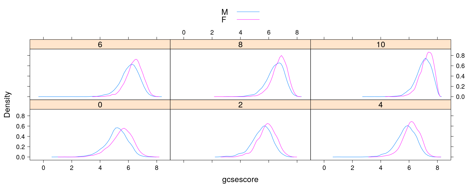
Variations: density histograms with 50 bins
Variations: histograms with unequal-width bins
histogram(~ gcsescore | factor(score), data = Chem97,
          nint = 10, breaks = NULL, equal.widths = FALSE)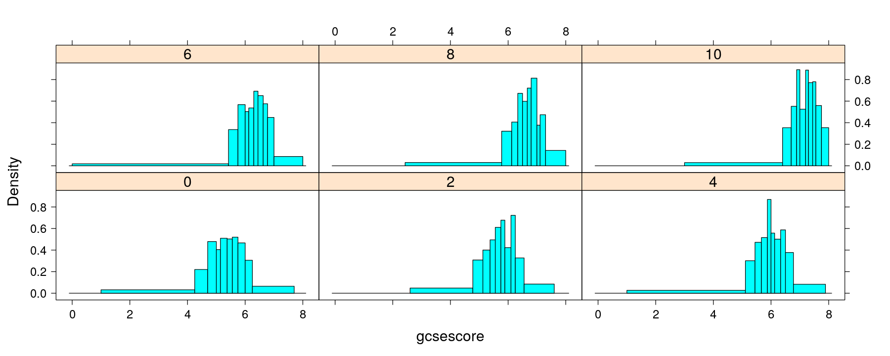
Variations: density plots with triangular kernel (ASH)
densityplot(~ gcsescore | factor(score), data = Chem97, plot.points = FALSE,
            groups = gender, kernel = "triangular")
Variations: bandwidth chosen by biased cross-validation
densityplot(~ gcsescore | factor(score), data = Chem97, plot.points = FALSE,
            groups = gender, bw = "bcv")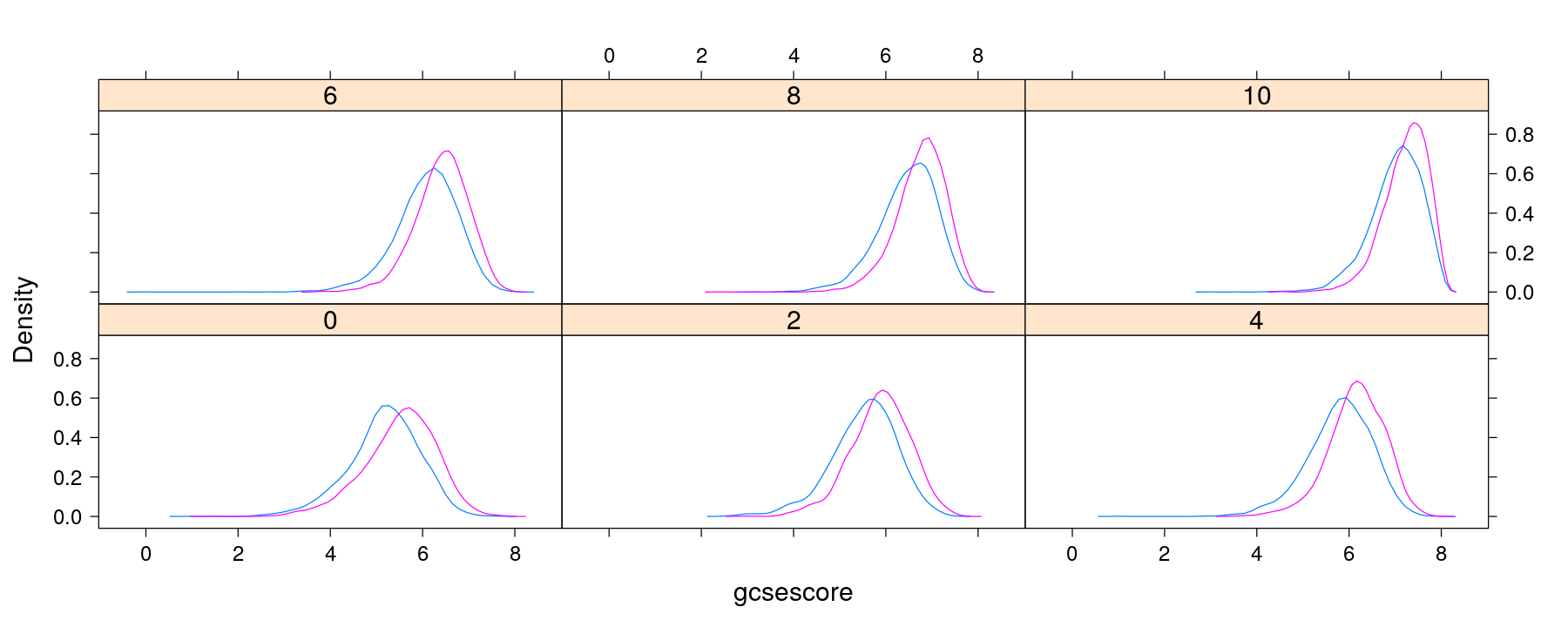
Normal quantile-quantile plots
qqmath(~ gcsescore | factor(score), data = Chem97, groups = gender, auto.key = TRUE,
       grid = TRUE, alpha = 0.2)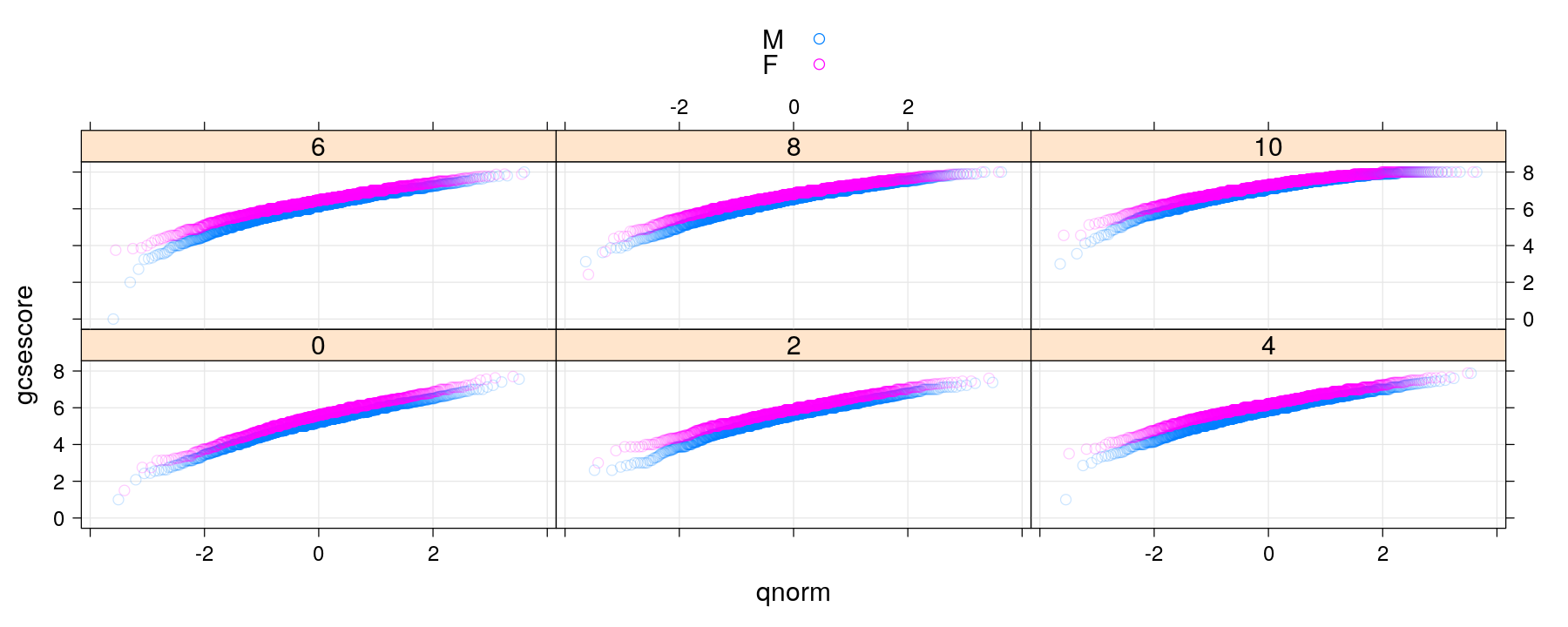
Normal quantile-quantile plots with banking
qqmath(~ gcsescore | factor(score), data = Chem97, groups = gender, auto.key = TRUE, grid = TRUE,
       f.value = ppoints(100),   ## plot fewer quantiles
       aspect = "xy")            ## adjust aspect ratio to 'bank' to 45 degrees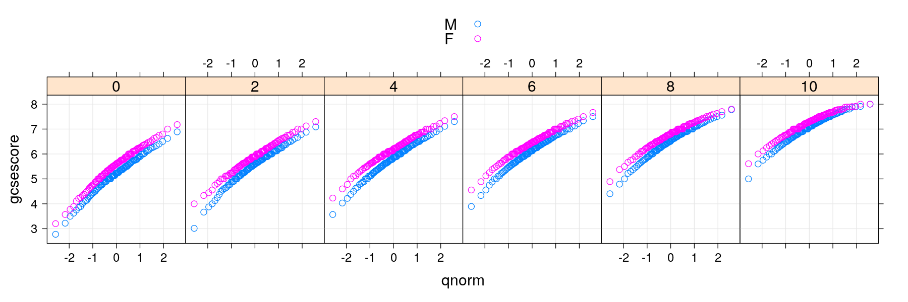
Two-sample quantile-quantile plots
qq(gender ~ gcsescore | factor(score), data = Chem97, grid = TRUE,
   f.value = ppoints(100), aspect = "iso")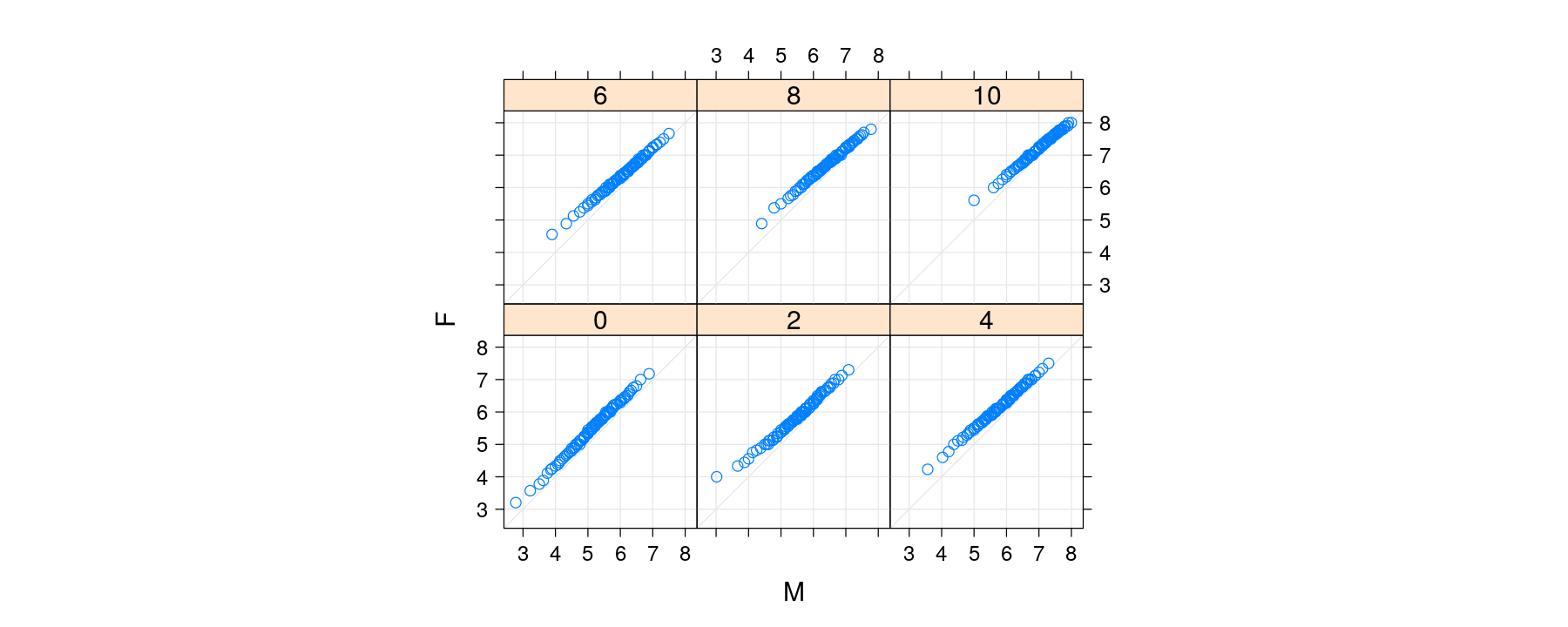
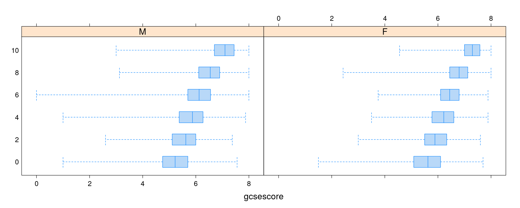
Box and whisker plots for multi-sample comparisons
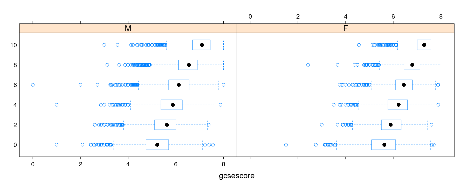
Box and whisker plots with categorical variable on x-axis
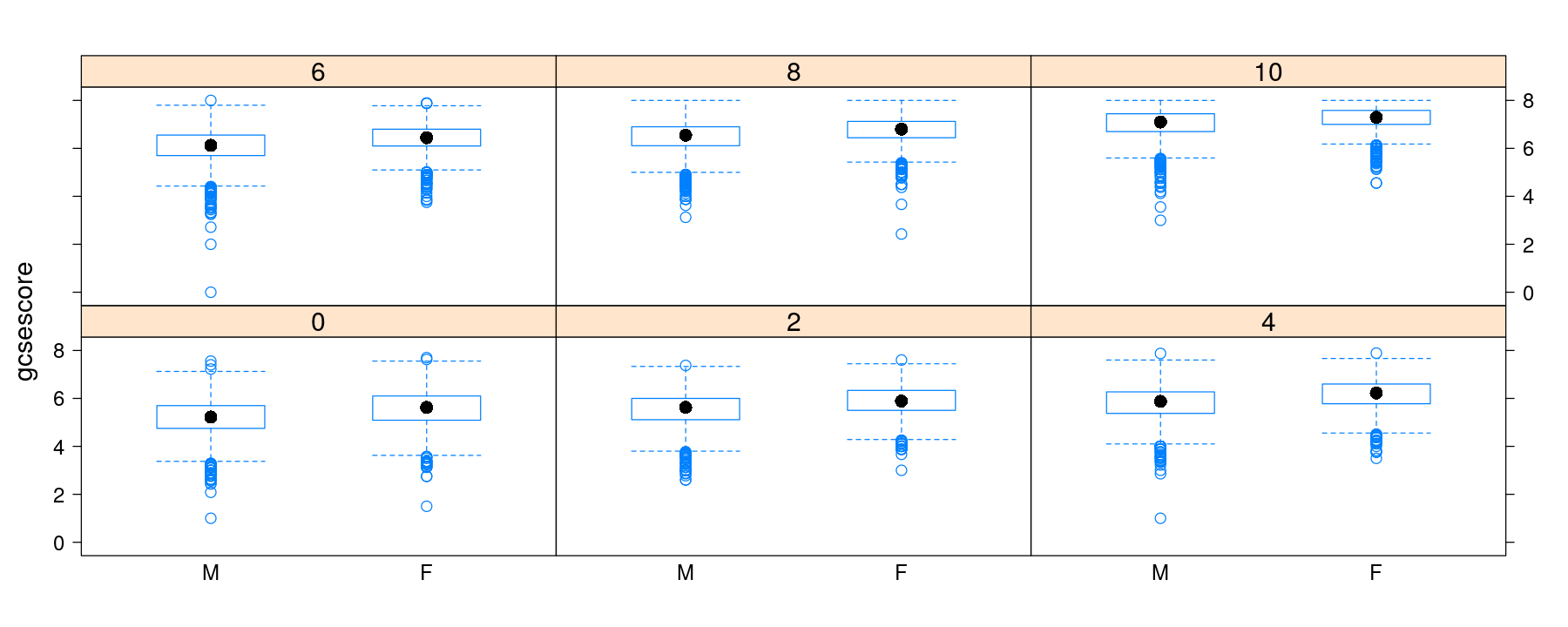
Box and whisker plots with explicit panel layout and gaps
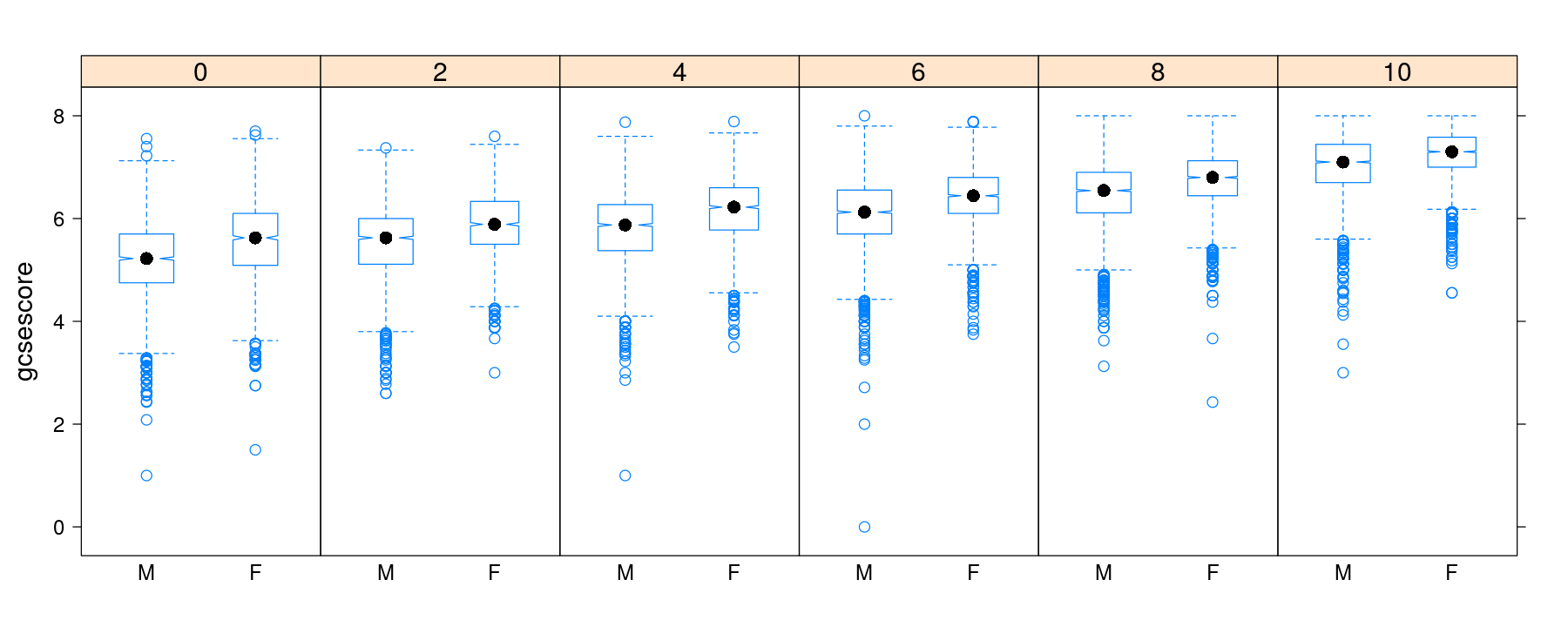
Box and whisker plots with notches and variable width
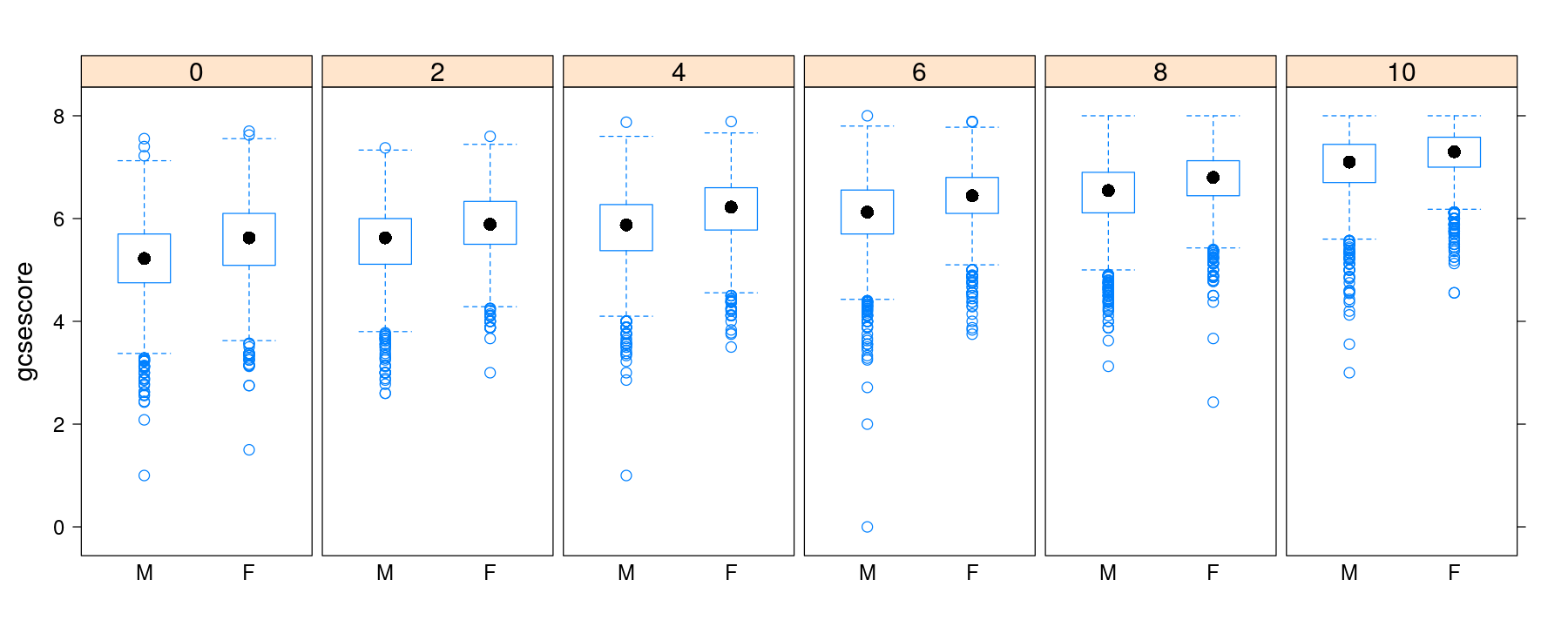
Example: Specifying optional parameters in bwplot()
bwplot(factor(score) ~ gcsescore | gender, Chem97, layout = c(2, 1), coef = 0,
       pch = "|", fill = hcl(h = 240, l = 85))