Lattice Graphics: Annotation, Themes, and Scales
Fuel efficiency by number of cylinders
Fuel efficiency by number of cylinders and weight
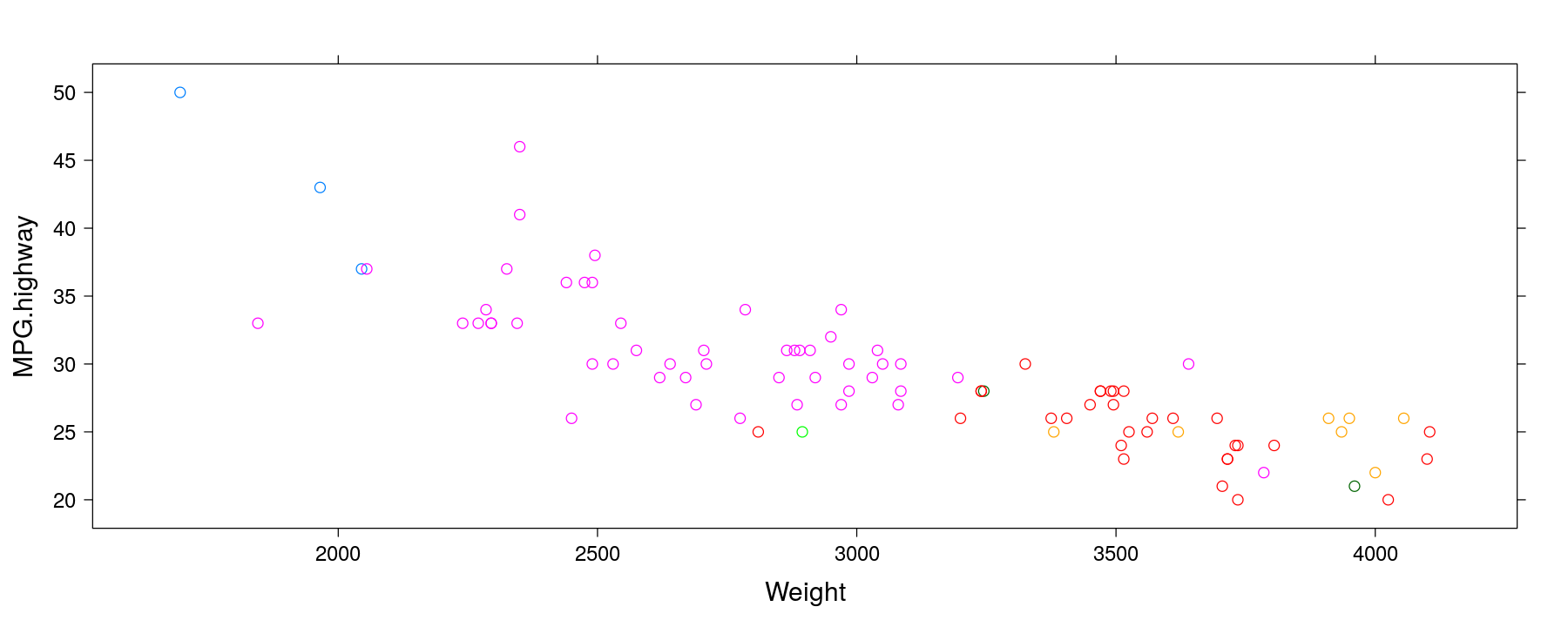
Fuel efficiency by number of cylinders and weight
xyplot(MPG.highway ~ Weight, data = Cars93, groups = Cylinders, grid = TRUE, auto.key = TRUE,
       xlab = "Weight (pounds)", ylab = "Fuel efficiency on highway \n (miles per gallon)",
       main = "Cars on Sale in the USA in 1993")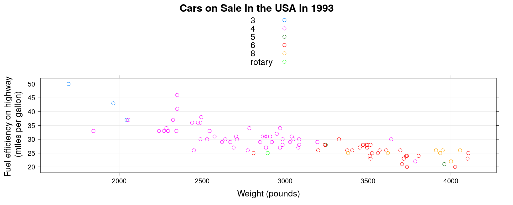
Using auto.key
xyplot(MPG.highway ~ Weight, data = Cars93, groups = Cylinders, grid = TRUE,
       auto.key = list(columns = 6))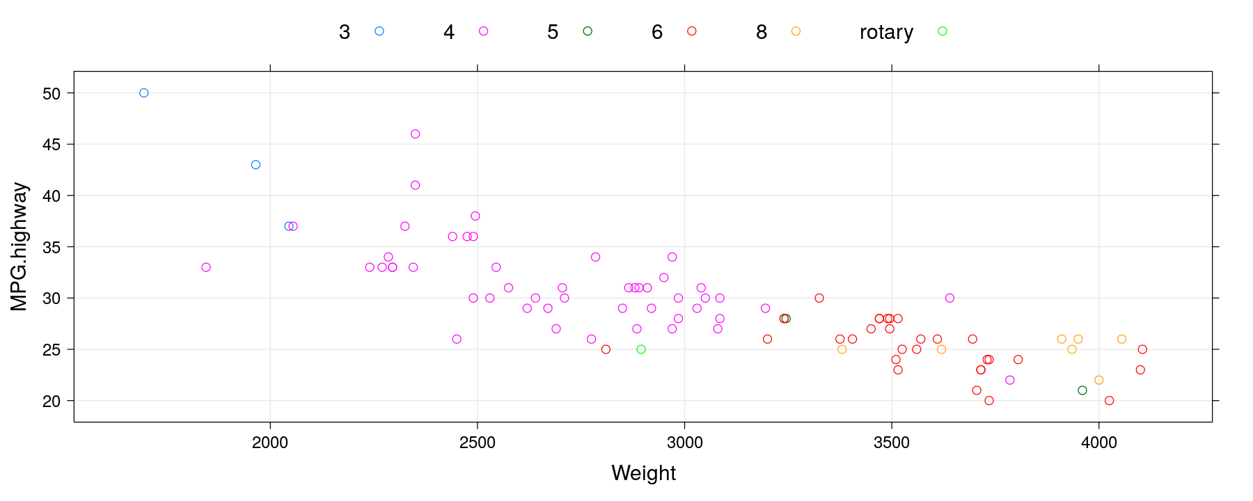
Using auto.key
xyplot(MPG.highway ~ Weight, data = Cars93, groups = Cylinders, grid = TRUE,
       auto.key = list(space = "right", title = "Cylinders"))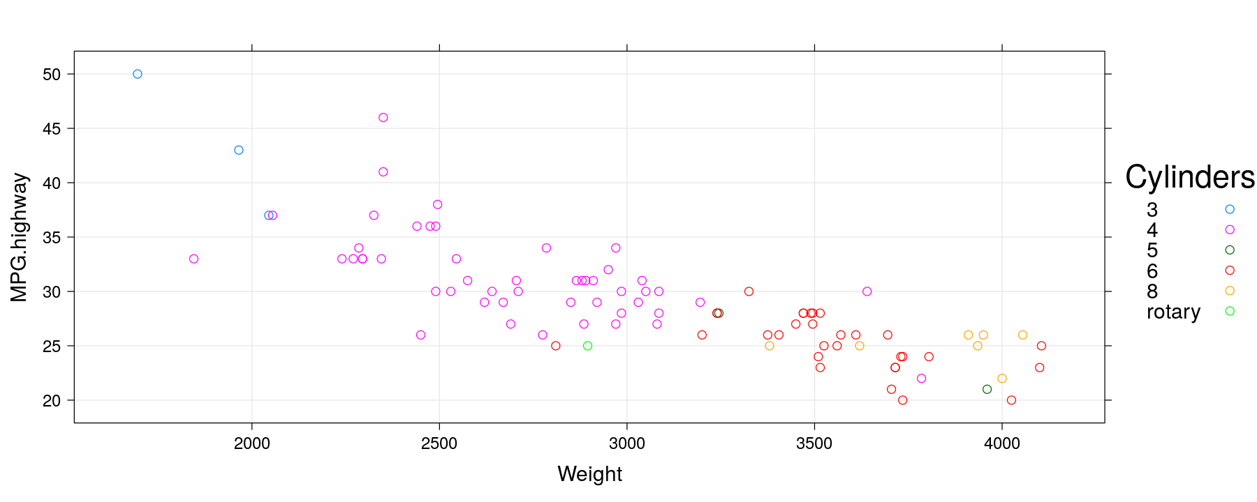
Modifying graphical parameters
xyplot(MPG.highway ~ Weight, data = Cars93, groups = Cylinders, grid = TRUE,
       auto.key = list(space = "right", title = "Cylinders"), pch = 16, cex = 1.5, alpha = 0.5)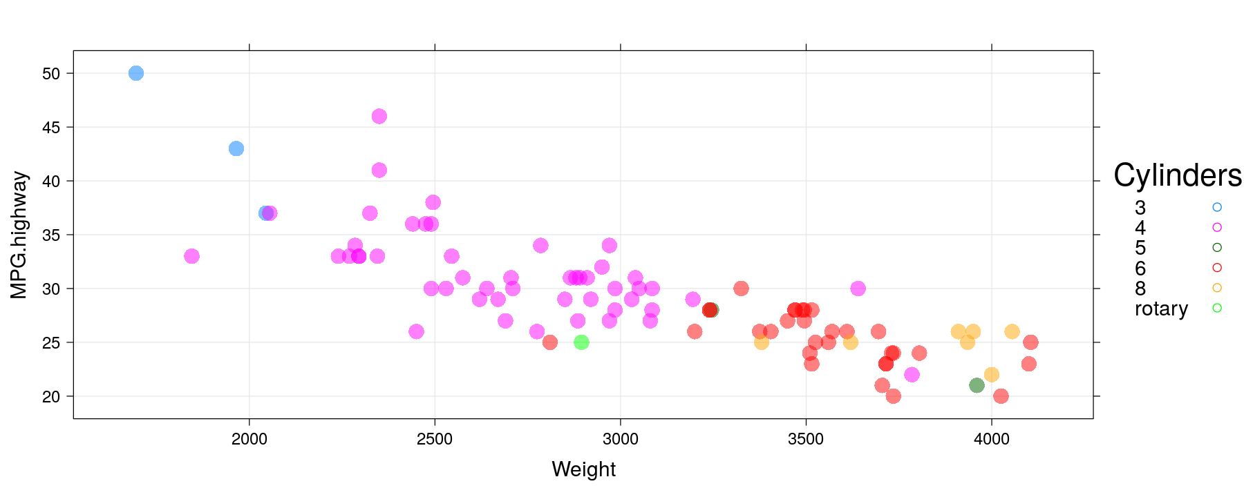
Modifying graphical parameters
xyplot(MPG.highway ~ Weight, data = Cars93, groups = Cylinders, grid = TRUE,
       auto.key = list(space = "right", title = "Cylinders"),
       par.settings = simpleTheme(pch = 16, cex = 1.5, alpha = 0.5))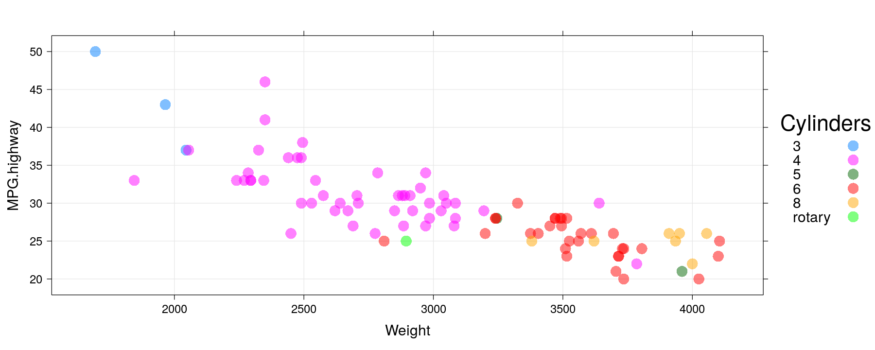
Global themes
trellis.par.set(standard.theme("x11"))                    # 'classic' S-PLUS theme
xyplot(MPG.highway ~ Weight, data = Cars93, groups = Cylinders,
       auto.key = list(space = "right", title = "Cylinders"),
       par.settings = simpleTheme(pch = 16, cex = 1.5))   # further customization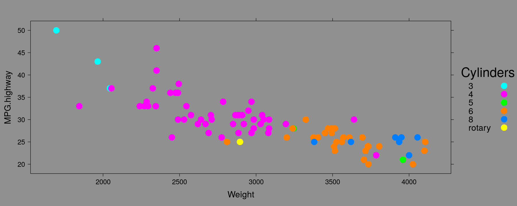
Global themes
trellis.par.set(standard.theme(color = FALSE))            # black and white theme
xyplot(MPG.highway ~ Weight, data = Cars93, groups = Cylinders,
       par.settings = simpleTheme(cex = 1.5),
       auto.key = list(space = "right", title = "Cylinders", padding.text = 4))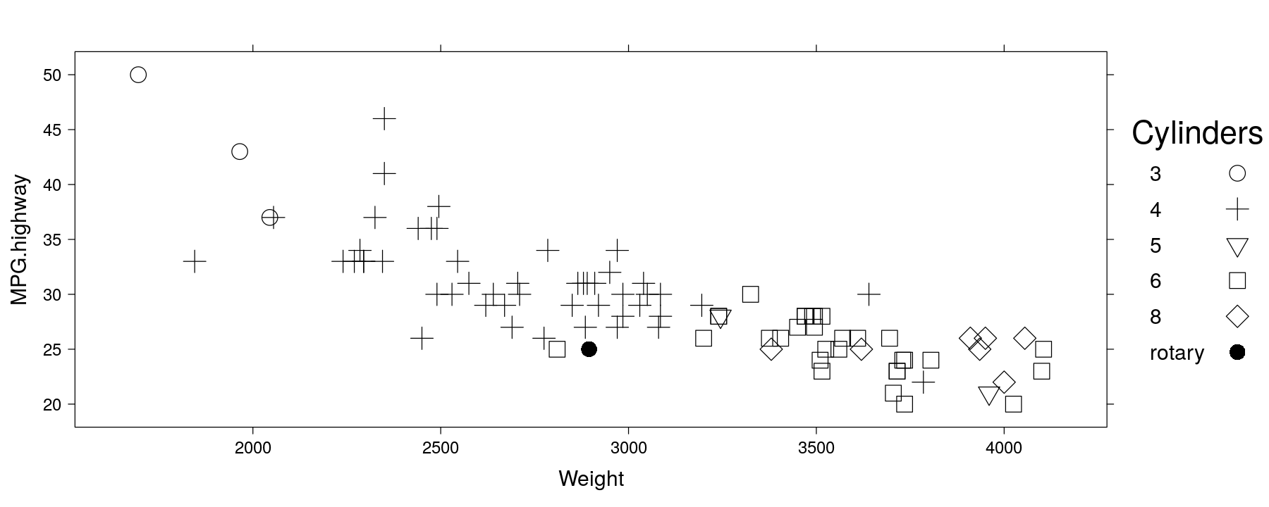
Global themes
library(package = "latticeExtra")
trellis.par.set(theEconomist.theme())                     # The Economist theme
xyplot(MPG.highway ~ Weight, data = Cars93, groups = Cylinders,
       auto.key = list(space = "right", title = "Cylinders"))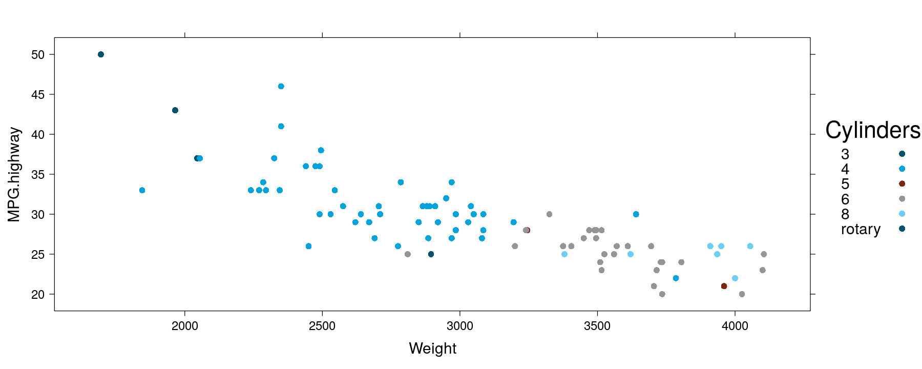
Global themes
library(package = "latticeExtra")
trellis.par.set(ggplot2like())                                  # ggplot2 theme
xyplot(MPG.highway ~ Weight, data = Cars93, groups = Cylinders,
       auto.key = list(space = "right", title = "Cylinders"))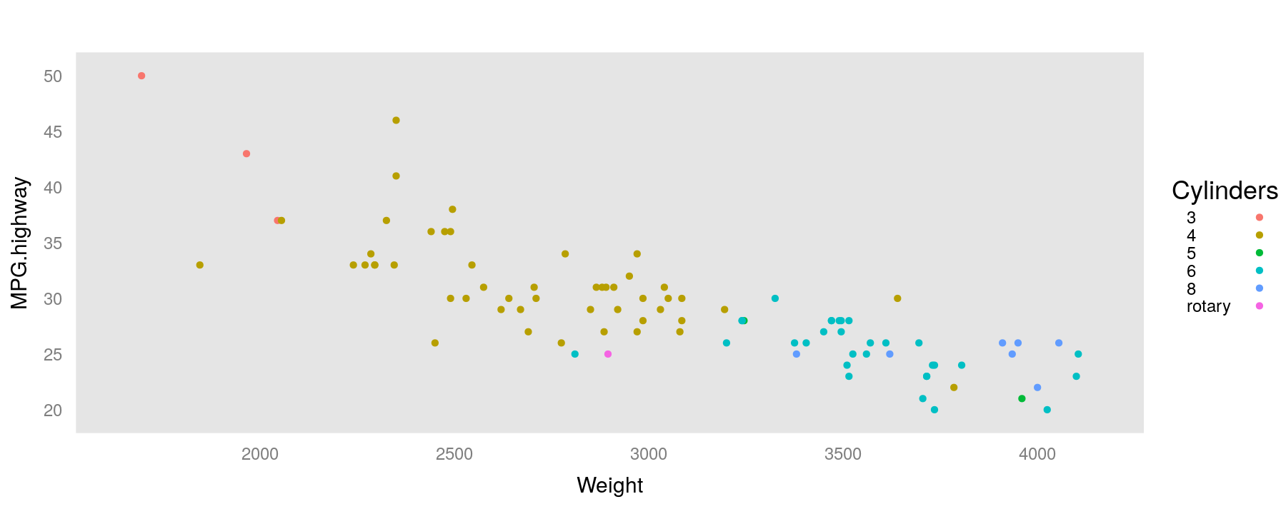
Global themes and global settings
trellis.device(new = FALSE, retain = FALSE) # reset to default theme
xyplot(MPG.highway ~ Weight, data = Cars93, groups = Cylinders,
       auto.key = list(space = "right", title = "Cylinders"),
       par.settings = ggplot2like(), lattice.options = ggplot2like.opts())
Global themes and global settings
xyplot(MPG.highway ~ Weight, data = Cars93, groups = Cylinders,
       par.settings = custom.theme(hcl.colors(6, "Dark 3"), pch = 16, cex = 1.2, alpha = 0.5),
       auto.key = list(space = "right", title = "Cylinders")) # user-provided colors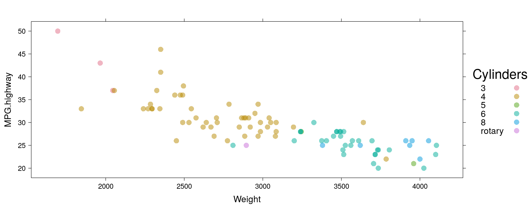
Themes and legends in other high-level plots
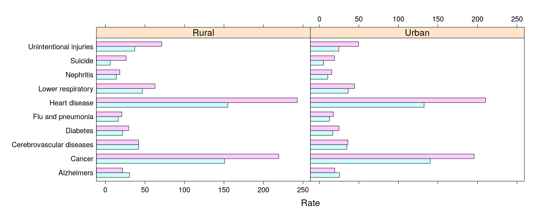
Themes and legends in other high-level plots
barchart(Cause ~ Rate | Status, data = USMortality, groups = Sex, auto.key = list(columns = 2),
         origin = 0, par.settings = custom.theme(fill = hcl.colors(2, "Pastel 1")))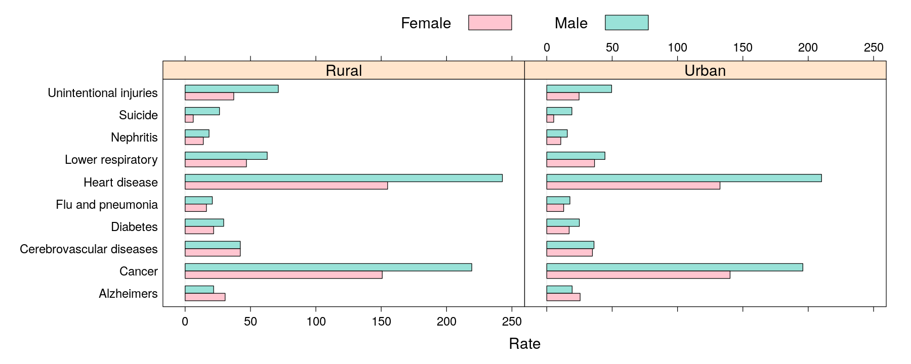
Themes and legends in other high-level plots
barchart(reorder(Cause, Rate) ~ Rate | Sex, data = USMortality, groups = Status,
         auto.key = list(columns = 2), origin = 0, stack = TRUE,
         par.settings = custom.theme(fill = hcl.colors(2, "Pastel 1")))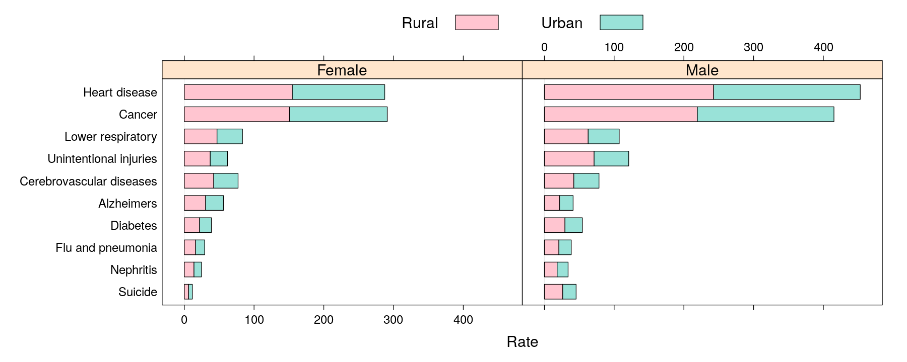
Themes and legends in other high-level plots
dotplot(reorder(Cause, Rate, mean) ~ Rate | Sex, data = USMortality, groups = Status,
        auto.key = list(columns = 2),
        par.settings = custom.theme(pch = 16, col = hcl.colors(2, "Dark 3")))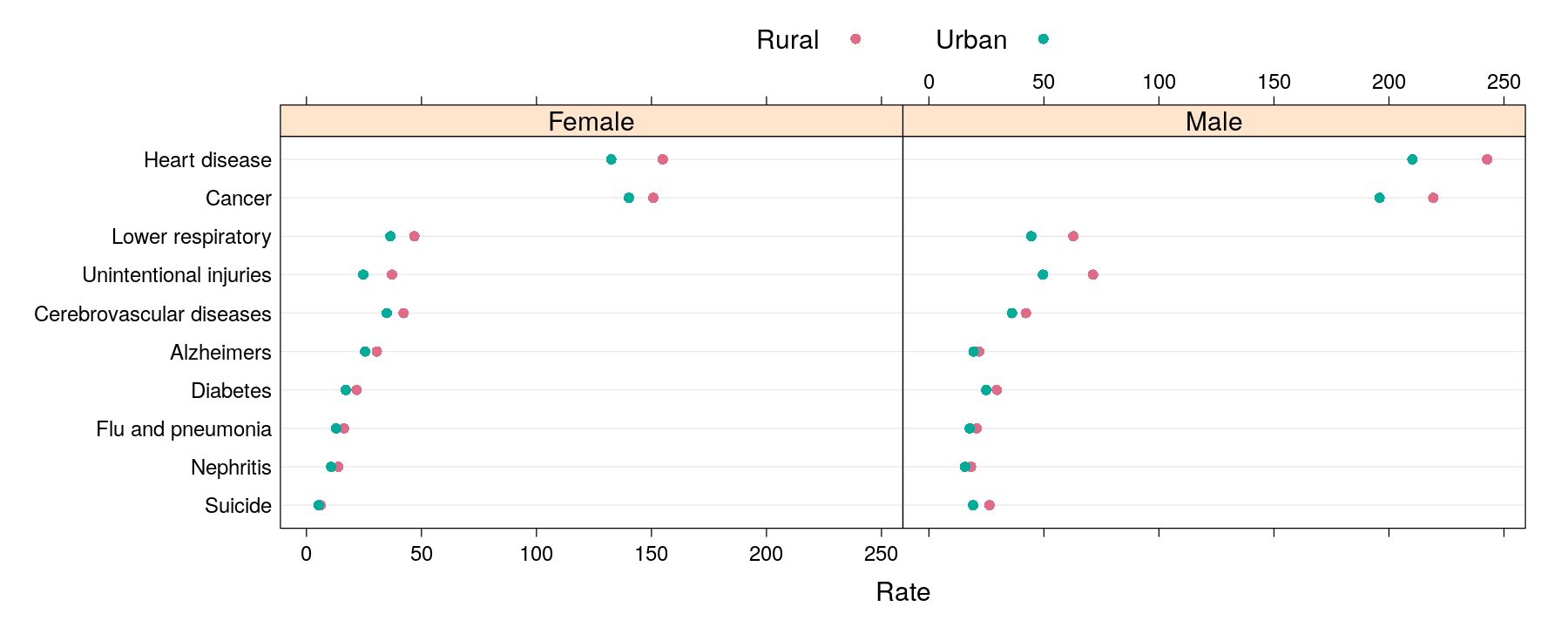
Finer control of scales: examples
dotplot(reorder(Cause, Rate, mean) ~ Rate | Sex, data = USMortality, groups = Status,
        auto.key = list(space = "right"),
        par.settings = simpleTheme(pch = 16), scales = list(x = list(relation = "free")))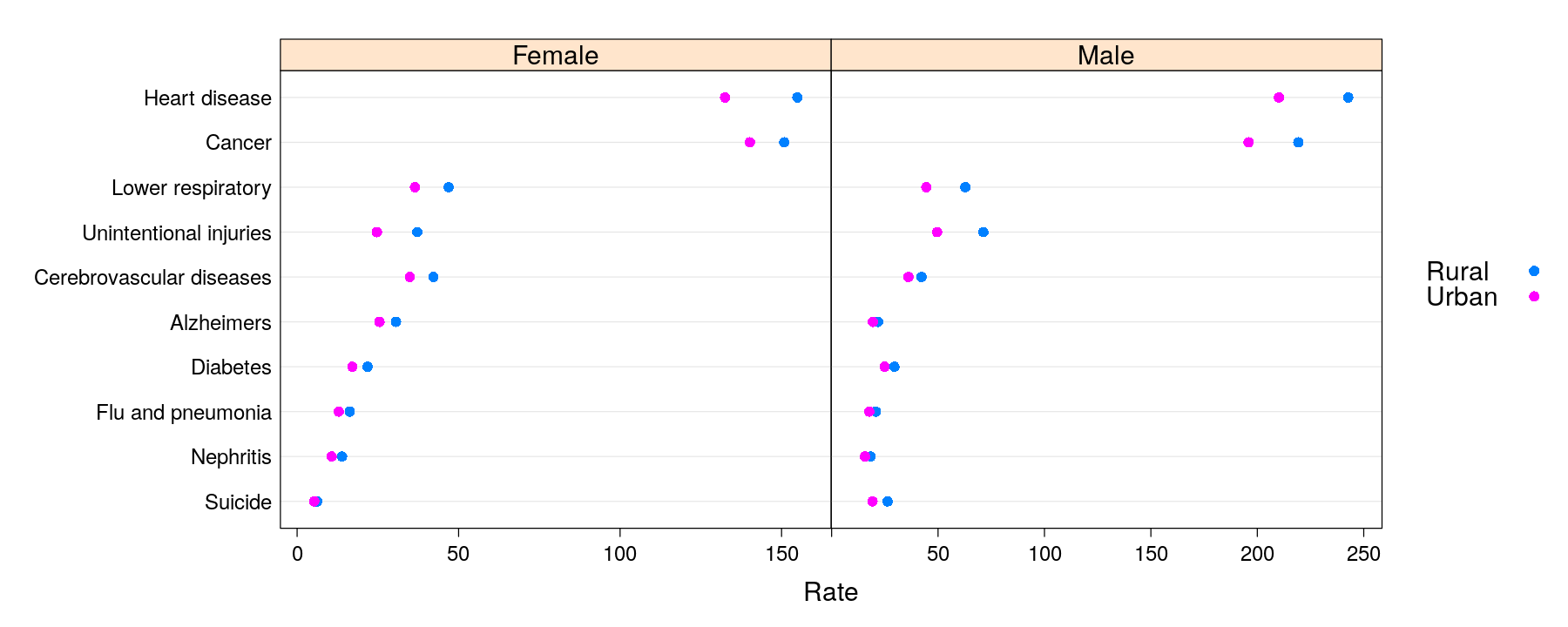
Finer control of scales: examples
dotplot(reorder(Cause, Rate, mean) ~ Rate | Sex, data = USMortality, groups = Status,
        auto.key = list(space = "right"), par.settings = simpleTheme(pch = 16),
        scales = list(x = list(log = TRUE, alternating = 3)))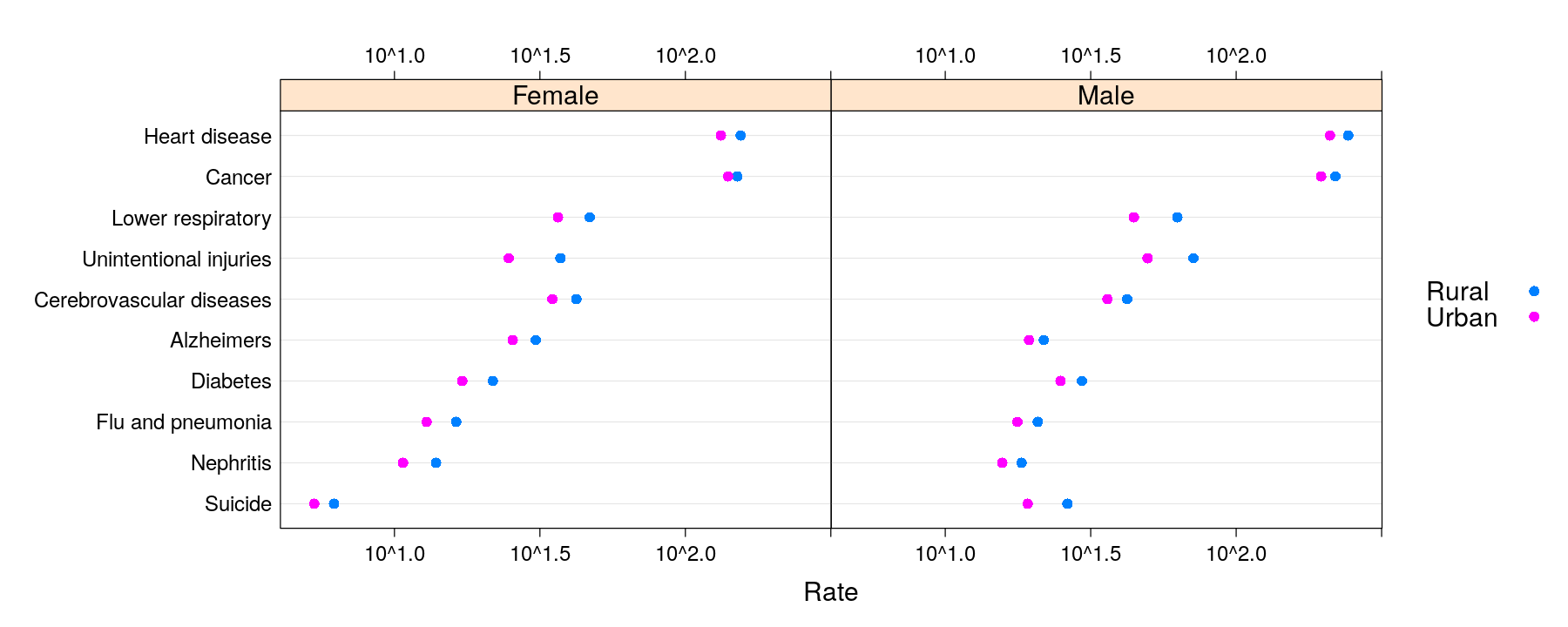
Finer control of scales: examples
dotplot(reorder(Cause, Rate, mean) ~ Rate | Status, data = USMortality, groups = Sex,
        auto.key = list(space = "right"), par.settings = simpleTheme(pch = 16),
        scales = list(x = list(log = TRUE, equispaced.log = FALSE, alternating = FALSE)))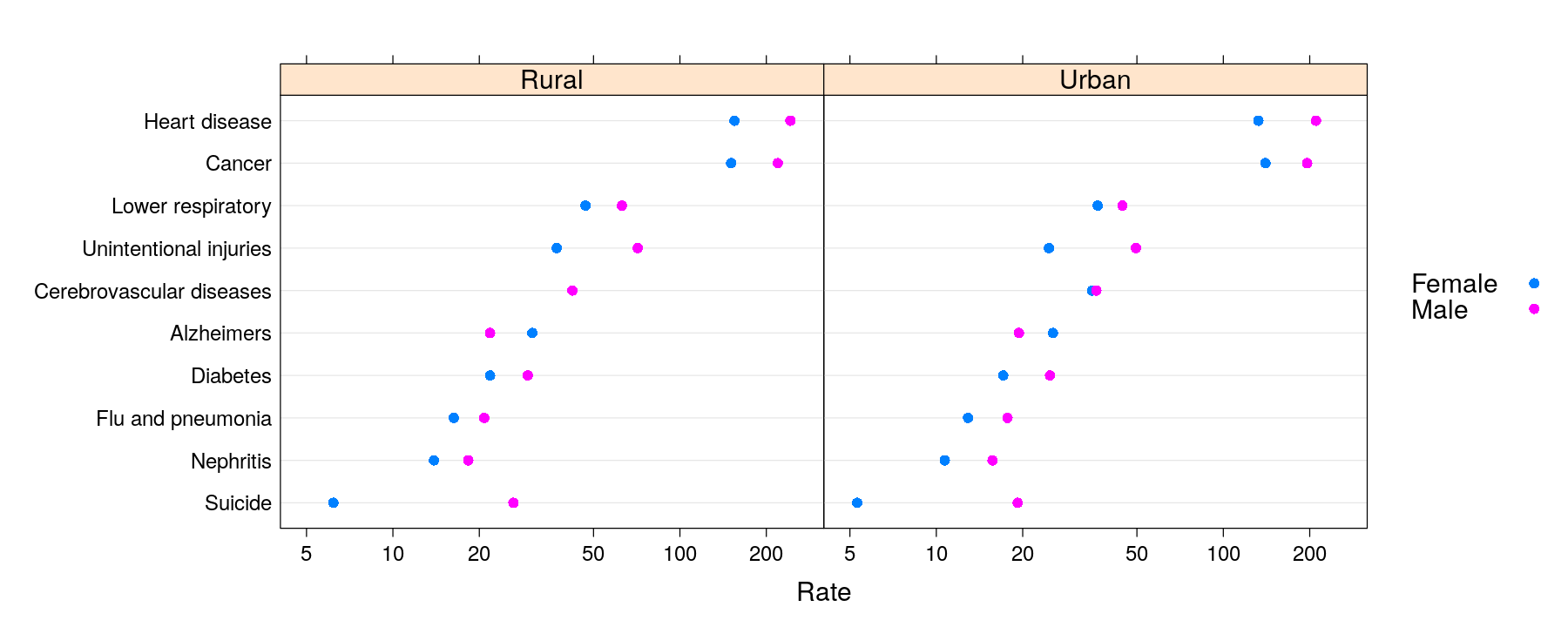
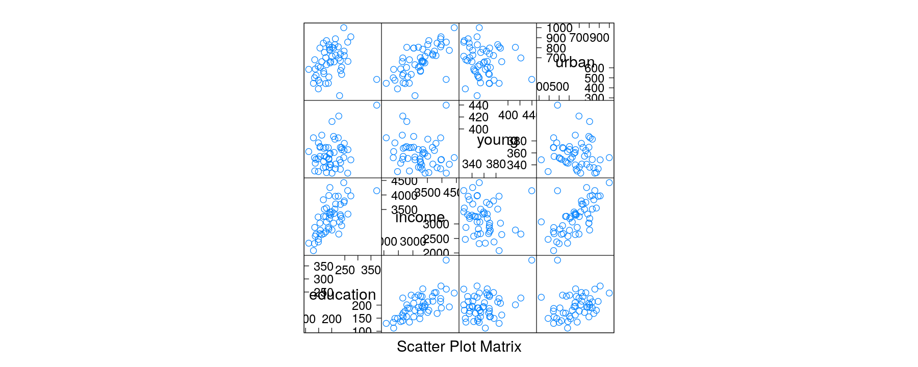
Anscombe data: model education expenditure
Scatter plot with multiple terms
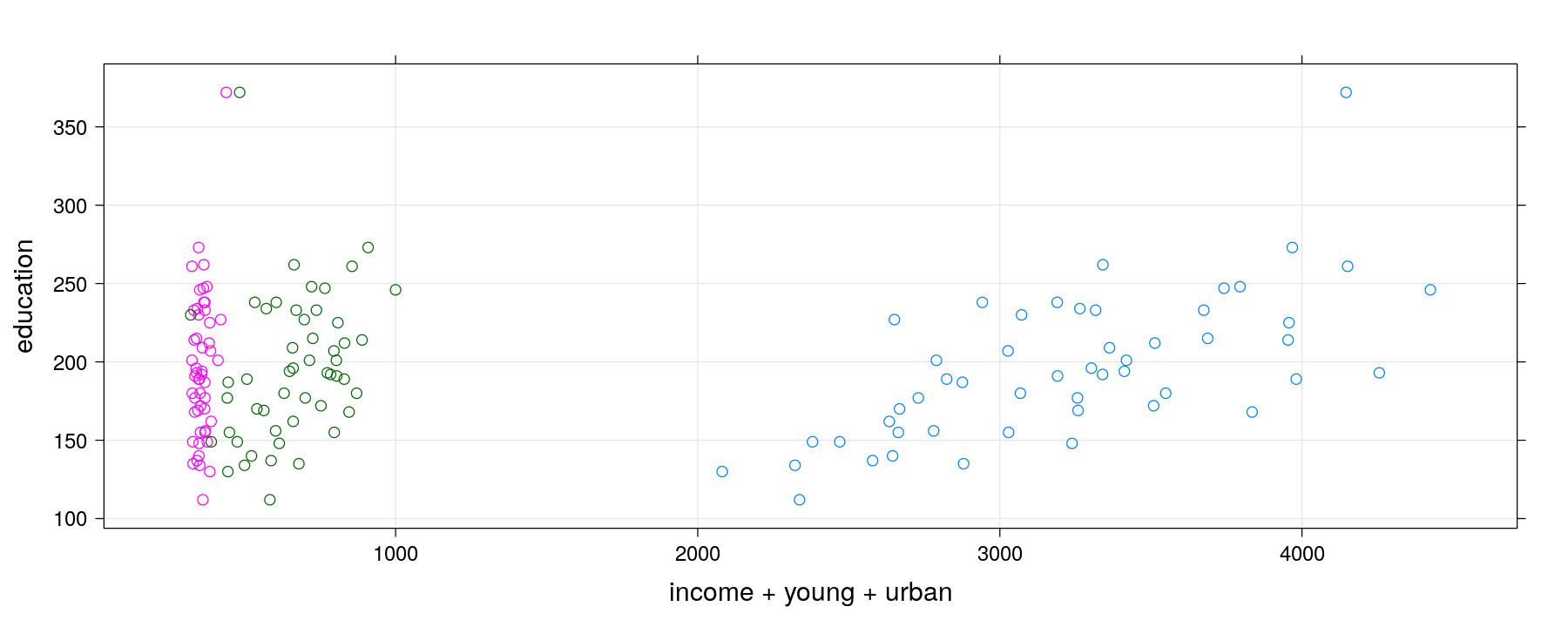
Scatter plot with multiple terms
Scatter plot with multiple terms
xyplot(education ~ income + young + urban, data = Anscombe, outer = TRUE, grid = TRUE,
       scales = list(x = list(relation = "free")))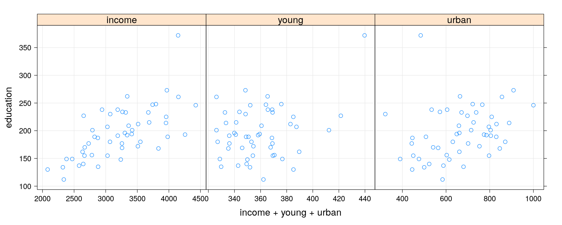
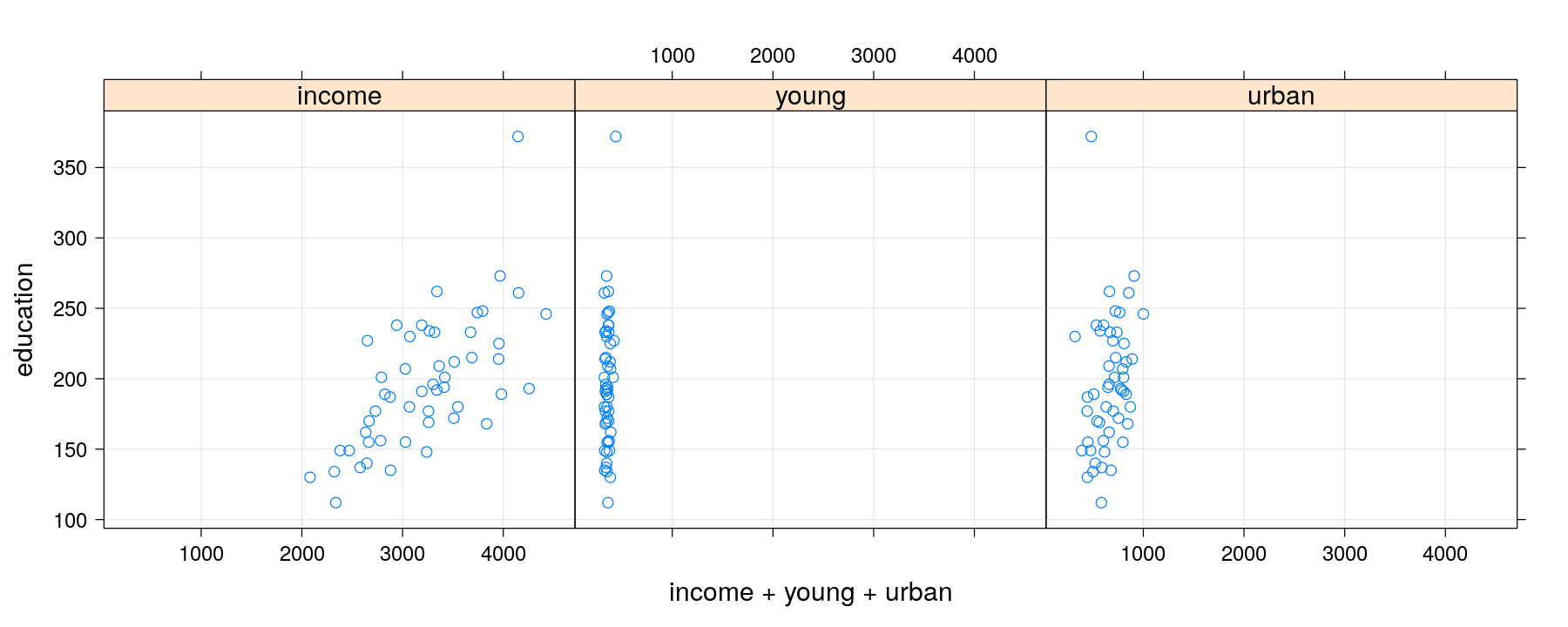
Scatter plot with multiple terms
xyplot(education ~ income + young + urban, data = Anscombe, outer = TRUE, grid = TRUE,
       scales = list(x = list(relation = "free")), between = list(x = 1),
       xlab = "predictor") # strips indicate term; safer for arbitrary layouts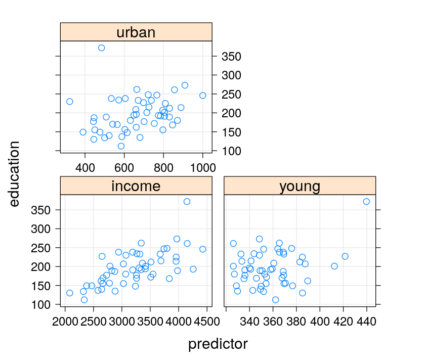
Scatter plot with multiple terms
xyplot(education ~ income + young + urban, data = Anscombe, outer = TRUE, grid = TRUE,
       scales = list(x = list(relation = "free")), between = list(x = 1), strip = FALSE,
       xlab = c("income", "young", "urban"), layout = c(3, 1)) # vector labels (fixed layout)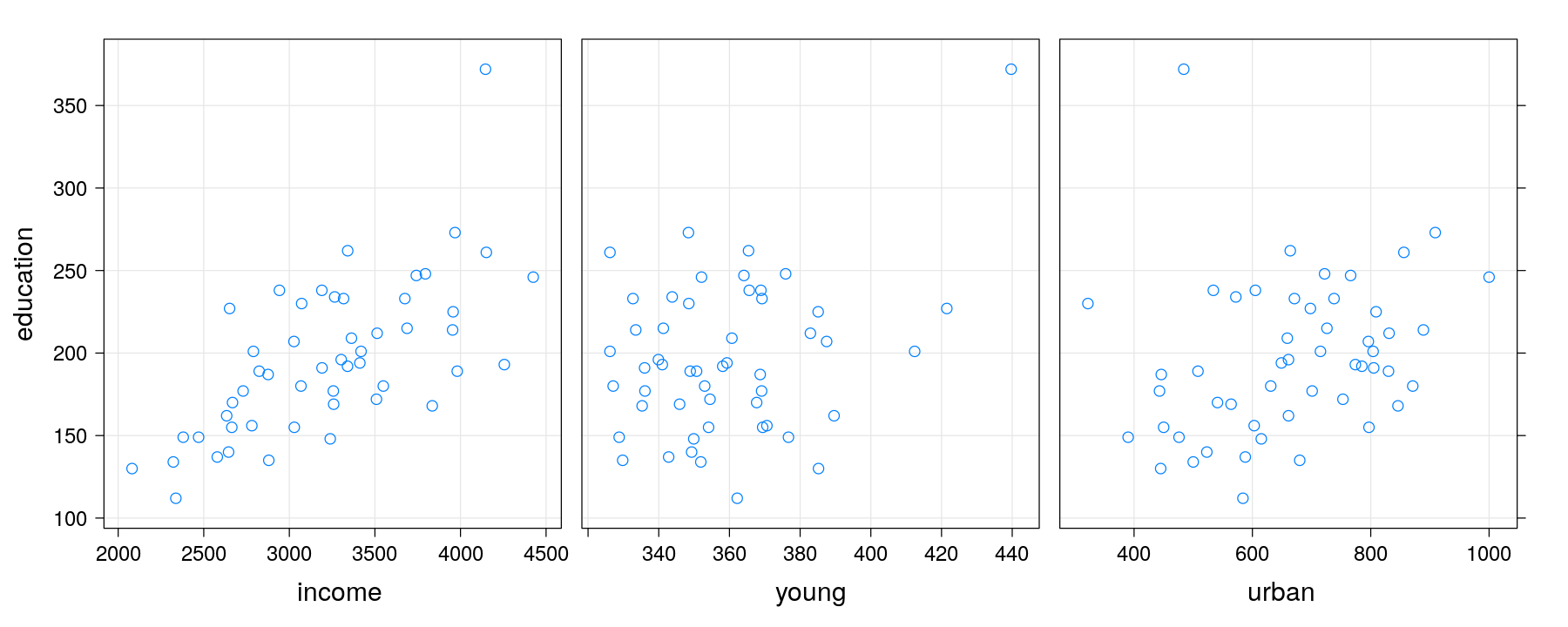
Exercises
Another class of useful methods are
barchart()anddotplot()methods for tables (array, matrix, etc.)Use these methods to recreate the following plots for the
VADeathsdata set (see?dotplot.table)