Lattice Graphics: Custom Panel Functions and Layers
Datasets for illustration
xyplot(conc ~ time | Subject, data = Indometh, strip = FALSE, layout = c(6, 1),
       pch = 16, grid = TRUE, xlab = "Time since indometacin injection (hr)",
       ylab = "Plasma concentrations of \n indometacin (mcg/ml)")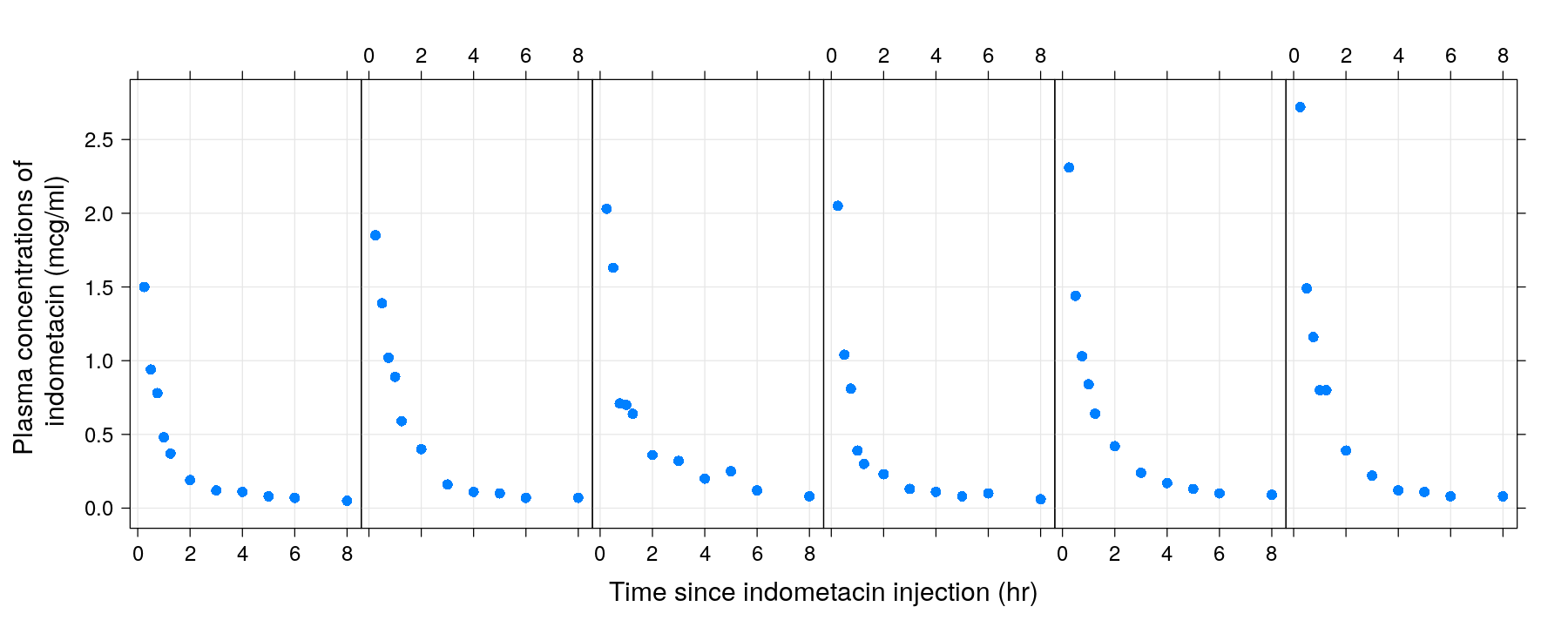
Datasets for illustration
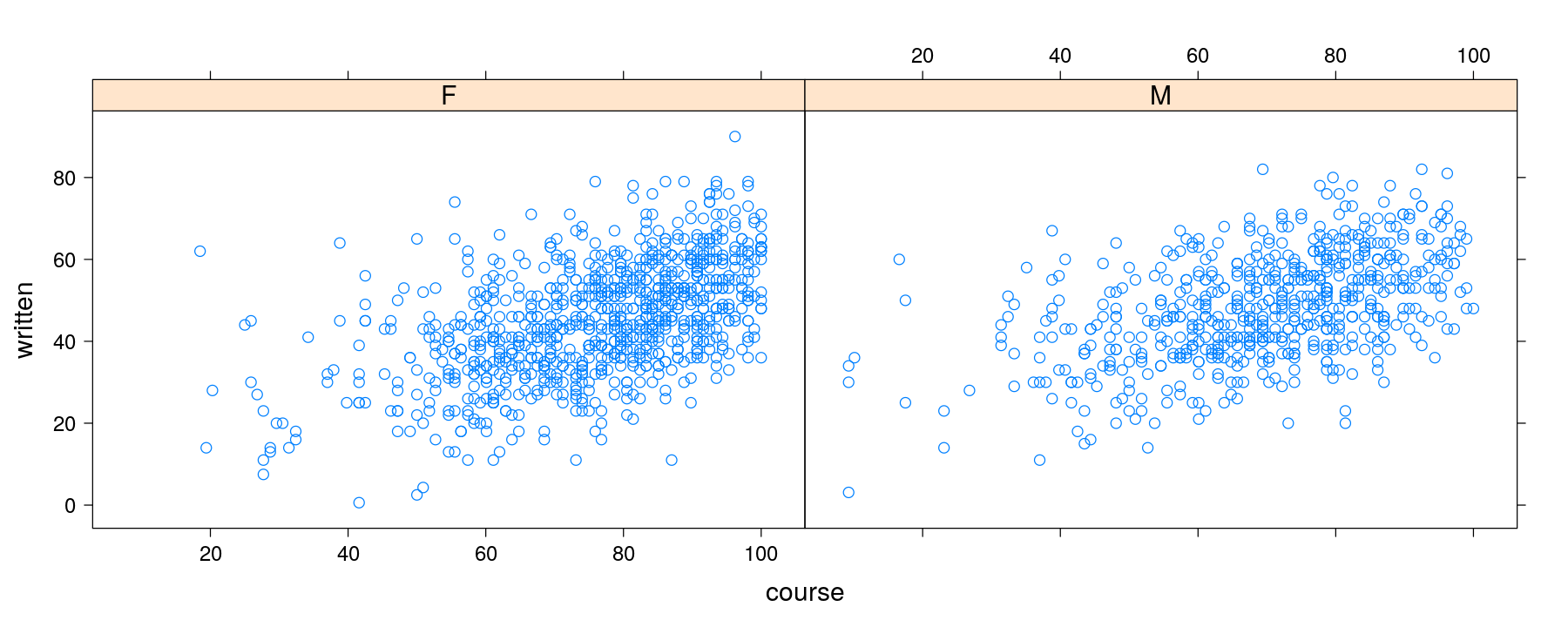
xyplot(written ~ course | gender, data = Gcsemv, grid = TRUE,
       xlab = "Coursework score", ylab = "Written exam score")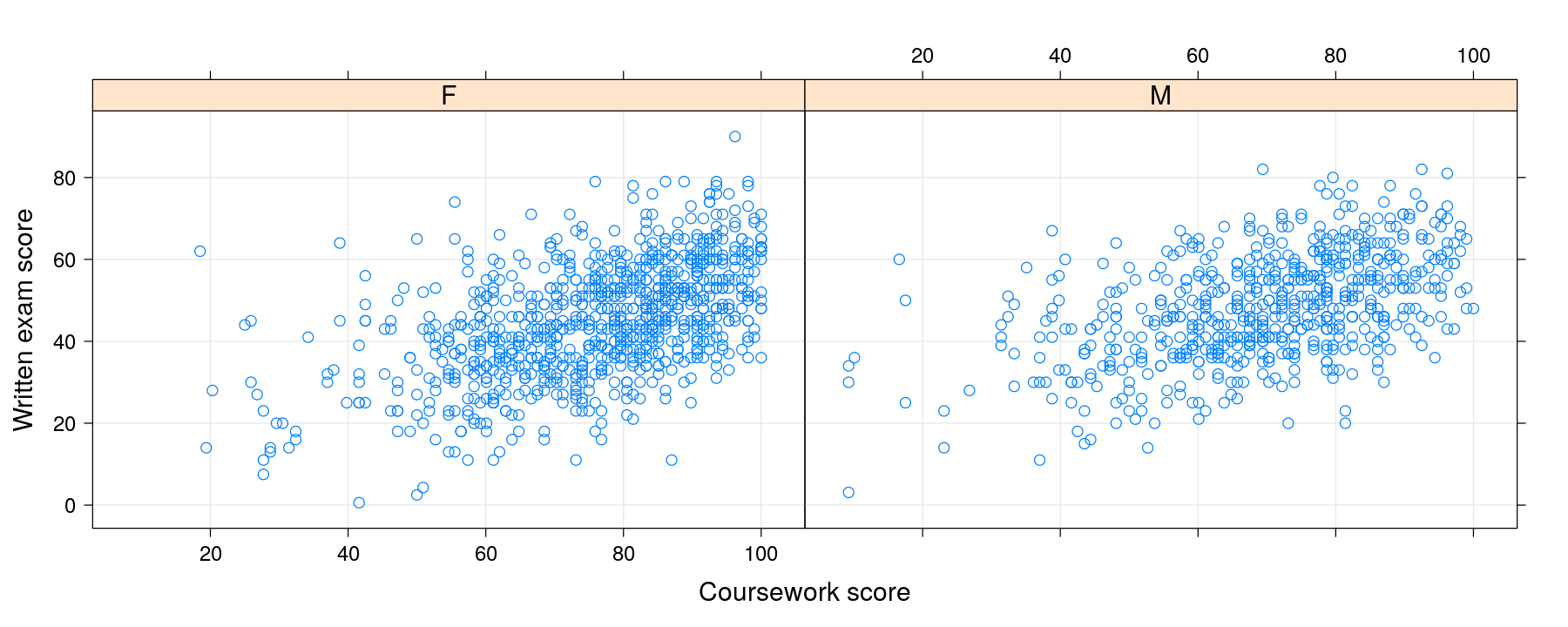
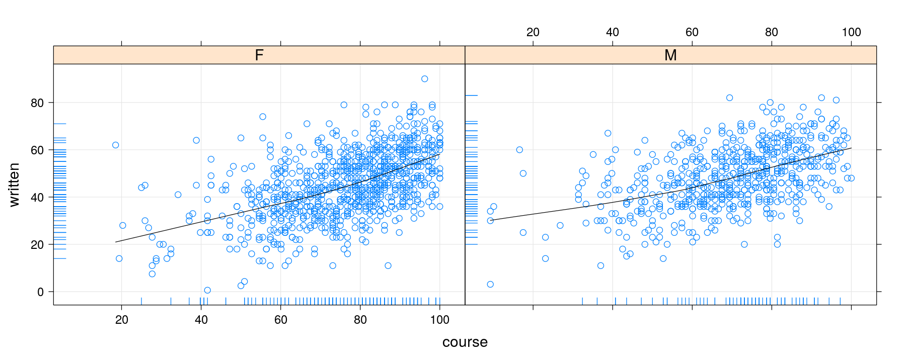
Adding smoothers
xyplot(written ~ course | gender, data = Gcsemv, grid = TRUE,
       type = c("p", "smooth"), col.line = "black")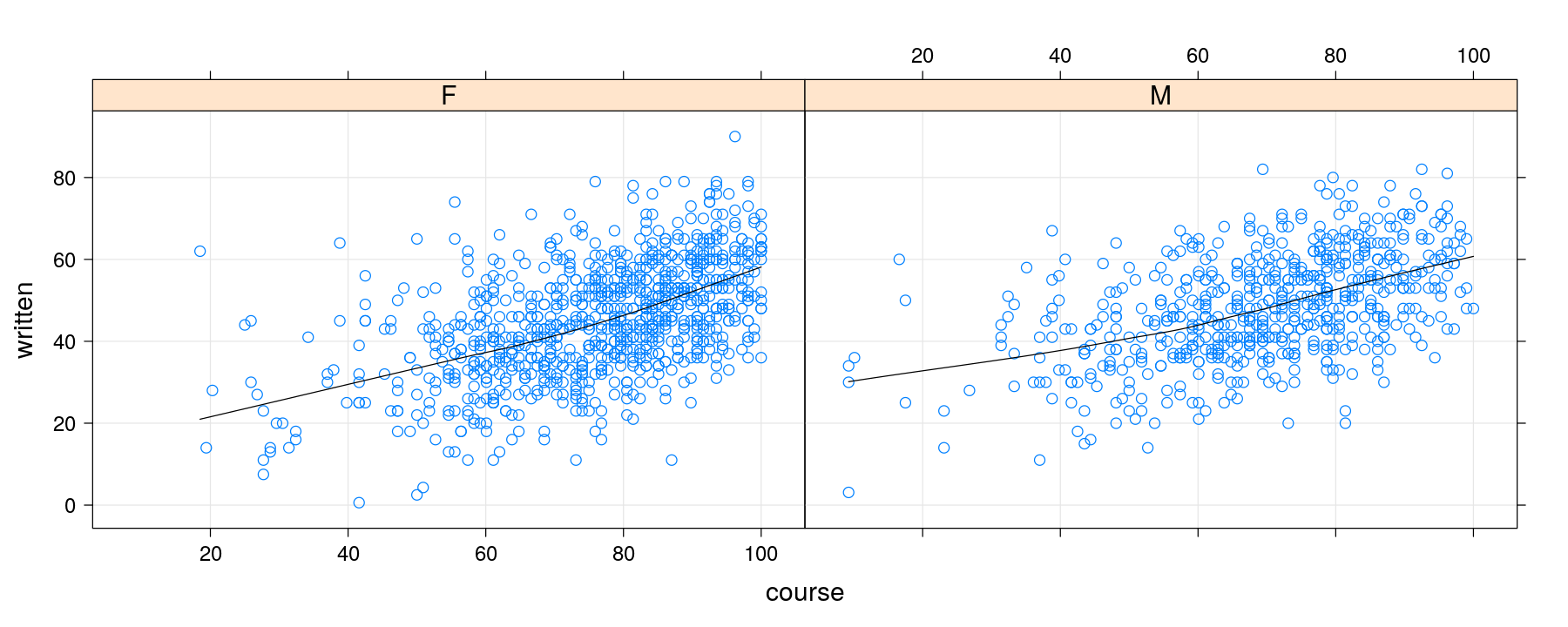
Understanding how panel functions work
Understanding how panel functions work
The ... argument
- As noted earlier,
panel.xyplot()itself directly supports these enhancements (except the rug)
xyplot(written ~ course | gender, data = Gcsemv,
       panel = function(x, y) {
           panel.xyplot(x, y, grid = TRUE, type = c("p", "smooth"), col.line = "black")
       })
The ... argument
xyplotuses the...mechanism to pass arguments to its panel functionSo these arguments can be directly supplied to
xyplot()
xyplot(written ~ course | gender, data = Gcsemv, grid = TRUE,
       type = c("p", "smooth"), col.line = "black")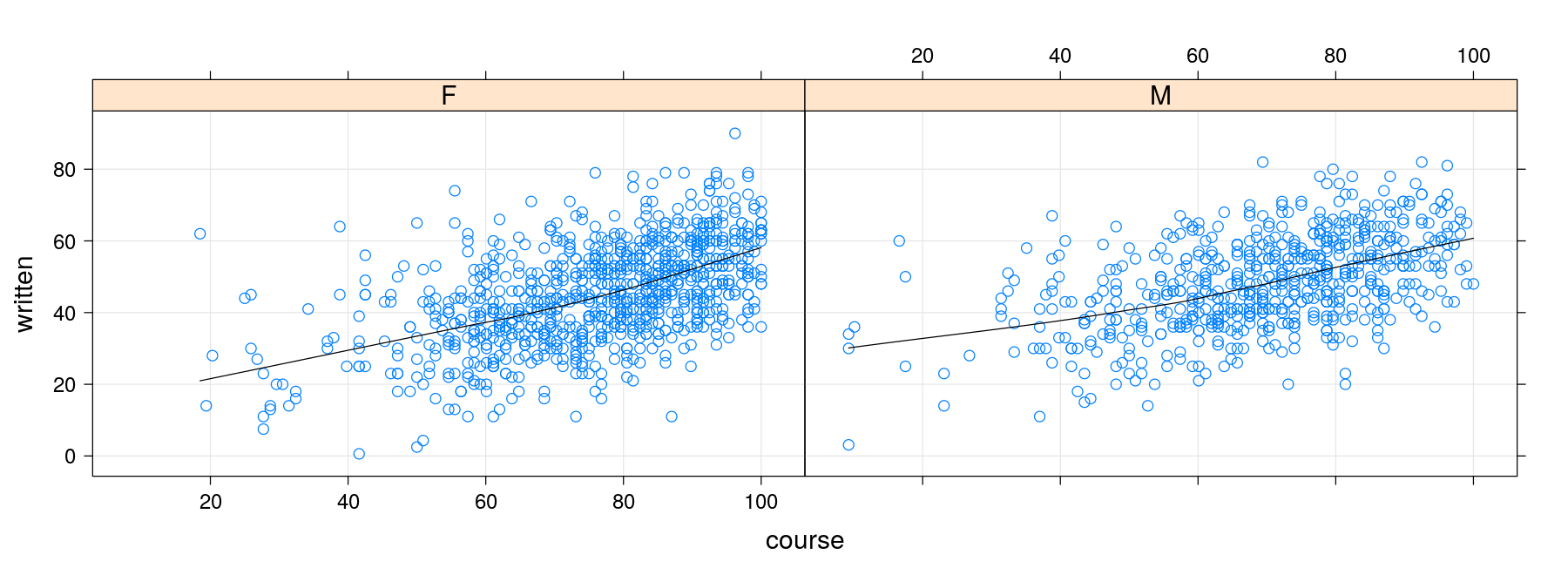
Alternative approach using layers
library(latticeExtra)
p <- xyplot(written ~ course | gender, data = Gcsemv, grid = TRUE)
p + layer(panel.loess(x, y, col = "black")) + layer(panel.rug(x[is.na(y)], y[is.na(x)]))
Alternative approach using layers
p <- xyplot(written ~ course | gender, data = Gcsemv, grid = TRUE)
p + layer(panel.smoother(x, y, method = "loess")) + layer(panel.rug(x[is.na(y)], y[is.na(x)]))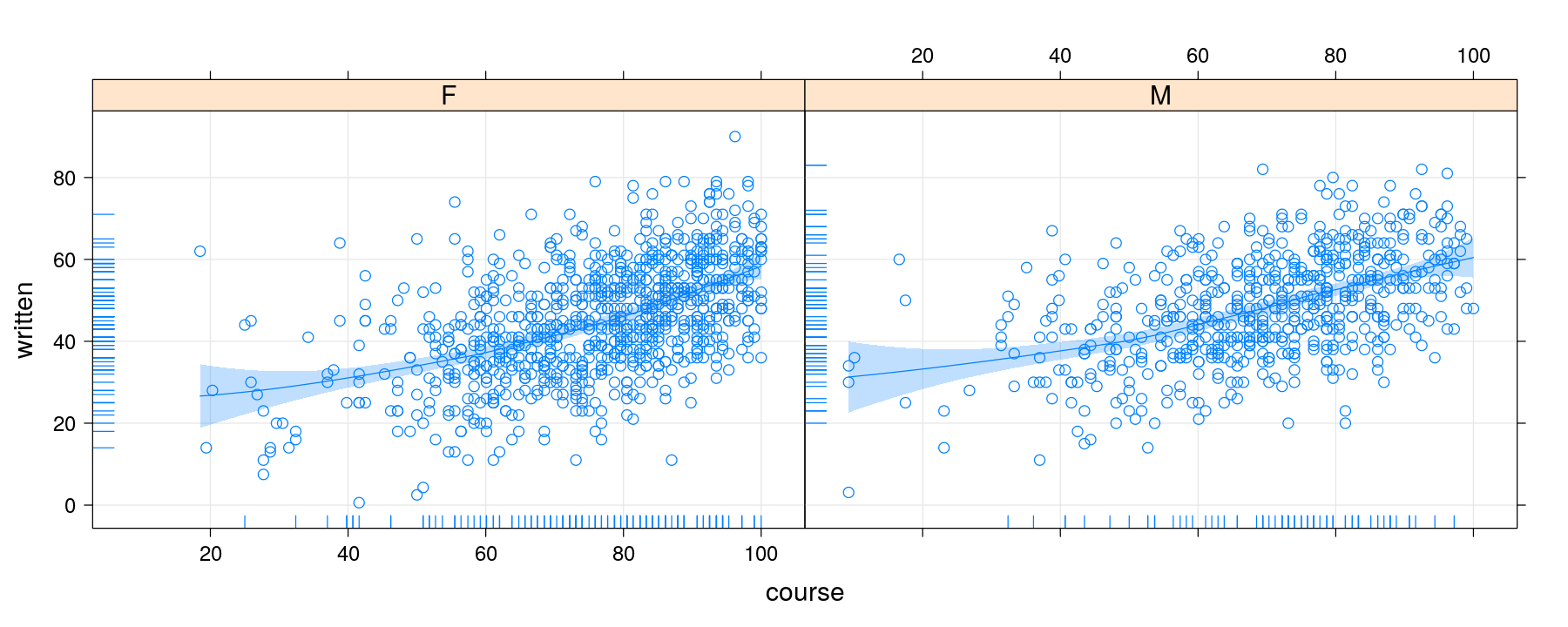
Alternative approach using layers
p <- xyplot(written ~ course | gender, data = Gcsemv, grid = TRUE)
p + layer(panel.smoother(x, y, method = "lm", form = y ~ poly(x, 2)))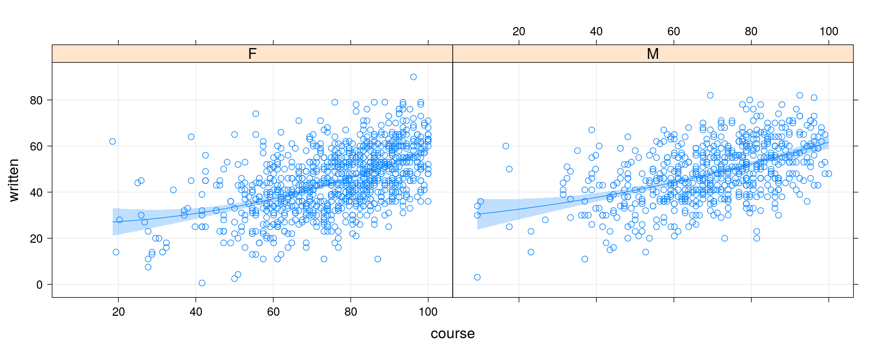
Fitting non-standard models
p <- xyplot(conc ~ time | Subject, data = Indometh, strip = FALSE,
            layout = c(6, 1), pch = 16, grid = TRUE)
p + layer(panel.abline(lm(y ~ x), col = "grey40"))      # clearly inappropriate model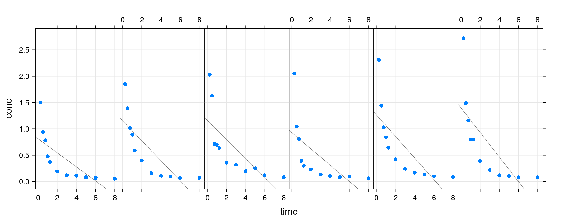
Fitting non-standard models
- Without thinking too much, try a simple linear regression model with
1/timeas predictor.
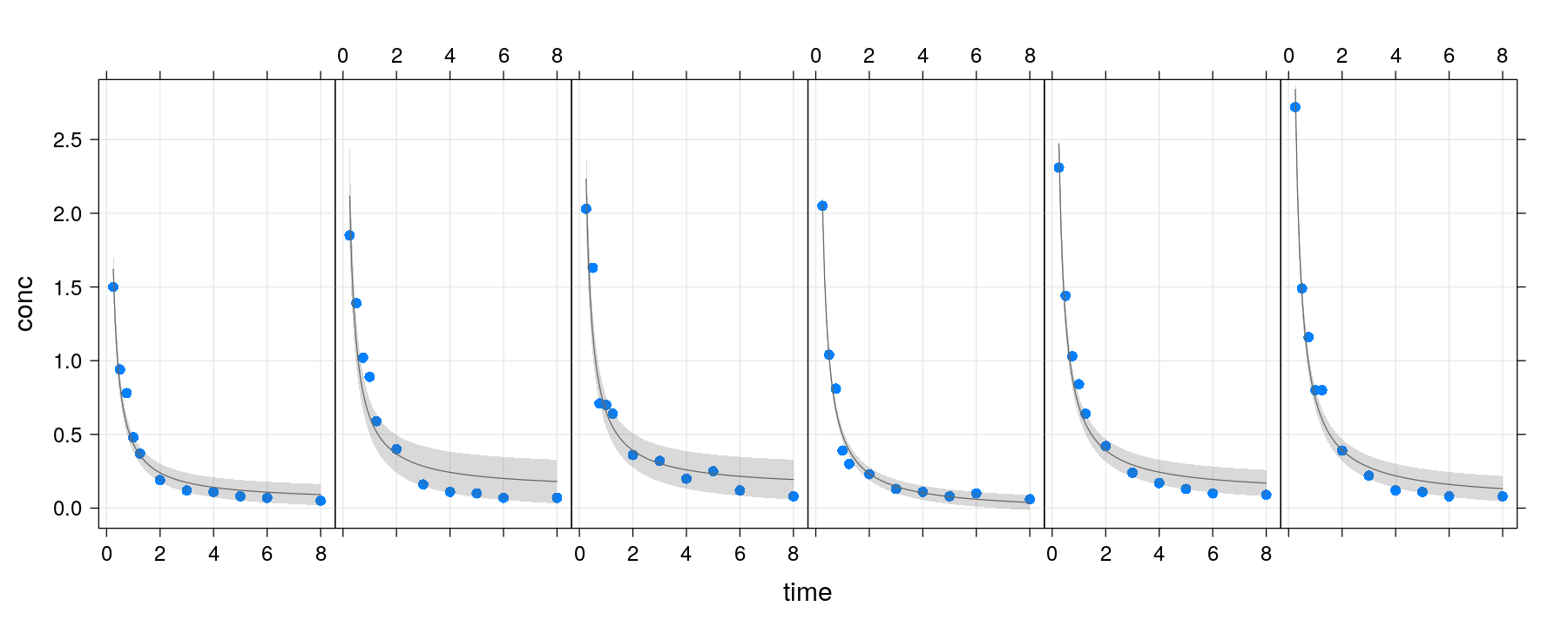
Fitting non-standard models
p + layer(panel.smoother(x, y, method = "nls",
                         form = y ~ SSbiexp(x, A1, lrc1, A2, lrc2), se = FALSE))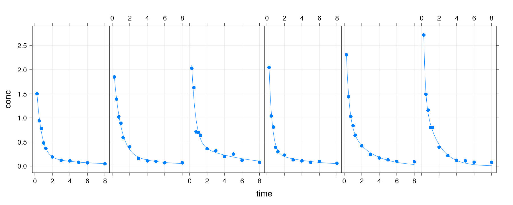
First approach: calulate fitted values inside panel function
xyplot(conc ~ time | Subject, data = Indometh, strip = FALSE, layout = c(6, 1), pch = 16,
       grid = TRUE, fit = fm.fixed, panel = panel.biexp)   # fixed model provided as 'fit'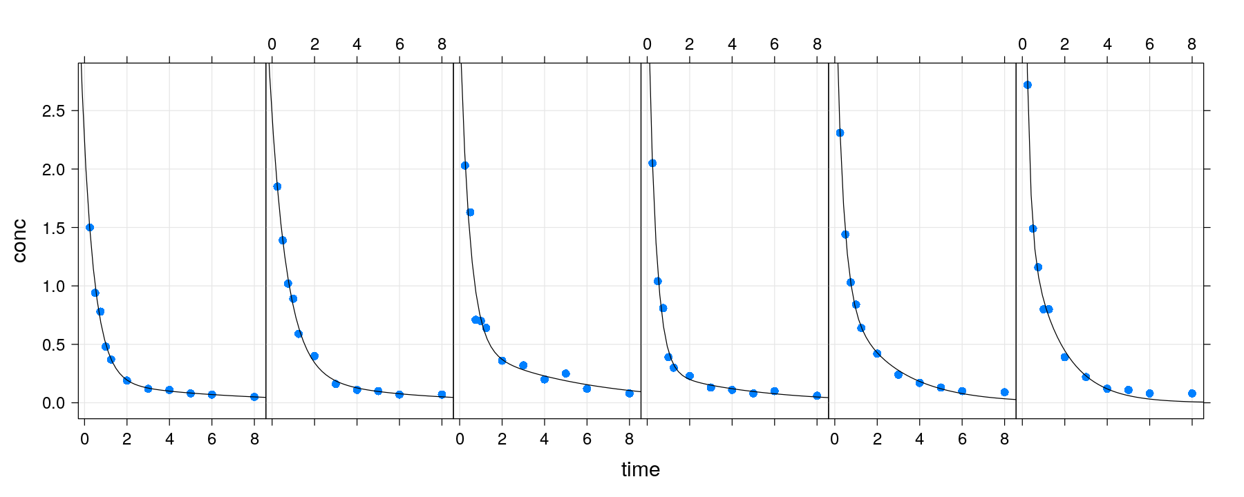
First approach: calulate fitted values inside panel function
xyplot(conc ~ time | Subject, data = Indometh, strip = FALSE, layout = c(6, 1), pch = 16,
       grid = TRUE, fit = fm.mixed, panel = panel.biexp)   # mixed model provided as 'fit'
Second approach: calculate fitted values beforehand
- Fitted values provided as extra arguments (unfortunately no non-standard evaluation)
xyplot(conc ~ time | Subject, Indometh, strip = FALSE, layout = c(6, 1), pch = 16, grid = TRUE,
       fit1 = Indometh$fitted.fixed, fit2 = Indometh$fitted.mixed, panel = panel.fitpred)
Second approach: calculate fitted values beforehand
- Again, the layering approach can simplify this kind of augmentation
pdata <- xyplot(conc ~ time | Subject, Indometh, strip = FALSE, layout = c(6, 1), pch = 16, grid = TRUE)
pfixed <- xyplot(fitted.fixed ~ time | Subject, data = Indometh, type = "l", col = "grey60")
pmixed <- xyplot(fitted.mixed ~ time | Subject, data = Indometh, type = "l", col = "black")
pdata + pfixed + pmixed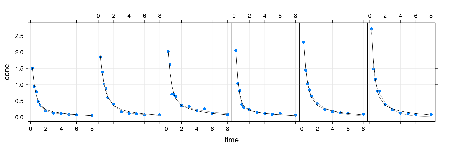
Second approach: calculate fitted values beforehand
pdata <- xyplot(written ~ course | gender, data = Gcsemv, grid = TRUE)
pfitted <- xyplot(written.common + written.additive ~ course | gender, data = grid,
                  type = "l", col = c("black", "red"))
pdata + pfitted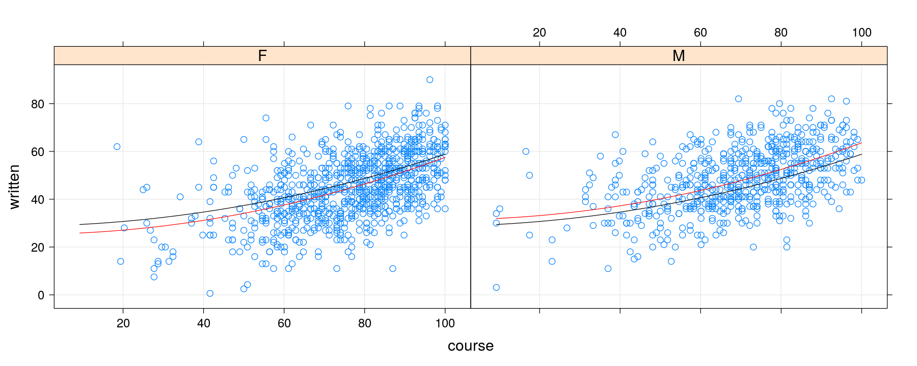
Second approach: calculate fitted values beforehand
update(pdata + pfitted, key = list(text = list(c("common", "additive")),
                                   lines = list(col = c("black", "red")), columns = 2))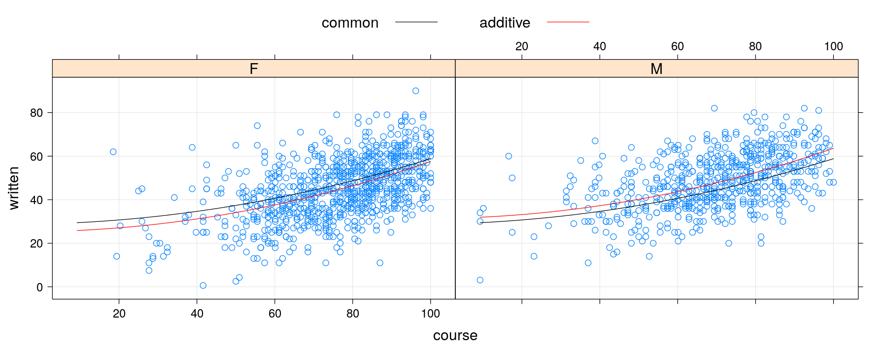
More examples of layering
data(Chem97, package = "mlmRev")
p <- histogram(~ gcsescore | factor(score) + gender, data = Chem97, type = "density",
               border = NA, col = hcl.colors(1, "Pastel 1"))
p + layer(panel.curve(dnorm(x, mean = mean(x), sd = sd(x))))   ## fails (too much non-standard evaluation)
More examples of layering
panel.dnorm <- function(x, ...) {
    m <- mean(x); s <- sd(x)
    panel.curve(dnorm(x, mean = m, sd = s), ...)
}
p + layer(panel.dnorm(x, col = "grey40"))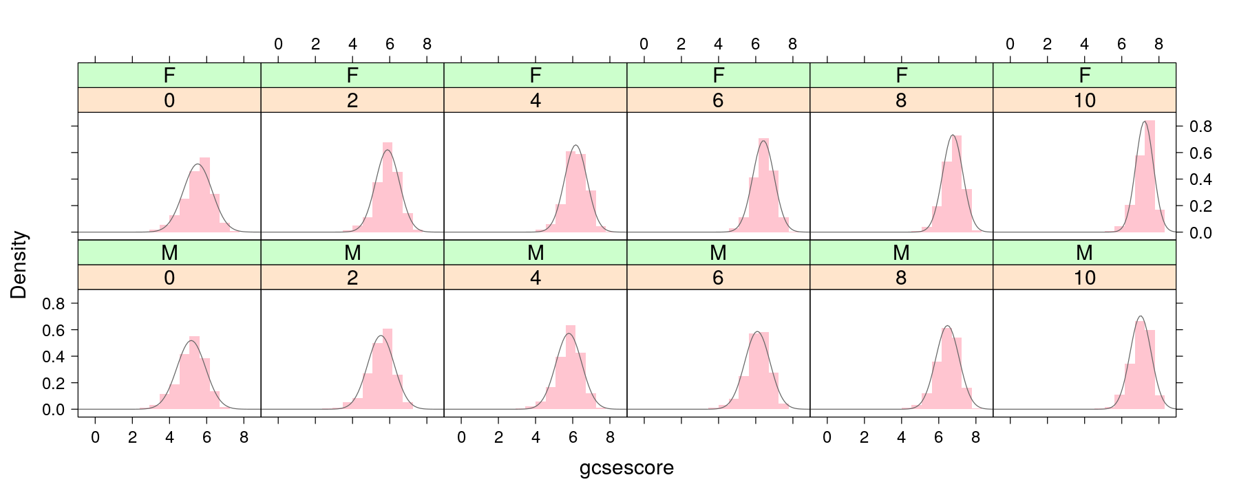
More examples of layering
VADeathsDF <- as.data.frame.table(VADeaths, responseName = "Rate")   # 1940 Death rates in Virginia, USA
barchart(Rate ~ Var1 | Var2, VADeathsDF, origin = 0) +
    layer(panel.text(x, y, labels = as.character(y), pos = 1, cex = 0.75))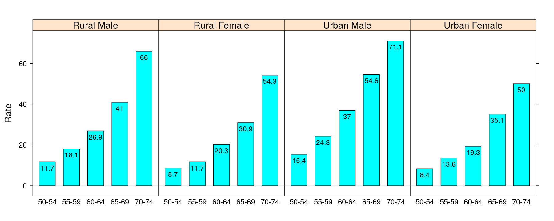
More examples of layering
dotplot(Var1 ~ Rate, VADeathsDF, groups = Var2, pch = 16, type = "o", aspect = 0.75) +
    glayer(panel.text(x[5], y[5], group.value, srt = 30, cex = 0.7, adj = 0.75, col = "grey50"))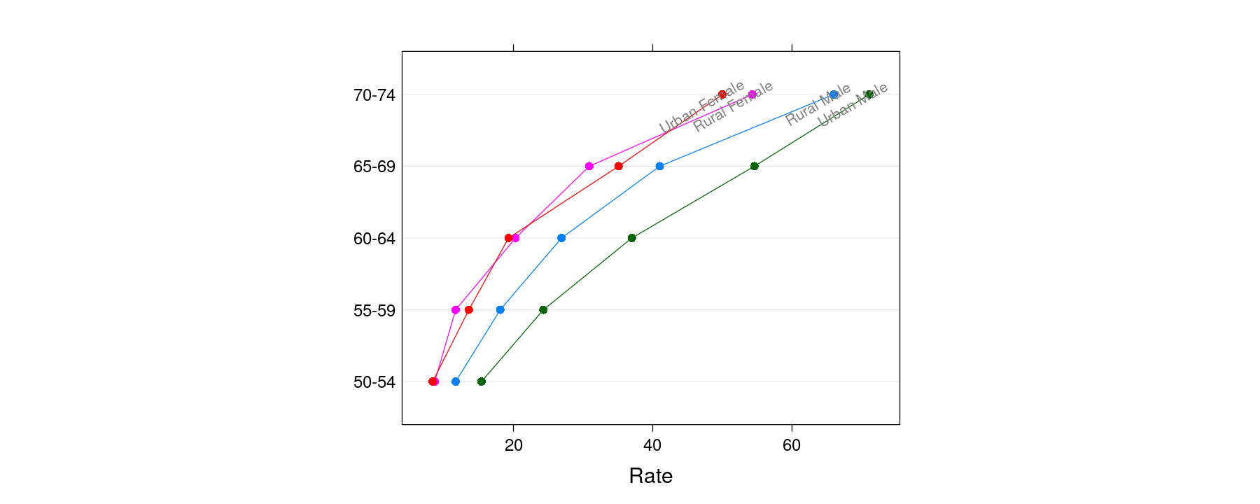
More examples of layering
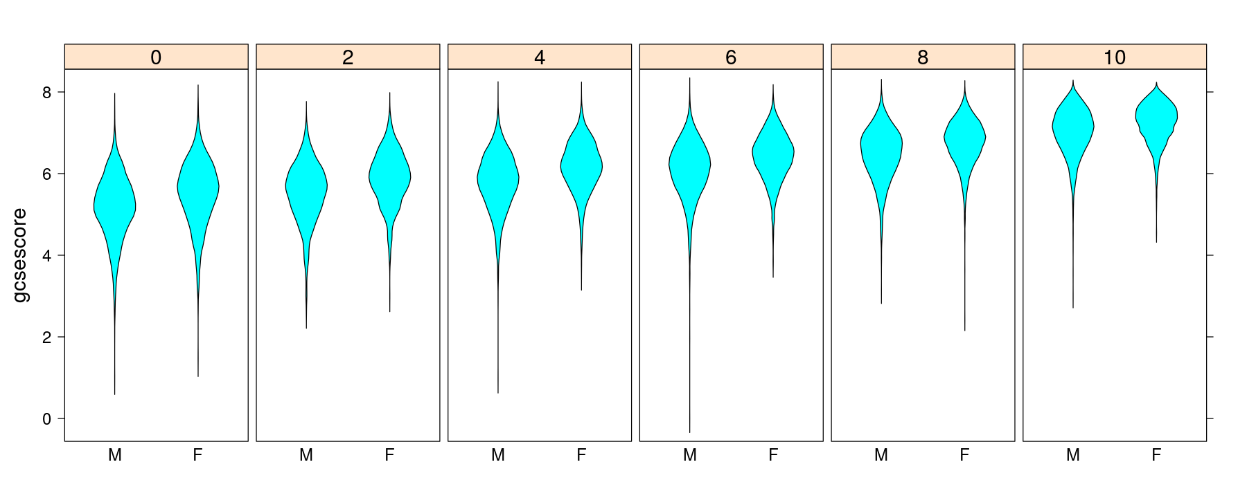
p <- bwplot(gcsescore ~ gender | factor(score), Chem97, layout = c(6, 1), between = list(x = 0.5))
p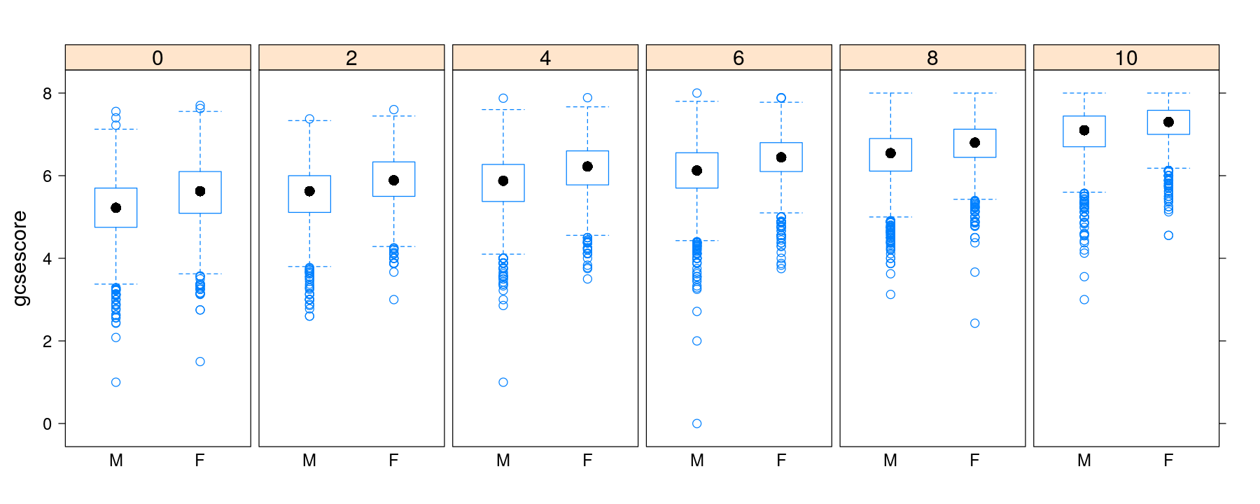
More examples of layering
More examples of layering

Custom panel functions
data(Anscombe, package = "carData")
xyplot(education ~ income + young + urban, data = Anscombe, outer = TRUE, strip = FALSE,
       scales = list(x = list(relation = "free")), between = list(x = 1), layout = c(3, 1),
       xlab = c("income", "young", "urban"), panel = panel.smoother.bs, method = "loess")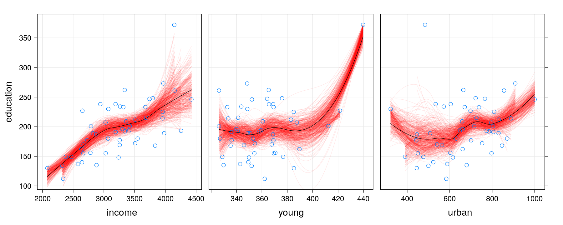
Custom panel functions
xyplot(education ~ income + young + urban, data = Anscombe, outer = TRUE,
       scales = list(x = list(relation = "free")), between = list(x = 1), strip = FALSE,
       xlab = c("income", "young", "urban"), layout = c(3, 1),
       panel = panel.smoother.bs, method = "lm", form = y ~ poly(x, 2), B = 1000)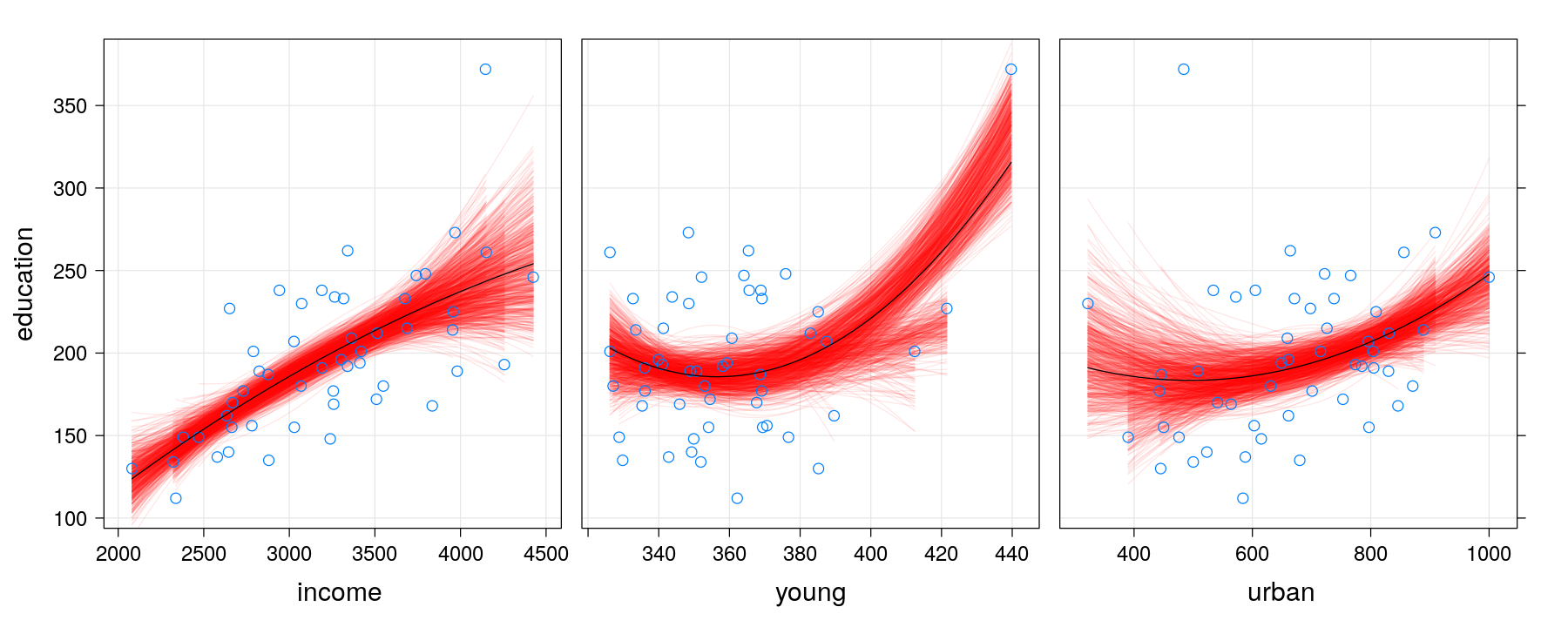
Using subscripts to incorporate additional variables
Using subscripts to incorporate additional variables
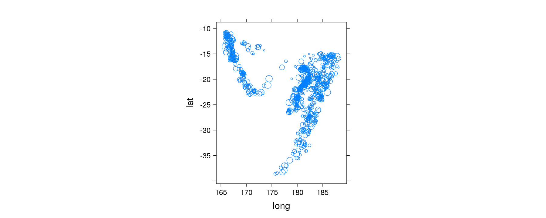
quakes <- transform(quakes, Depth = equal.count(depth, 6, overlap = 0.1))   # a shingle object
xyplot(lat ~ long | Depth, data = quakes, aspect = "iso",
       panel = panel.bubbleplot, size = sqrt(quakes$mag))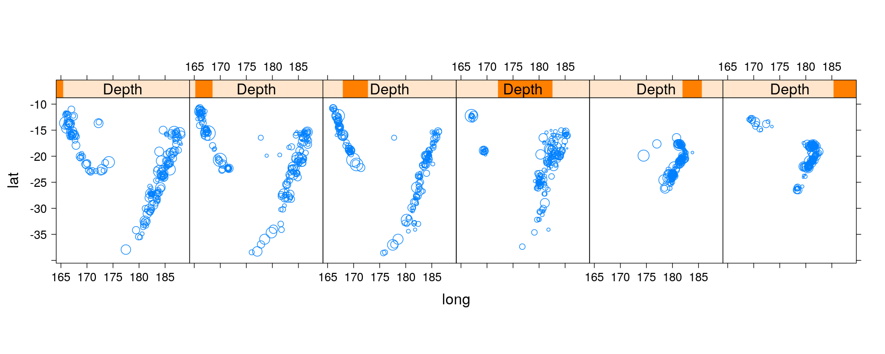
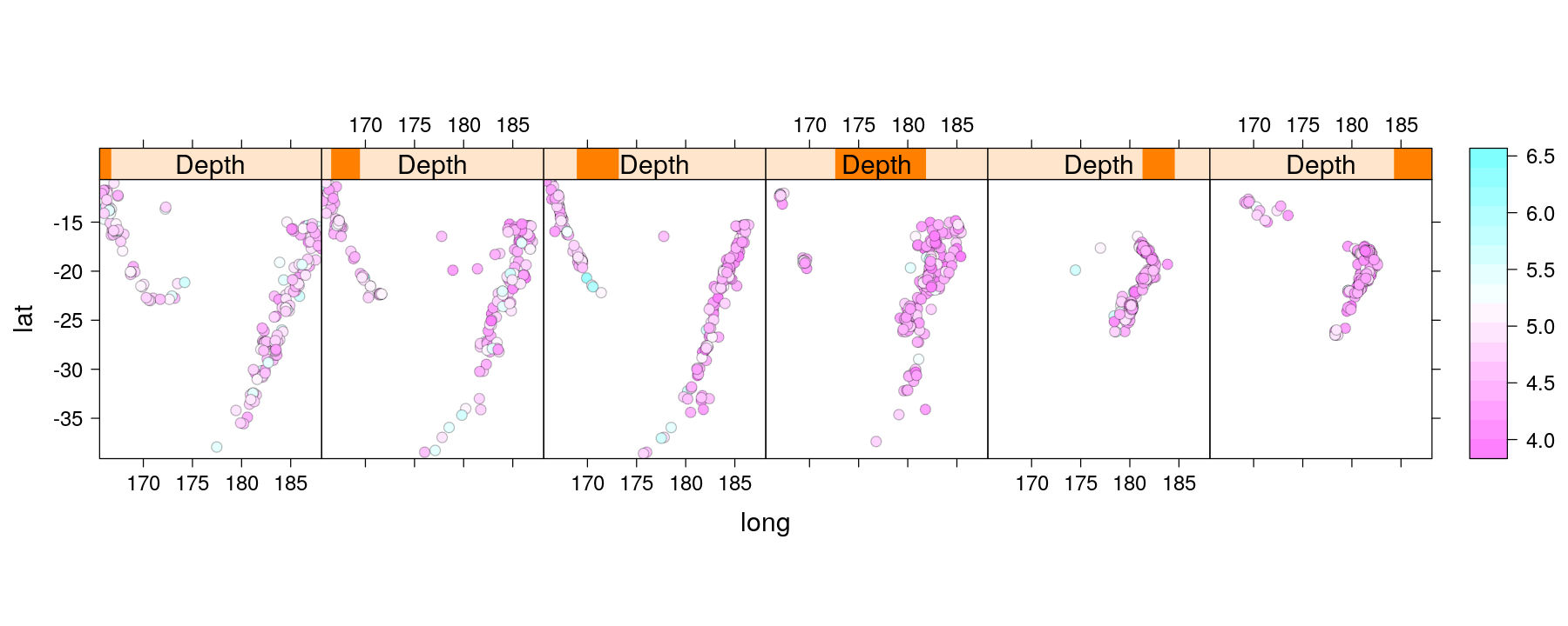
Using subscripts to incorporate additional variables
- A similar function to encode magnitude by color is already implemented
Topics we have not discussed in detail
- Manipulation of “trellis” objects: example
p1 <- barchart(VADeaths, layout = c(NA, 1), groups = FALSE)
p2 <- dotplot(VADeaths, type = "o", par.settings = simpleTheme(pch = 16),
              auto.key = list(columns = 2))
print(p1, position = c(0, 0, 0.6, 1))
print(p2, position = c(0.6, 0, 1, 1), newpage = FALSE)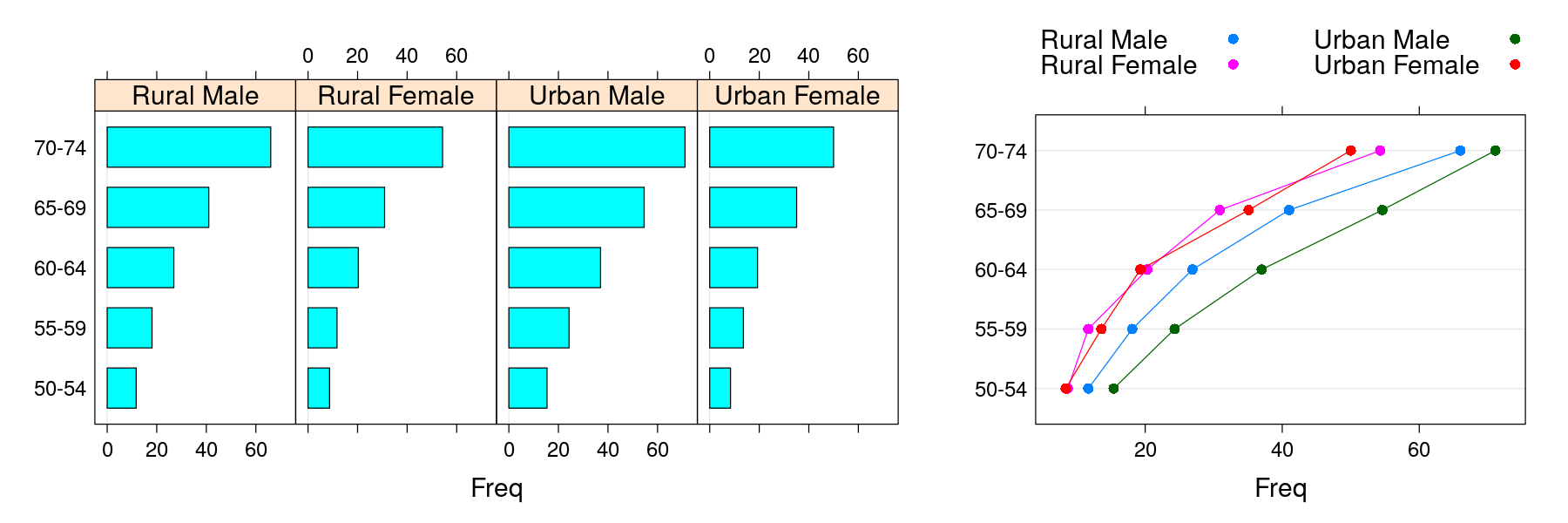
Topics we have not discussed in detail
$Var2
[1] "Rural Male"   "Rural Female" "Urban Male"   "Urban Female"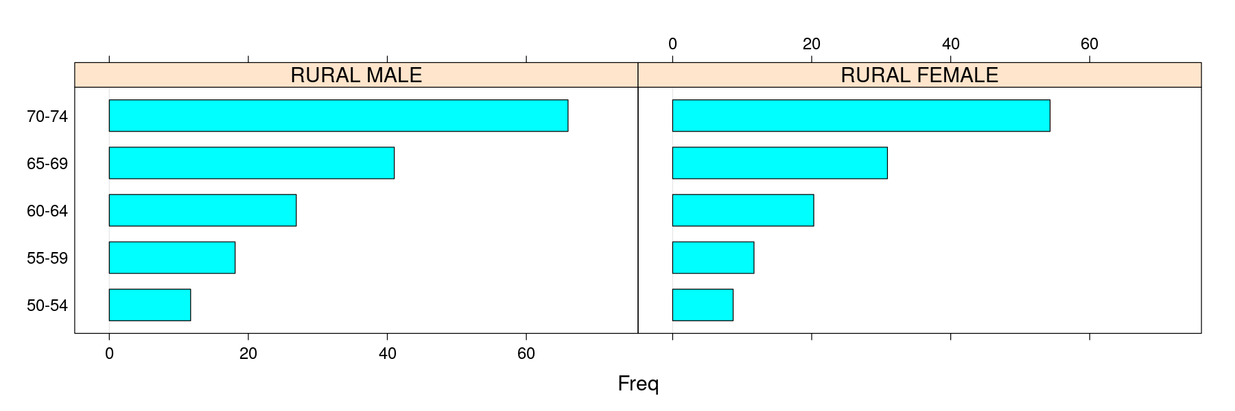
Residual plots
library(package = "car")
Prestige$type <- factor(Prestige$type, levels=c("bc", "wc", "prof"))
fm.prestige <- lm(prestige ~ education + income + type, data = Prestige)
residualPlots(fm.prestige, layout = c(1, 4), tests = FALSE)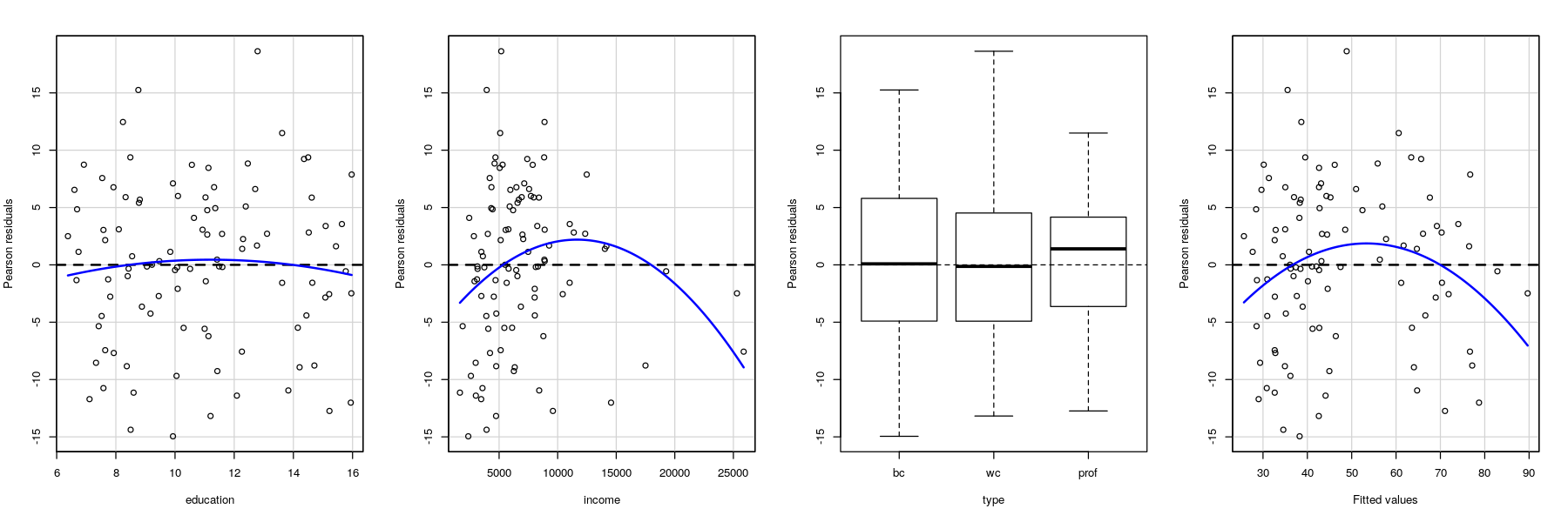
Marginal model plots
## lines are loess smooths of response (Data) and fitted (Model) vs x-variable
marginalModelPlots(fm.prestige, terms = ~ ., fitted = TRUE, layout = c(1, 3), ylab = "prestige")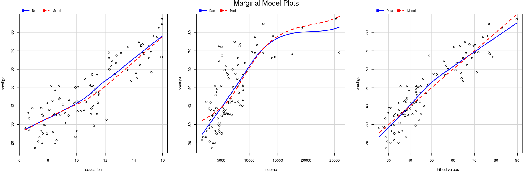
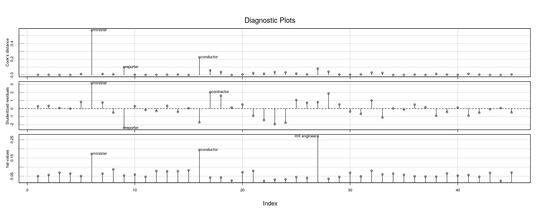
Hat-values, Cook’s distance, Studentized residuals
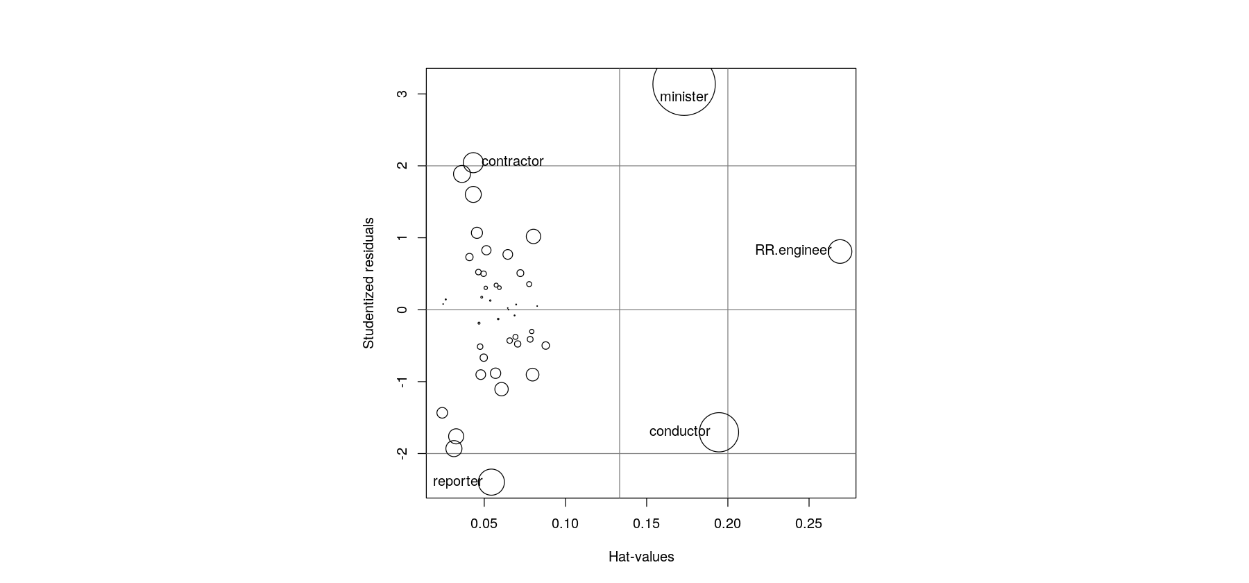
Hat-values, Cook’s distance, Studentized residuals
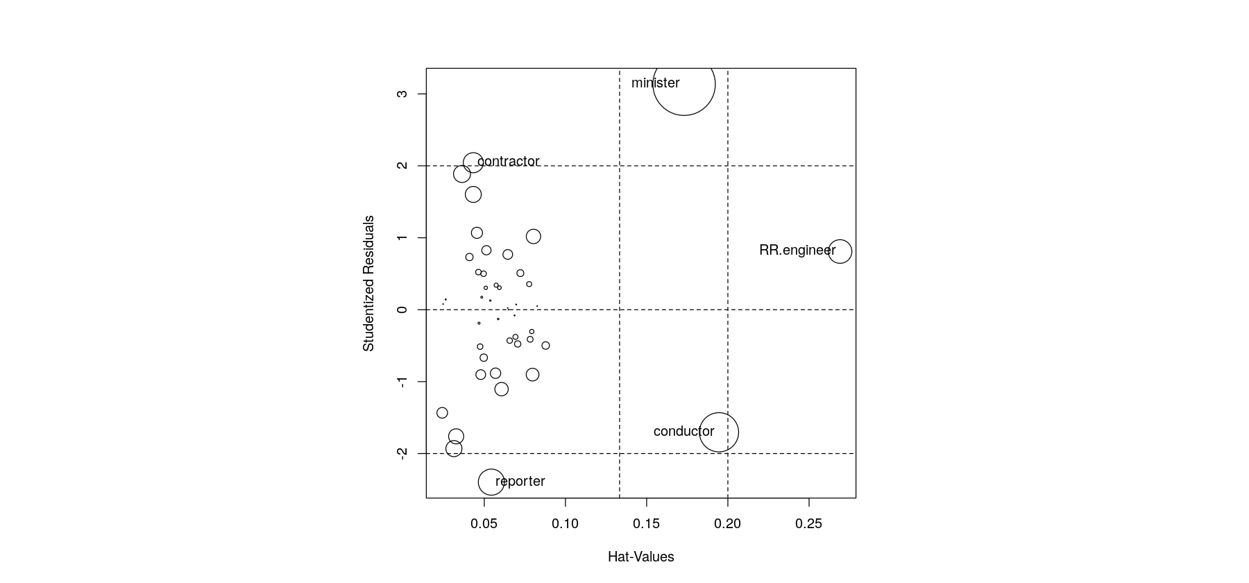
Hat-values, Cook’s distance, Studentized residuals