R Graphics
Traditional graphics
Traditional graphics
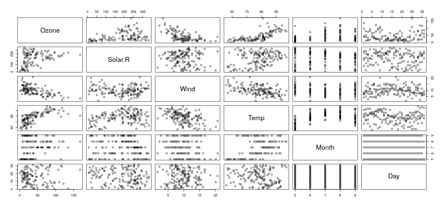
The core of the traditional R graphics system is the suite of functions available in the package,
with various add-on packages providing further functionality.
The full list of functions can be seen using
The listed functions can be roughly categorized into two groups:
High-level functions are those that are intended to produce a complete plot by themselves.
Low-level functions are those that are intended to add elements to existing plots.
Of course, high-level functions are themselves built up from low-level functions.
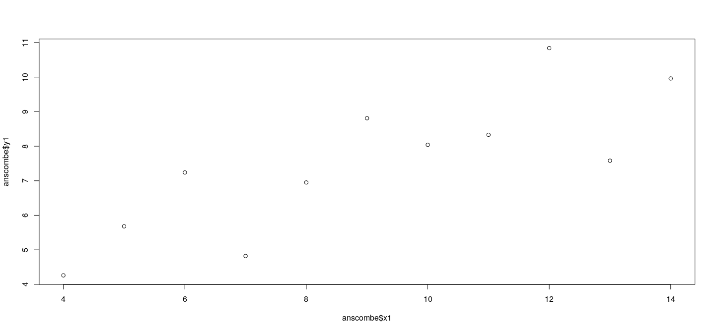
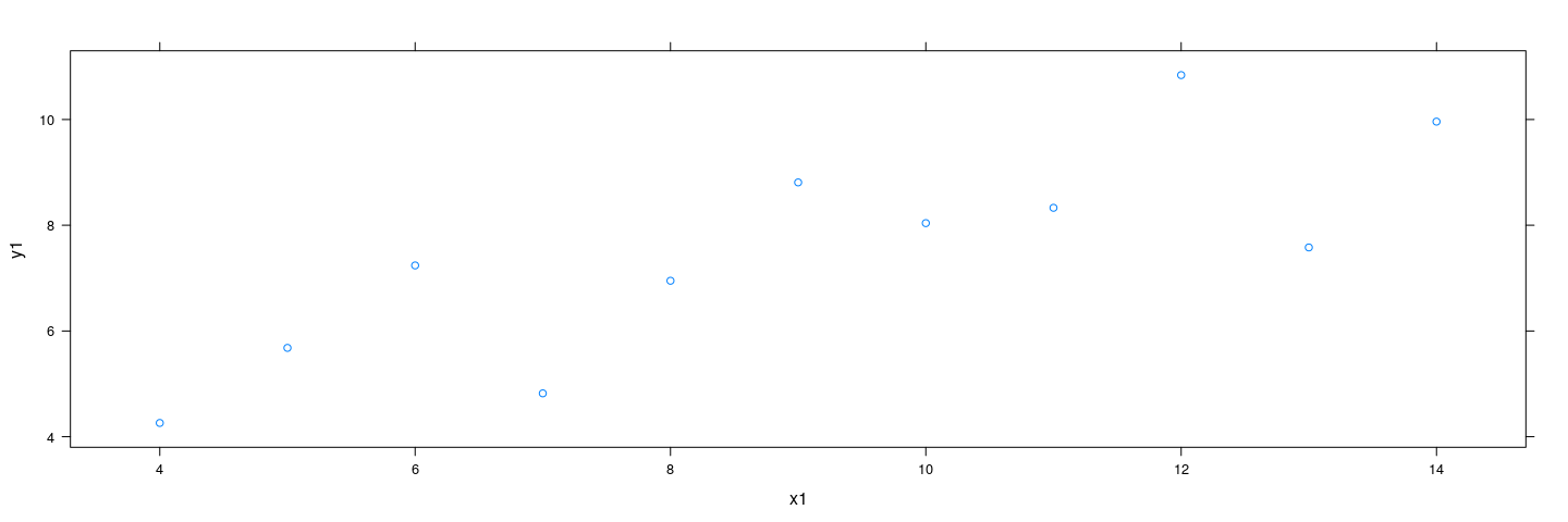
Example: Anscombe’s data
Let us look at an example. The simplest and most common type of statistical plot is the scatterplot, which depicts bivariate numeric data as points in a Cartesian coordinate system.
The high-level function that produces scatterplots is (although that is not all does).
We use R’s built-in dataset, , for illustration.
The dataset contains Anscombe’s well-known quartet of bivariate datasets that are quite different from each other, yet have the same traditional statistical summaries (mean, variance, correlation, least squares regression line, etc.).
The first dataset can be plotted as follows:
Example: Anscombe’s data
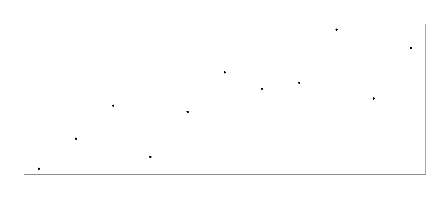
Details
What low-level functions could have created this plot?
The plot consists of
- the points,
- the box surrounding the plot,
- the axes,
- the axis labels.
All these elements can be suppressed by as follows.
This produces a completely blank page
but performs one important task: it sets up the coordinate system for subsequent low-level calls.
Details
- The extent of this coordinate system can be obtained using
[1] 0 1 0 1- This is the range of the data that was supplied to , with a padding of 4% on both sides
[1] 4 14[1] 4.26 10.84Details
This rectangular region does not occupy the full figure area, only a part of it.
This is referred to as the plot region
We can now draw a box around the plot region and add the data points as follows.
Details
Details
The area outside the plot region is known as the margin, and is used for axis annotation and labels.
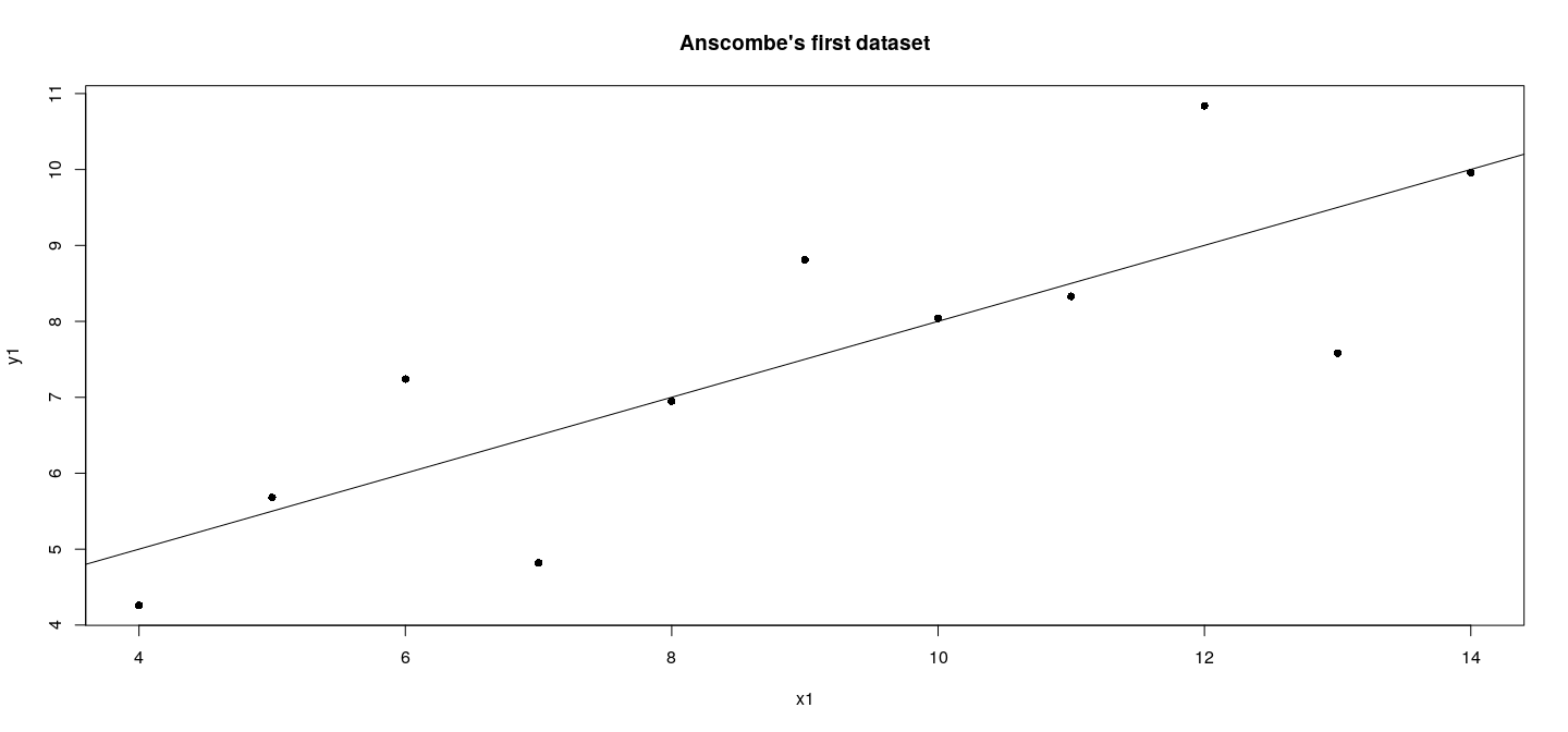
The following low-level calls complete the plot and adds a linear regression line.
axis(side = 1)
axis(side = 2)
title(main = "Anscombe's first dataset",
      xlab = "x1", ylab = "y1")
abline(lm(y1 ~ x1, anscombe))
Details
Why are these details important?
- Is this relevant for routine use? Consider this code:
plot(anscombe$x2, anscombe$y2,
     type = "n", axes = FALSE, xlab = "", ylab = "")
lims <- par("usr")
rect(lims[1], lims[3], lims[2], lims[4],
     col = "grey80", border = NA)
abline(v = pretty(lims[1:2]), h = pretty(lims[3:4]),
       col = "white", lwd = 2)
axis(side = 1, col = "grey80", col.axis = "grey20")
axis(side = 2, col = "grey80", col.axis = "grey20",
     las = 1)
points(anscombe$x2, anscombe$y2, pch = 16)
title(main = "Anscombe's second dataset",
      xlab = "x2", ylab = "y2", col = "grey20")
abline(lm(y2 ~ x2, anscombe), col = "grey20")
Why are these details important?
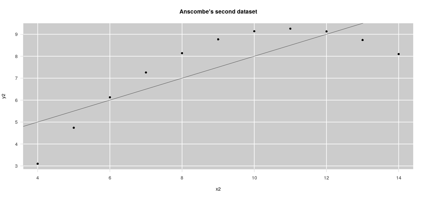
Why are these details important?
This kind of customization is often desirable,
making use of low-level functions as above is the standard approach with traditional graphics
Most other high-level traditional graphics functions follow this structure
We will not discuss low-level structure of traditional graphics
Some useful low-level functions
| Add Text to a Plot | |
| Add Connected Line Segments to a Plot | |
| Add Points to a Plot | |
| Polygon Drawing | |
| Draw One or More Rectangles | |
| Add Line Segments to a Plot |
Some useful low-level functions
| Add Straight Lines to a Plot | |
| Add Arrows to a Plot | |
| Add an Axis to a Plot | |
| Draw a Box around a Plot | |
| Add Grid to a Plot | |
| Add Legends to Plots | |
| Plot Annotation |
The function
The function is actually a generic function that can deal with the task of plotting several types of R objects.
The most common method is the default method , which can be used to plot
- paired numeric data
- univariate numeric data, plotted against serial number
See and for details, including
- logarithmic scales using the argument
- the argument for controlling display
The formula method
Another common method for bivariate data: use a formula
Similar to various statistical modeling functions
Allows cleaner specification of the plot
Leads to better default axis labels
The formula method
Other plot methods
Full list of available methods for the generic can be listed by
 [1] plot,ANY-method     plot,color-method   plot.acf*           plot.data.frame*    plot.decomposed.ts*
 [6] plot.default        plot.dendrogram*    plot.density*       plot.ecdf           plot.factor*
[11] plot.formula*       plot.function       plot.ggplot*        plot.gtable*        plot.hclust*
[16] plot.histogram*     plot.HoltWinters*   plot.isoreg*        plot.lm*            plot.medpolish*
[21] plot.mlm*           plot.ppr*           plot.prcomp*        plot.princomp*      plot.profile.nls*
[26] plot.R6*            plot.raster*        plot.shingle*       plot.spec*          plot.stepfun
[31] plot.stl*           plot.table*         plot.trellis*       plot.ts             plot.tskernel*
[36] plot.TukeyHSD*
see '?methods' for accessing help and source code
Other plot methods:
Other plot methods:
Actually, the method in this case simply calls , the function designed to draw scatterplot matrices
The previous figure could also have been produced by
Other plot methods:
Similarly, the method for may call
to show a bar chart of the frequency distibution (if the input is a single variable)
to show box-and-whisker plots (if an additional numeric variable is provided)
We discuss these specialized high-level functions next
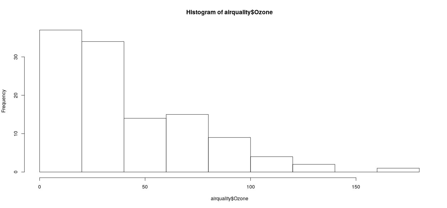
Specialized functions: histogram
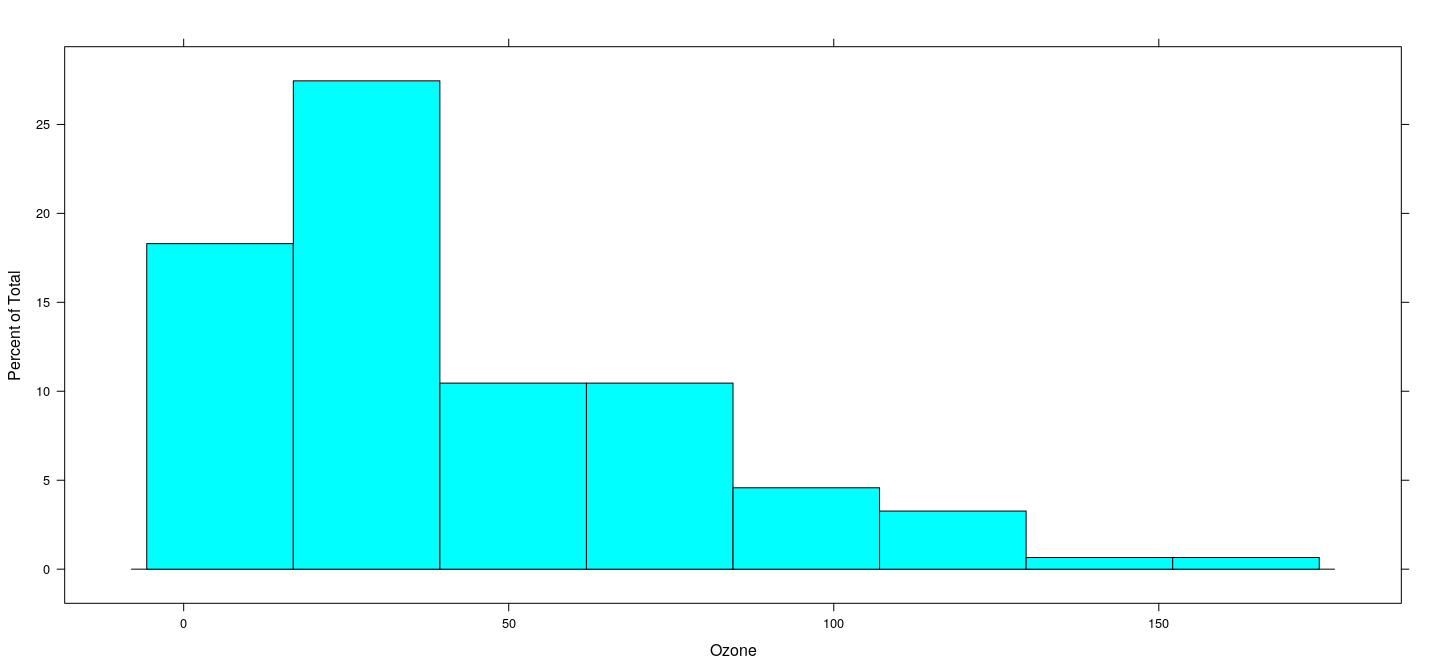
Histograms are produced by the function
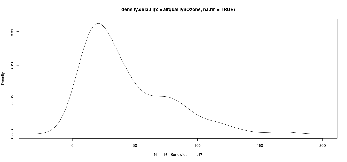
Specialized functions: kernel density estimate
First step: compute density estimate as a object
List of 7
 $ x        : num [1:512] -33.4 -33 -32.5 -32 -31.6 ...
 $ y        : num [1:512] 1.08e-05 1.24e-05 1.41e-05 1.62e-05 1.85e-05 ...
 $ bw       : num 11.5
 $ n        : int 116
 $ call     : language density.default(x = airquality$Ozone, na.rm = TRUE)
 $ data.name: chr "airquality$Ozone"
 $ has.na   : logi FALSE
 - attr(*, "class")= chr "density"
Common high-level functions for specific displays
Second step: plot it with the suitable method
Return values of specialized plotting functions
returns object with information about calculations
Similarly, return a object containing details
List of 6
 $ breaks  : num [1:10] 0 20 40 60 80 100 120 140 160 180
 $ counts  : int [1:9] 37 34 14 15 9 4 2 0 1
 $ density : num [1:9] 0.01595 0.01466 0.00603 0.00647 0.00388 ...
 $ mids    : num [1:9] 10 30 50 70 90 110 130 150 170
 $ xname   : chr "airquality$Ozone"
 $ equidist: logi TRUE
 - attr(*, "class")= chr "histogram"
Such objects can also be plotted using
More useful because it allows customization (examples later)
Quantile-based plots: box plots
produce comparative box-and-whisker plots
airquality$fmonth <- with(airquality,
  droplevels(factor(Month, levels = 1:12, labels = month.name)))
boxplot(Ozone ~ fmonth, data = airquality)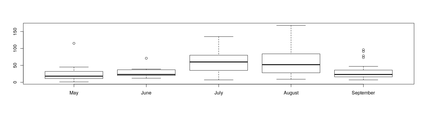
As with and , these functions also have useful return values.
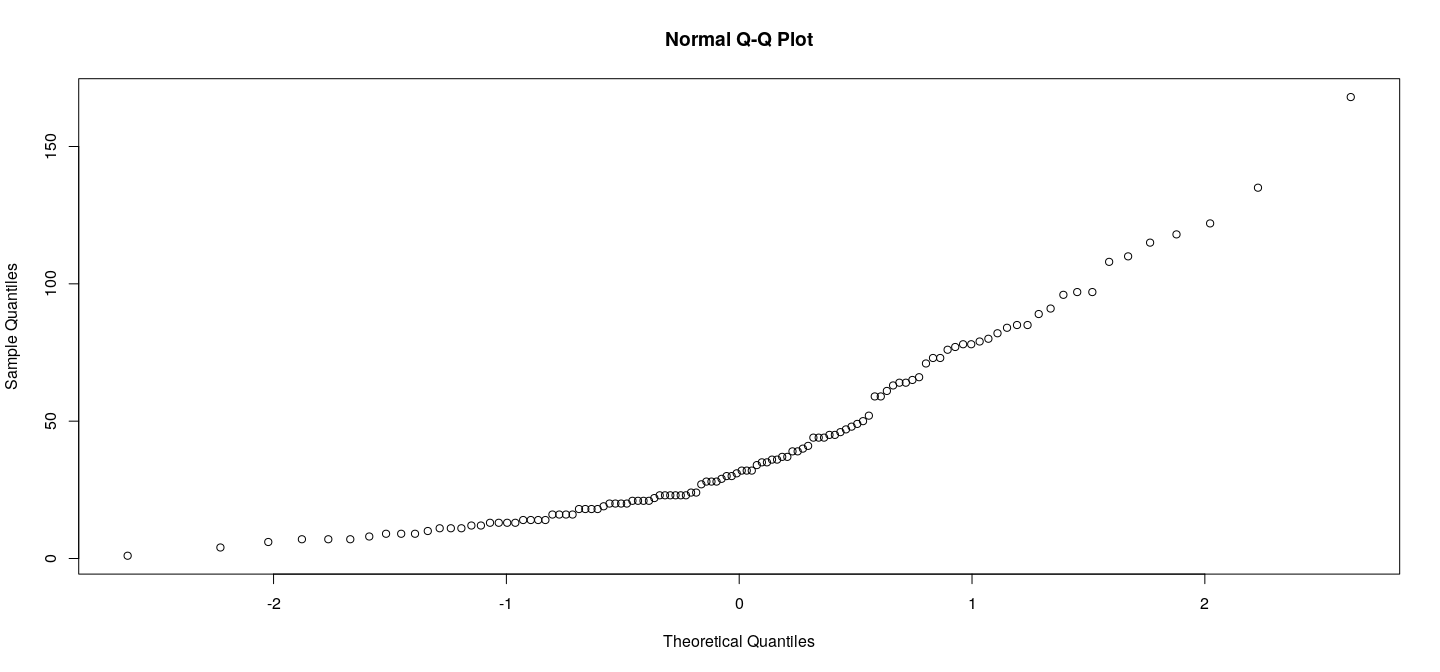
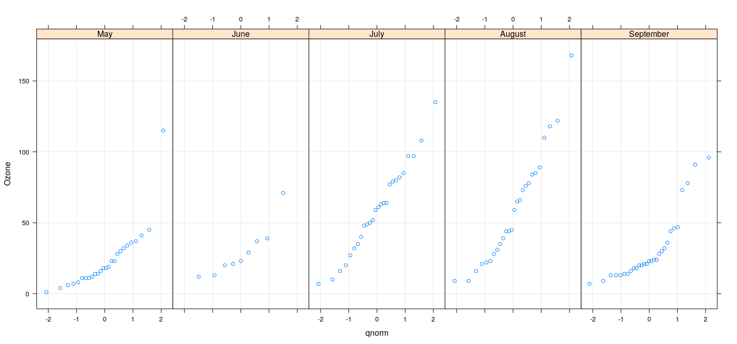
Quantile-based plots: Q-Q plots
produces Normal Q-Q plots
Displaying tabular data
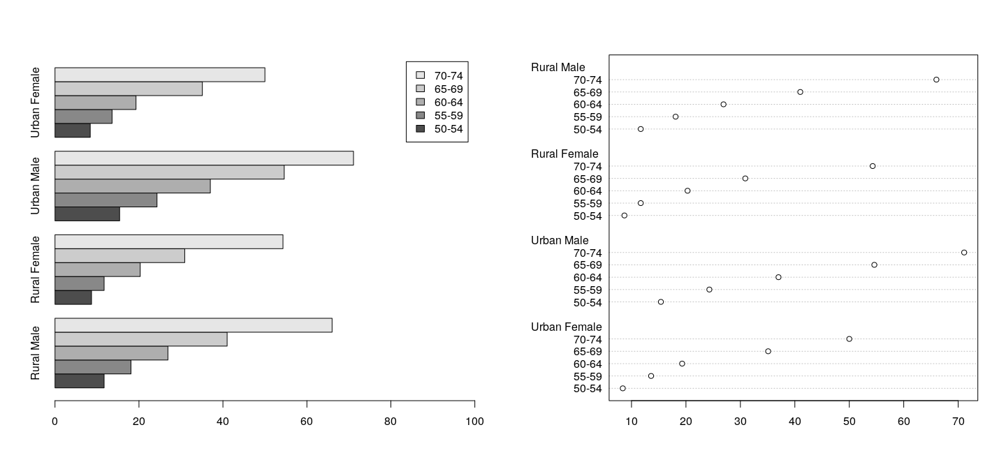
Common visualizations: bar plots and dot plots
Bar plots are produced by
Dot plots by the function.
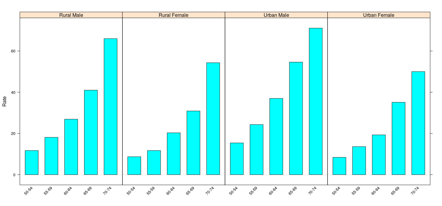
Example using dataset on death rates in different population subgroups in the US state of Virginia in 1940
- Note use of to fit legend
Displaying tabular data
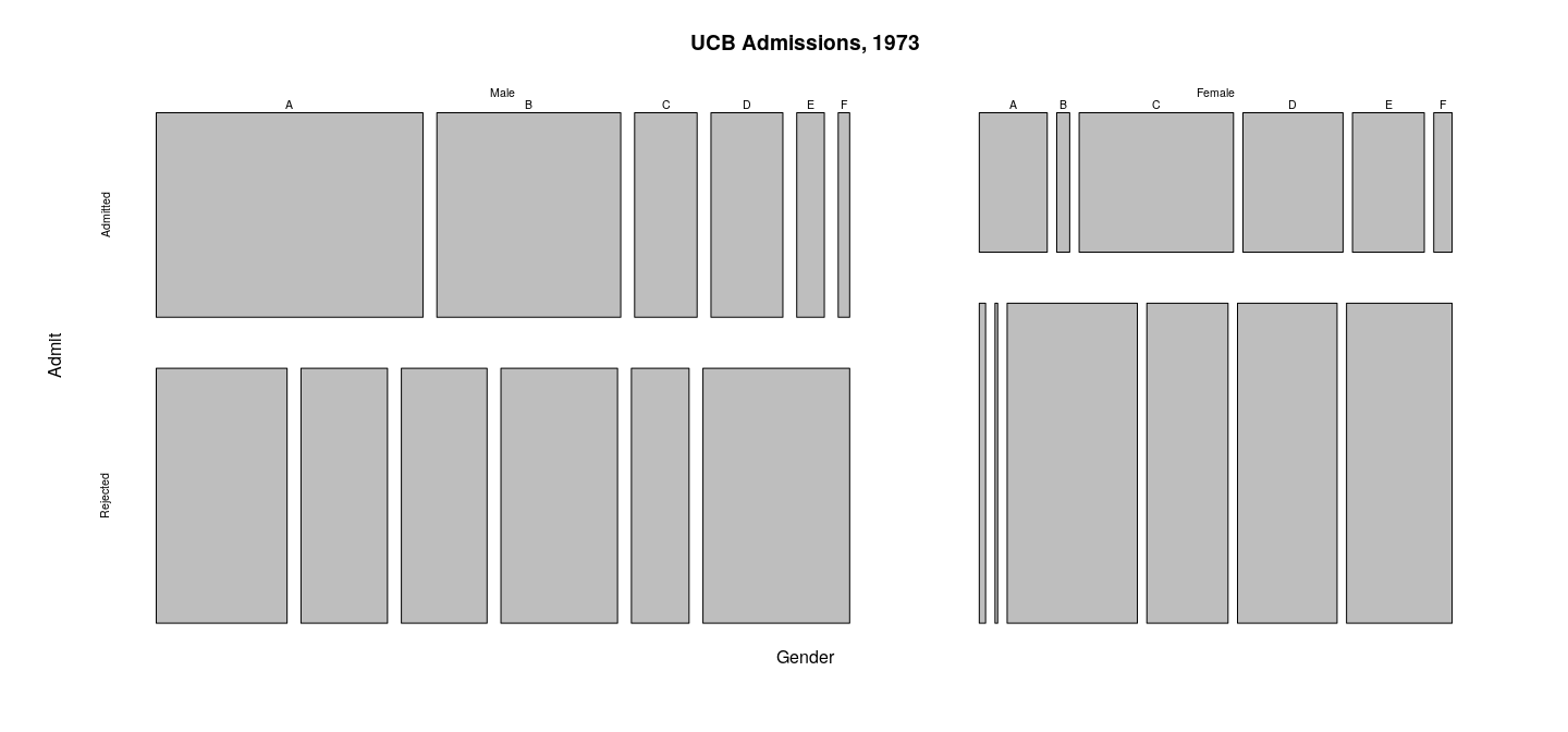
Displaying tabular data: mosaic plots
Less common visualization
Useful for tabular higher dimensional tables
Example: Simpson’s paradox in Berkeley admissions data:
- aggregate number of applicants to at Berkeley in 1973
- six largest departments (labeled A-F)
- classified by gender and whether they were admitted.
Displaying tabular data: mosaic plots
Displaying tabular data: mosaic plots
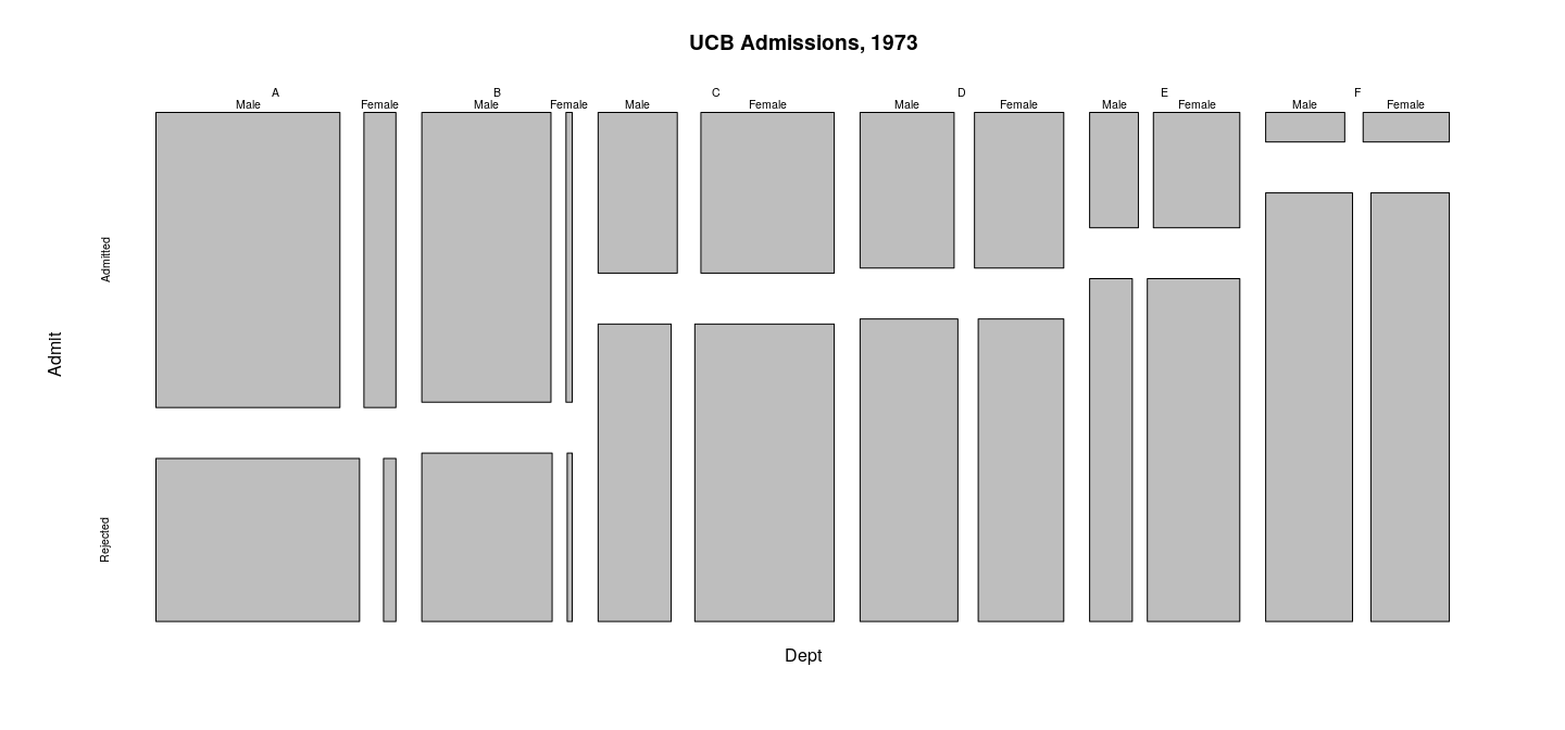
Displaying tabular data: mosaic plots
The plots are produced by the following calls
Uses to rearrange the dimensions of the array to achieve the desired hierarchy of groups.
mosaicplot(aperm(UCBAdmissions, c(2, 1, 3)),
           main = "UCB Admissions, 1973")
mosaicplot(aperm(UCBAdmissions, c(3, 1, 2)),
           main = "UCB Admissions, 1973")
Visualizations for time series data
R comes with many specialized graphical designs
Those used for time series data deserve special mention because of their ubiquity.
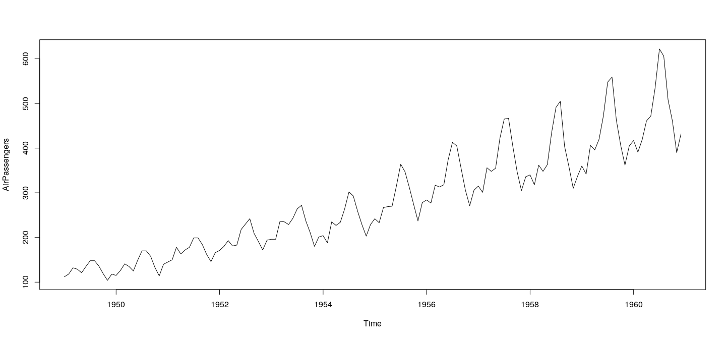
Time series data are typically represented in R as objects of class .
Corresponding method produces a standard time series plot, which is essentially a scatterplot with points joined by lines.
Typical plot of time series data
A time series plot of the data
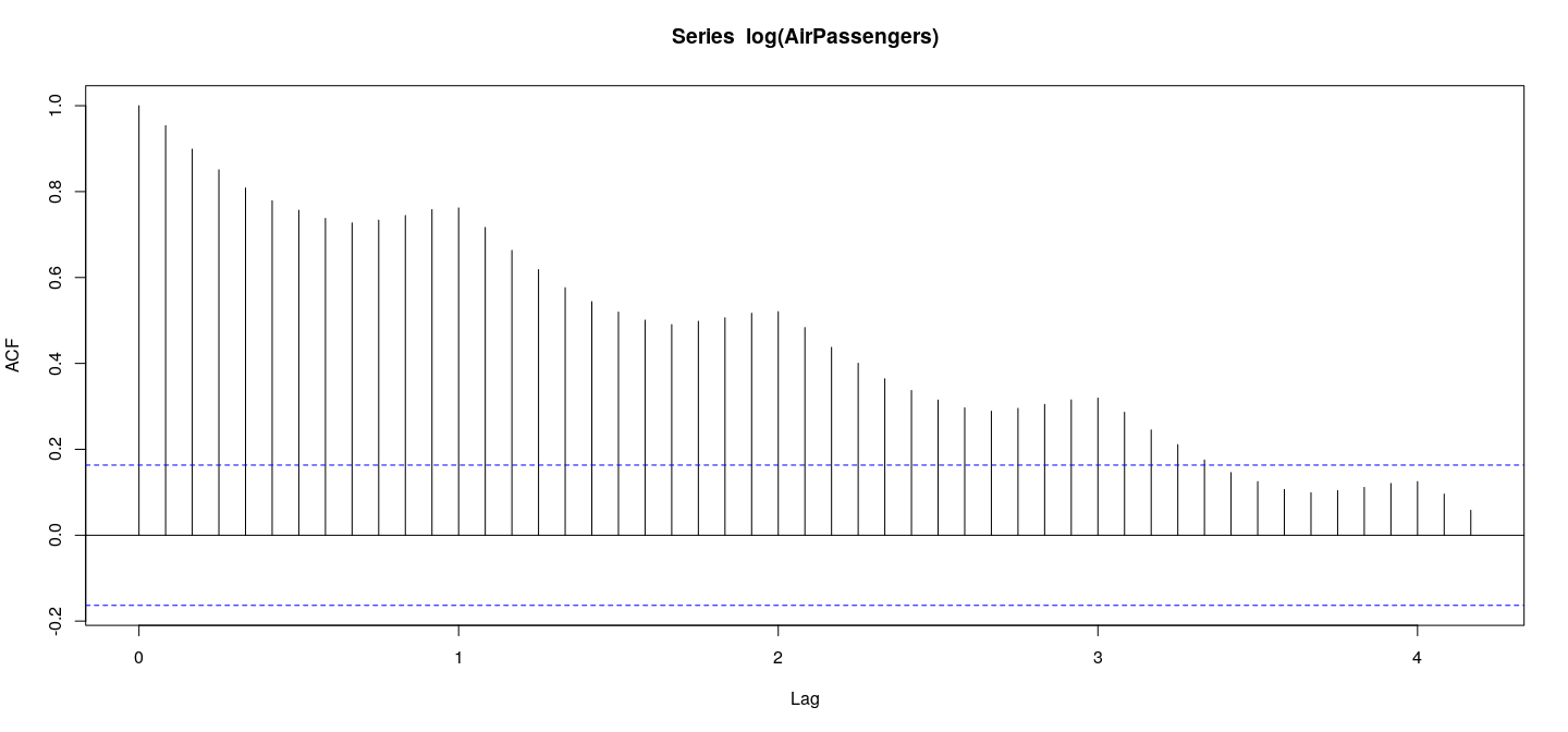
Time series data: ACF plot
Plot of estimated autocorrelation function (of log-transformed data)
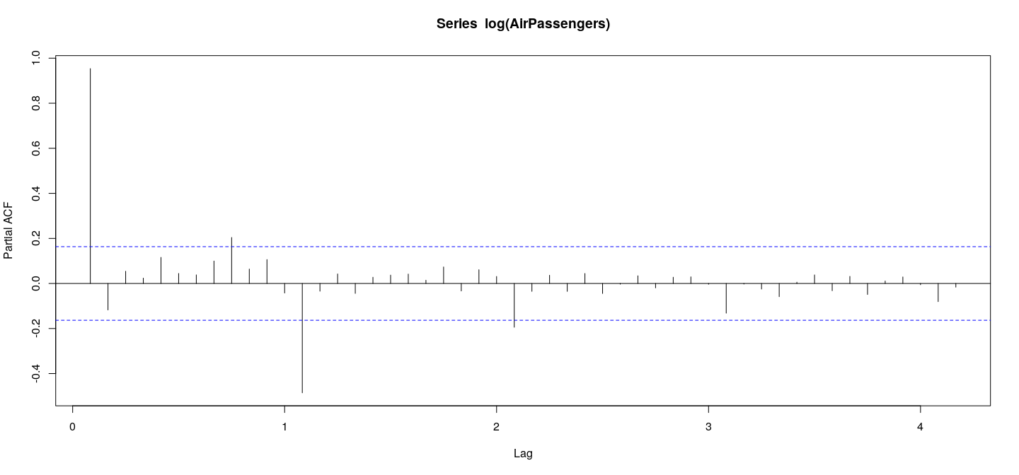
Time series data: ACF plot
Plot of partial autocorrelation function by
Time series decompositions
In addition to these basic plots, R provides functions for various time series decompositions that can be plotted.
For example, an STL decompositionof the data is produced by
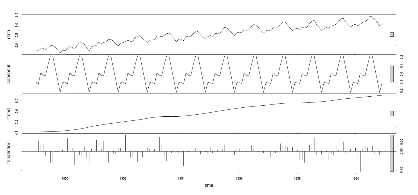
Other decomposition methods are implemented in the and functions.
A number of contributed R packages substantially enhance the time series analysis capabilities of R; see
Customizing plots using low-level functions
High-level graphics functions produce basic versions of common statistical graphs
Often we want to fine-tune them in different ways to get something more relevant to our purposes.
We have seen a somewhat extreme example before (Anscombe’s data), starting from a blank plot
More common to start with a complete high-level plot
Incrementally add components to customize it
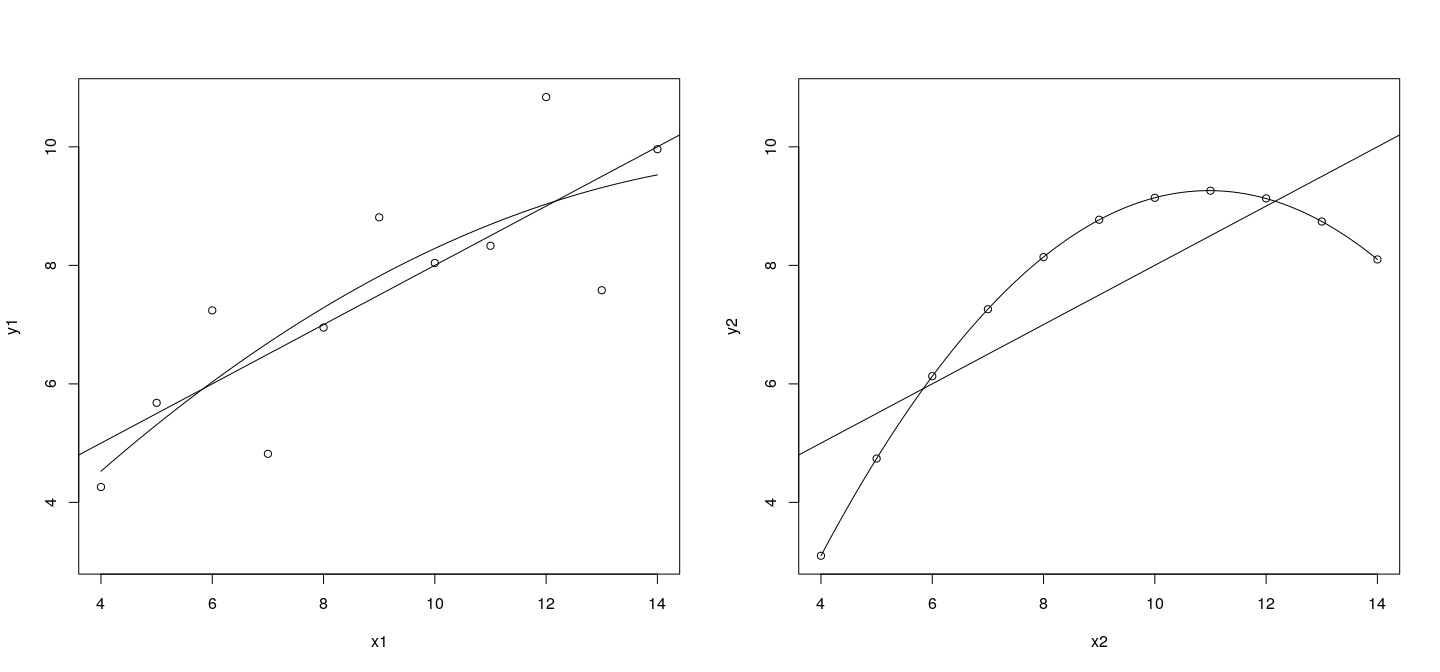
Customizing plots using low-level functions
Common use: add representation of some model fit
Example: side-by-side scatterplots of Anscombe’s first two datasets, with the least squares fits from a linear and quadratic model.
lims <- with(anscombe, list(x = range(x1, x2),
                            y = range(y1, y2)))
par(mfrow = c(1, 2))
plot(y1 ~ x1, data = anscombe,
     xlim = lims$x, ylim = lims$y)
abline(lm(y1 ~ x1, data = anscombe))
f1 <- function(x) predict(lm(y1 ~ poly(x1, 2), data = anscombe),
                          newdata = list(x1 = x))
curve(f1, add = TRUE)
plot(y2 ~ x2, data = anscombe,
     xlim = lims$x, ylim = lims$y)
abline(lm(y2 ~ x2, data = anscombe))
f2 <- function(x) predict(lm(y2 ~ poly(x2, 2), data = anscombe),
                          newdata = list(x2 = x))
curve(f2, add = TRUE)
Customizing plots using low-level functions
Customizing plots using low-level functions
Linear fit easily added using
Quadratic fit needs more general function.
Second approach works for any other modeling function that has a suitable method.
The
par(mfrow=)construct is used to enable a ``multiple figure" layout (see ).
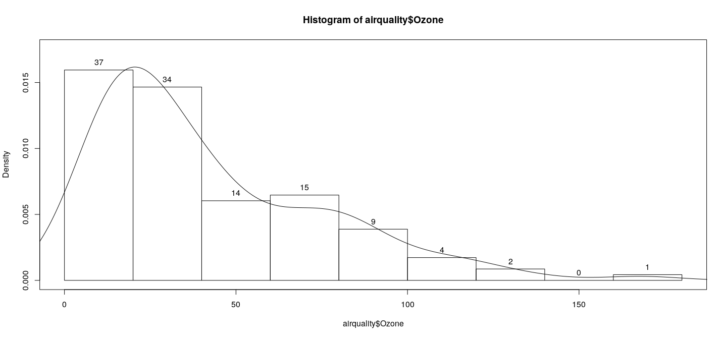
Customizing plots: histogram
As noted before, many high-level graphics functions (e.g., , , ) return objects containing intermediate computations.
These are useful for customizations.
Example: annotates a density histogram of Ozone concentration (the data) with the bin frequencies, and adds a kernel density estimate for comparison.
h <- hist(airquality$Ozone, plot = FALSE)
d <- density(airquality$Ozone, na.rm = TRUE)
plot(h, freq = FALSE, ylim = c(0, 1.1 * max(h$density)))
box()
text(h$mids, h$density, labels = h$counts, pos = 3)
lines(d)
Note the need to increase the y-axis range slightly to accommodate the label for the highest bin.
Customizing plots: histogram
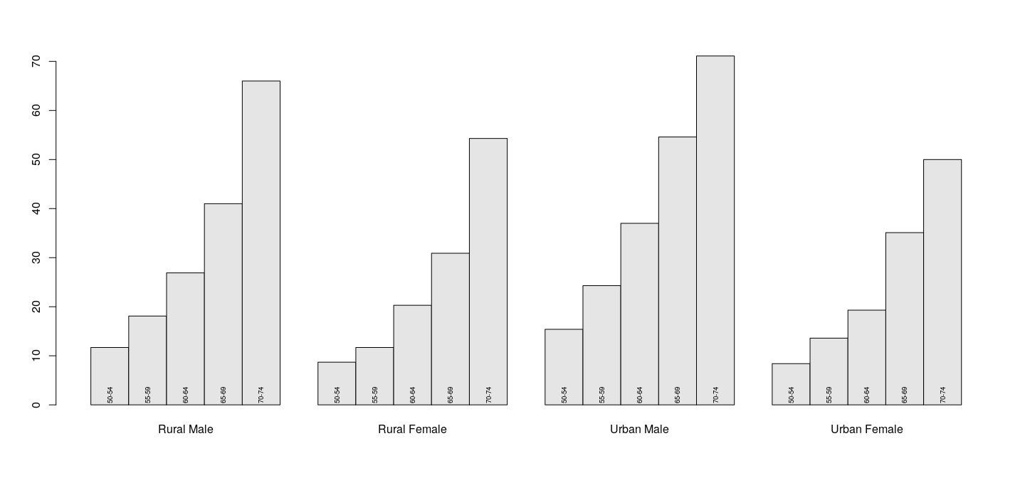
Customizing plots: bar plots
returns coordinates of the bar midpoints, allows similar annotation to be added to bar charts.
Example: age groups in the data are indicated using text labels rather than a legend
b <- barplot(VADeaths, beside = TRUE, col = "grey90")
text(b, 0, labels = rownames(VADeaths), srt = 90, adj = -0.1, cex = .6)
Customizing plots: bar plots
Limitations of traditional graphics
Traditional graphics model is considerably limited by its design.
Basic Assumption: a single plot area in the center, and margins will be used for axis annotation and labels.
Not all graphical designs fit this paradigm.
One important class of such examples: “small multiples” or “conditioned plots”, where one page contains multiple plots grouped by some categorical variable.
Limitations of traditional graphics
Example using traditional graphics:
lims <- with(anscombe, list(x = range(x1, x2, x3, x4),
y = range(y1, y2, y3, y4)))
par(mfrow = c(2, 2), mar = c(2, 2, 1, 0))
plot(y1 ~ x1, data = anscombe, pch = 16, xlim = lims$x, ylim = lims$y)
abline(lm(y1 ~ x1, data = anscombe), col = "grey50")
plot(y2 ~ x2, data = anscombe, pch = 16, xlim = lims$x, ylim = lims$y)
abline(lm(y2 ~ x2, data = anscombe), col = "grey50")
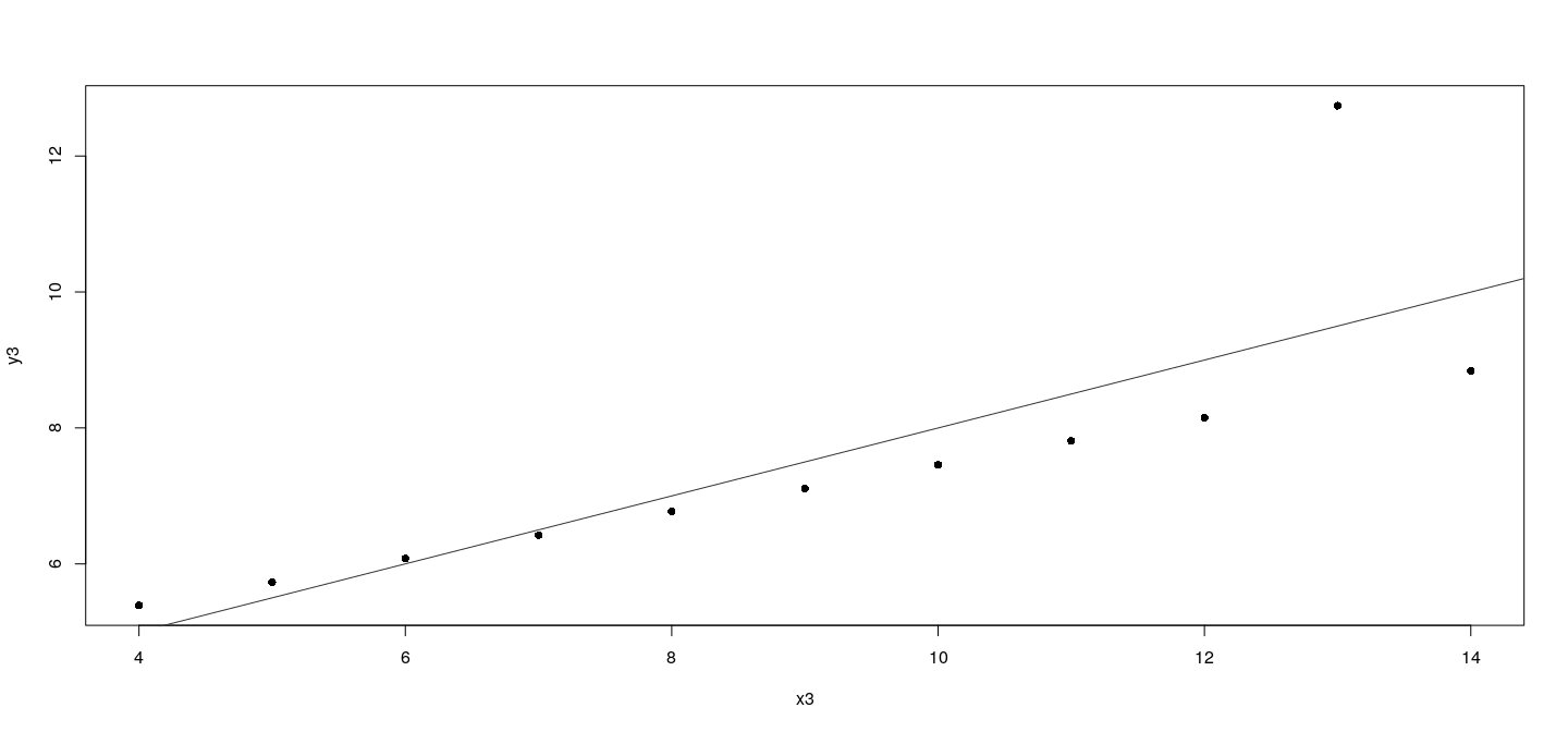
plot(y3 ~ x3, data = anscombe, pch = 16, xlim = lims$x, ylim = lims$y)
abline(lm(y3 ~ x3, data = anscombe), col = "grey50")
plot(y4 ~ x4, data = anscombe, pch = 16, xlim = lims$x, ylim = lims$y)
abline(lm(y4 ~ x4, data = anscombe), col = "grey50")Limitations of traditional graphics
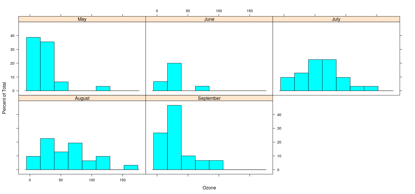
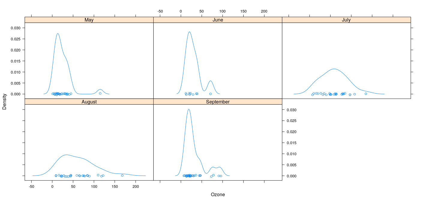
More realistic example: data
Compare the distributions of across months
With density plots or histograms
Density estimates can be superposed in the same plot, with a little work to ensure adequate axis limits.
More realistic example: data
We first use the function to divide up the observations by month.
List of 5
 $ May      : int [1:31] 41 36 12 18 NA 28 23 19 8 NA ...
 $ June     : int [1:30] NA NA NA NA NA NA 29 NA 71 39 ...
 $ July     : int [1:31] 135 49 32 NA 64 40 77 97 97 85 ...
 $ August   : int [1:31] 39 9 16 78 35 66 122 89 110 NA ...
 $ September: int [1:30] 96 78 73 91 47 32 20 23 21 24 ...
Next, we call on each component using .
More realistic example: data
Each component of now contains a object with components and giving the estimated density function. We can compute the range needed to contain all the densities as follows.
dxrng <- range(unlist(lapply(dlist, function(d) d$x)))
dyrng <- range(unlist(lapply(dlist, function(d) d$y)))
More realistic example: data
We then create a blank plot (using ) and add the densities one by one, followed by a legend.
plot(dxrng, dyrng, xlab = "Ozone concentration", ylab = "Density")
for (i in seq_along(dlist)) lines(dlist[[i]], col = i)
legend("topright", legend = names(dlist),
       lty = 1, col = seq_along(dlist))
More realistic example: data
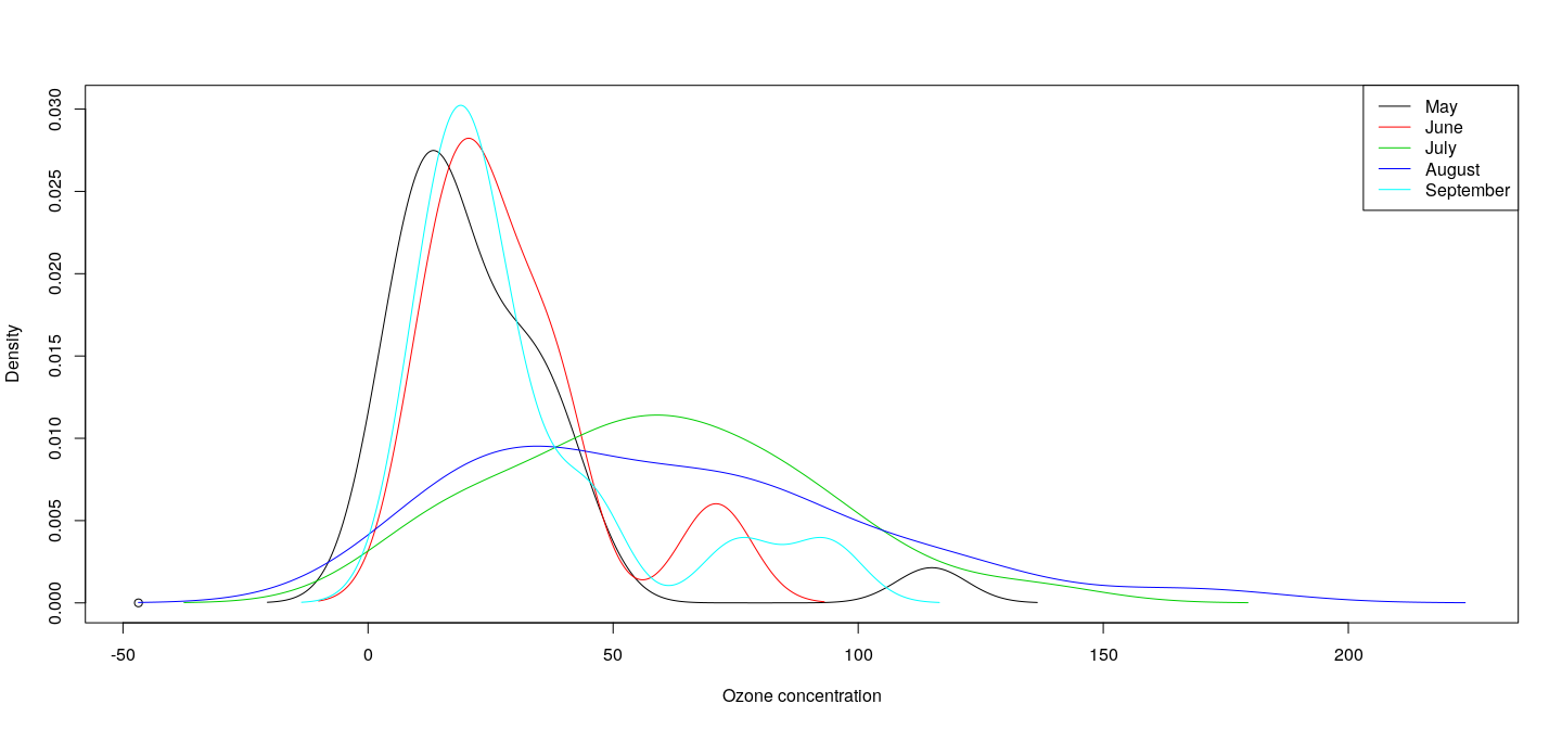
More realistic example: comparative histogram
Histograms are not easily amenable to superposition, but they can be juxtaposed.
Using similar tricks along with the multiple figure approach we obtain
par(mfrow = c(2, 3))
hlist <- lapply(s, hist, plot = FALSE)
hxrng <- range(unlist(lapply(hlist, function(h) h$breaks)))
hyrng <- range(unlist(lapply(hlist, function(h) h$density)))
invisible(lapply(names(s),
                 function(nm) {
                     plot(hlist[[nm]], main = nm, freq = FALSE,
                          xlim = hxrng, ylim = hyrng, xlab = "Ozone")
                 }))
More realistic example: comparative histogram
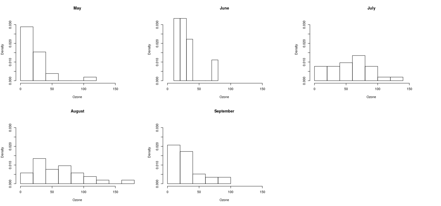
Limitations
Although not very difficult, obtaining these plots is not simple either, and the results leave a lot to be desired.
It is precisely the need to deal with these kinds of graphic designs that Trellis graphics as implemented in the package, and more recently the package, was developed.
Before we move on to these, we will briefly discuss the low-level system these packages are based on, namely, Grid graphics.
Grid graphics
Grid is a flexible low-level graphics toolbox.
It does not provide high-level functions itself, but is used by other packages to do so.
We will not delve into the details of , as it is a considerable topic.
Here, we will only try to give a glimpse of its flexibility using a practical example.
Our goal is to implement an with the following features:
- A central plot region with a standard scatterplot.

- ``Rugs" on the left and bottom boundaries showing marginal scatter.

- Density estimates on the right and top boundaries.- This is a simple design, but difficult to obtain with standard graphics.
Viewports
Viewports are a central concept in Grid graphics. They are essentially rectangular subregions of the plotting area. They can be nested within other viewports, forming a tree of viewports. The initial blank graphics area is the ROOT viewport. New viewports can be defined relative to parent either by position, or in terms of a layout. Viewports are created by the function, and made active by . The function is used to navigate to the parent of the current viewport. Viewports support several coordinate systems that can be used to specify locations within the viewport. Of these, the most useful is the , which is determined by specifying x-axis and y-axis extents when creating the viewport using the arguments and .
Coordinate systems in grid
Units and primitives
Another fundamental concept is that of units of length
Grid can specify lengths in various ways
The basic low-level primitive functions in traditional graphics have analogs in .
There are two versions of each function, one that produces output, and one that produces an object without actually plotting it.
These objects can eventually be plotted, but they can also be queried to determine their height and width, so that appropriate space can be allocated for them.
Common primitive objects in grid
Simple attempt
The data we will use for our example is the dataset, which contains eruption times and inter-eruption intervals lengths for the famous Old Faithful geyser in Yellowstone national park. We first compute some summaries that will be required to set up the plot.
'data.frame':   272 obs. of  2 variables:
 $ eruptions: num  3.6 1.8 3.33 2.28 4.53 ...
 $ waiting  : num  79 54 74 62 85 55 88 85 51 85 ...
x <- faithful$eruptions
y <- jitter(faithful$waiting)
xrng <- range(x)
yrng <- range(y)
xlim <- extendrange(xrng, f = 0.1)
ylim <- extendrange(yrng, f = 0.1)
xdens <- density(x)
ydens <- density(y)
xdens.max <- max(xdens$y)
ydens.max <- max(ydens$y)We can now use these to take a shot at our desired plot. First we create a viewport for the central plot area with a suitable native coordinate system that covers the range of the data. The location of the viewport itself is specified in terms of the parent (root) viewport. By default, the coordinate system used to specify the location of a viewport is the (NPC) system, which assigns the range \([0,1]\) to both coordinate axes.
library(grid)
pushViewport(viewport(x = 0.45, y = 0.45, width = 0.7, height = 0.7,
                      xscale = xlim, yscale = ylim))
Next we add the data points using the native coordinate system and add the x- and y-axes.
For the rugs, we use line segments whose locations along the axes are specified using the native coordinate system, but whose lengths are specified using the NPC system to be exactly 3% of the range of the corresponding axis.
grid.segments(x0 = unit(x, "native"), y0 = unit(0, "npc"),
              x1 = unit(x, "native"), y1 = unit(0.03, "npc"))
grid.segments(x0 = unit(0, "npc"), y0 = unit(y, "native"),
              x1 = unit(0.03, "npc"), y1 = unit(y, "native"))
Finally, we can add axis labels, and then the densities by creating two new viewports and plotting the densities inside.
upViewport(1)
grid.text("Eruption times (minutes)", x = 0.45, y = 0,
          just = c("centre", "bottom"))
grid.text("Time to next eruption (minutes)", x = 0, y = 0.45,
          rot = 90, just = c("centre", "top"))
pushViewport(viewport(x = 0.45, y = 0.85, width = 0.7, height = 0.1,
                      xscale = xlim, yscale = c(0, xdens.max),
                      clip = "on"))
grid.polygon(x = xdens$x, y = xdens$y, default.units = "native",
             gp = gpar(fill = "lightgrey", col = "transparent"))
upViewport(1)
pushViewport(viewport(x = 0.85, y = 0.45, width = 0.1, height = 0.7,
                      xscale = c(0, ydens.max), yscale = ylim,
                      clip = "on"))
grid.polygon(x = ydens$y, y = ydens$x, default.units = "native",
             gp = gpar(fill = "lightgrey", col = "transparent"))
upViewport(1)
We finish by adding a main label on top.
pushViewport(viewport(x = 0.5, y = 0.95, width = 1, height = 0.1))
grid.text("Old faithful eruptions", x = 0.5, y = 0.5)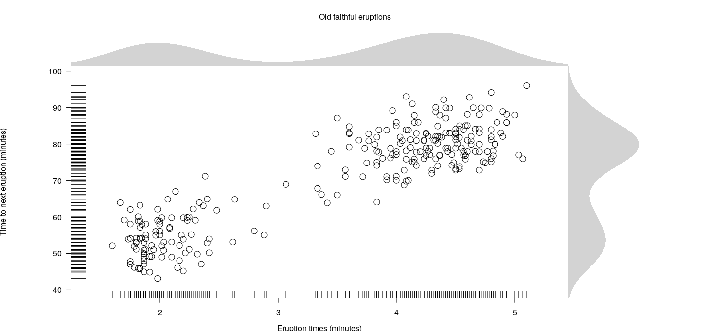
Further improvements
This approach can be easily generalized to work with other datasets
Several improvements could be desirable:
space for the axes, main title, etc., are proportions of the total figure area
instead, could want to use only as much space as necessary
can be done by specifying viewports are using “”
Will not go into that approach
Such advanced features of are used by the and packages (discussed next)
lattice
Lattice
- : add-on package that implements Trellis graphics in
Powerful high-level data visualization system with an emphasis on multivariate data.
Typical usage: revisit histograms for the ozone concentration data
Function used:
Histogram (without conditioning)
Histogram
Note that is specified in a formula.
All high-level functions in support formulas
The formula language allows us to elegantly express conditioning variables that are used to subdivide the data into subgroups that are plotted in “panels” juxtaposed to enable comparison.
To see the distribution of across different months, we can simply use
Histogram (with conditioning)
Features
Panels share the same data ranges
Axes are labeled only along the boundaries of the whole plot
Optimal use of available space while making comparison easier
Kernel density plots (with conditioning)
Kernel density plots (with grouping)
densityplot(~ Ozone, data = airquality, groups = fmonth,
      plot.points = FALSE, auto.key = list(columns = 2))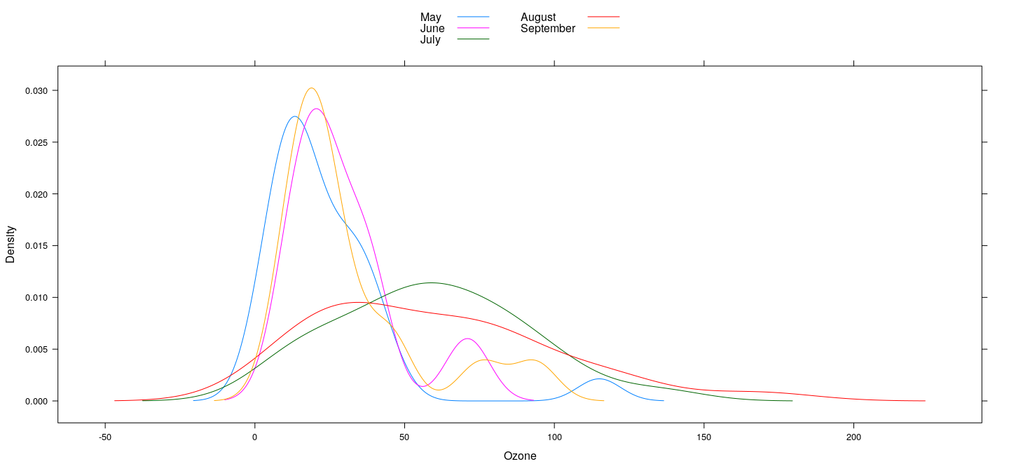
Features
Conditioning gives juxtaposition with common axes
Even better comparison by superposition (grouping)
and control further details
General overview
High-level system for statistical graphics
Independent of traditional R graphics
Modeled on the Trellis suite in S
Displays defined by type of graphic and role different variables play in it
Function name indicates type of graphic: ,
Typical roles are:
primary variables define the main display (e.g., )
conditioning variables divide data into subgroups displayed in different panels
grouping variables divide data into subgroups contrasted within panels
High-level functions
Design features
Overall goal: make comparison easier
Use as much of the available space as possible
Force direct comparsion by superposition (grouping) when possible
Encourage comparison when juxtaposing (conditioning): use common axes, add common reference objects such as grids.
Design features: implications
Avoid empty space: no space for labels/legends if they are absent
To implement this, all details need to be known when plotting begins
Implication: incremental approach common in traditional R doesn’t work
Lattice approach:
plots are R objects (of class )
incremental updates are performed by modifying and re-plotting
Extensions / customizations
Within overall structure, components can be customized
The main components are
- the primary (panel) display
- axis annotation
- strip annotation (describing the conditioning process)
- legends (typically describing the grouping process)
Most common: customized panel display
Common high-level displays: Q-Q plots
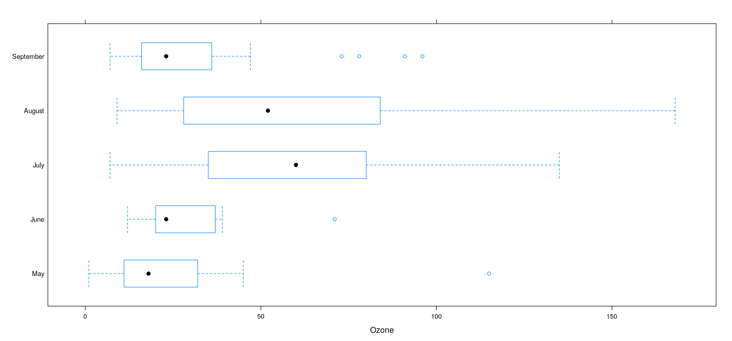
Common high-level displays: Comparative box-and-whisker plots
Common high-level displays: different scales
bwplot(fmonth ~ Ozone + Solar.R, data = airquality,
       outer = TRUE, scales = list(x = "free"), xlab = NULL)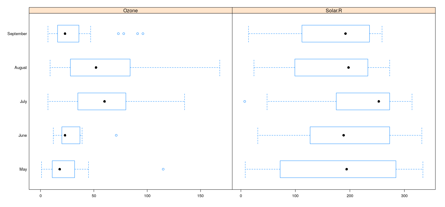
Bar charts and dot plots for tabular data
We will use the dataset again
is a matrix, but need a data frame to use the formula interface
'data.frame':   20 obs. of  3 variables:
 $ Var1: Factor w/ 5 levels "50-54","55-59",..: 1 2 3 4 5 1 2 3 4 5 ...
 $ Var2: Factor w/ 4 levels "Rural Male","Rural Female",..: 1 1 1 1 1 2 2 2 2 2 ...
$ Rate: num 11.7 18.1 26.9 41 66 8.7 11.7 20.3 30.9 54.3 ...- TO produce a bar chart:
Bar charts
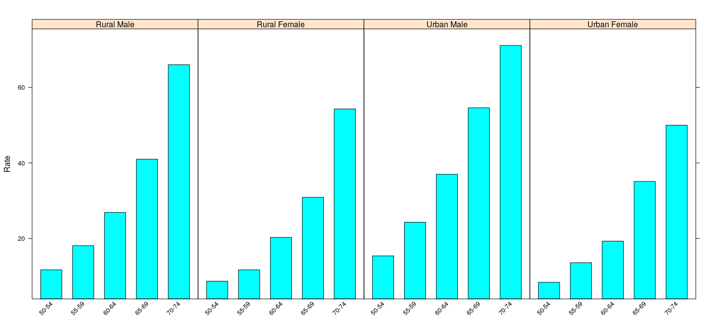
Bar charts
Potentially misleading, because
strong visual comparison: areas of the shaded bars
areas do not mean anything here
can be addressed by making the bars start at 0.
barchart(Rate ~ Var1 | Var2, VADeathsDF, layout = c(4, 1),
         origin = 0,
         scales = list(x = list(rot = 45)))
Bar charts
Dot plots: compare only location
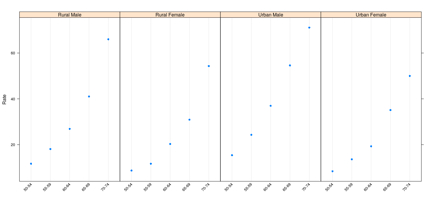
Dot plots (grouped)
dotplot(Rate ~ Var1, VADeathsDF, groups = Var2, type = "o",
      auto.key = list(columns = 2, points = TRUE, lines = TRUE))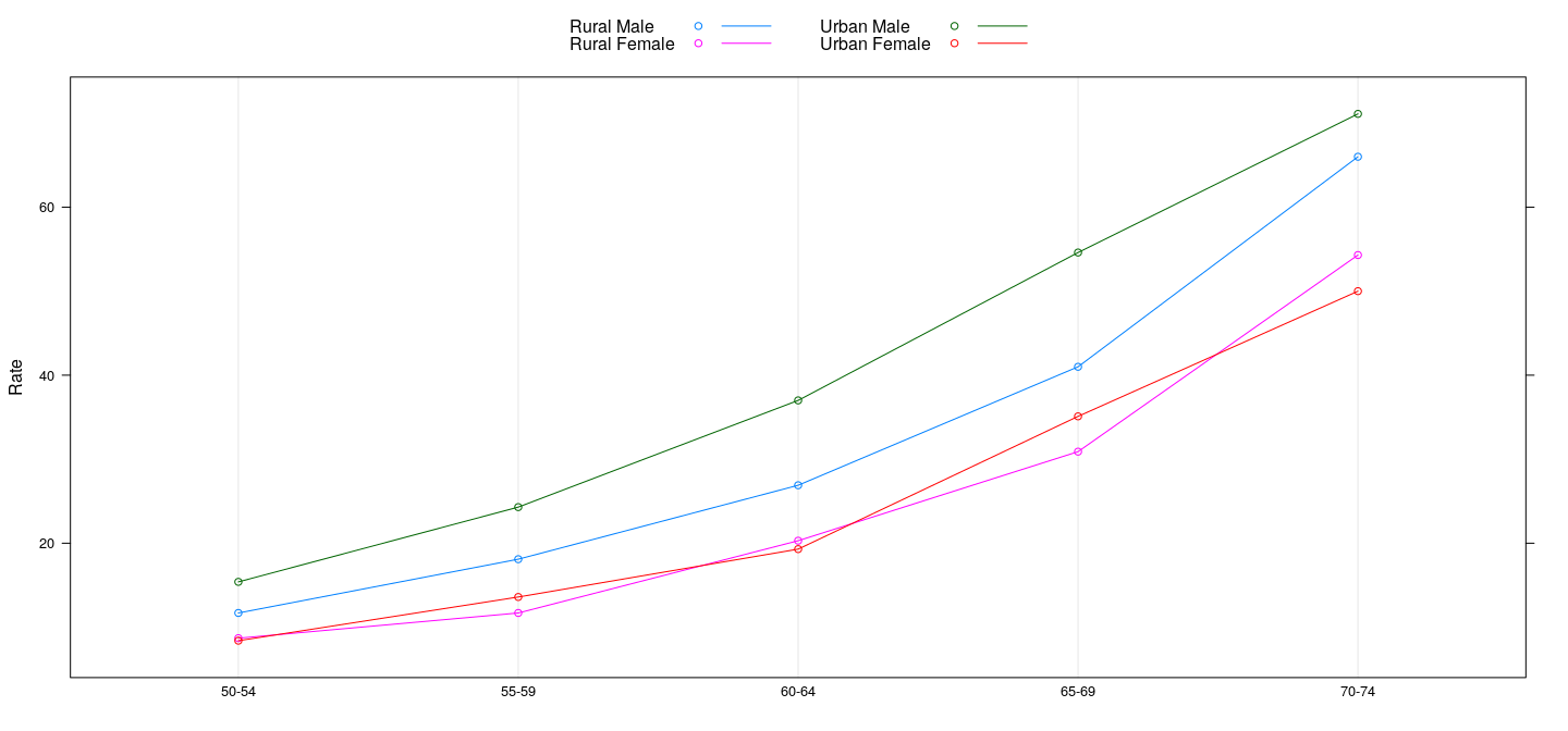
Methods
High-level functions are actually generic
Specific methods do the actual work
Examples seen so far are methods
and also have methods
dotplot(VADeaths, type = "o", ylab = "Rate", horizontal = FALSE,
        auto.key = list(columns = 2, points = TRUE, lines = TRUE))
Scatter plots
Produced using
Scatter plots
To show all four datasets, need to rearrange data
anscombe.long <-
    with(anscombe, data.frame(x = c(x1, x2, x3, x4),
                              y = c(y1, y2, y3, y4),
                              which = gl(4, nrow(anscombe))))
Scatter plots
A conditional plot can now be created using
Customization
Suppose we want to add linear and quadratic regression lines
Similar idea: fit models, add lines or curves representing the fits
However, this cannot be done after the basic plot is already drawn
- Solution:
- provide a function that implements procedure to display data
- executed once for every panel (data subset)
- known as the
- supplied as the argument to high-level calls
Customization
Such a function might look like:
panel.lq <- function(x, y, ...)
{
    panel.grid()
    panel.xyplot(x, y, ...)
    fm1 <- lm(y ~ x)
    panel.abline(fm1)
    try({
        fm2 <- lm(y ~ poly(x, 2))
        f <- function(x) predict(fm2, newdata = list(x = x))
        panel.curve(f)
    }, silent = TRUE)
}
Uses analogues of functions such as and
The function represents the default panel function
The quadratic model fit is wrapped inside because the fit fails for the fourth dataset which has only two unique values
Customization
Three-dimensional plots
Three-dimensional scatterplots supported by the function
Example: scatter plot of latitude, longitude, and depth of earthquake epicenters
cloud(depth ~ lat * long, data = quakes,
      zlim = rev(range(quakes$depth)),
      screen = list(z = 105, x = -70), panel.aspect = 0.75,
      xlab = "Longitude", ylab = "Latitude", zlab = "Depth")
Three-dimensional plots
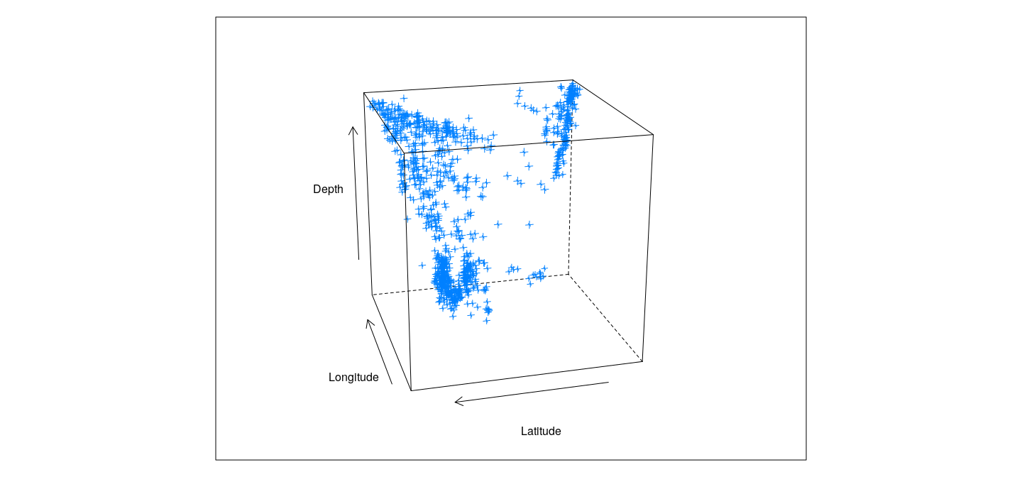
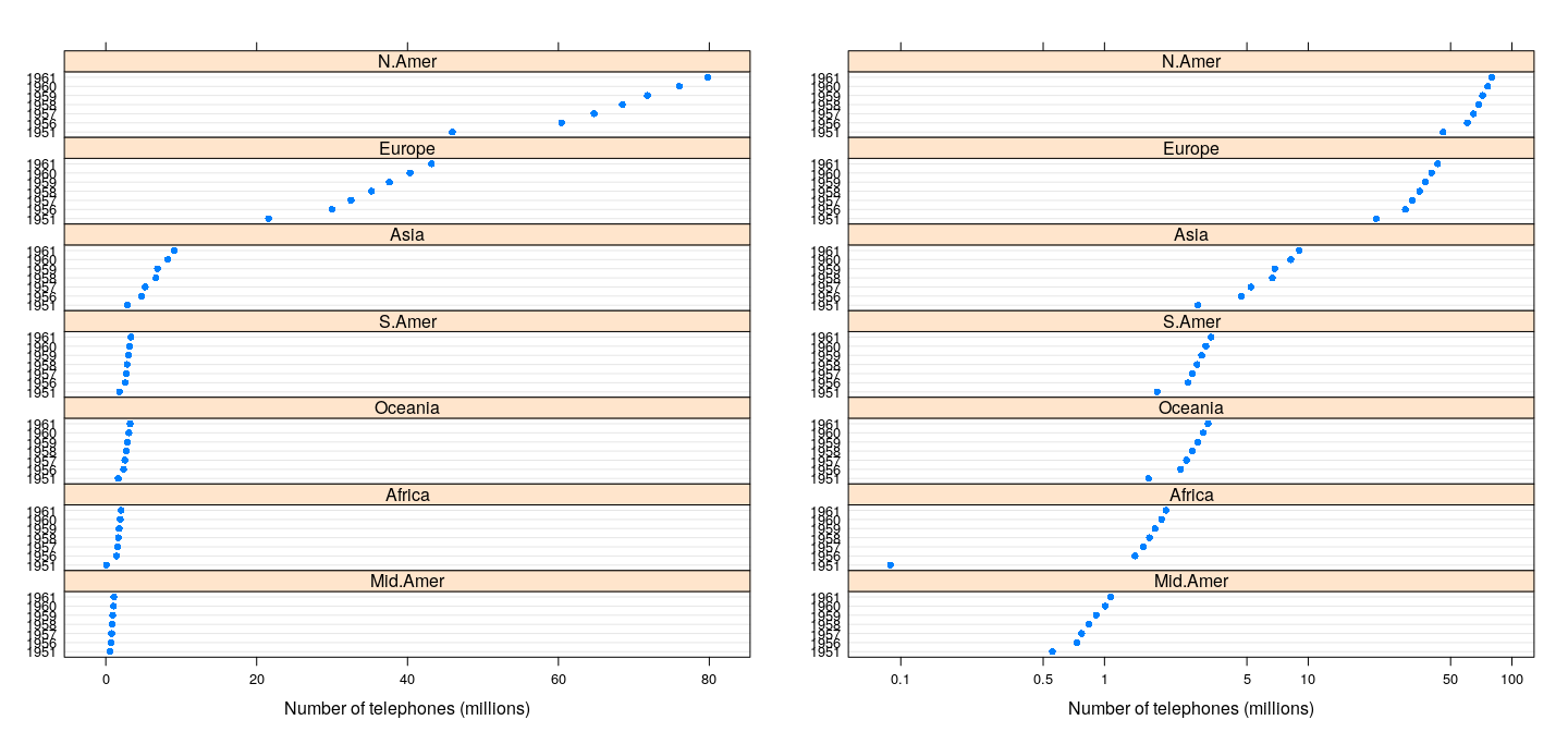
The object
Important feature of :
high-level functions do not plot anything.
they return an object of class
must be -ed or -ed (not necessary in interactive use due to R’s automatic printing rule)
can be useful to display multiple plots:
dp.wp <- dotplot(WorldPhones/1000, groups = FALSE,
                 layout = c(1, NA),
                 xlab = "Number of telephones (millions)")
dp.wp.log <-
    dotplot(WorldPhones/1000, groups = FALSE, layout = c(1, NA),
            scales = list(x = list(log = TRUE,
                                   equispaced.log = FALSE)),
            xlab = "Number of telephones (millions)")
plot(dp.wp,     split = c(1, 1, 2, 1))
plot(dp.wp.log, split = c(2, 1, 2, 1), newpage = FALSE)
The object
ggplot2
Grammar of graphics
Traditional and trellis graphics both have the same basic approach:
functions are written to implement specific graphical designs
usually these designs have already been established as beingu useful
customization is achieved through a procedural approach.
The package takes a different approach:
defines a “layered grammar” for defining graphical designs
defines various components of a graphical display
final display is a composition of various independent components
grammar is used to specify the composition
can be used to create novel displays easily
plots consist of one or more layers
(e.g., raw data could be one layer, model fits another)
Grammar of graphics
The main components of the grammar are:
that map data values to some aspect in the displayed graph, such as coordinate positions, color, shape, size, group, etc.
geometric types used to render the mapped data, e.g., by points, lines, polygons, or something more complex such as a box-and-whisker plot.
statistical transformations that are applied to the data beforehand, such as binning for histograms, or computation of kernel density estimates.
Scales that give a visual indication of the aesthetic mappings, e.g., axis annotation for position mapping, legends for mapping to color, size, etc.
Faceting (conditioning in Trellis terminology) to produce small multiples.
Example: Air quality data
Goal: produce histograms and kernel density plots conditioned on .
Common data source and faceting, so capture these aspects first.
specifies the aesthetic mapping: saying in this case that variable should be mapped to x-coordinates in the plot.
is not yet a valid plot, because it doesn’t yet have any layers.
To create a scatterplot, we can add a point “geom” (short for geometric type), but to do so, we also need to specify a variable that will map to the y-coordinates.
Example: scatter plot
Warning: Removed 42 rows containing missing values (geom_point).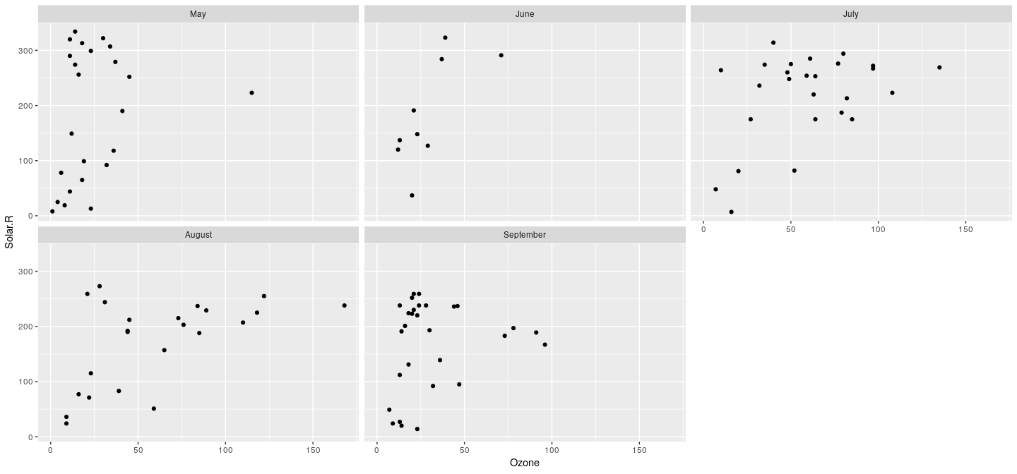
Example: histogram
adding a geom is not enough for histogram
we first need to transform the data by binning it
we add a new “stat” layer created by
we can also specify the geom to be used for rendering the transformed data.
Example: histogram
Warning: Removed 37 rows containing non-finite values (stat_bin).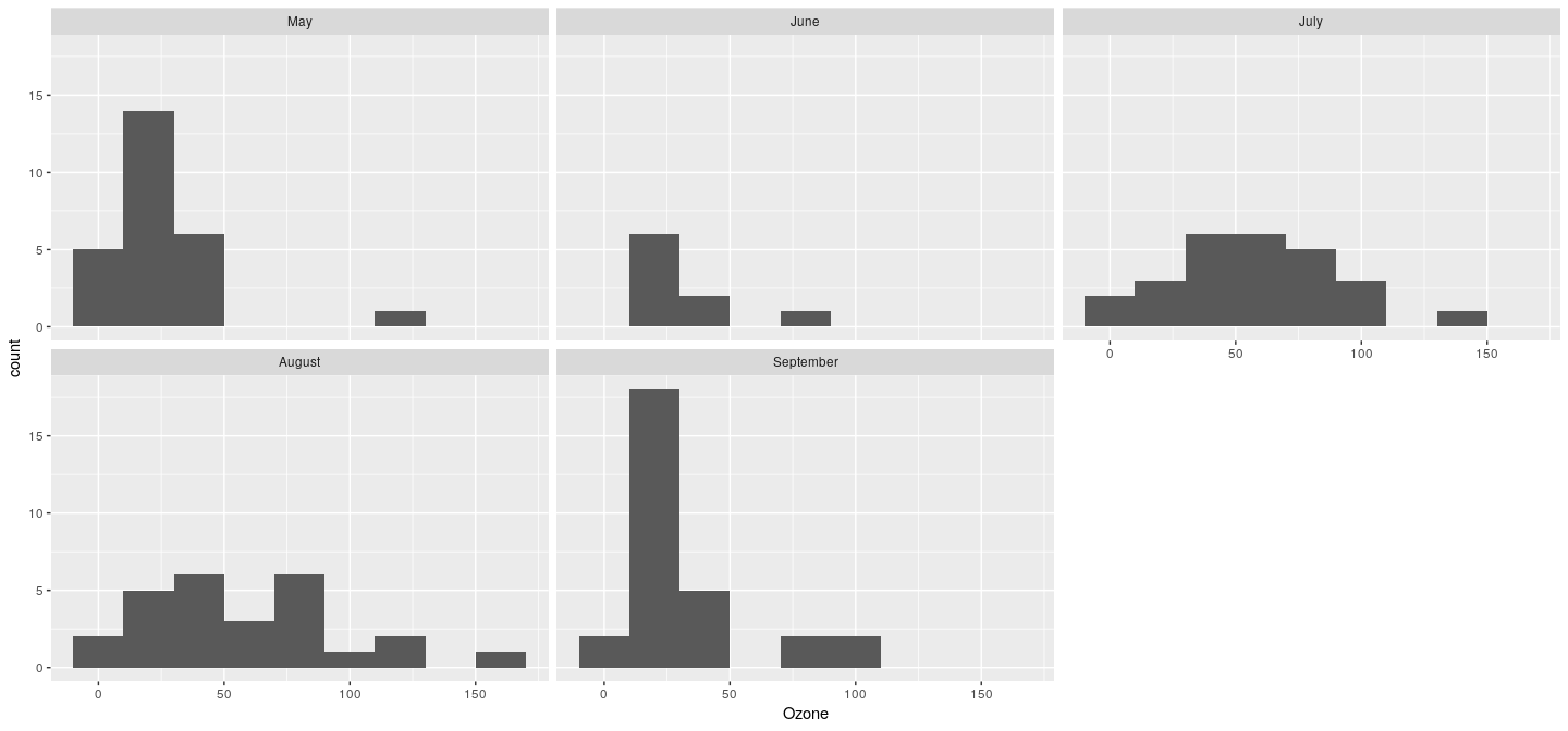
Example: kernel density plots
- similarly produced using .
Warning: Removed 37 rows containing non-finite values (stat_density).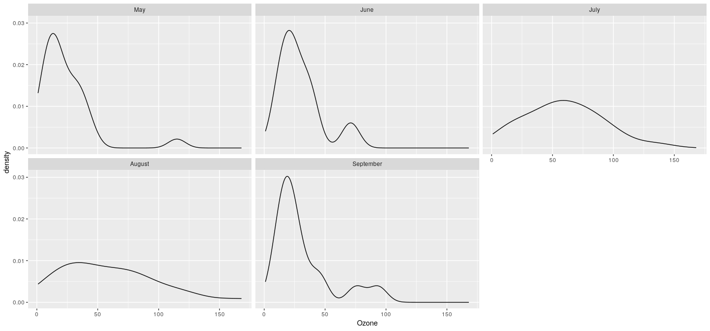
Simpler interface
For these standard graphical designs, the calls above are too verbose
offers a simpler interface for common designs
The previous plots can be produced directly using
qplot(x = Ozone, y = Solar.R, data = airquality,
      facets = ~ fmonth)
qplot(x = Ozone, data = airquality, facets = ~ fmonth,
      stat = "bin", binwidth = 20)
qplot(x = Ozone, data = airquality, facets = ~ fmonth,
      stat = "density", geom = "line", binwidth = 20)
Layers
Full potential of the layered approach becomes apparent when we need to add more elements to a plot.
The following call creates a scatterplot of the data with a LOESS fit and rugs on the margin.
Layers
qplot(x= jitter(eruptions), y= jitter(waiting), data= faithful) +
    stat_smooth(method = "loess") + geom_rug()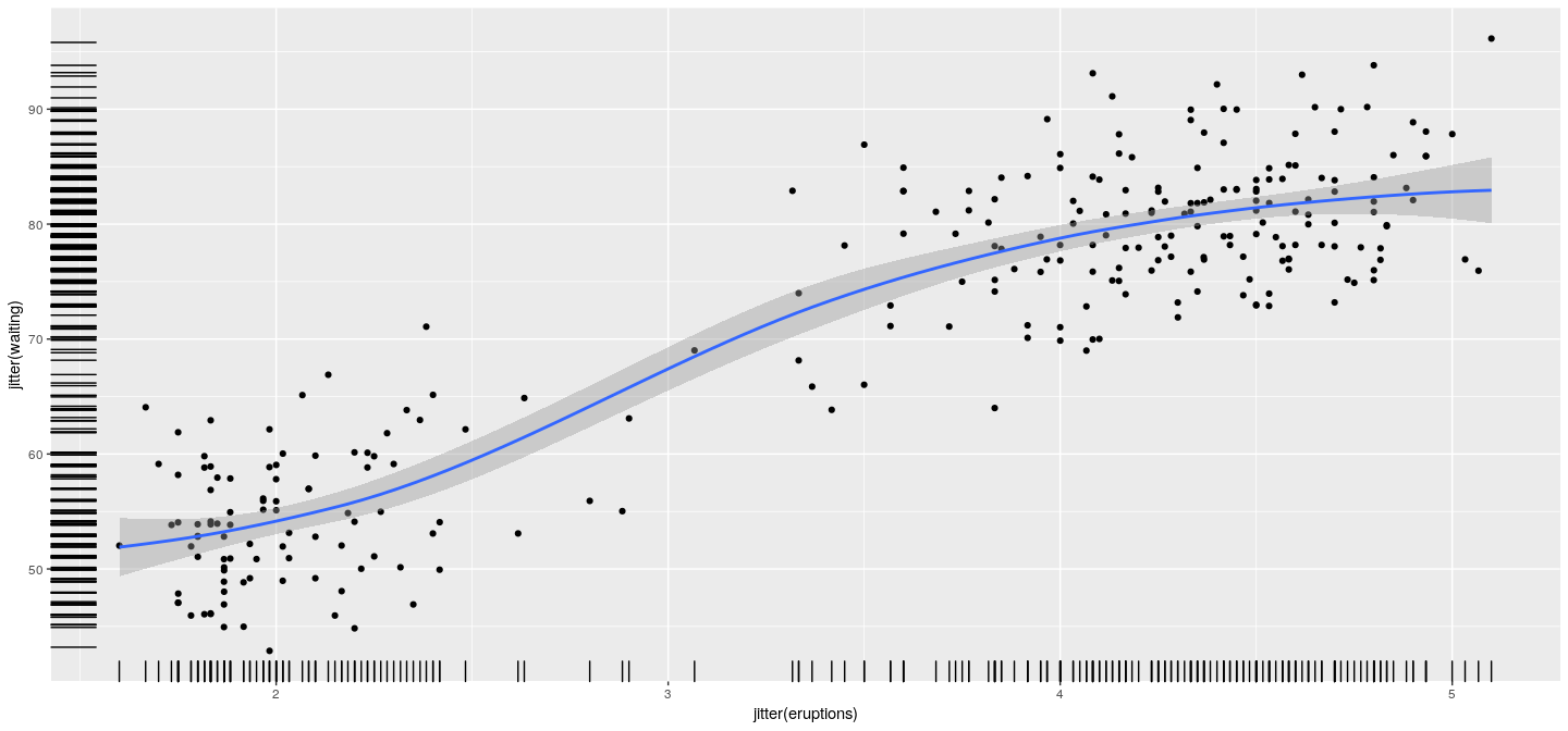
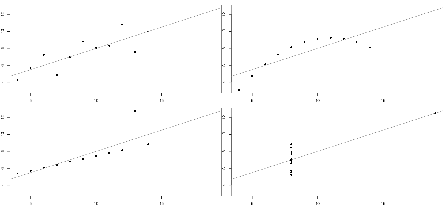
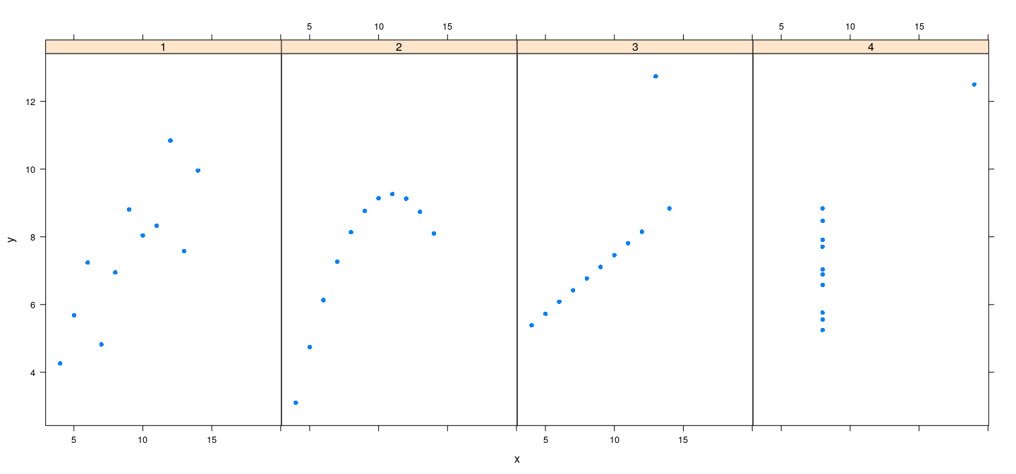
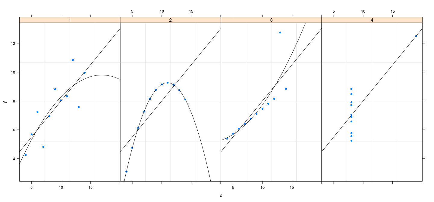
Layers: another example
anscombe.123 <- subset(anscombe.long, which != "4")
qplot(x = x, y = y, data = anscombe.123, facets = ~ which) +
  stat_smooth(method = "lm", se=FALSE) +
  stat_smooth(method = "lm", formula = y ~ poly(x, 2), se=FALSE)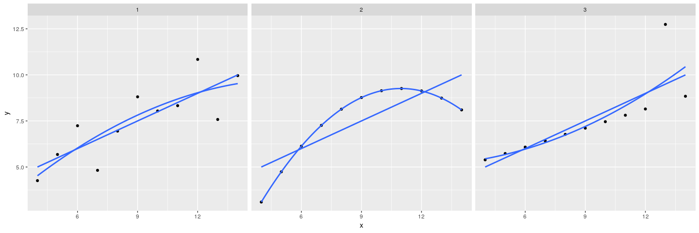
References
Anscombe, F.J., 1973. Graphs in statistical analysis. The American Statistician 27:1, 17–21. Link
Murrell, P., R Graphics (second edition), 2011. Chapman & Hall/CRC.
Sarkar, D., 2008. Lattice: Multivariate Data Visualization with R. Springer, New York.
Tukey, J.W., 1977. Exploratory Data Analysis. Addison-Wesley, Menlo Park, CA.
Wickham, H., 2009. ggplot2: Elegant Graphics for Data Analysis. Springer, New York.
Wilkinson, L., 1999. The Grammar of Graphics. Springer, New York.